|
| Group |
Round |
C/R |
Comment |
Date |
Image |
| 79 |
Nov 20 |
Reply |
Hi Peter.....no, not wrong at all. It's very much a personal choice. I'm very much a plain matt girl and I don't feel that it would have pulled the viewer's eyes away....more perhaps, kept them inside the image.
I wonder, if you felt the image needed a vignette, why you didn't put one on the image itself??
I wonder also, how the image would look with a plain matt in one of the tones you have chosen for your vignette?
Thanks...will have a look at that wave filter....looks interesting. |
Nov 12th |
| 79 |
Nov 20 |
Comment |
Nice to have you join the group Peter!
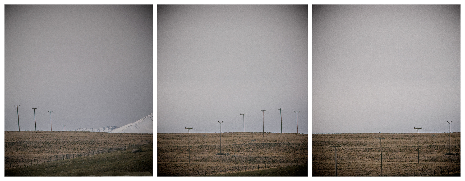
An interesting image and you've had quite a bit of fun with it! Love the colours and I wonder if a triptych is out of the question with the purple flowers lending balance to both sides.Perhaps there is not enough of prominence in the centre?
What part of your post-production caused the "stretching".
Not sure that the mauve colours on the matt work for me. I think there is so much brightness and colour happening in your image, that it detracts. Interesting idea though.
NB What is the wave filer? |
Nov 12th |
| 79 |
Nov 20 |
Comment |
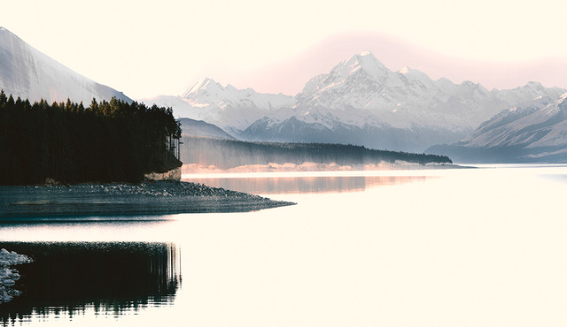
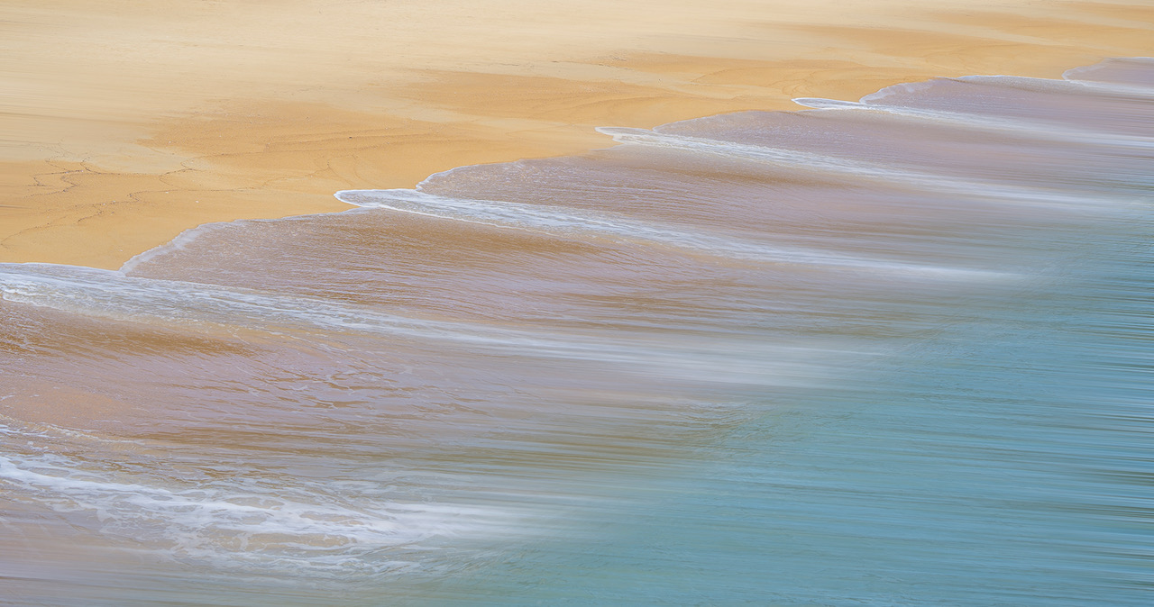
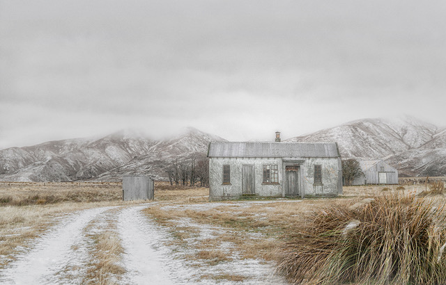
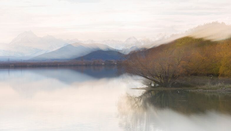
Hi Lauren.....a stunningly beautiful image! The Autumnal colours, the serenity, the long exposure to slow the frantic water, the tree trunks framing the cabin, all combine to produce a delightful image. The colours have popped! The water leads you toward the cabin....great composition. Wonderful, I love it. |
Nov 9th |
| 79 |
Nov 20 |
Comment |
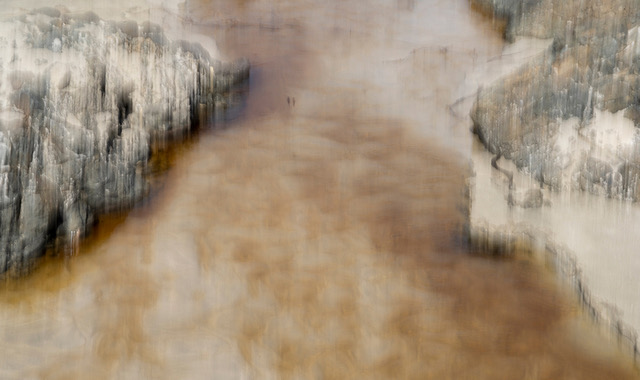
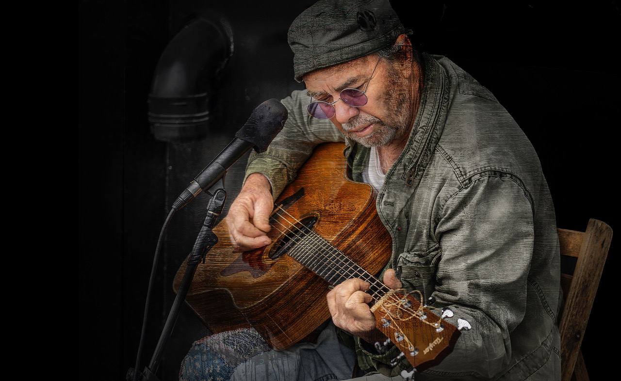
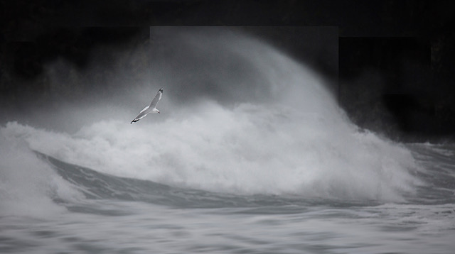
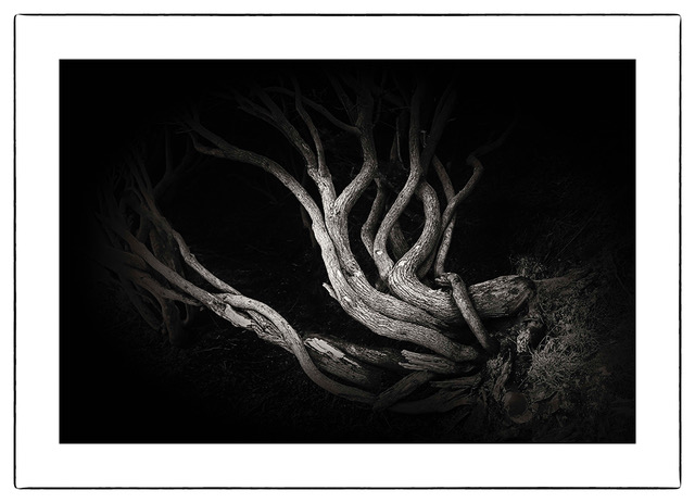
Yes, we can! It's a magnificent display of light drawing Karl! Truly striking and I understand that it's a technique exercise, but would love you to be more grandiose within this awesomeness. However, that's by the by. I love the effects you have achieved and certainly won't pretend to understand the process you have gone through to achieve this. Whatever it is, there should be more of it! It's absolutely stunning! |
Nov 9th |
| 79 |
Nov 20 |
Comment |
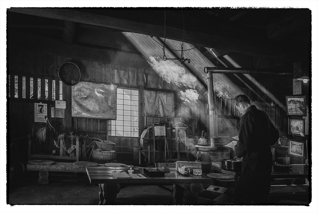
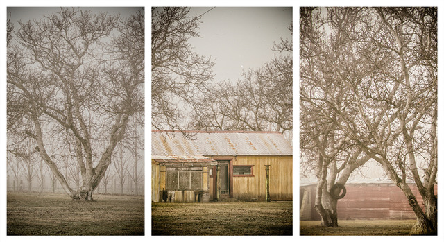
Hi Marie...what a lovely series of photos depicting a Japanese tea making ceremony and to make the triptych so current with the wearing of the mask. History!
I think you've done a great job.
Just a couple pf comments; I would keep the mat placement consistent throughout, so that the focus remains on the subject and the teapot and cups. I would also try to balance the tea maker's head. You have 2 going to the right and 1 central. Picky I know, but it affects the overall balance of the 3 images displayed together.
Overall, I think the series works well! |
Nov 9th |
| 79 |
Nov 20 |
Comment |
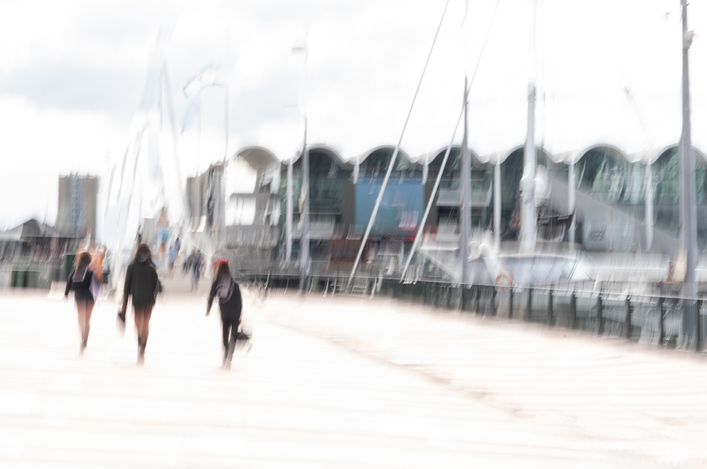
Hi Sandra....lovely and soft, gentle colours.....but I feel I need there to be something at the end of the tunnel, so to speak. Or even just very subtle hints throughout the image. What would happen if you layered them and used a soft light blend mode, I wonder...and lowered the opacity to let some shapes come through, graduating them very gently until there was a more obvious hint of the petals of the rose in the centre. Or perhaps slowed the zoom a little? I think Lauren's idea will produce interesting results too. Looks like you're having great fun experimenting too! |
Nov 9th |
| 79 |
Nov 20 |
Comment |
Hi Judith
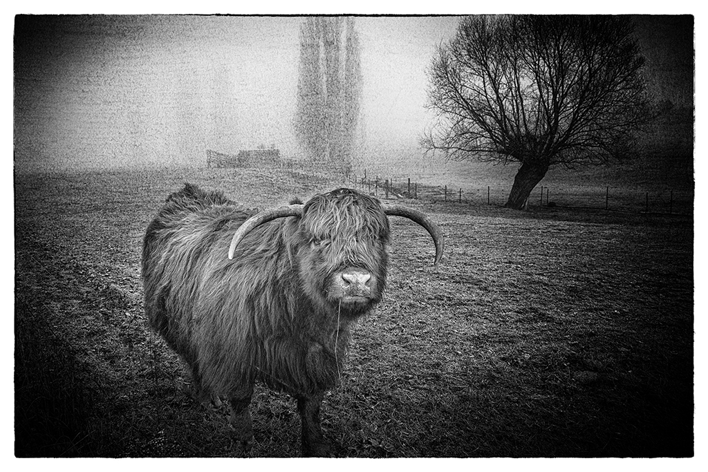
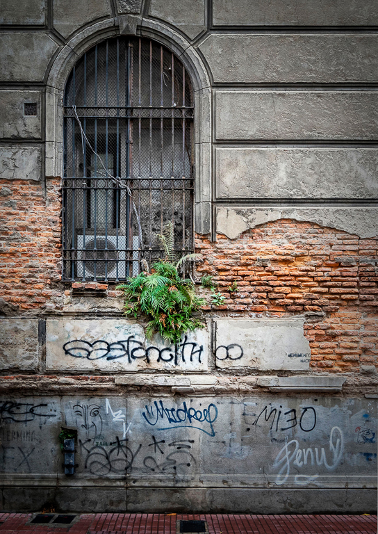
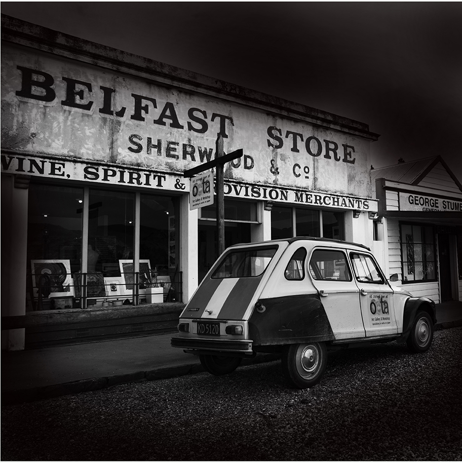
I totally agree with all previous comments. Love the composition, the tones, the texture....love that texture..... and the subject! It's certainly a step back in time and now well preserved in your photographic image. Well seen! |
Nov 9th |
| 79 |
Nov 20 |
Comment |
Thanks for the positivity everyone! I hope you've been out with your cameras and been amazed at what you can achieve. It's a bit like opening Xmas presents when you check the results :-) |
Nov 9th |
7 comments - 1 reply for Group 79
|
7 comments - 1 reply Total
|