|
| Group |
Round |
C/R |
Comment |
Date |
Image |
| 79 |
Sep 20 |
Comment |
Interesting image Lauren, but for me, I don't love the backs of the flowers; however, I appreciate that the darker area gives form to your main flower. It's unusual and the colours are gorgeous against the darker backdrop. The little bud, as cute as it is, and the leaves, don't need to be there, to my mind. I think if they were removed, the composition would have more impact as my eye keeps wandering to them. Just my humble opinion. |
Sep 19th |
| 79 |
Sep 20 |
Comment |
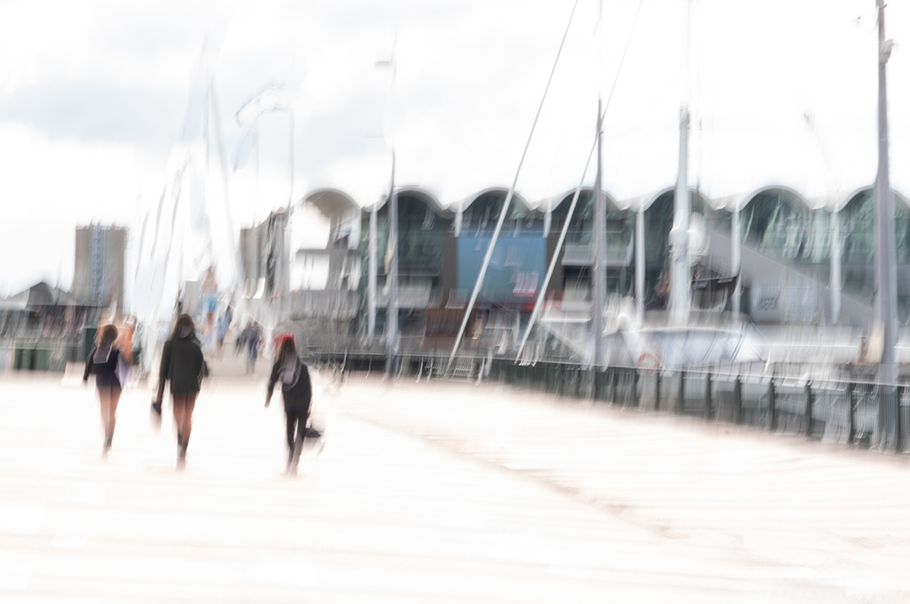
Hi Karl.....this is a hard one to comment on. I'm not seeing the connection between the mannequin and the expression on the girl's face. To me, it's two different stories that haven't quite come together. Perhaps I'm just not "getting it". The colours too are completely different and to me (perhaps that's what Marie is getting at?), make the disconnect even stronger. I get the feeling that the girl has not even noticed the torso, she's too busy with the slide activity (which in reality would not be the case) and that makes it look as if it's just been popped into the composite for a bit of shock value for the viewer. Perhaps I'm too literal :-) |
Sep 19th |
| 79 |
Sep 20 |
Comment |
Hi Marie
This is an interesting composite although I may not have got the connection if you had not explained it. I love the story...just sad that it's one that is being told, isn't it.
You've put a lot of thought into this and obviously enjoyed being creative! Well done!! |
Sep 19th |
| 79 |
Sep 20 |
Comment |
Hi Sandra
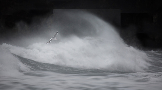
I love the silhouetted shape of the original and would have liked to have seen it against a moody sky to perhaps develop a sense of foreboding....yes, a darker blue would work too. Stephen has certainly made a difference to the piece you have taken from the original hasn't he! I do like this as well, but it's the unusual building that tweaks the imagination, and that I particularly love. |
Sep 18th |
| 79 |
Sep 20 |
Comment |
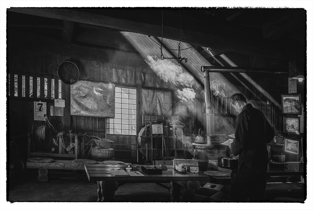
Hi May...an intriguing image as ever. I like the way you have framed the poster and it works well in B&W. Perhaps you intended the subject to be out of focus, but it makes me just a little uncomfortable looking at it for too long. I liked Karl's final comment.....I imagine they could be! |
Sep 18th |
| 79 |
Sep 20 |
Comment |
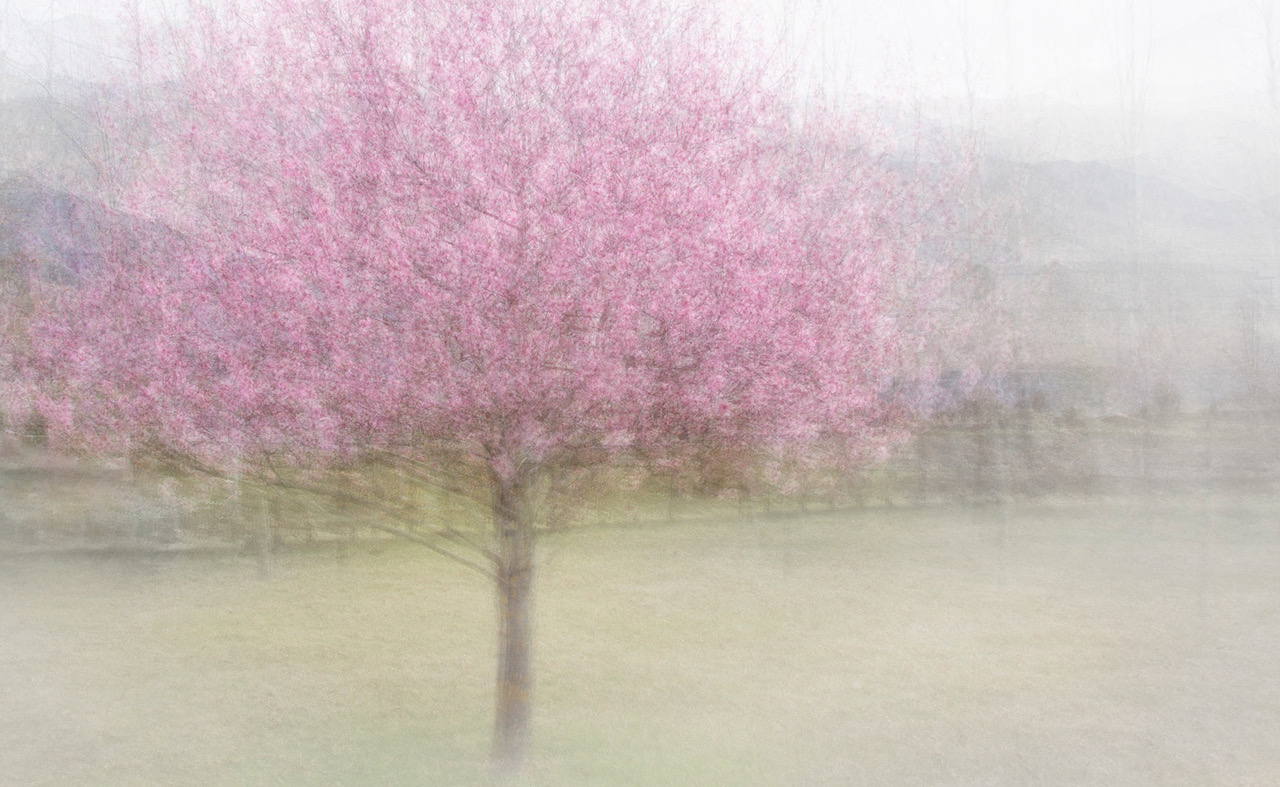
Beautiful explosion of colour Judith! The zoom has meant all the lines are heading to the lovely little green pieces at the centre. Very nice. There's a bluey-white piece on the left which you could probably do without, but lovely impact overall. |
Sep 18th |
| 79 |
Sep 20 |
Comment |
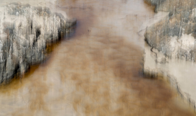
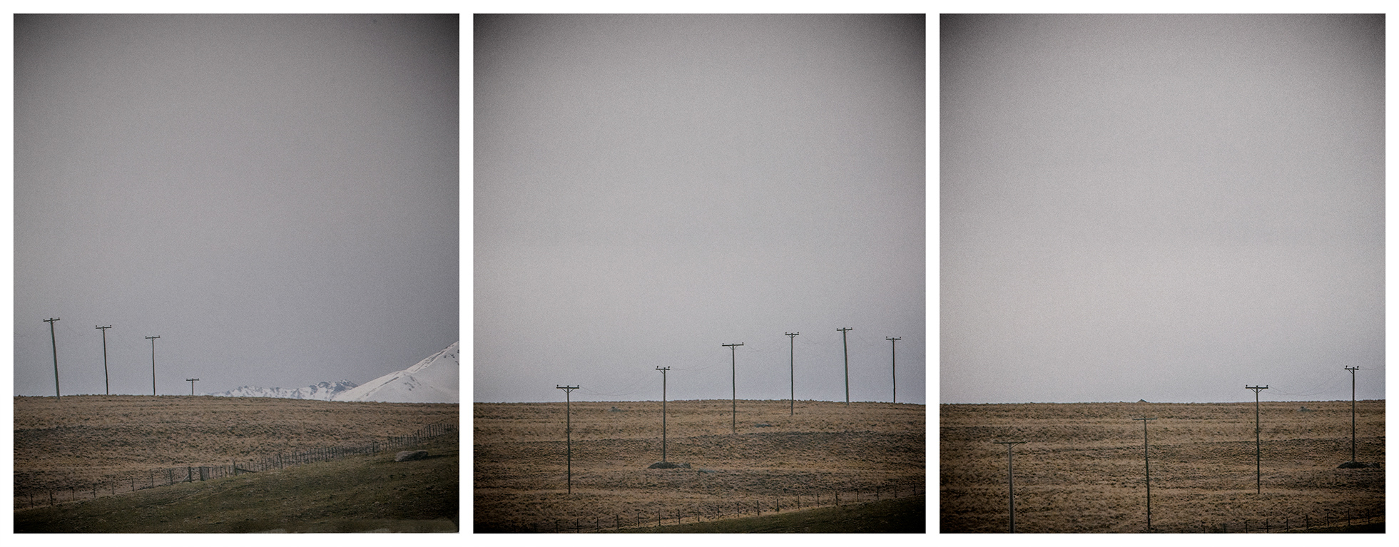
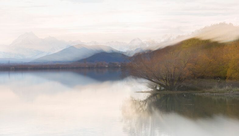
Funny Marie....the things you take for granted in your own culture! Tussocks everywhere in NZ, so we assume...wrongly... :-) Yes, both Karl and yourself are probably correct about the lack of detail where the water once was. It has become a big empty space, hasn't it! I'll try it without removing all that detail.
These photos of Cook are a dime a dozen for us folk here so didn't want to have just another one, hence the experiment. Good comments. Funny about that halo...it's not showing on my computer....hmmmm. Thanks for your input...and Karl your interesting composite. Great to get some constructive comments!! |
Sep 18th |
7 comments - 0 replies for Group 79
|
7 comments - 0 replies Total
|