|
| Group |
Round |
C/R |
Comment |
Date |
Image |
| 79 |
Jun 20 |
Reply |
Oooops......almost the last :-) Two kittens.....you're a tiger for punishment! Lots of joy and laughs though coming your way I imagine! |
Jun 21st |
| 79 |
Jun 20 |
Reply |
Thanks Sandra. Yes, the lighter version provides more contrast. |
Jun 21st |
| 79 |
Jun 20 |
Reply |
Thank you Lauren. Appreciate your comments. Yes, you're all right on the shadows on the road splitting the image. It seems so obvious to me now. Funny isn't it! I'm unclear about the pond comment though. There's no pond in the image....or trailer??? |
Jun 21st |
| 79 |
Jun 20 |
Comment |
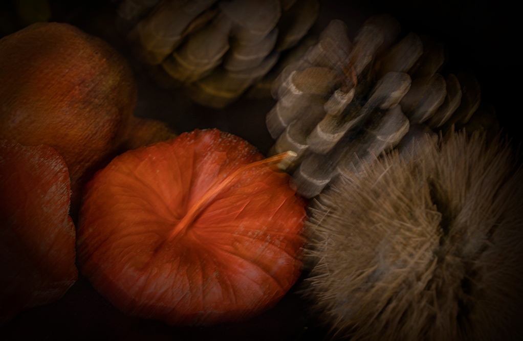
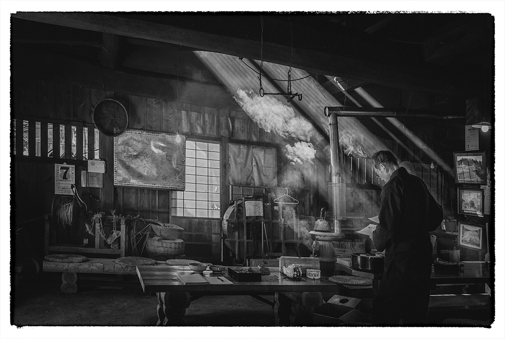
Hi Karl....you have surpassed yourself yet again. Love both images. Incredibly shallow depth of field....very little in the second image is sharp to my eye, but that's the nature of the beast and what I find incredibly frustrating when trying macro. It is fiddley, but the results can be a knock-out as you have shown. I echo Judith's query.
Must try the scanner trick....sounds like fun too.
Not sure which I prefer....perhaps the one on the left. It's very striking for such a delicate piece of nature! Lovely work. |
Jun 12th |
| 79 |
Jun 20 |
Comment |
Hi Sandra.....always good to be last in line responding :-) I agree with all of the above, otherwise your image, as nice as it is, is only a snapshot.
I wonder if removing the vegetation at least from the central part, might have helped a little also. Watch your highlights too as they appear a little blown out on your version although I appreciate you were trying to make it sunnier. Maybe a selfie stick could help you get some of those low angle shots and consequently different perspectives, without you having to bend down?
All in all a nice idea, but definitely needs that point of difference to give it your stamp and set it apart. |
Jun 12th |
| 79 |
Jun 20 |
Comment |
This is an interesting and rather creative image Lauren. It's a bit busy for me, but I enjoy the idea...the strong, bold swirls of gorgeous colour. I wonder if desaturating the green areas might make it less frantic, but as ever, it's personal taste. It is fun trying all the wonderful tools available to us in post processing, isn't it! Yes, Creative it is!! |
Jun 12th |
| 79 |
Jun 20 |
Comment |
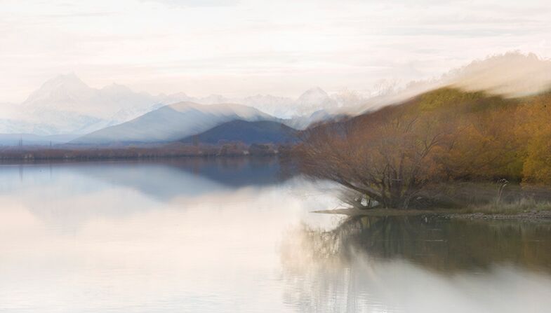
Lovely image Marie. Great little story in the old versus new. Karl has again posted great comments and I agree that the sky does nothing to enhance this. It's about the flowers. Just a little note, beware of horizon lines that are not straight. A crooked horizon will always draw the eye. You've done a great job with composition! I wonder if you could have removed the out of focus leaf in the foreground with PS Content Aware Move tool. Sometimes it does a great job, but other times, not so good. Very nice. |
Jun 12th |
| 79 |
Jun 20 |
Reply |
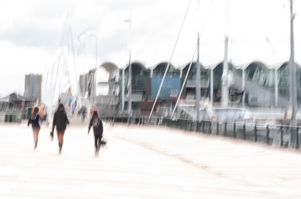
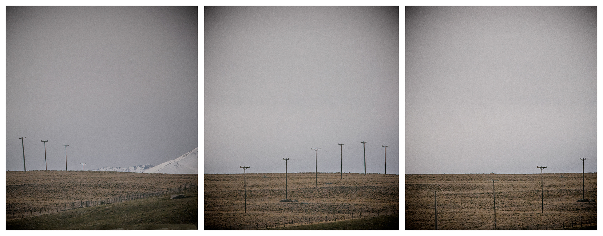
Thanks Karl. It is actually a better image cropped at the demarcation, although I liked the long lead in for some reason, but the shadows have split the image, haven't they. |
Jun 12th |
| 79 |
Jun 20 |
Comment |
Yes, Judith. I'm with Karl and Marie on this one. I like both; the colours in the original are lovely and warm and then the black and white is a little mysterious, even alien- like.....definitely unsettling...the unknown figure. I would be interested to see what happens if you follow Karl's suggestions. |
Jun 12th |
| 79 |
Jun 20 |
Comment |
Hi May....I very much enjoyed your submission this month....so minimalist, yet so very complex. I wondered about the darker mirror image of your shoulders...perhaps a sign of reflection. The blacks and whites and subtle grey tones of the image allow the imagination to wander....the darker shapes...the whispy shaded area on the neck. Just lovely. Thank you May. |
Jun 12th |
6 comments - 4 replies for Group 79
|
6 comments - 4 replies Total
|