|
| Group |
Round |
C/R |
Comment |
Date |
Image |
| 79 |
Sep 19 |
Comment |
Hi Sandra....you can use the Content Aware Move tool in PhotoShop or the Clone Tool or even the Patch Tool. There are other ways as well....in PhotoShop there always seem to be several ways of doing the same thing. |
Sep 29th |
| 79 |
Sep 19 |
Comment |
Really like Karl's crop!!!! |
Sep 9th |
| 79 |
Sep 19 |
Comment |
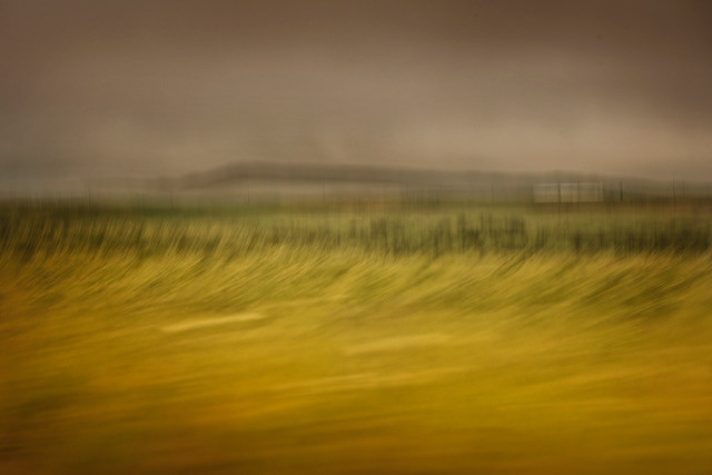
Hi Sandra...lovely colour palette and interesting textures. It is unfortunate that the image is soft. This is accentuated by the sharper pieces which don't contribute to the overall effect. Judith's idea is interesting, but in contrast, I wonder about cropping the left side out to a portrait format and giving more prominence to the leading lines going toward the dark hole. I think it has the makings of something quite lovely, but needs a little more work compositionally as my eye keeps zipping around from point to point at present. |
Sep 8th |
| 79 |
Sep 19 |
Comment |
Hi Karl....hmmm...interesting, but I'm trying to understand why Primal is not having the impact on me that it perhaps could have. I think perhaps it's that the surrounds are not giving any sense of what the model is going through. It's perhaps a little bland....I guess I'm thinking of Munch's "The Scream". You refer to Mortenson but he is more contrasty, dark, gothic...nightmarish. Has the nudity added anything to the scream? How are they connected? There needs to perhaps be more clues here as to what is creating the anguish or frustration....more story......Maybe infra red was not the most suitable medium???
Agree with Susan re the pose. |
Sep 8th |
| 79 |
Sep 19 |
Comment |
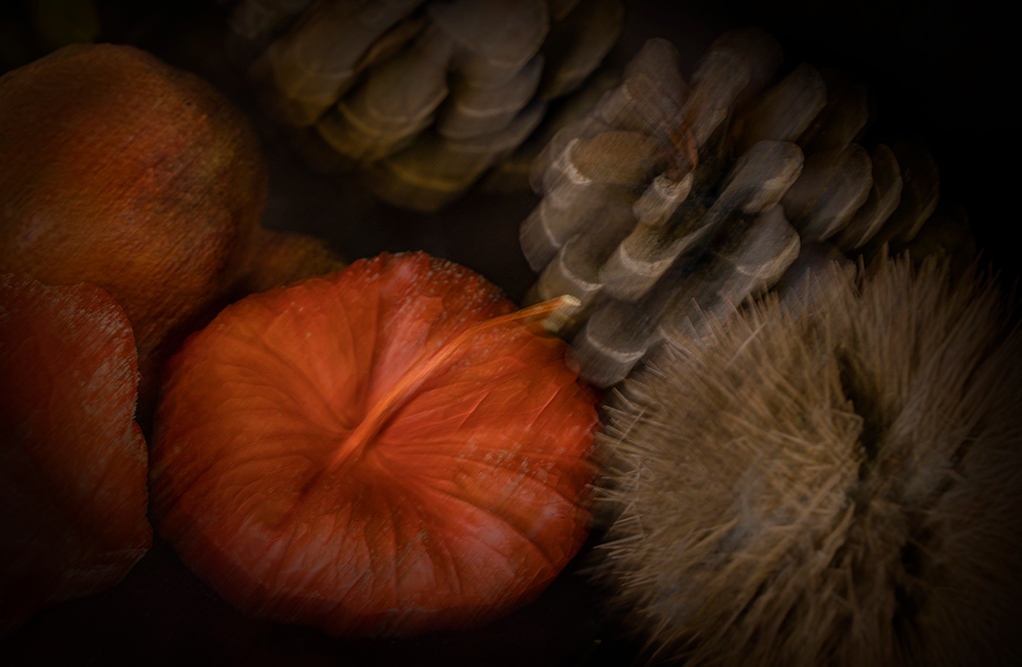
You have certainly created a piece of art here. I love what you have done...I don't mind the grain, but would be interested to see what effect a smaller one has. I think I like the colour palette of the centre without the introduction of the pinks, particularly at the top....and the dark vignette in the top right corner is a little distracting. These are very subjective comments and very much a personal opinion. Love the dreamy slightly surreal effect you have achieved. |
Sep 8th |
| 79 |
Sep 19 |
Comment |
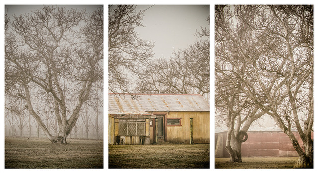
Marie....Just love this image; the composition, the shapes and textures...the depth...beautiful! The colour perhaps reflects the time and would seem to be perfect for the circumstances. Wouldn't change a thing.
|
Sep 8th |
| 79 |
Sep 19 |
Comment |
Hi Judith....lovely bokeh and light and I like the crop which makes the image more dynamic. The blown out areas are just a little distracting and if Susan's tip doesn't work, you could try cloning these strands. Also wondering about the pinks and blues in the lighter web areas....was this intended? Well seen. Water droplets on spider webs with morning light.....agree ....lovely....and lots of fun shooting. |
Sep 8th |
| 79 |
Sep 19 |
Comment |
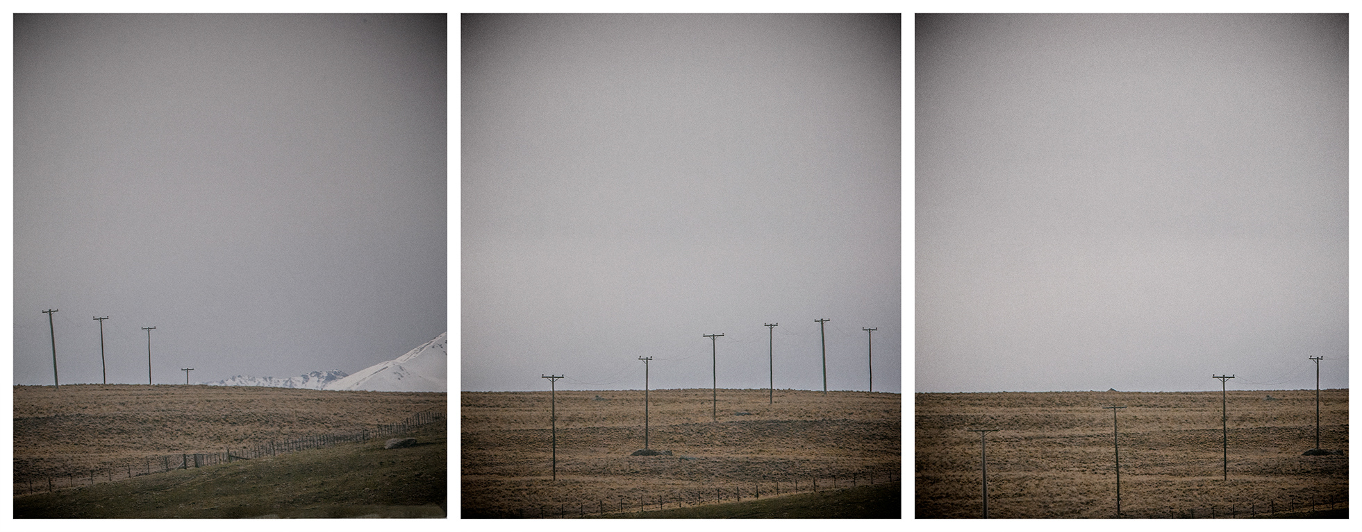
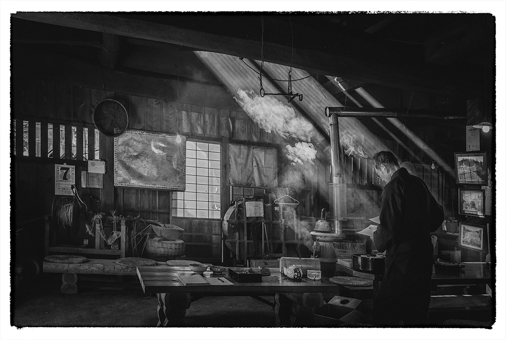
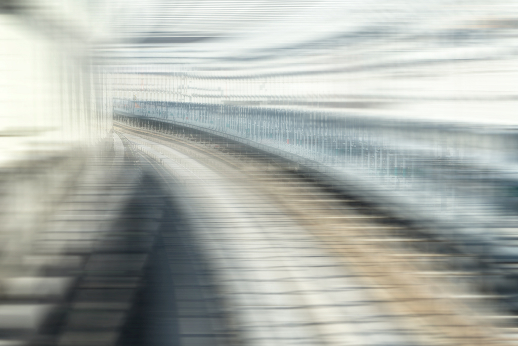
Thanks Susan and Judith. Yes, you are both correct, removal of the markers is the way to go. I quite like the big road Judith, as it stops the image being just another landscape. I don't mind it cropped and it does give the 2/3 perspective, but I have an affection for the road...who knows why :-). However, I do see a mistake and it is the title. The image really isn't just about the canal at all. It definitely needs a rethink! |
Sep 8th |
8 comments - 0 replies for Group 79
|
8 comments - 0 replies Total
|