|
| Group |
Round |
C/R |
Comment |
Date |
Image |
| 44 |
Nov 22 |
Comment |
Excellent contrast of color. Looks like a fun place to explore and photograph. Greetings from group 78. |
Nov 11th |
1 comment - 0 replies for Group 44
|
| 66 |
Nov 22 |
Comment |
This one stopped me in my tracks. Fantastic idea and image! The richness in tones in the trees and background are look great as well as the warm orange colors you've added to her dress and light particles.
I did notice the ghosting and while it is already an excellent work, I think you could get it even more so if you can tamper that down some.
Greetings from group 78. |
Nov 11th |
1 comment - 0 replies for Group 66
|
| 78 |
Nov 22 |
Comment |
This is an impressive building. I would have guessed England before Cincinnati. I like the "new life" of green and pink buds juxtaposed with this house of death.
I agree with Terry that something seems a bit off in your edit, either over-sharpened, or to me has the look of old overdone HDR processing which causes halos and other strange effects.
I think you could get a more natural version that still maintains a pop of color and sharpness, but tampered down a little. |
Nov 6th |
| 78 |
Nov 22 |
Reply |
Terry, did you run Topaz on the cropped version or original?
I tried running the original using Topaz AI (vs sharpen stand-alone) and it just made a weird painted effect (like photoshop "posterize") which is not so good.
Though as I wrote in my other comment to Helen, Topaz AI absolutely saved a shot I took of a red kite (linked in that comment) which was quite out of focus to the point I would have normally tossed the image. |
Nov 6th |
| 78 |
Nov 22 |
Comment |
This one is an osprey (also called a sea hawk.) I've always wanted to watch osprey's fishing but have not had much luck spotting them. Even going to areas where they are known to frequent, somehow whenever I go they are MIA.
Love your catch of his catch with the fish in the claws.
Topaz is pretty amazing. I was a hold out for a while and finally bought it (the new all in one version). One of the first shots that sold me was saving one of my bird shots (this one is a kite -- red kite)
https://jason.aminus3.com/image/2022-10-07.html
My image was pretty far out of focus to the point I might have chucked it, but I liked the pose so much that I kept it. Glad I did as technology has come a long way since 2008 or whenever I took that one.
As for your bird -- Terry's version looks better to me. I think it is a tough one because the bird is far away from you, you are not going to get as super detailed sharp image out of that.
On a weird note, I ran your original through my version of Topaz AI and it must made a painted effect that looks like it was posterized. Not really a very good edit. So maybe Topaz is not a miracle worker after all or maybe I should have cropped first then ran it through? |
Nov 6th |
| 78 |
Nov 22 |
Comment |
Just before I opened your image I thought to myself, "ooo, I wonder what Terry's got for us this month"
et viola
Another creative and fun image! I don't have much to add but I do like Sunil's idea of darkening it up a little as she seems less "cut out" somehow that way to me. |
Nov 6th |
| 78 |
Nov 22 |
Comment |
a good abstract indeed! Can stare at this a little cross eyed and just enjoy the pleasing pattern.
I like Terry's idea to add some contrast though might do about half of his version. I didn't really notice that red one till looking at his version! |
Nov 6th |
| 78 |
Nov 22 |
Comment |
This is a good subway candid. I like the cropped version.
The only other thing that bugs me but not much to do about it is the thing behind him that looks like it is coming out of his head which gets more exaggerated in the B&W vs color. If you can lighten that up or tamper it somehow it would work better I think.
And on street photography in general. You get the sense some people don't really want their photo taken and this guy doesn't seem too happy with you. Or maybe as in your title, he is just coming off a long day. |
Nov 6th |
| 78 |
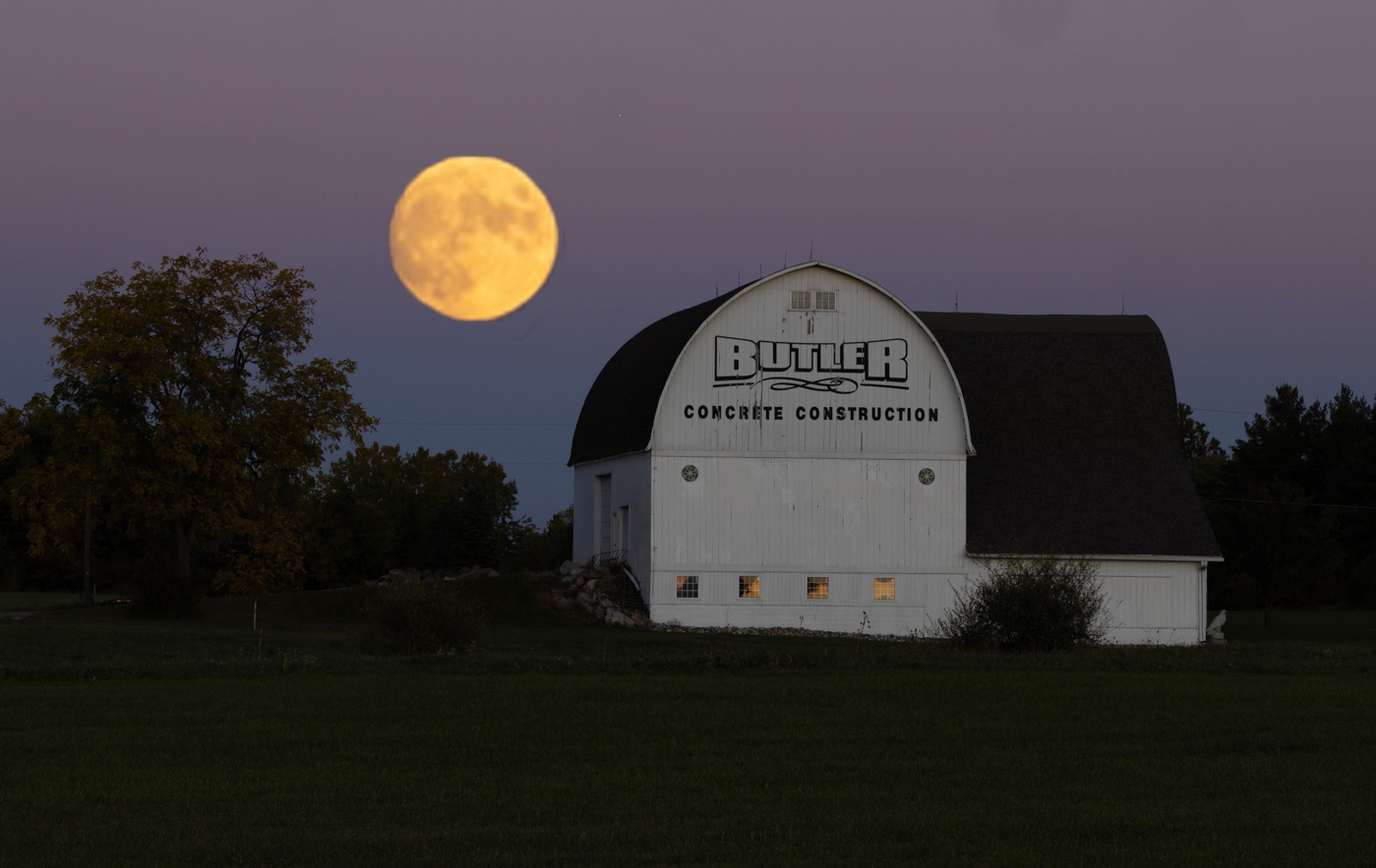
Nov 22 |
Comment |
Wow! I am a sucker for scenes with big full moons so I immediately was drawn into this one. I don't think the size is actually that unrealistic because from the right distance away with the right lens, you can get a moon to look pretty huge compared to the other elements in the photo.
There is a landscape photographer on Aminus3 named Gary Hart. He has photographed some truly incredible full moon images.
https://garyhart.aminus3.com/archive/?search=moon
If you look at some of his images, you will see that the moon is most always in sharp focus but the foreground elements are always a bit out of focus. Looks like you sharpened yours up quite a bit (a testament to Topaz AI?) but I would try leaving it just a little out of focus to make the scene more natural.
Also for me, something about how the moon is more saturated / higher contrast looks odd. I personally prefer the moon in your original. Here's a quick edit just to show the size and position that I'd go for and using the moon from original vs edit version. |
Nov 6th |
 |
6 comments - 1 reply for Group 78
|
8 comments - 1 reply Total
|


