|
| Group |
Round |
C/R |
Comment |
Date |
Image |
| 78 |
Sep 22 |
Comment |
I like the centered composition you have as it makes me think of a golden pathway to the mountains.
I might consider darkening the background just a touch as the white/yellow mountain seems a little too bright compared to the rest of the scene to me. |
Sep 26th |
| 78 |
Sep 22 |
Comment |
This guy is quite charismatic and fantastic that this is his bike (vs say a model and a prop bike).
My only critique is the separation of the subject and background. Going with some of the other comments, I would maybe try to select out the rider and desaturate / darken the background just a touch, or even a little blur to add more separation. |
Sep 26th |
| 78 |
Sep 22 |
Comment |
Fantastic light and mood on this one Sunil.
I do like the B&W but the color also works quite well IMO. I like Terry's edit.
One thing that sort of bugs me, but also I kind of like, is how the tip of the branch is right on the water line. Not sure if you did that on purpose or if it was happenstance.
At first I didn't like it and was thinking if you had just changed your angle slightly higher or lower it would have put the branch in a different place.
But after sitting with the image a bit, I kind of like how it seems to hold back the water. |
Sep 26th |
| 78 |
Sep 22 |
Comment |
I just noticed that the Maumee River also goes right past Antwerp, Ohio which connects us to my photo this month as well (or the Antwerp in Belgium anyway). This is a lovely timeless scene. Your editing has made the colors pop. I think some of the other comments provide some good suggestions. |
Sep 26th |
| 78 |
Sep 22 |
Comment |
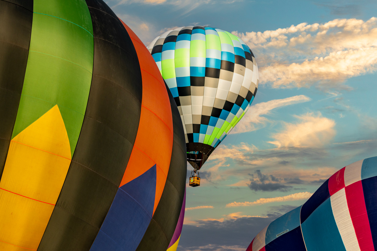
Pretty colors on this one. I think the sky replacement works well and looks natural to me. I think I'd prefer some separation but if you are going to put the two together in the frame, I would suggest cropping off some of the left side. We still get the idea of the foreground balloon but it draws my eye more into the image towards that background balloon. |
Sep 26th |
 |
| 78 |
Sep 22 |
Reply |
Thank you Sunil. I agree this type of scene can benefit from a slower shutter and more motion. It would be worth going back with a tripod sometime and getting some more slow speed images. |
Sep 21st |
| 78 |
Sep 22 |
Reply |
Thanks Jim for your comment! |
Sep 21st |
| 78 |
Sep 22 |
Reply |
Thanks Terry. If you read my comment to Brenda, you'll see that another group of commenters on my website seemed to think the posters added to the image in the way the faces were "facing off" towards each other. I didn't consider much on first glance but after their comments, I am partial to them. Though toning them down just a little might work too.
On the girl, I see a juxtaposition of the man "coming" by dragging his suitcase and the woman "going" while dragging along the girl. I would not want to take that out. |
Sep 21st |
| 78 |
Sep 22 |
Reply |
Thanks Mitch. I suppose depends on what the photographers wishes to highlight. I did post it for "glass" and so it makes sense for that to be the feature, but I do personally like the different stories being told in the people beneath. There is a kind of symmetry between the people "coming" vs "going", and the way the two big faces balance it out as they face each other all creates a different narrative for the image for me which I like. |
Sep 21st |
| 78 |
Sep 22 |
Reply |
Thanks Brenda. It's always interesting to see how different people feel about an image. When I posted this on my Aminus3 page (https://jason.aminus3.com/image/2022-08-24.html) I had a couple people say they liked the way the two faces were kind of staring at each other or "facing off". I didn't really notice them when putting the image together but like that aspect of the image since posting. |
Sep 21st |
| 78 |
Sep 22 |
Comment |
One again we find ourselves in a unique frame and moment from your pics.
We do get a sense he is in the sky without looking too much at the gauges.
This makes a great environmental portrait of the pilot in the cockpit.
That area under his chin where the sky comes through bugs me a little as I find my eye goes to that spot but not much doing. Dunno what to do to fix though, darken it up a little?
Also not so crazy about the toning on this one. Even though it adds to the retro feel, I think a different B&W tone / silver might work better. |
Sep 3rd |
6 comments - 5 replies for Group 78
|
6 comments - 5 replies Total
|


