|
| Group |
Round |
C/R |
Comment |
Date |
Image |
| 78 |
Nov 21 |
Reply |
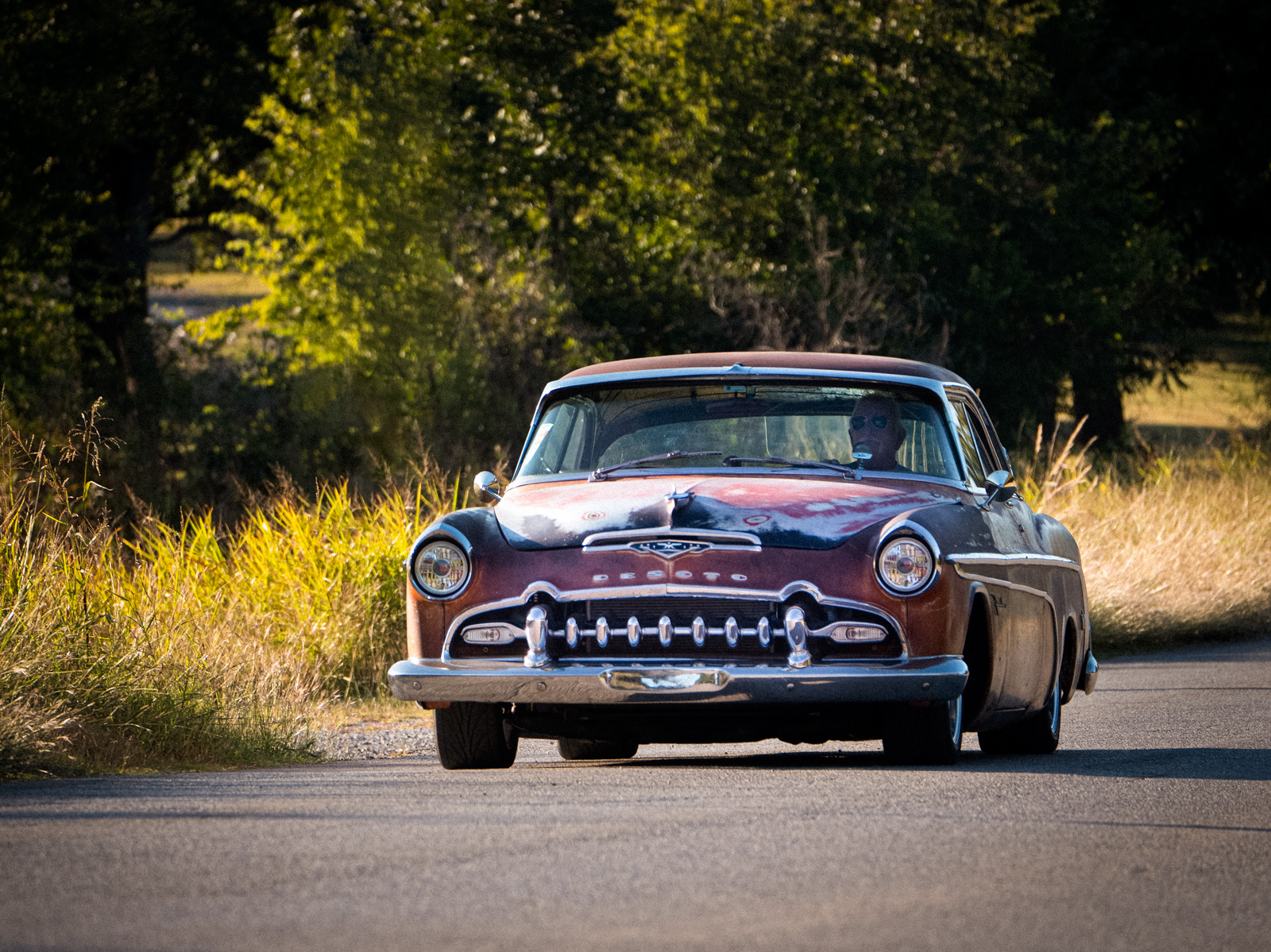
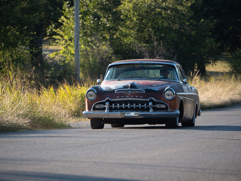
Thanks Helen, glad to bring back the DeSoto connection. B&W is a good choice for a retro feel. I like this edit featuring car and driver. Your version also has a bit of a painted effect (maybe just JPG compression) but looks like it might be another idea for an arty "painted" rendition of this one as well.
|
Nov 25th |
| 78 |
Nov 21 |
Comment |
Wow that is a dangerous place to lounge around but makes for a great photo opp for you!
Good choice to crop to feature the couple though I personally think you could come out just a little to give us more of the foreground ledge which leads the eye to the people and the mans foot going out to the canyon walls.
As is, it feels too close to me like I am right on top of them.
*EDIT* I see that I was looking at your revised version with the tighter crop but I think I prefer to leave a little foreground. Maybe half between your first and 2nd edit. |
Nov 18th |
 |
| 78 |
Nov 21 |
Comment |
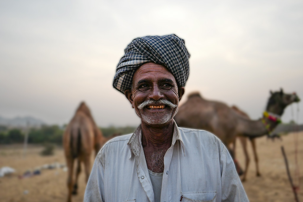
This is a really great portrait and more so that you were able to recover from such an underexposed photo. Reading your story of this guy you can see his happiness coming through. Must have been a good deal.
The only thing I find slightly off is there is what looks like ghosting around the camels. Might just be natural out of focus area of the image or perhaps amplified by cranking up the exposure. I don't know if there is much to do for that, maybe cut out the man and blur the background a little to smooth it out. Here's a rendition of that technique using gaussian blur on the image with a cut-out layer of the man on top. I could have cut out more carefully but this is just a quick idea to show what I mean. |
Nov 18th |
 |
| 78 |
Nov 21 |
Comment |
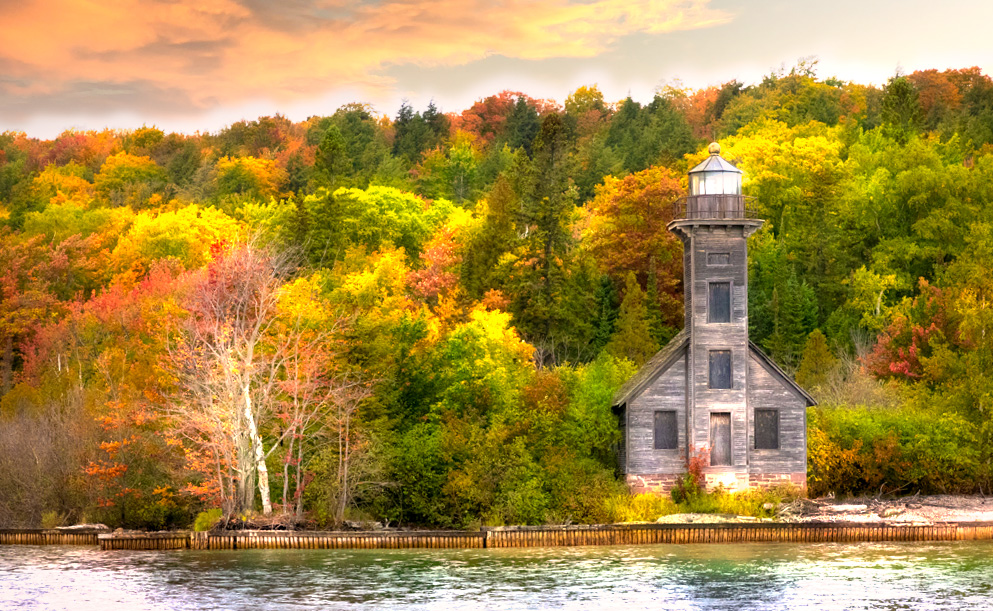
And here's a more vivid edit. For this one I created a duplicate layer, scaled it to be slightly larger than the original, brightened it up, and then did a gaussian blur to create the Orton effect. I set the blend mode to "Color Dodge" which really cranked up the colors. I didn't mask out the lighthouse so it is part of the Orton effect too. I kept the same replaced sky as my previous edit but realized it is better to add that after doing other edits or the mask gets screwy (and is still not 100% great as the orton layer causes some ghosting in the sky layer) |
Nov 17th |
 |
| 78 |
Nov 21 |
Comment |
The old lighthouse has a lot of character and looks fantastic surrounded by that bouquet of autumn trees. As already discussed, I'm also a fan of that tree on the left which adds an excellent counter element to the lighthouse.
I have to say, this one was a lot of fun for me to play around with as my first inclination was to tone down the vibrancy / colors, but then found myself creating some even more wild and colorful edits as well.
Also FWIW, I don't know what it is about straightening verticals but as you and I have already talked about, there are just some images that never quite seem right to me. I agreed with Sunil that the lighthouse seemed skewed slightly to the right, but then trying to rotate it on my own in LR and what LR said was a straight vertical seemed even more wonky to me. Someone should write a book about that!
As for editing suggestions. Here was my first attempt to do something a bit more subtle than your edit. My sky replace has some color in it which I think adds more color to the leaves without making them so vibrant. I also did some dodge / burning on a 50% overlay layer in selective spots to tone down the water and bring up that white tree trunk a little.
|
Nov 17th |
 |
| 78 |
Nov 21 |
Comment |
Powerful portrait Helen and good choice to get down at eye level with your subject. I like the B&W conversion as well which brings out the many textures of the man, his cart, and the surrounding scene.
I'm on the fence about the figures in the background. They do provide a good contrast as they seem to be wearing more touristy clothing / backpack, vs the local man. But I think they would serve the overall image better if they were either more prominently featured in the frame, or cropped / cloned out. |
Nov 13th |
| 78 |
Nov 21 |
Comment |
My immediate word association with this image was SPLAT. Funny to read your story about this bear being a poor hunter. Guess he will figure it out one way or another.
I like the wider crop and Brenda's suggestion to add some contrast. |
Nov 9th |
| 78 |
Nov 21 |
Comment |
I think the heart visualization comes through quite well (bleeding or not). A good find for a quick shoot.
My only critique was going to be to clone out that stem in the bottom left but then saw in the original it was not there previous. I think I prefer the original background which seems less distracting and minimal to me. I'd even consider cropping / cloning out the other stem so you just have a simple green background. |
Nov 9th |
| 78 |
Nov 21 |
Reply |
Thanks Mitch. I was not familiar with the car but someone else mentioned to me that it is DeSoto (likely 1950's) either Fireflite or Firedome but not sure how to tell difference. |
Nov 7th |
| 78 |
Nov 21 |
Reply |
Thanks Brenda. I posted my OOC image in response to Terry (above) and a revised edit (below) incorporating this first round of feedback. |
Nov 6th |
| 78 |
Nov 21 |
Comment |
Here's an edit incorporating some of the suggestions so far including pole removal, lightening the front of the car, and darkening the road a bit. I also slightly toned down the yellow/warming on the overall image.
You can see the OOC version in response to Terry's comment. |
Nov 6th |
 |
| 78 |
Nov 21 |
Reply |
Good edit, thanks Sunil |
Nov 6th |
| 78 |
Nov 21 |
Reply |
I forgot to send the original with this one. Here it is.
Thanks for the other suggestions. I'll play around with the cloning etc and post a revision. |
Nov 6th |
 |
8 comments - 5 replies for Group 78
|
8 comments - 5 replies Total
|


