|
| Group |
Round |
C/R |
Comment |
Date |
Image |
| 78 |
Aug 21 |
Reply |
Thanks Brenda for the info about the competition rules, your thoughts on ethical insects, and editing ideas. |
Aug 18th |
| 78 |
Aug 21 |
Reply |
This is really a beautiful rendition. I love the minimalism and shape of the negative space on the pad. Great revision and thank you Bev for the comment and ideas. |
Aug 14th |
| 78 |
Aug 21 |
Reply |
thanks Terry |
Aug 13th |
| 78 |
Aug 21 |
Reply |
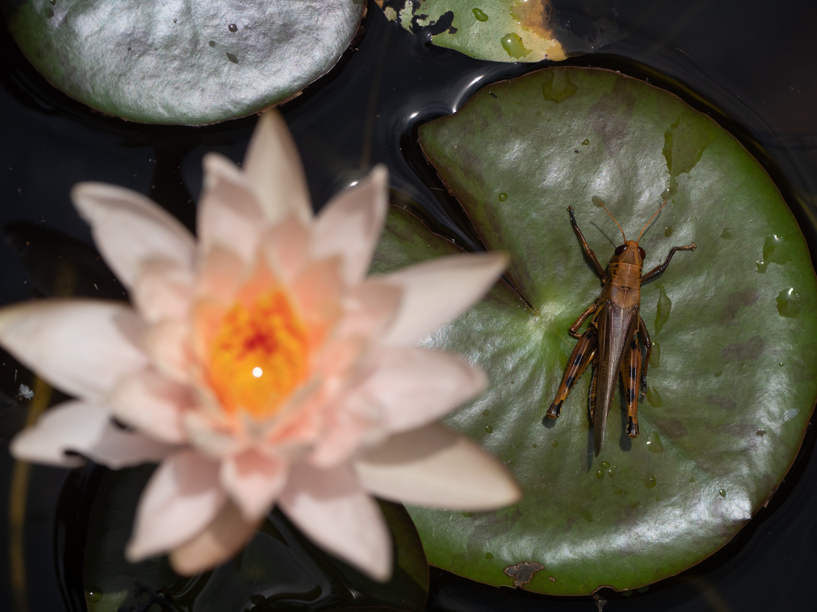
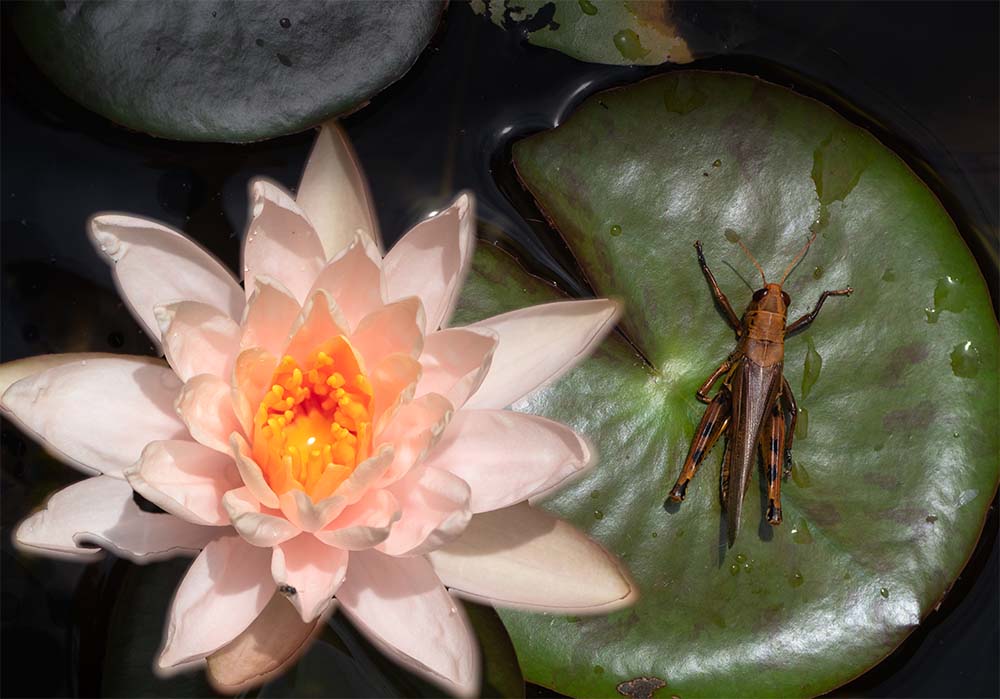
Appreciate your insights on competition rules and "ethics" too. Thanks Terry.
Interesting point as well about having too many points of interest. FWIW, here's one of the two shots used for the composite where the flower is out of focus. I am curious of your thoughts as compared to the focus stacked version. |
Aug 11th |
 |
| 78 |
Aug 21 |
Reply |
Thanks Helen for the good feedback. Here's an edit incorporating some of your ideas plus a solution for that distracting bit at the top by burning to reduce highlights. |
Aug 10th |
 |
| 78 |
Aug 21 |
Reply |
My take on the image flip was just what seemed more aesthetically pleasing to me for these particular images.
You can find several articles about this in relation to art and photography composition. The theory being that as English / European language speakers who read left to right, we find this to be a more natural way to "read an image". Though people in Israel or Iran or China or any other cultures with language that reads right to left would see it the opposite way.
Still, there is also a school of thought for leaving things how they were photographed.
FWIW, it seems western graphic design mimics these principle as well. Look at most websites you visit. Where is the logo placed? Top left or top right? Our (western) tendency may well be to start in the top left corner of a page (or image) and parse it to the right / bottom from there. |
Aug 9th |
| 78 |
Aug 21 |
Reply |
Thanks Mitch and interesting about the "cooling" process for macro photography. Sorry you were not able to get to that workshop.
I see what you mean about the top pad. Will play around with dulling it down some or other crops and see what works.
|
Aug 9th |
| 78 |
Aug 21 |
Comment |
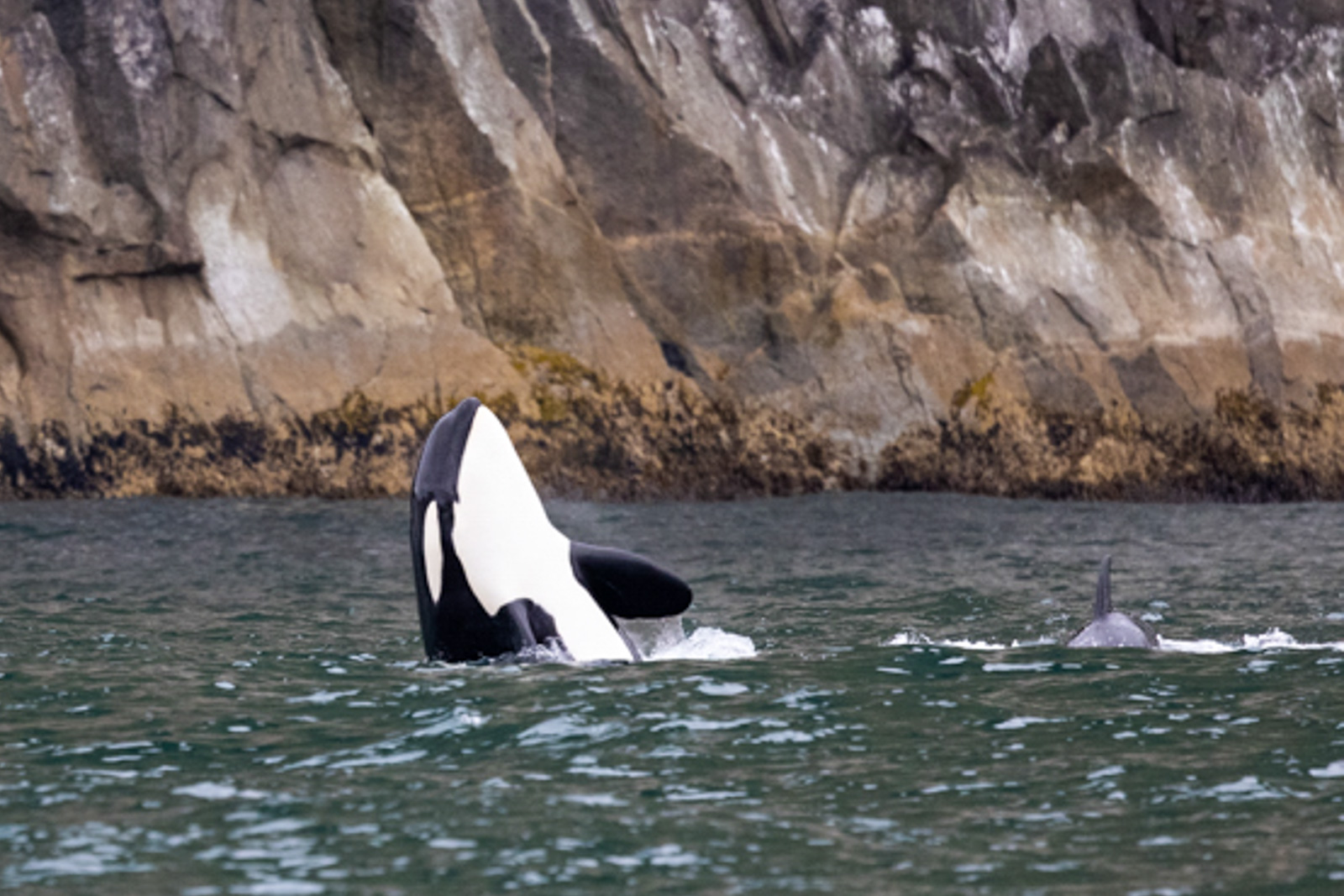
The position of the orca coming out of the water is perfect and I think you did a good job based on the conditions.
I tried cropping it a few other ways but didn't find anything that much better than what you've got.
Since I had already recommended it to others a few times this month, I tried flipping it around. I do find this perspective of the whale's momentum from right moving left is more pleasing somehow. What do you think? |
Aug 4th |
 |
| 78 |
Aug 21 |
Comment |
This is a great perspective looking from the dark bridge into the canal and light. The reflections and inclusion of the boat are excellent too.
I like what you did in your edit, especially to darken the bridge area but keep the detail in the railing which leads the eye into the canal and image. Also good detail retained in the brighter area out of the tunnel.
What would you think about a square crop which retains some of those leading lines of the railings but removes some of the empty space? |
Aug 4th |
| 78 |
Aug 21 |
Reply |
Ha! That is funny that you were already getting the flip memo and need another nudge to try it out.
It is something that I forget to do as well but then for some reason this week it was top of mind and seemed to be my go to suggested edit for several of the group's photos this month. |
Aug 4th |
| 78 |
Aug 21 |
Comment |
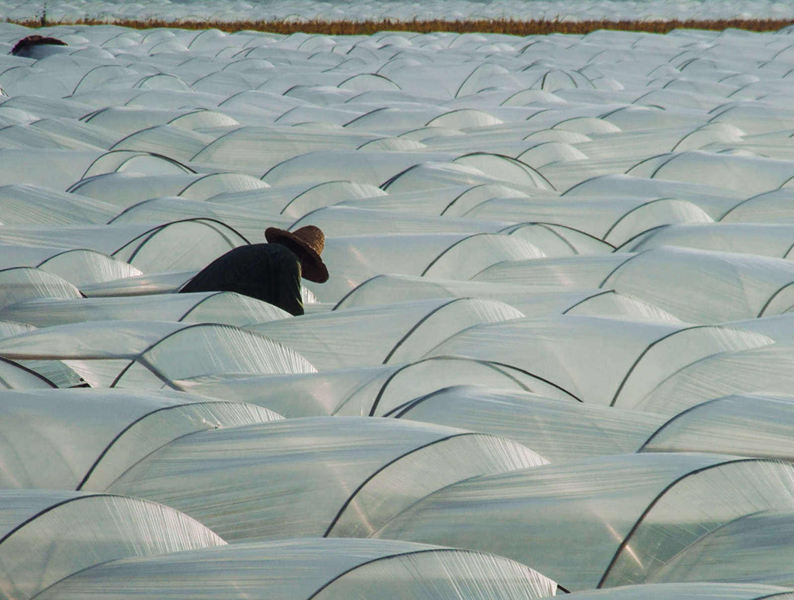
I think what you've got makes for an interesting abstract though I find it hard to get a sense of what is going on.
I'd say if your objective is an interesting graphism type of image then what you have works fairly well. If you are going more for a travel / documentary feel, then maybe consider a color version with a little more of the scene for context.
Here's a quick version I whipped up where I flipped it around (dunno why this month it seems I'm finding things more pleasing to my eye when flipped horizontally) and left some of the top grass to provide more context. |
Aug 3rd |
 |
| 78 |
Aug 21 |
Comment |
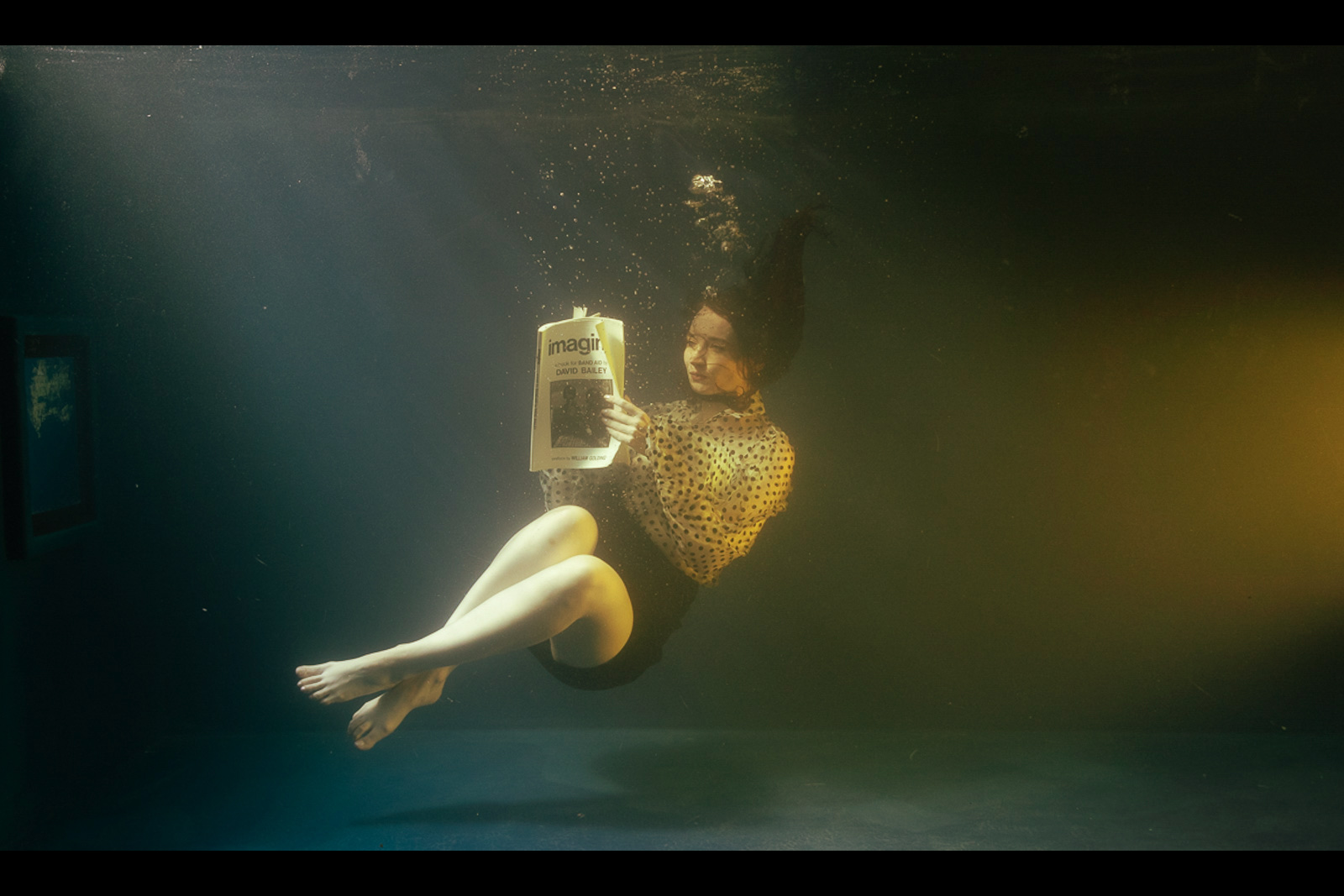
Another awesome project and a really nice image as a result. I like the B&W version though I would maybe clean up some of those bubbles and debris and maybe darken some of the area around her like on the bottom or a dark to light gradient from bottom right to top left.
I also really like the color version and the inclusion of that little window seems interesting and cinematic to me. Here's a crop and toning idea on the original. |
Aug 1st |
 |
| 78 |
Aug 21 |
Reply |
Here's a quick version of Original 2 with the crop I was thinking and a partial concept of darker water with glowing lamp. I think it would be even better if the lamp is more illuminated and the water darkened further. |
Aug 1st |
 |
| 78 |
Aug 21 |
Comment |
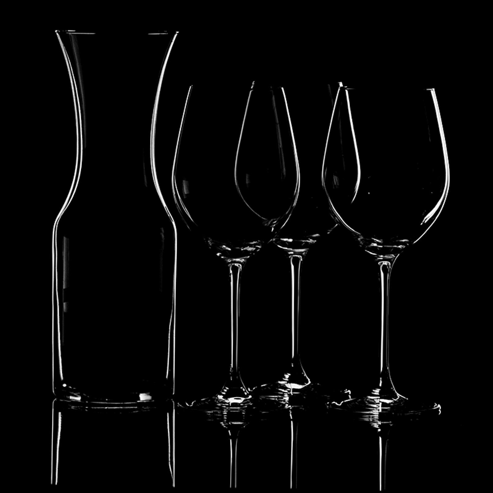
This is a cool idea. Everyone is doing fun projects for this month.
I really like the mono tones in your original, more so than the amber version. I would consider upping the contrast even more to bring out those curved lines and negative space.
Don't know why but I find it more balanced with the decanter on the other side. |
Aug 1st |
 |
| 78 |
Aug 21 |
Comment |
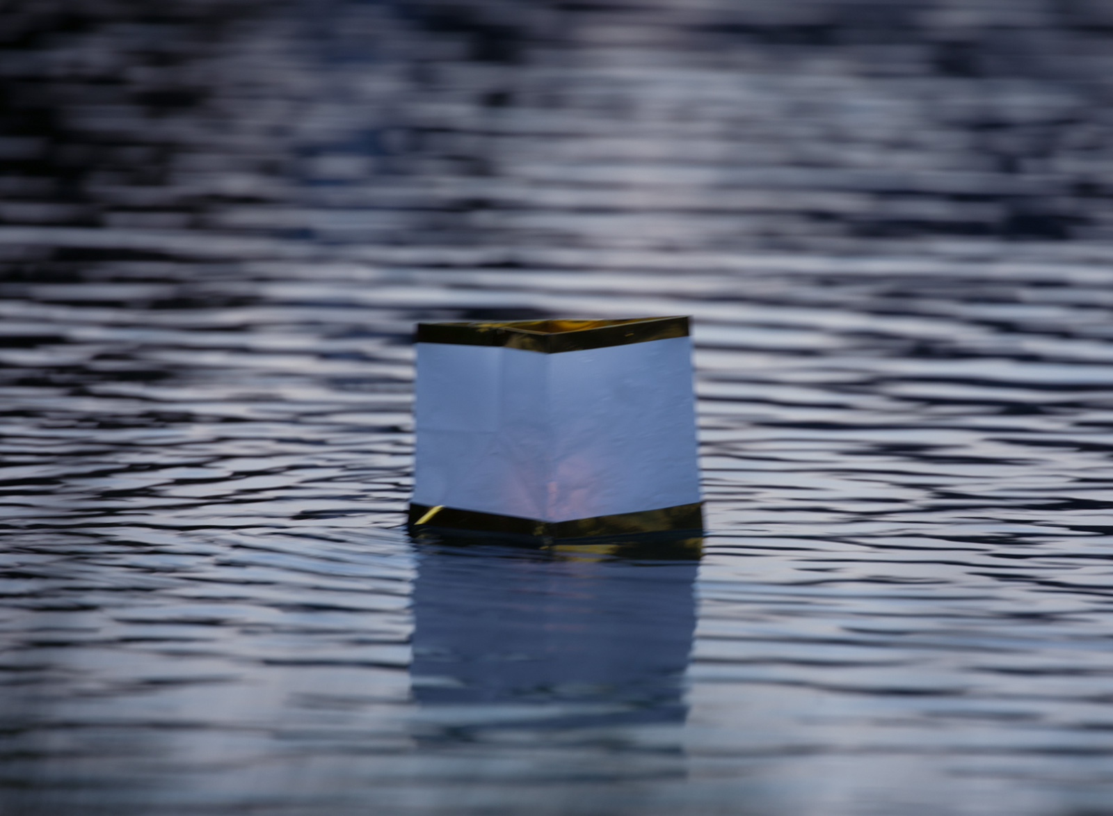
This looks like a fun creative project Brenda. Funny about the fish.
I like the golden ripples which accentuate the golden light of the candles and the gold trim on the lantern. You might also try a version with darker water where the lantern is the main beaming light of the image or if you can get a cooler bluer tone on the water with the warm tone of the lantern.
I would also consider a different composition maybe with the lantern more centered, more similar to your "Original 2".
If you reshoot, I would prioritize to get a sharp focus on the lantern which will make for a stronger image overall. |
Aug 1st |
6 comments - 9 replies for Group 78
|
6 comments - 9 replies Total
|


