|
| Group |
Round |
C/R |
Comment |
Date |
Image |
| 78 |
May 21 |
Comment |
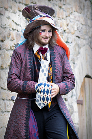
I like this character and you created a good portrait in what was probably a very quick and casual moment. The backdrop of a medieval looking building adds nicely to the fantasy mix.
One thing that pulls me out of the mood is the brand tag on his scarf at the bottom. Not a huge deal but if it didn't violate the salon rules, might try to clone out.
I think this would also make a good 3/4 portrait vs full body, as it would focus in on his sly grin, heart mark, and the other details of his upper outfit (which seem more thought out than the pants and bottom part). In my attached version the focus is not so great at his eyes but maybe from working with smaller res source?
Otherwise, this seems like an image that would be a great candidate for some creative filters / textures / toning etc, for a digital art creation. You could also probably cut him out fairly cleanly and place in some other fantasy setting.
|
May 23rd |
 |
| 78 |
May 21 |
Comment |
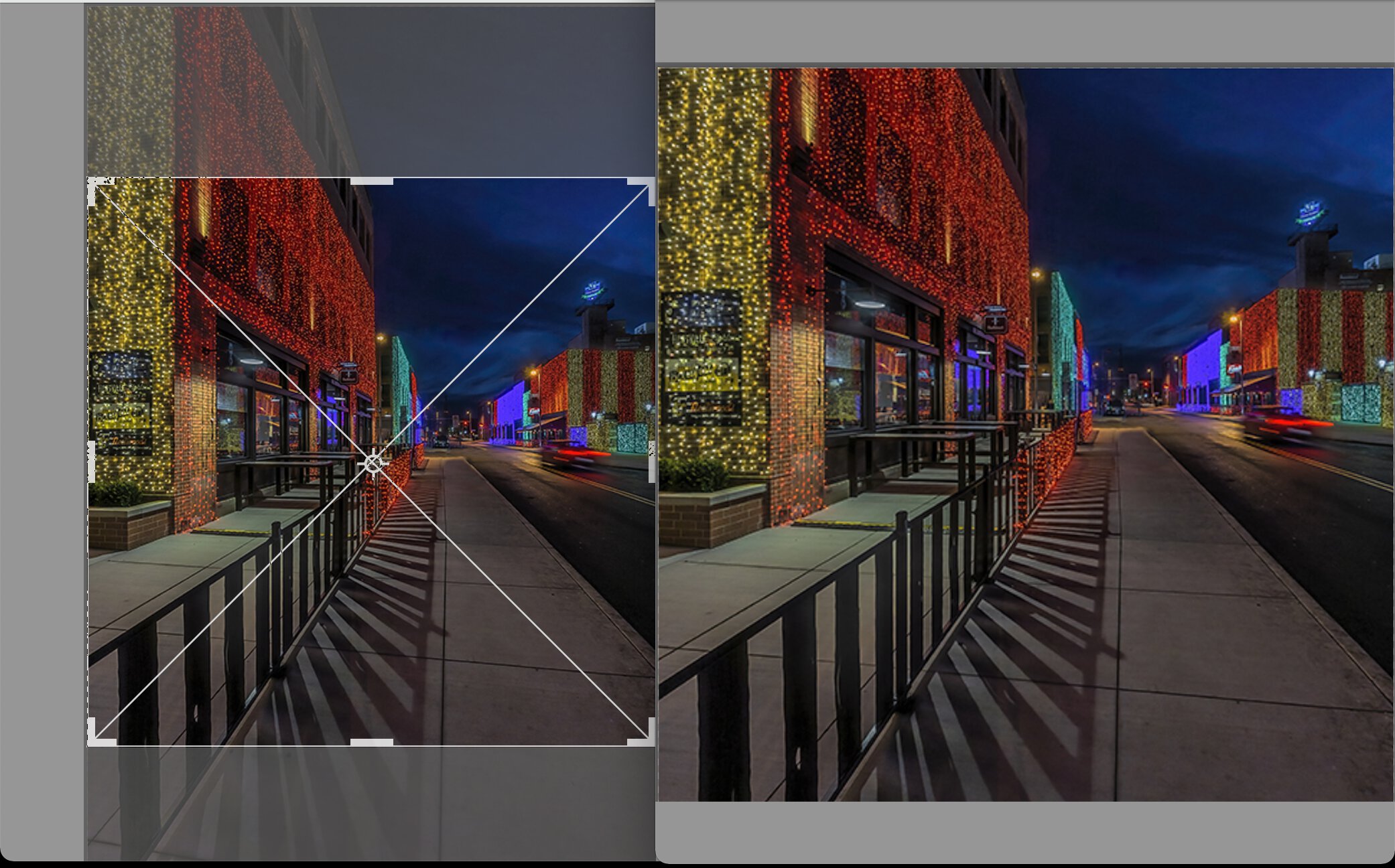
What a great scene to see and photograph. I hope you got a lot of different pics while you were there! Love the blue hour sky contrasted to the lights on the buildings, and those shadows are a definitely a key component that take the image a step further.
I like some of the cropping ideas presented by Terry. I was even thinking to crop just a hair off the top and bottom to bring the focus even more into the shadow line and buildings.
If you should want to do a 1x1 square crop, I think you can get a really nice one which emphasizes the diagonals and retains the core elements of the image.
One other thought on the processing. I'd be curious to look at your original to see how it differs from your toning here as this seems a little more processed than natural to my eye (like that HDR esque look you get when upping shadows etc). It definitely works here but maybe possible to do an alt version as well that is less so. |
May 19th |
 |
| 78 |
May 21 |
Reply |
Thanks for the explanation Brenda. I get the idea of not photoshopping out power lines etc, but seems like the choice to crop tighter should be allowed since you could have just done that in camera to begin with and not shown the donkey. But that's why we strive to get it right in the camera before editing :) |
May 19th |
| 78 |
May 21 |
Comment |
Fun to see this old classic Helen! As a relative newbie to photography, you had some great instincts with this one. The monks in front of that big sun with the silhouettes of this iconic bridge make the image. I would also recommend cropping out the stroller and other couple. |
May 19th |
| 78 |
May 21 |
Comment |
What a great opportunity to see and photograph this rare poppy.
I recently did some flower pics along these lines so I can respect the tradeoffs of how to approach the in-camera composition and then how to crop or process for a final image.
I find myself drawn into that little white array of threads, lit up almost like fiber optic cables, or even a coral or sea plant glowing phosphorescent.
For a creative alternate version, you might even crop in closer to emphasize that. This is a quick edit to give an idea.
|
May 15th |
 |
| 78 |
May 21 |
Comment |
This is a good conceptual image Sunil, and a great discussion around it as well.
I like Jim's crop for a clean minimal approach, but I like your crop as well with the people / food truck, in response to Mitch.
I find the people do add interest as a night scene if that is what you are going for, and the minimalist version works good for the conceptual ideas of what the freedom building and statue represent.
I also liked your comment to Terry about how the lit up building adds "light" and balance to these dark events.
My only criticism aside from all that is I'm not crazy about the statue overlapping the building. Maybe on one hand with your symbolic ideas, they are aligned or seen together, but from a photographic standpoint, I would have liked the statue to appear in one of the spaces in the skyline if at all possible (shifting your perspective left or right). |
May 15th |
| 78 |
May 21 |
Reply |
I like this moment you have photographed Brenda. Very interesting in both the visual story, as Helen mentioned, and the details you provided as well in terms of how the kids take care of the kids, and the thorny brush fence.
I think I like Jim's crop better than Terry's, but both are good suggestions for a stronger image that brings us to the subject.
I do wish that alert goat was not right behind her head as it is the most interesting goat of the bunch and sort of cut in half like this. But you take what you've got.
Can you tell me the rule of the travel category and why cutting out the donkey is disqualifying? I'm still a total noob when it comes to the PSA and exhibitions. |
May 15th |
| 78 |
May 21 |
Reply |
Thanks Brenda! |
May 8th |
| 78 |
May 21 |
Reply |
Thank you Terry for the ideas and suggested edit. Good thinking on the desaturation of that purplish tone. |
May 8th |
| 78 |
May 21 |
Reply |
Thanks Mitch. |
May 8th |
| 78 |
May 21 |
Reply |
Thanks Helen ! |
May 8th |
| 78 |
May 21 |
Reply |
Thanks Jim for your suggestions. I didn't notice the vignette as much until I started seeing the smaller thumbnail views from the other people's edits and was also thinking it was way too much!
Interesting about the white door. I didn't consider this one either until you brought it up, but can see how it could be distracting for the rest of the scene. |
May 8th |
5 comments - 7 replies for Group 78
|
5 comments - 7 replies Total
|


