|
| Group |
Round |
C/R |
Comment |
Date |
Image |
| 78 |
Apr 21 |
Reply |
And if that doesn't work, try this one next:
https://jason.aminus3.com/remix/4895/ |
Apr 11th |
| 78 |
Apr 21 |
Reply |
Ah makes sense on the color version and awesome it got published in the Leica gallery.
On the Aminus3 link, I think the PSA website might have done something weird to URL when I pasted it. Trying again...
https://www.aminus3.com/remix/4895/ |
Apr 11th |
| 78 |
Apr 21 |
Reply |
That is a creative edit and good framing. Thanks Mitch! |
Apr 10th |
| 78 |
Apr 21 |
Comment |
I like your original edits on tones and building removal, and the updates in your latest revision. Terry's suggestion to go left is interesting as well.
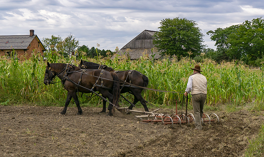
I would consider cropping even a little tighter to remove some of the foreground dirt which to me does not add a lot to the image. It would cut the building in the back in half but I think it works and creates some nice diagonal lines through the horses to the chimney. |
Apr 7th |
 |
| 78 |
Apr 21 |
Comment |
Excellent and dramatic nature photography!
I like the larger crop as suggested (and demonstrated by Terry). I'd also agree with more contrast on the bear as compared to your original.
Now I've got a new place I'd like to visit some day.
|
Apr 7th |
| 78 |
Apr 21 |
Comment |
Before reading your description, I was wondering if you were on the set of a movie or something. This is a very cinematic image to me, and as such, maybe start with a 16x9 crop to bring out that feeling.
Here's an edit where I played with the tones in the shadows and midtones, cooler white balance, big vignette to add some contrast and shadows and a bit more mystery to the scene. A few other odds and ends. |
Apr 7th |
 |
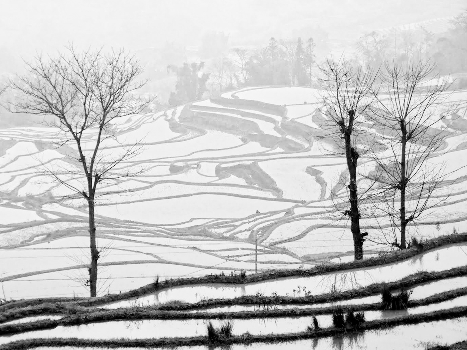
| 78 |
Apr 21 |
Comment |
This image has so many great lines, shapes and patterns.
I think one of the main issues is that it is underexposed. I like your updated (to Mitch) crop and added contrast, but still seems a bit dull due to the exposure.
Here is a quick LR edit where I cropped, bumped exposure by +1.5 stops, converted to B&W using LR's "Black and White treatment" (aka just the generic color to B&W with no additional filters), added some texture and then brought the blacks slider way down to emphasize the lines and shapes.
You can also play with the "Dehaze" slider to add more foggy to the image or bring it back if your edits start to remove that foggy look. |
Apr 7th |
 |
| 78 |
Apr 21 |
Comment |
This is a really cool and unique hood ornament. I didn't know Dodge was using that Ram imagery back in the 50's.
I like the design aesthetic of your B&W version, but I feel like the story of this old rusty car gets lost in the processing. I like the faded texture in the color version as well as the other car in the background which adds context which is also lost in the B&W. Maybe consider a grungy color version to have on hand.
For some visual inspiration... as you may recall, I run a photography community website called Aminus3 where you can "remix" collections of photos. I've been curating a "Hood Ornament" remix from many photos over the years which has some really excellent finds. You can see it here:
https://www.aminus3.com/remix/4895/ |
Apr 7th |
| 78 |
Apr 21 |
Reply |
One note on Jim's version, I like the way he cropped with some more room on the left vs your updated version which is off center and tighter to left. |
Apr 7th |
| 78 |
Apr 21 |
Comment |
Great action shot Brenda! I like what has already been suggested and I think some blur would help draw the eye to the horse and rider -- but agree with Sunil that cutting it off sharply on the fence and too much is a little unreal.
I also think the expression of the man with his daughter really adds something to this photo (he is like, "WHOOOOA") which lends creditability as well to the concern that someone might not think this was all in one image vs a composite. With that in mind, your blur still shows the guy a little bit which is good vs Jim's really just removes him from the scene.
On color vs mono... I have to say I really like both for different reasons. This is one of those images that I'd keep two versions for different uses. The color one works better with some blur I think and looks vivid, but the mono as Terry observed keeps the focus on the action. |
Apr 7th |
| 78 |
Apr 21 |
Reply |
Thanks Terry. I like the tones in this one which appear more natural to the scene. To me, those extra branches do frame the bird but feel a bit messy to my eye in the way they are just floating into sides and corners. But I'll play around a bit more and see if I can find something that integrates them. |
Apr 7th |
| 78 |
Apr 21 |
Reply |
Thanks Jim and good suggestion on the aperture. In this case I was on a tripod and should have considered going to something with more DoF. I was probably thinking of background blur but given it was already a long lens and closer to subject than background, it would have been OK to go up a few stops I think. |
Apr 7th |
| 78 |
Apr 21 |
Reply |
Thank you Sunil |
Apr 7th |
| 78 |
Apr 21 |
Reply |
Thanks Helen, I'll have to play around with a mix between this edit and the original and see what shakes out. You also see my favorite photo from this same afternoon on Aminus3 here:
https://jason.aminus3.com/image/2021-03-23.html |
Apr 7th |
| 78 |
Apr 21 |
Reply |
Good thinking on darkening the branch a bit, thanks Brenda. I don't recall giving it too much thought one way or the other, was mainly just going for a bright warmer overall tone. |
Apr 7th |
| 78 |
Apr 21 |
Reply |
Thanks Mitch for the suggestions and idea to pull that top branch in a little closer. |
Apr 7th |
6 comments - 10 replies for Group 78
|
6 comments - 10 replies Total
|


