|
| Group |
Round |
C/R |
Comment |
Date |
Image |
| 78 |
Dec 20 |
Reply |
Thanks Helen. Hope all is well at home and nice to see you back.
I made a new edit (under Sunil's comment), have a look and let me know what you think. |
Dec 22nd |
| 78 |
Dec 20 |
Reply |
I've made a new edit based on all the feedback (under Sunil's comment). Let me know what you think ! |
Dec 22nd |
| 78 |
Dec 20 |
Reply |
I've made a new edit based on all the feedback (under Sunil's comment). Let me know what you think ! |
Dec 22nd |
| 78 |
Dec 20 |
Reply |
I've made a new edit based on all the feedback (under Sunil's comment). Let me know what you think ! |
Dec 22nd |
| 78 |
Dec 20 |
Reply |
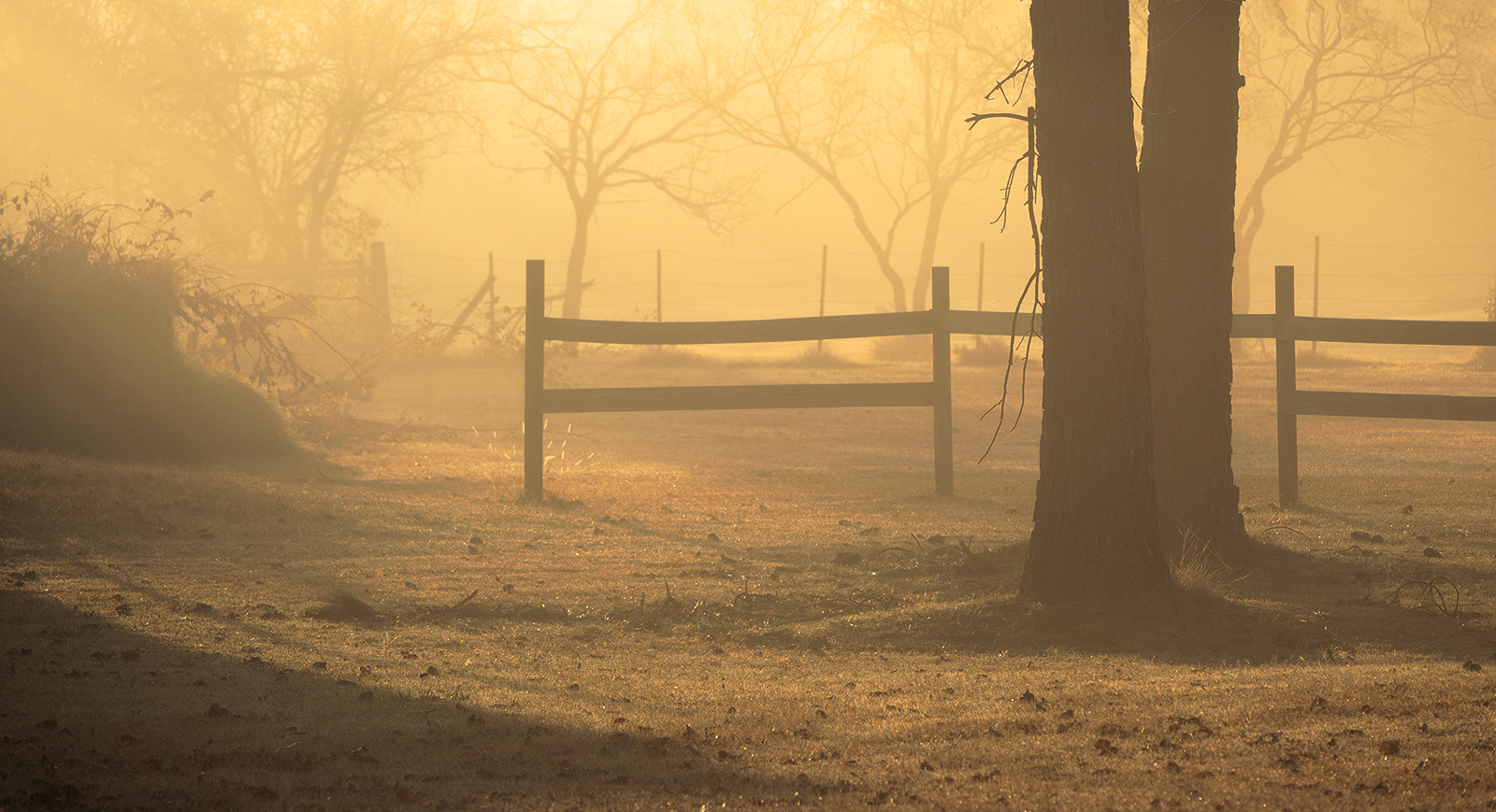
Thanks all for the suggestions and comments. Here is an new version in which I
- cropped tighter to remove some of the sky
- cloned out the tree stump that Brenda and Terry mentioned
- cloned out some other stray branches from the crop so they were not hanging in the frame
- used dehaze / negative clarity to make it even more "dreamy"
- blended in a heavy curves layer in PS which gives it an illuminated effect (and then used "Lighten" blending + opacity to make it a bit more natural)
- went to more of a 16:9 / cinematic crop
Let me know what you think! |
Dec 22nd |
 |
| 78 |
Dec 20 |
Comment |
Great tropical image. Makes me want a coconut drink.
I like Jim's edit with the palms cloned out on the right. |
Dec 21st |
| 78 |
Dec 20 |
Comment |
Great image and amazing the eye is so sharp even in the tight crop.
I'm with the others in that I would like to see just a bit more room around the frame and maybe move the bird to the left more so the eye is not so centered (giving more room to look out of the frame to the right).
Here's an idea of a more vertical format, though as you say, it takes away from the bird somewhat. |
Dec 21st |
 |
| 78 |
Dec 20 |
Comment |
You've done a fantastic job straightening out the effect from the wide angle lens. The tones are perfect as well. Makes me think of a computer rendering in some futuristic city skyline.
Your edit on the street light helps balance the scene as well. |
Dec 18th |
| 78 |
Dec 20 |
Reply |
I like your suggestion to remove some off the top, thanks Jim.
A person or subject would have been a nice addition for this scene. |
Dec 18th |
| 78 |
Dec 20 |
Comment |
Great setting and composition to the left. I agree with the others about this guy being more of a distraction then adding to the scene. For example if not more in the frame, would have been better if he was in focus vs the tree back of frame.
But since your focus does seem to be out the door (and his too) ,maybe a title that reflects that like, "The path behind and the road ahead". |
Dec 7th |
| 78 |
Dec 20 |
Comment |
I was not familiar with "Billy no Mates" either but glad to learn a new colloquialism. I think you've done good work on this isolating to the stairs and figure.
Funny I didn't realize how much I like higher contrast images till looking at everyone's shots month to month. But like in previous critiques, I feel like the whites could be whiter in this, particularly on the railing line going up the frame from his head. (or maybe that's just my high contrast pref, or my laptop screen is dulling)
On the man... I don't get a sense of him in the setting. I suppose as a photographer / tourist (like yourself) he fits in, but feels like this is a snap from a photo walk or something and doesn't seem to quite fit the scene to me. Perhaps because he looks to be chimping his gear which is not that compelling of a pose for me.
I think it is a good location, maybe worth reshooting with a model or someone in different style clothing.
I've been in PSA for two years now but still don't quite get the whole salon concept. Suppose I need to sit down with someone at some point and figure out how it all works. |
Dec 7th |
| 78 |
Dec 20 |
Comment |
This is a great take on a still life Brenda. Feels like there is a story here. The smoke is a nice addition I think, although as Terry said, the red burning tip somewhat takes away from it -- perhaps that with opacity of 0.2 or something to give a hint of it but not so prominent.
I think part of the issue of why the hard edges look weird is Depth of Field. You see the area of focus is not the tip of the cigar and so the smoke coming off it should not be in sharp focus either. I would suggest using a slight Gaussian or Motion Blur to give it a more out of focus look and I think it might be more natural. You will need to do that on the smoke layer (hard to isolate it in the final image like this).
On title, maybe, "Club Life" ?
|
Dec 7th |
| 78 |
Dec 20 |
Reply |
Thanks Brenda.
I think you and Terry are talking about the same thing which is maybe a tree stump? I can try to clone that out.
On the preset, I thought it was a built-in thing, but then was able to track it down to "Matt's Presets":
https://mattk.com/lightroom-presets-matts-auto-enhance-preset/
|
Dec 6th |
| 78 |
Dec 20 |
Reply |
Thanks Terry for the great suggestions. I didn't think about negative clarity (or dehaze) but both together are creating some really interesting effects from an "Orton Effect" up to something that looks really minimalist and dreamy.
I didn't see that box previous (maybe a tree stump) but I see what you mean!
On the title, I do see your point, though also perhaps open to imagination on where the path to peace can be found. |
Dec 6th |
6 comments - 8 replies for Group 78
|
6 comments - 8 replies Total
|


