|
| Group |
Round |
C/R |
Comment |
Date |
Image |
| 78 |
Oct 20 |
Reply |
Brenda, I think you've made some nice changes here - halos especially look much better (or are not there which is good). Being honest, I don't like the gaussian blur on the background so much - like the steeple seems a little weird to me as if there is something funky with the DOF. I prefer the background sharpness in your original in that respect.
All told, you've done a lot of good work with this image both for the final result, and as a learning experience. Well done! |
Oct 25th |
| 78 |
Oct 20 |
Reply |
Funny I didn't even see that guy in the corner till Terry pointed it out and then can't "unsee" him! I like the tighter crop for the high key and the other changes as well look good ot me. |
Oct 25th |
| 78 |
Oct 20 |
Reply |
I like this crop and the processing.
I also like Sunil's idea to get the truck looking similar to your first edit |
Oct 23rd |
| 78 |
Oct 20 |
Reply |
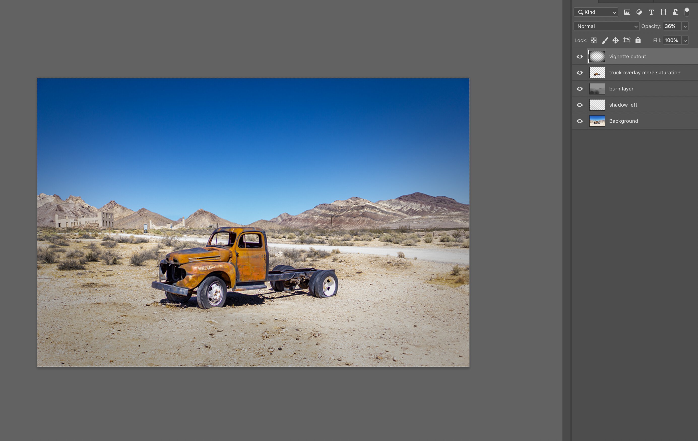
I did a quick edit in photoshop trying to create some more contrast in different areas. I took a screen shot with the photoshop layers.
- Set exposure -0.5 (which made the sky bluer)
- burn layer (using 50% gray overlay + brush) on the ground and in the mountain and building areas
- empty layer with low opacity black brush on left to darken the ground a little
- cut out the truck over top and upped saturation a little
- created a vignette (black layer with feathered elliptical cutout set to 36% opacity)
Not sure if that would be my final edit / direction, but gives some ideas of ways to create contrast in a uniform image like this. |
Oct 23rd |
 |
| 78 |
Oct 20 |
Reply |
I like this alternate version Brenda. It reminds me of an old postcard. |
Oct 23rd |
| 78 |
Oct 20 |
Reply |
Hi Stephen. Glad you liked the concept and suggestion. Thanks! |
Oct 12th |
| 78 |
Oct 20 |
Comment |
Looks like a great location to create some unique images. I like the house of mirrors quality to it and the gritty textures contrasted to your model's silky dress.
I think this edit works fairly well, but agree with Brenda it seems a bit low contrast. As this reminds me of an old film noir cinematic scene, I think it might benefit from the use of dramatic light and shadows to make it more alluring |
Oct 6th |
| 78 |
Oct 20 |
Comment |
I can empathize with the "forgot to change camera settings" situation. Fortunately, aside from shooting in full manual, our cameras have a lot of latitude to compensate.
I like the texture of the old truck and mountains, though I personally find the image too uniform in brightness. Similar to last month, I think a little selective contrast (or dodge /burning) could amplify the subject while still keeping the context of the blue sky, run down town, and mountains.
As Sunil suggested, if you are OK to share the original, it would be interesting to try out an alternate edit. |
Oct 6th |
| 78 |
Oct 20 |
Reply |
I like that soft dreamy effect Brenda. It lends itself nicely to the golden light and colors. Glad you had fun working on it!
In addition to photography, I am an avid dreamer. I find it interesting that we call this type of image "dreamy" but generally the imagery from my own dreams is actually quite "clear" and not hazy or moody like that. But it seems a good visual depiction to capture that feeling of remembering a dream that is on the periphery of our conscious waking mind. |
Oct 5th |
| 78 |
Oct 20 |
Comment |
A lot happens in a year. My goodness!
I think the monochrome is an improvement on the original which elevates something of a snapshot to something more artistic.
The B&W minimizes the people and puts the focus back on the bridge, buildings, water and sky.
I am a fan of high contrast although one tricky thing is that different filters / processes can cause halos. Look at the black top shutter on the right side and it looks like a little black smudge next to it in the sky that is not in the original. Might be part of what you are going for in the grungy effect but worth considering if you want to keep that or not. |
Oct 4th |
| 78 |
Oct 20 |
Comment |
This is fantastic. What a beautiful image. Love the background colors or orange and purple.
I also like that this image can be further cropped in several ways as required (by competition or publication) since you have a lot of space to work with. If you wanted to cut out that rock in the foreground you could make it landscape or square format as well and I think it would still be very successful.
Any other critiques are just nitpicking. This is great. |
Oct 4th |
| 78 |
Oct 20 |
Reply |
Good thinking on the 3:2 to cut some of that sun burst / blown highlight. Thanks Sunil. |
Oct 4th |
| 78 |
Oct 20 |
Comment |
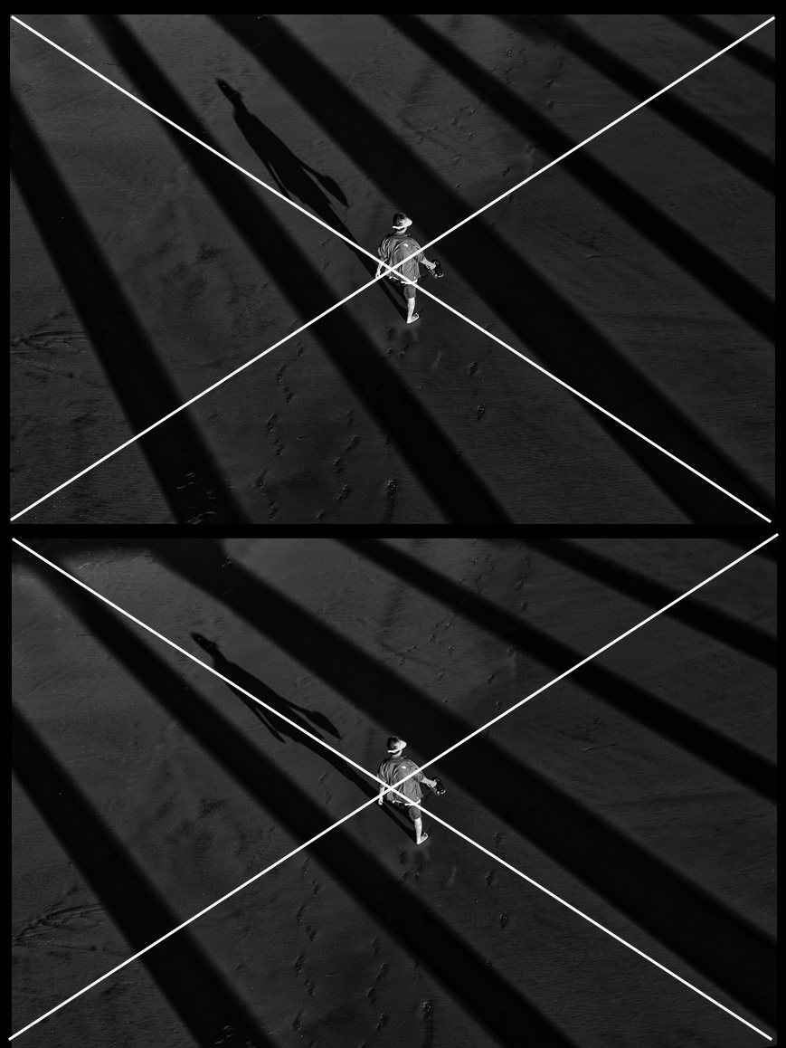
I'd say this one was worth a second look!
Love the shadows and minimalist result.
It's interesting that the person (who is main subject or is it her shadow?) is dead center as that is traditionally eschewed in traditional composition but seems to work here especially with the shadows creating interest.
On composition, not sure if you ascribe much to composing on diagonals or "dynamic symmetry", but it happens that your person and shadow can align quite well to the main diagonal of the image if you rotate it just slightly. Though that does require you to crop in closer and you lose some shadow areas at top.
It is a matter of personal preference.
For a visual, here is your version on top with a rotated version underneath. |
Oct 4th |
 |
| 78 |
Oct 20 |
Comment |
Funny we just posted a "frame in a frame" photo challenge on Aminus3 and this image would fit right in!
Along those lines, I like the natural frame in this image around this woman as she seems to be joyfully going about her flower picking.
I'm no expert on competition rules but for me, the image has a lot of character, great narrative and story (even without your description).
A couple things that stick out critically are
- It feels a bit tight to me like it is cropped in too close (even though it frames your subject well)
- that top corner blur is a little distracting but not much to do there I don't think as it would make the tight crop even tighter
- I wish she was looking at the camera vs off to the side
- I find the red bag a bit dissonant to her traditional hat and clothing, maybe toning down the color slightly would draw less attention from it ? |
Oct 2nd |
| 78 |
Oct 20 |
Reply |
Thanks for playing along Helen! I was thinking this would lend itself nicely to B&W and you've done a good rendition (though I do love that golden back light).
I think the detail enhancing works well to bring out textures in grass and cow. |
Oct 2nd |
6 comments - 9 replies for Group 78
|
6 comments - 9 replies Total
|


