|
| Group |
Round |
C/R |
Comment |
Date |
Image |
| 78 |
Aug 20 |
Reply |
Thanks Jim |
Aug 29th |
| 78 |
Aug 20 |
Reply |
I like this version Brenda as well as the cropped color version (brighter not muted). |
Aug 29th |
| 78 |
Aug 20 |
Reply |
This works great for this image Stephen. It is a fun creative idea.
As I wrote in the group 78 BB, I had been playing with this technique already this week on my blog.
Here's one I posted today which I think turned out well
https://jason.aminus3.com/image/2020-08-21.html |
Aug 21st |
| 78 |
Aug 20 |
Comment |
That is quite an ominous sky for a birthday party celebratory photo. But does tell the story. I like the inclusion of your dog and the table vs just standing out on the rock. Though almost seems like there was a flood or something else going on as well. |
Aug 18th |
| 78 |
Aug 20 |
Comment |
Overall a good pic of this classic building. Seems like a setting you could experiment with different subjects and perspectives.
I like the contrast of the warm golden interior with the blue light from outside at the end of the hallway. I tend to agree that maybe toning down the gold just a touch might work.
Even though the left pillar is perfectly straight, I kind of feel like I'm leaning to the left going down the hallway. Maybe a result of the lens / perspective?
|
Aug 17th |
| 78 |
Aug 20 |
Comment |
Remarkable detail Abdo. For a moment I thought it was resting on a bed of hair like a horses mane. The diffused light from the strobe creates a nice even light over the image. I like the clear wings as well. |
Aug 17th |
| 78 |
Aug 20 |
Comment |
Hiya Helen !
This one was not a composite. You can see the original (thumbnail on right) was quite dark to expose for the moon and I brought up the details in the foreground in Lightroom.
The moonlight is coming from behind the ape so it didn't light up the front. It was just after dusk so there was still some ambient light. It would have been much brighter (and in focus) had I exposed / focused the foreground vs. moon, but that would have blown the moon out losing all that detail.
I can see how it seems a bit weird though out of context. There was maybe a street light or something on that left side that was lighting up the arm. |
Aug 17th |
| 78 |
Aug 20 |
Reply |
Good suggestions, thanks Terry.
|
Aug 11th |
| 78 |
Aug 20 |
Reply |
Thanks Brenda |
Aug 10th |
| 78 |
Aug 20 |
Reply |
Thanks Sunil |
Aug 10th |
| 78 |
Aug 20 |
Reply |
Let me know how the dodge burn technique works for you.
I don't think your version is too gold but my edits (from curves?) seemed to crank it up so I brought it down slightly. |
Aug 7th |
| 78 |
Aug 20 |
Comment |
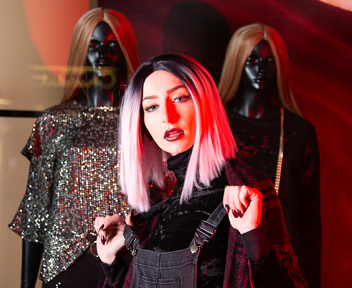
I like the consideration you put into your photos Terry in terms of creating a story and some meaning into the image. This is an interesting "reflection" on womanhood/humanity with the photo/mannequin/model in the frame.
I like the red tones and her hair in the color version. I hope you kept a version in color as well.
Did you create some other photos from this scene? Seems like you could make an interesting photo just going tighter with the model and mannequin heads. Something like this. |
Aug 3rd |
 |
| 78 |
Aug 20 |
Comment |
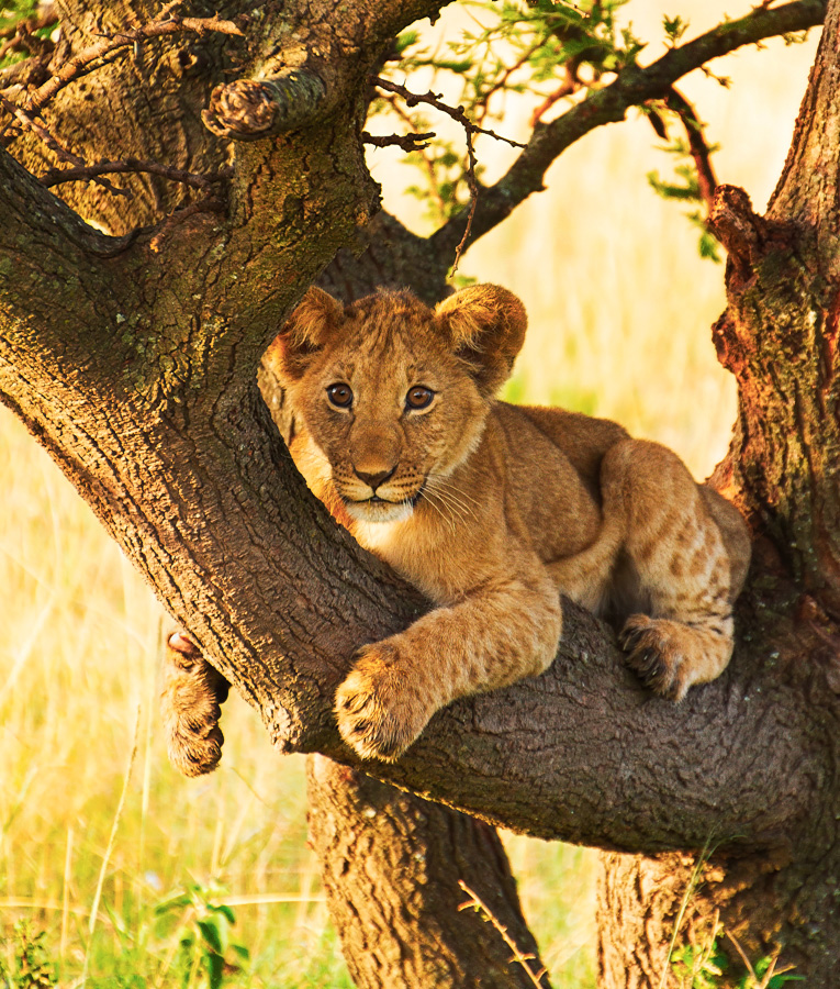
What a great capture of this curious cub! (A perfect title). A funny story too. Good that your husband was looking around.
It is a little soft in the original but your edits did help address that. I didn't have a whole lot to add but since Helen mentioned it reminded her of her background in her image this month, I tried to use the same "burn" technique on the bright areas that I shared with her (creating a 50% neutral gray layer in Overlay blend mode and painting black with a low opacity brush).
I don't know if it helps much as I kept it pretty subtle but will share for you to consider. And you mentioned already doing some dodge/burn so maybe you did something similar in those areas.
I also added a subtle curves layer and just a hint of desaturation. I can share my PSD with you if you'd like. |
Aug 3rd |
 |
| 78 |
Aug 20 |
Comment |
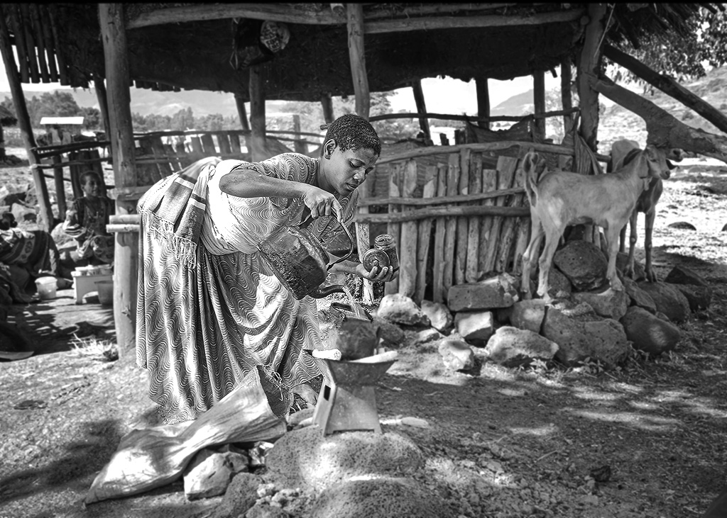
This is a great case study in editing Helen! It is a wonderful documentary image and more so that you were able to create it while, "just walking by".
It is a shame the color version is so tricky because her colorful scarf is really beautiful in contrast to the color and texture of her dress, skin, and hair.
The two goats on the side are a nice addition as well.
I think going B&W is a good choice though, especially with the blue tarp and turquoise bag which are a bit distracting from the main subject.
But the contrast does seem to be an issue when doing a straigh desaturation type conversion.
I think this image would benefit from some area specific dodge / burning.
This is an interesting dodge/burn technique using 2 neutral gray layers in "Blend>Overlay" mode vs just using PS Dodge/Burn tool.
https://www.youtube.com/watch?v=OMi-d9CX41U
You paint with black on the "burn" layer and white on the "dodge" layer.
I also felt like all of the background elements are competing with the foreground and one way I thought you could minimize that is to cut out the woman (see my quick and not so accurate example) and then apply a slight Gaussian blur to background to give it some separation.
I can send you the PSD file if you'd like. |
Aug 3rd |
 |
7 comments - 7 replies for Group 78
|
7 comments - 7 replies Total
|


