|
| Group |
Round |
C/R |
Comment |
Date |
Image |
| 78 |
Jul 20 |
Comment |
This is a fun bright image and a great memory from your outing. Good eye to spot the colorful paint and yellow rope as well as telling a story by featuring the buoy from the boat.
I don't have much on the edits other than the back and forth you've already had with the other comments.
Though one thing I do notice is that on your edits I see a blue halo around the rope which doesn't seem to be the case in the edits by the other folks. It seems a little unnatural to me and I wonder if you can preserve your colors / style, but somehow minimize or remove that halo as well. |
Jul 15th |
| 78 |
Jul 20 |
Comment |
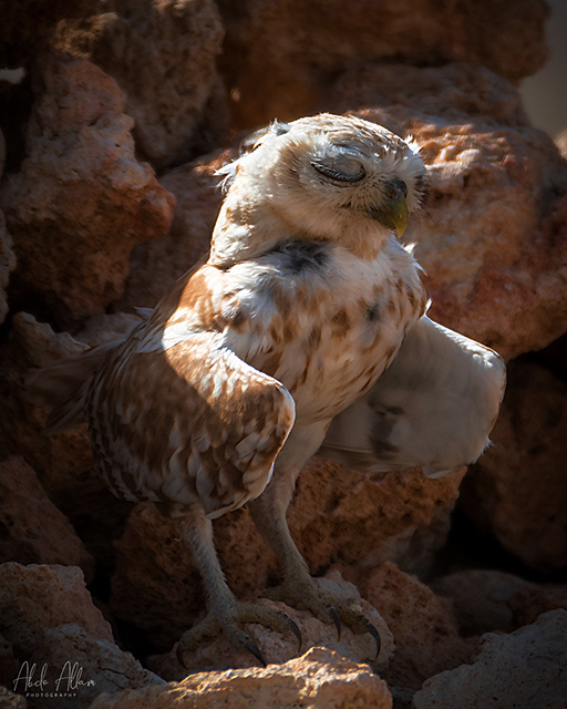
Such a sweet little owl. I am surprised he was being cranky with you as he looks serene here.
I feel like the highlights on the brightest part of the bird are a little too bright and if it were my image I'd probably add some contrast in curves to darken it up a little. But that is a personal choice and I imagine you left it as you did to your liking. |
Jul 14th |
 |
| 78 |
Jul 20 |
Comment |
Yikes. I don't know if people have always been so reckless to get a photo or that is a new phenomenon. A good documentation of these folks. I tend to agree with Sunil that I prefer the more muted colors of the original over the edit. |
Jul 14th |
| 78 |
Jul 20 |
Reply |
Thanks Brenda. This one was a little experimental but figured a good one for the group to discuss! |
Jul 7th |
| 78 |
Jul 20 |
Comment |
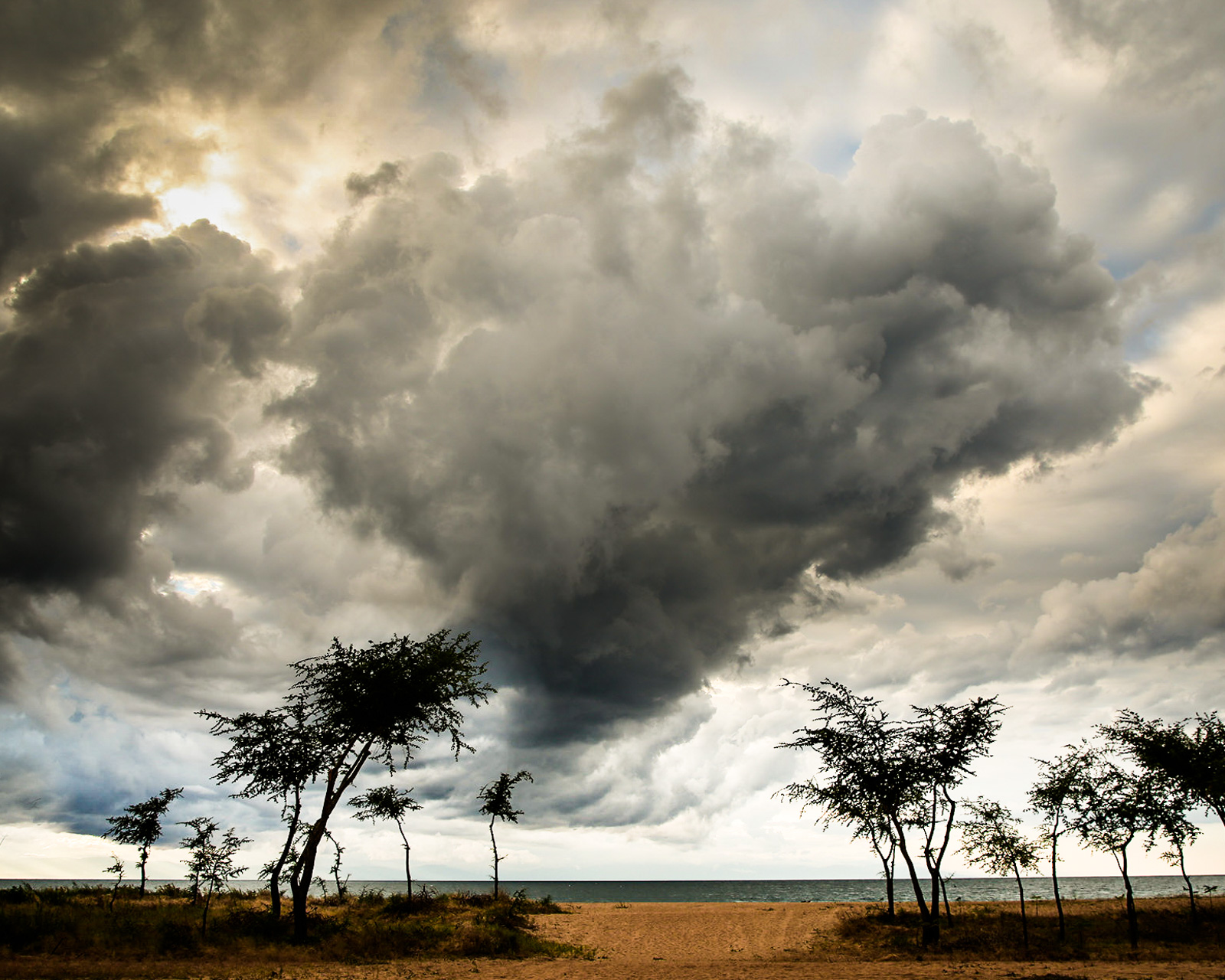
Great image to kick things off Helen! These are some very dramatic clouds indeed.
I liked what Terry did to the clouds, but I find the trees and landscape in his edit to be a bit too bright in this image for my taste. I played with curves to darken the whole thing, then added a gradient in LR to brighten the bottom part.
I really like that bit of sun coming out in the left corner, but find the composition overall is not adding too much to the subject (the clouds). With that in mind, I cropped it to a 5:4 format as I find it interesting how those trees on either side of the center are leaning in (and somewhat pointing the viewer up to the start of the clouds).
If I were to keep playing around, I might lighten up the bottom of the center cloud where it intersects with the tree, to give more visual separation of the silhouette of the leaves with the dark of the clouds.
On your processing... one of the advantages of LR is that you can create Export presets. That way you could make a preset for many of the popular competition requirements and at the click of a button you can export all your photos you want to enter to that format. (Maybe Bridge serves a similar function, it's been years since I've used it and they are both Adobe products so I assume the borrowed from each other).
For LR, you can make a collection of all the images you typically enter into competitions and then click one or more of them and Export->Preset very quickly. All of your metadata is saved to the LR original so every export will keep that info (assuming you tick the box to do that for your presets).
|
Jul 3rd |
 |
| 78 |
Jul 20 |
Comment |
Kudos to Cynthia for sitting on top of those old boxes and things! I like the expression you chose to highlight, something along the line of overwhelm meets disgust. (the title captures it well!)
It's not a clean flashy model shot but instead matches the overall mood of disarray. Even her hand in slightly messed up hair adds to it all.
I like the B&W processing and variation of dark / light areas and textures.
My only nitpick is that if you were taking time to set it all up, I'm not crazy about her position in front of that wall corner. On one hand it adds some depth vs just a flat wall, but maybe if there was a way to position her more in front of the flat part it may have been better.
|
Jul 2nd |
| 78 |
Jul 20 |
Reply |
Thanks Terry. It is amazing what can be done these days to enhance an image. I don't think I would have done much with it either had I not seen some ideas on the LR Discover site that seemed worth trying.
I see what you mean about the alien creature, looks like a rounded head shape and glowing eyes to me!
On the orange light, not sure what caused that, on the original it looks like painted area of the train maybe.
And on timing, that was luck of the shutter. Basically was just sitting there waiting for the train to pass, and snapped a few pics in the meantime. |
Jul 2nd |
| 78 |
Jul 20 |
Reply |
Thanks Helen. I looked at the history but it's a lot of steps! Probably one of the most complex edits I've ever made on pure LR adjustments. I was generally emulating a processing workflow that this person uses (which you can also play back their edits in the LR Discover) -- this was not the exact image but gives the same sort of idea
https://lightroom.adobe.com/learn/discover/fa98186f-8de1-4e6e-bb99-a5ed9432d263
I find Lightroom to be a much better way to archive / edit lots of images than Bridge/Photoshop. I usually only go into Photoshop when I have to do something complex that I can't do in LR.
|
Jul 2nd |
5 comments - 3 replies for Group 78
|
5 comments - 3 replies Total
|


