|
| Group |
Round |
C/R |
Comment |
Date |
Image |
| 78 |
Jun 20 |
Reply |
I like your edits Brenda! I would not crop the foreground as I think it adds balance and interest to the image with the lines leading the eye to the buildings in the back.
To me the tower (and image) still looks a little skewed to the right. But I have this problem with my own images as well.
With some of my pics, I swear I've rotated in micro-adjustments back, forth, and back again, and still something looks a little titled to me that I can't quite get to straighten. |
Jun 24th |
| 78 |
Jun 20 |
Comment |
Another creative quarantine image Richard! I like the contrast of color between the background and sweatshirt.
It's been great sharing photos with you over the last year or so Richard. I have very much enjoyed your images and perspectives.
Perhaps I will see you on Aminus3 sometime, or 1x, or somewhere in between.
Jason |
Jun 22nd |
| 78 |
Jun 20 |
Comment |
Hi Sunil. Reading through the comments and responses... I think you did a great job refining the photo down to the minimal elements needed to tell the kind of story you have described (the small people in this vast and beautiful scene), though respectfully, I don't think this one was as successful as some of your other similar people photos.
From my perspective, this would have benefited from more separation or distinction between the two people, or different body positions so they don't blend together like this. Also it seems, at least in this lower resolution version, the people are not in the focal plane which to me detracts from them as the main subject.
It could potentially be addressed somewhat in editing, as I think even in Terry's version, they are darker and a little more sharp which is an improvement on your version where they are duller and fuzzier (you could still use your version's sky as to not overpower the subject, but tweak the people to be more prominent).
And FWIW, the sky in the 2nd color version is fantastic! I hope you were able to use that in another image from this scene.
|
Jun 22nd |
| 78 |
Jun 20 |
Comment |
This is a very engaging (and slightly mouth watering) still life! I like the textures and muted colors of the various components. I think I prefer Jim's brighter version than your darker tones (or maybe a mix of the two, slightly brighter than your version)
My only suggestion would be to have zoomed out just a little to give some room around the subjects and so that the edge of the left kahk is not cut off. Seems a bit abrupt or unintentional as is. |
Jun 19th |
| 78 |
Jun 20 |
Reply |
Hi Stephen. This is very cool and thank you for sharing your ideas around photo "subject matter coincidences".
In fact, I have also been tracking this phenomenon on my own website. I run a photo community called Aminus3 where people can only post one photo per day. I started to notice that on some days, I would see similar subjects from different countries / parts of the world.
I named this phenomenon "Photo Resonance" and created a 3 image triptych slideshow to feature photos that resonated together around different themes.
I found this to be a really fun and interesting way of curating and grouping images, as well as a way of showing the similarities between diverse life experiences and cultures.
You can see a few of my curated creations:
https://www.aminus3.com/res/patterns-of-creation/
https://www.aminus3.com/res/someone-to-watch-over-me/
https://www.aminus3.com/res/ |
Jun 19th |
| 78 |
Jun 20 |
Comment |
For something totally different, this was a Luminar / Tonality preset called "isochromatic" which gives it a kind of charcoal drawing effect. Could be interesting to create a different version like this as well. |
Jun 9th |
 |
| 78 |
Jun 20 |
Comment |
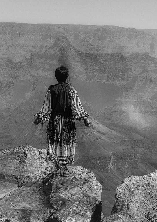
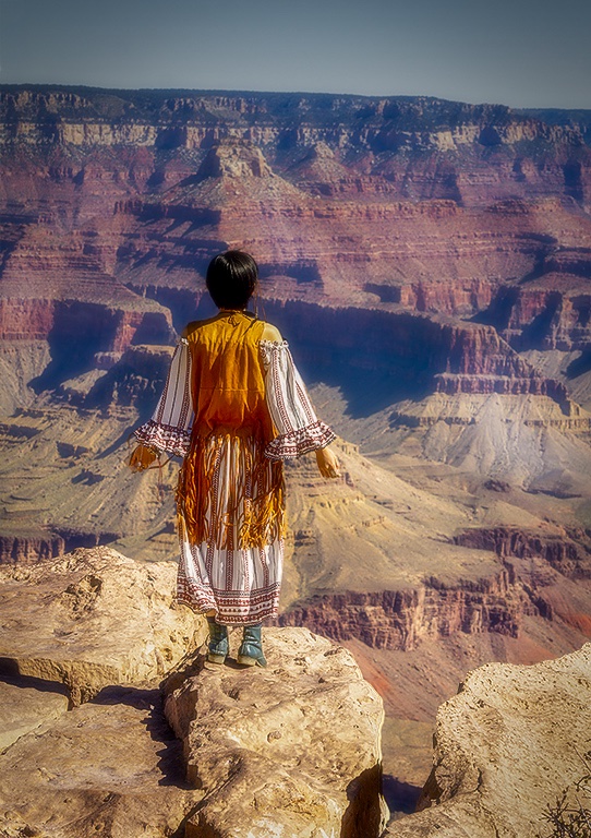
That's a lucky find to be in that amazing majestic canyon beauty, and then have such an interesting subject show up on the scene.
I like the way you've presented her standing alone at the precipice overlooking all that vast space around her.
Similar to what Terry said about the sky, I feel like the brightness is too uniform and is a little distracting going into the background. I would maybe try a graduated filter to bring down the brightness a little. You could also even blur things out even more to isolate the figure.
This image also has a timeless quality and using an old film style filter might give it a unique look (like 1960's or 70's effect).
Here's a version using a Luminar filter called "Dreamy Portrait" (under their default portrait filters) which blurs out the background a little more (probably using a variation of an Orton effect) adding some more separation. (note this one is not the retro effect but mainly to show the gradient in sky and slightly more blur in background) |
Jun 9th |
 |
| 78 |
Jun 20 |
Comment |
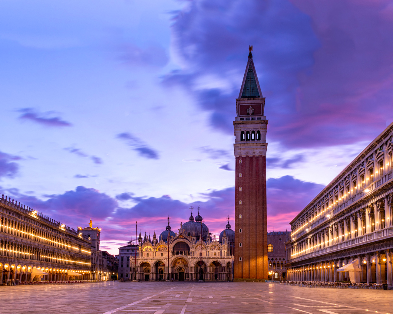
The lights on the buildings against that beautiful sky is truly sublime!
I would definitely try to get some more room at the top. Here's a suggested 4:5 (10x8) version with some more sky on top. I also cropped a little off the bottom and right side which brings the tower more to the right and creates some diagonals from the left smaller towers to the larger one.
Note that when I added room on top and tried to use the trusty "Content Aware Fill" in Photoshop, it didn't do so well and created some really ugly cloud sections.
Instead I used an old tried and true method of copying a section from the top and then doing a "flip vertical" on it which creates a relatively seamless transition from the original to the new sky area. But that also ended up making some of those clouds look like Rorschach tests! To fix that, I went in with the clone and heal brush some more to add variance. You could probably spend more time on it to make it even more natural. |
Jun 9th |
 |
| 78 |
Jun 20 |
Comment |
Wow! I have to say this one was a little unsettling as I just started to look at the main photo from the stairs to the water and was startled to find a face at the bottom of the steps!
I'd say that is an effective presentation.
It is a little strange just seeing these steps going down into the water. I almost see the image as straight on like a walkway leading into some weird water wall.
I think your blending technique here is spot on. Her face almost seems to ripple in the water.
I agree with Brenda that the choice of face / expression seems off somehow. The size is OK for me but maybe the tormented expression or as Brenda noted, the direction of her gaze is not quite working.
On titles... how about "Soul of the Sea" or something like that? or "Lost Souls of the Sea" |
Jun 9th |
| 78 |
Jun 20 |
Reply |
Thanks Terry.
My original purpose for the vertical was for an educational project I'm working on which I'll share once it is in publication -- but ended up using a different photo for the "Graphism" portion so there is no longer any strict requirement for the aspect ratio on this image.
I like the punchier version and the crop does help to bring things to the core elements.
Although in an image like this, the negative space can also be utilized for a purpose as much as the areas with stuff in them (not that that is or is not my intention here but pointing out FWIW)
|
Jun 9th |
| 78 |
Jun 20 |
Reply |
Thanks Brenda for the suggestions and ideas. I like the flipped around version and the "face" in the abstract! I think I prefer the natural version vs texture in this case but a fun experiment either way. |
Jun 9th |
7 comments - 4 replies for Group 78
|
7 comments - 4 replies Total
|


