|
| Group |
Round |
C/R |
Comment |
Date |
Image |
| 78 |
May 20 |
Comment |
Thanks Terry. I like the added clarity and toning in the sky.
Very interesting suggestion on the blue channel for enhancing the moon. Will have to give that a try.
|
May 12th |
| 78 |
May 20 |
Reply |
Thanks Brenda. Your edit brings out some nice color in the sky |
May 12th |
| 78 |
May 20 |
Reply |
thanks Richard |
May 12th |
| 78 |
May 20 |
Comment |
I really like your interpretation of this scene. From a tourist snapshot to an artistic display of this ancient wall and shutter.
The textures are so rich and you've done well to accentuate them. I agree with Terry that the bottom feels a little cramped. Would like to see a little more space under the window but understand if it was not possible to shoot it like that.
I don't mind the left side so much and like that texture, though might consider either putting the window right in center, or doing a crop like Terry's where it is pushed further to left or right. Here it seems too close to center but not... |
May 12th |
| 78 |
May 20 |
Comment |
I like your thinking in terms of the symbolic aspects in this photo (rose and flag). It is a timely image and timeless too as these lines of uniform military headstones have become all too familiar over the last century.
I think your latest crop and edits are very effective and create a strong image.
I don't have much additional criticism - though I wonder... usually you see these kind of photos with a more uniform distribution of headstones. I suppose this effect comes from the angle of the camera. In this case, we see these four foreground markers are somewhat arbitrarily placed. I don't know if that helps or hinders the image but my inclination when looking at the photo is wanting to see it more uniform in the way the headstones are aligned vs how they are here.
I think that could be a statement in itself, or perhaps an unconscious choice. Either way, something to consider. |
May 12th |
| 78 |
May 20 |
Comment |
Very impressive detail in this macro! I think your 2nd edit is very good. I like the composition and removal of distracting elements.
My only very minor complaint would be to brighten up the eye a little as much as you can. I see from your original, the whole image was darker but it seems the back and wing have the most light and eye is still in shadow. Any kind of dodging or lightening there might be effective.
Otherwise, with your edits, I think a really great macro image. |
May 12th |
| 78 |
May 20 |
Reply |
Makes sense. Thanks for the explanation Brenda.
In this case I think your choice was a good one. |
May 12th |
| 78 |
May 20 |
Comment |
I like your updated version Brenda, those sun rays are spectacular and the whole scene is very peaceful.
I kind of like your original #2 with silhouettes - or maybe another image from that scene in silhouette would make a nice image as well.
I didn't catch what you meant by cutting / cropping the tree different, can you explain that? |
May 11th |
| 78 |
May 20 |
Comment |
Great idea Richard and really well done. Even your conceptual art piece is a work of art in itself!
I don't have much to critique. I like Terry's idea of going for a little more contrast or "punch".
On the story of the image, for some reason I saw more of a workman than healthcare professional or stay at home covid isolator. Not sure if you reshot this if there would be a better outfit than what you have already but just thought I'd mention as that was my initial reaction.
|
May 11th |
| 78 |
May 20 |
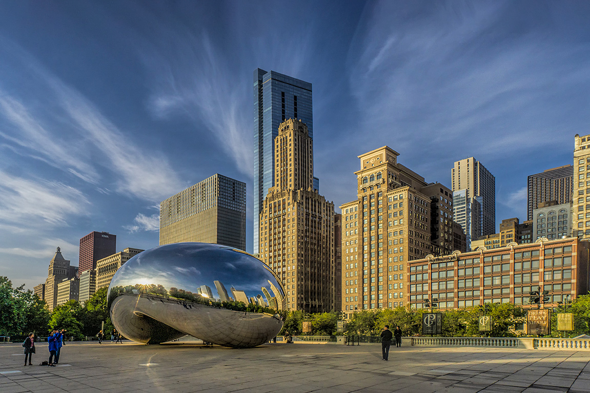
Comment |
That is an impressive sculpture well represented in your image. I like the sense of scale the people and buildings add. Those clouds are great too and almost emanating from the buildings.
My only suggestion is that while the wide angle gives a nice perspective, I feel like the right side of the image is not adding much and seems a little arbitrarily cut off. Maybe crop in a bit tighter like this (in which case I added a little extra sky on top using a content fill).
To me, this brings the eye more into the frame and less likely to wander off the right edge. |
May 9th |
 |
8 comments - 3 replies for Group 78
|
8 comments - 3 replies Total
|


