|
| Group |
Round |
C/R |
Comment |
Date |
Image |
| 47 |
Feb 20 |
Comment |
The motion in the waves and rickety dock give me a sense of vertigo. Great image with a beautiful sky and clouds adding to the rich textures of the frame. |
Feb 28th |
| 47 |
Feb 20 |
Comment |
A great and minimal image that tells a wonderful story. I really like the shape of the opening and the way she is peaking through. The toning adds to this perfectly.
Once small critique would be to consider cloning the thing behind her collar on the left side and the little piece next to that so that there is a consistent gray gradient behind her (unless that is part of her collar as it is a slightly similar texture but I get the sense it is something else). |
Feb 28th |
2 comments - 0 replies for Group 47
|
| 54 |
Feb 20 |
Comment |
This is a very creative and striking image. I almost didn't see the head / silhouette on first glance and when I did it made it even more magical.
My first impression was that it had almost a tribal art feel to it with the elongated people. In contrast to some of the other comments, I think the proportion of the people works, and find that it adds to the unique style of this image. |
Feb 28th |
1 comment - 0 replies for Group 54
|
| 78 |
Feb 20 |
Reply |
Thanks Richard |
Feb 28th |
| 78 |
Feb 20 |
Reply |
Ha, I like that visual of the old farmer. Thanks Brenda. |
Feb 28th |
| 78 |
Feb 20 |
Reply |
You've made a beautiful travel photo even better.
Looks good Terry. |
Feb 14th |
| 78 |
Feb 20 |
Comment |
This is certainly a subject you can revisit with it's vibrant pink exterior and charismatic tree next door. I think your idea for a night shot is spot on as it brings out all the colors even more so with that yellow light on top.
I try not to alter reality to much but I like Terry's revision of the building on the right in order to keep the tree but minimize the other buildings presence. |
Feb 12th |
| 78 |
Feb 20 |
Comment |
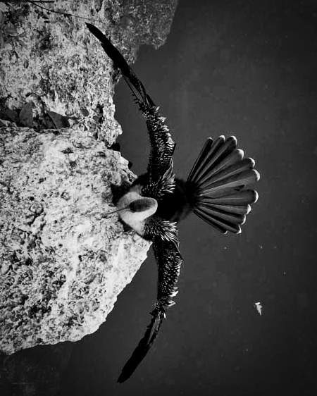
Beautiful capture and unique perspective of the anhinga. I find the myself drawn to the fanned out tail feathers more than anything.
Maybe another take would be to rotate clockwise, give a little more space in the water, and even a B&W conversion to bring out the contrast and feathers.
What do you think? |
Feb 12th |
 |
| 78 |
Feb 20 |
Reply |
Thanks Terry
This was at f1.4 (or closer to 2.8 I guess given the m43 conversion)
so a shallow DoF which may be causing some weird effect here... |
Feb 12th |
| 78 |
Feb 20 |
Reply |
Thanks Sunil |
Feb 12th |
| 78 |
Feb 20 |
Comment |
After seeing the original, I think you did a great job isolating the subject and bringing out the warmth and texture of the subject. |
Feb 7th |
| 78 |
Feb 20 |
Reply |
Thanks Jim for your ideas and reinterpretation. |
Feb 7th |
| 78 |
Feb 20 |
Comment |
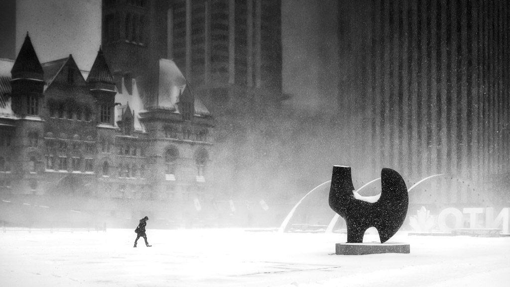
This looks like another one of those classic (and fantastic) Richard dystopian photos to me. A somewhat surreal location with a lone figure traversing the wastelands.
At first, those arches looked to me like a frozen fountain. The figure was definitely worth the wait to add something of interest to the frame.
My only criticism might be to add some contrast with levels or curves (or both). Granted the "white out" sets the tone ,but I think this image can still benefit from brighter whites / darker darks. Something like this quick edit (levels and curve adjustments) |
Feb 4th |
 |
| 78 |
Feb 20 |
Comment |
I imagine you had some excellent photo ops in Iceland. This is a scenic church with its red roof.
Your edits create an illustrated look to me. More 2D somehow. I like how the dirt takes on a redder tone closer to the roof, and makes me think about the negative space shapes in the snow / rocks behind the church.
That negative space is somewhat broken up though by the plants in the bottom left corner. Perhaps for another use (if you don't want to over edit for exhibition) you might consider cloning those out.
There is also a nice repetition of vertical elements in the windows and fence posts. |
Feb 4th |
| 78 |
Feb 20 |
Comment |
I really like the shading on this one Abdo. A true study in form, light and shadow.
I like the symmetry as well of the windows on the left (in the light) and on the right in shadow but details still visible.
Funny, I just published a blog post on Graphism in photography with this kind of photo in mind -- as well as some good examples of Islamic architecture.
You can see it here https://www.aminus3.com/threads/graphism-photography/ |
Feb 4th |
6 comments - 6 replies for Group 78
|
9 comments - 6 replies Total
|


