|
| Group |
Round |
C/R |
Comment |
Date |
Image |
| 34 |
Nov 19 |
Reply |
That certainly could work as well.
Btw, also forgot to mention how I enjoyed your creative idea to rotate the image to create the "ramp" on the bottom. |
Nov 7th |
| 34 |
Nov 19 |
Comment |
This makes for a great image of this religious looking man walking into the unknown curves of the stark metal structure. His orange outfit against the blue and grey tones is evocative.
One thought, even though the actual lighting of the figure make the shadow fall on his right side, I wonder if a long shadow leading from the bottom of the frame to the figure might create another unique visual as well as symbolic element for this image. |
Nov 6th |
| 34 |
Nov 19 |
Comment |
I like the symbolism of the window that you've described. I was also thinking how windows separate "inside" from "outside", or the boundary between our inner and outer worlds.
I also like the contrast of the desert dwellers transposed to the sea. |
Nov 6th |
2 comments - 1 reply for Group 34
|
| 67 |
Nov 19 |
Comment |
This is a beautiful dream like image. I can feel your nostalgia through the frame. |
Nov 8th |
1 comment - 0 replies for Group 67
|
| 78 |
Nov 19 |
Reply |
Thanks Alan for checking out the article
Glad you liked it. |
Nov 30th |
| 78 |
Nov 19 |
Reply |
It is impressive what can be recovered in RAW and you did a good job in your edits. I agree with Richard that the color version has a nice quality to it. I don't mind the vignette dark corners in the color version so much either as they retain more detail. |
Nov 6th |
| 78 |
Nov 19 |
Comment |
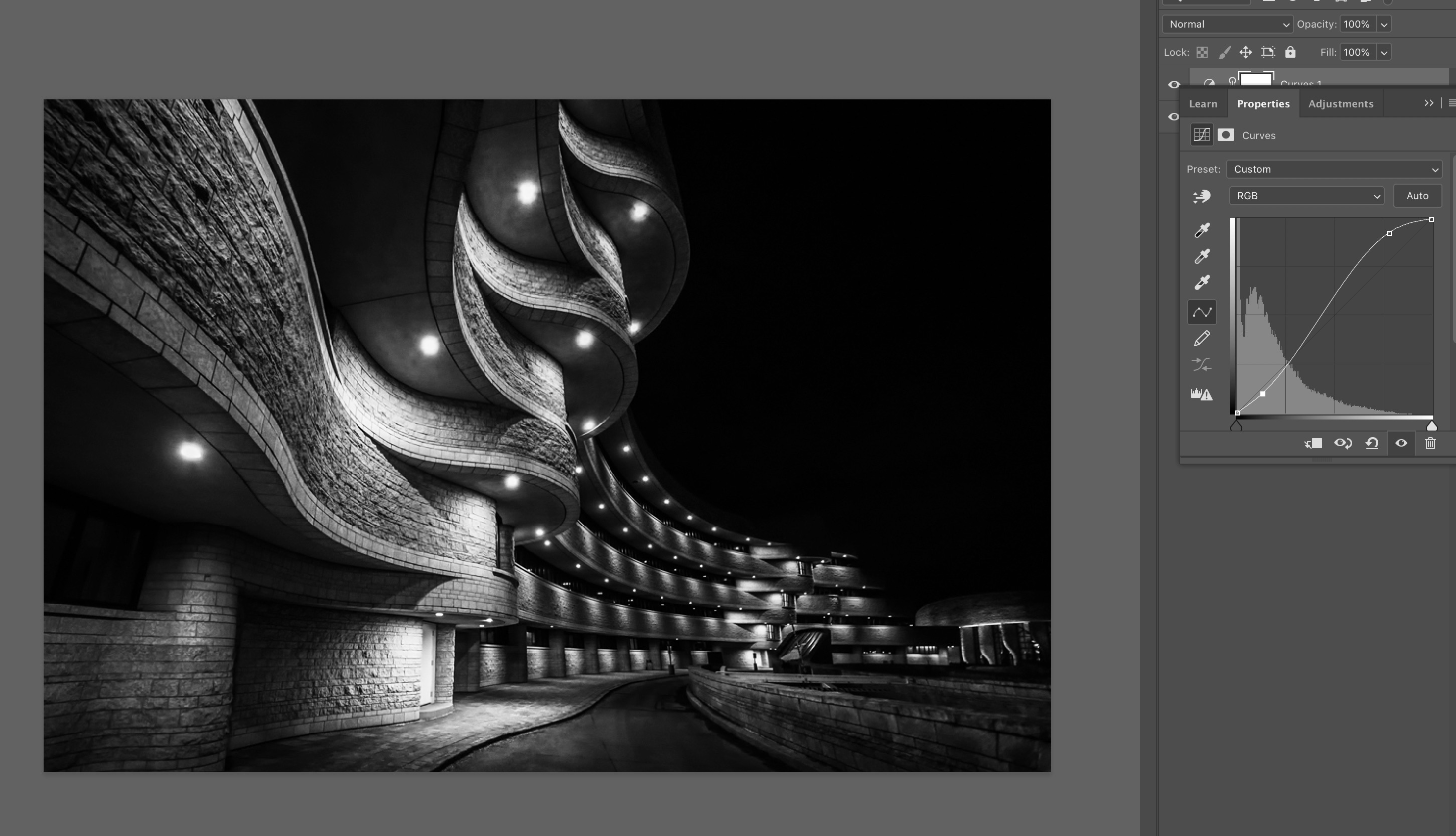
You do have a knack for finding these surreal locations.
I like the way the curvy sidewalk mirrors the curvy building, all enhanced by the perspective you choose for the pic. The lighting also forms a nice line through the frame. Great use of negative space as well with the darkened sky. You could pull those blacks out into the rest of the image by upping the contrast. What do you think of this kind of curve adjustment for a more dramatic image? |
Nov 4th |
 |
| 78 |
Nov 19 |
Comment |
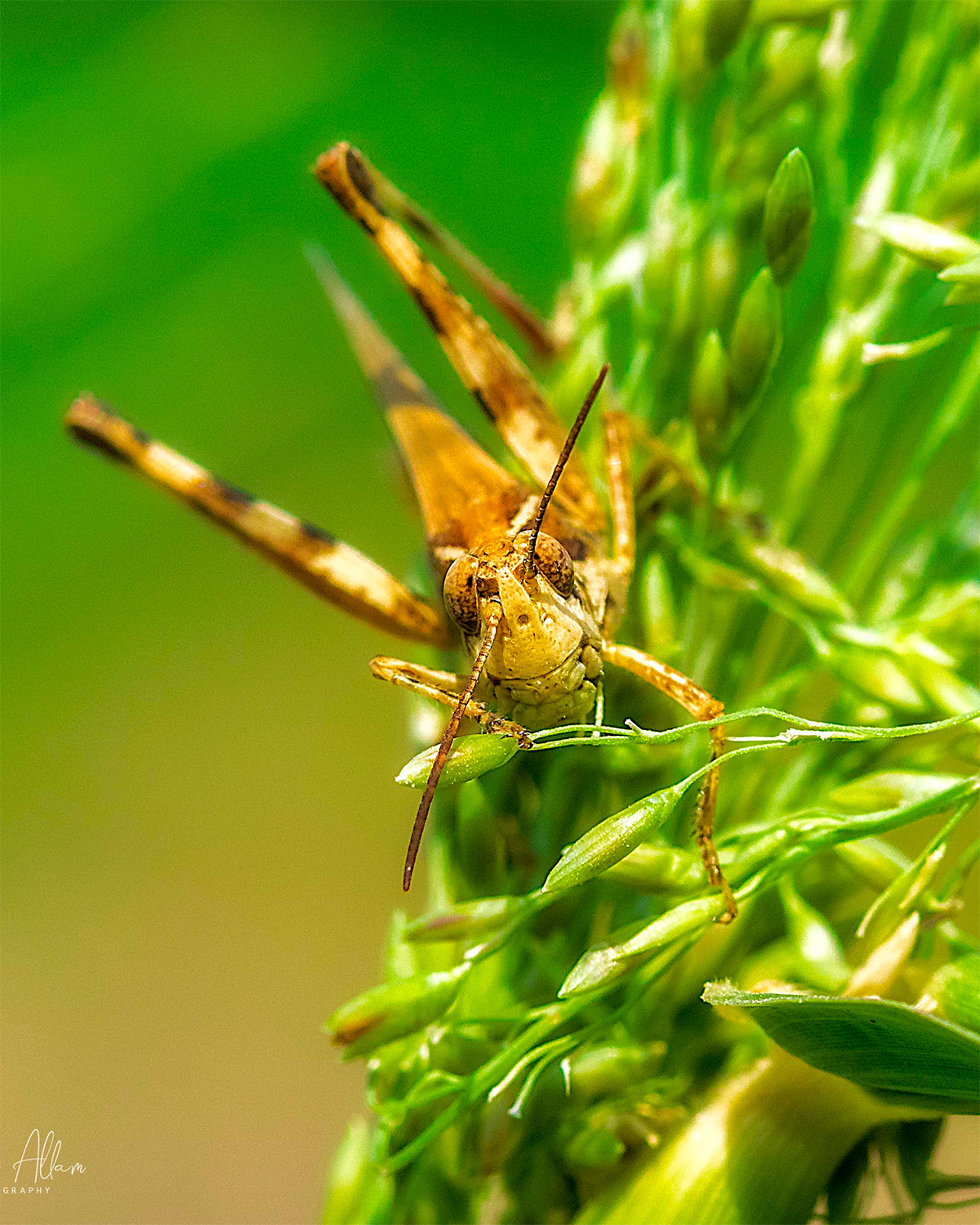
Wow, great macro and excellent detail on its face.
I agree about the leaf, maybe a vertical crop might work to minimize that element. |
Nov 4th |
 |
| 78 |
Nov 19 |
Comment |
I like these photos that grab our attention and see them as an opportunity for further personal reflection.
This one is a great study of texture and decay.
If it were my photo I might be tempted to add more contrast or increase the dark tones, though also tend to overdo that type of edit at times so perhaps not.
|
Nov 4th |
| 78 |
Nov 19 |
Comment |
I like your processing Alan. Looks like a postage stamp.
I think Richard has some good ideas about using the surroundings and art to create a unique composition. It would be interesting if you had a young lady sitting at the foot or something like that.
Reminds me of a blog post I published last month about how to better use juxtaposition in your compositions. Might be interesting for you to read as well as many examples for inspiration.
https://www.aminus3.com/threads/juxtaposition-photos/ |
Nov 4th |
| 78 |
Nov 19 |
Comment |
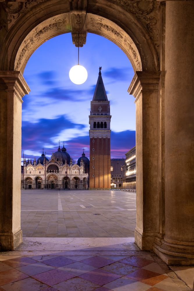
Fantastic eye Brenda. The sky is beautiful and the clarity of the ornate building is impressive.
I love the faux moon but do wish, as Richard observed, there was a little more space between it and the tower. I wonder if moving to the right would have helped but then the tower would not be framed in the arch.
One idea as a real cheat would be to shrink the tower a little so that the moon fits alongside the triangle tower roof. It would be a fake for sure but might work. Here's a quick edit to show you what I have in mind.
|
Nov 4th |
 |
| 78 |
Nov 19 |
Reply |
Good ideas for consideration, thanks Richard |
Nov 4th |
| 78 |
Nov 19 |
Reply |
Gives it a magical glow, thanks for the edit suggestions Brenda |
Nov 4th |
| 78 |
Nov 19 |
Reply |
Thanks Terry, good thinking. |
Nov 3rd |
| 78 |
Nov 19 |
Reply |
Excellent idea and rendition. Thanks Sunil !
I'll give this a try on the larger image. |
Nov 3rd |
5 comments - 6 replies for Group 78
|
| 80 |
Nov 19 |
Comment |
I like the narrative here and your B&W conversion. I'm curious why cropped much of the photographer in your edit vs. making that a stronger element as it was in your original. |
Nov 6th |
1 comment - 0 replies for Group 80
|
9 comments - 7 replies Total
|


