|
| Group |
Round |
C/R |
Comment |
Date |
Image |
| 78 |
Jul 19 |
Comment |
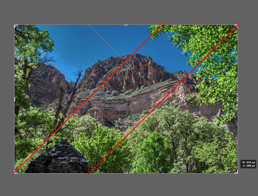
That sky fits nicely for this image and seems very natural and overall I like the toning.
Two things I think got overlooked in your crop...
The left tree / leaves feels too cut off to me, like it should either have more of it or not be in the frame - especially at the top.
And the black rock in bottom left is a nice contrasting element to the larger mountain rock face but in your crop and toning it gets a little lost.
Here's a suggested crop that adds more of the left top trees, and more of the rock such that it creates diagonal leading lines up to the main subject (blow up to 200% to see it better).
This seems better balanced to me, and brings the other elements more into the composition (left bare tree, left rock, and left top leaves) |
Jul 12th |
 |
| 78 |
Jul 19 |
Comment |
Great perspective with that sunburst in the tree. Did you shoot at f/16 to get the star effect?.
The branches of the tree are also very nice and your framing is perfect with the branches spanning across.
I don't mind the other cars in there so much as it adds to the story, though the single car alone does give a certain look, maybe more stylized.
I almost find the uniform exposure to be a little too sterile or unnatural. I think I might prefer some contrast with a darker car / shadow (more similar to the original) with the sun and tree lighter. I tried to mock up my ideas but didn't quite get what I was going for - but maybe my description makes sense to try for yourself. |
Jul 12th |
| 78 |
Jul 19 |
Comment |
Good abstraction Richard. I like the contrast which adds separation to the sections. Terry's idea to do a gradient helps accentuate that.
I was playing around with rotating and cropping but didn't find anything much more interesting than what you've got.
Though maybe using a different color gradient could be interesting. Here is one of the photoshop built-in gradients of blue to red to yellow. I added the gradient on an adjustment layer and then lowered the opacity to about 60% to make it more subtle. I also changed the crop a little as well. |
Jul 12th |
 |
| 78 |
Jul 19 |
Comment |
Good spur of the moment catch and creative editing to convey a narrative. I'd advocate cloning the right light as it doesn't add much to your theme and is somewhat distracting.
I personally like the asymmetrical balance created with the man on one side and woman / poster on the other. Putting a 2nd center poster somewhat breaks that. Though I get that you are using it as a plot device so it works for you in that case.
Speaking of symmetry / asymmetry... my local photo club (Viewfinders Brussels) did a challenge a few months go on this topic. One of the videos someone suggested for inspiration is an analysis on how director Peter Greenaway used the center line of his frame to create these really interesting contrasts.
Like things look symmetrical but are actually different contrasting elements on either side of the frame. It was a fun challenge and got me thinking about these concepts a lot more.
I recommend watching the video for some ideas...
https://vimeo.com/89464907
(note there is some nudity / NSFW in this) |
Jul 12th |
| 78 |
Jul 19 |
Comment |
Wow! What a catch. You did a great job on the exposure and composition here. You certainly did find the perfect angle to capture this.
I hear what Terry is saying about almost looking "cut out" or like a collage of images put together.
I think maybe there is a sharpness to this version of the image that could be adding to the effect. Might be a result of resizing and image compression - or added sharpness? It's not such a bad thing, but gives it a more unreal look I think than not.
I'd be interested to see a larger version or the original for comparison.
|
Jul 12th |
| 78 |
Jul 19 |
Reply |
Thanks Richard. It is a debate on creating a reflection of the scene as it was or some perfect image version of it. Guess it depends where the photo is used and why. |
Jul 12th |
| 78 |
Jul 19 |
Reply |
I like the square crop suggestion (looks like several others do as well). Thanks Terry. |
Jul 12th |
| 78 |
Jul 19 |
Reply |
Thanks Sunil for the suggestion to go back to the original and do some more localized updates. Will give that a try when I have some time. |
Jul 12th |
| 78 |
Jul 19 |
Comment |
This is cool. Reminiscent of some kind of alien entity from Star Trek.
I like your creative edits and I think you made a unique version of your own, though comparing it with the original - there are some really nice geometric shapes that get lost in your rendering (like some of those triangles).
In this case, reinterpreting someone else's art, it is difficult to say then what the right approach is, I guess it depends on what you like and what seems to resonate for you.
One idea I was thinking of if presented with such a subject, would be to do some multiple exposures with it (or others like it). Sort of like Richard's Vegas image from a couple rounds ago. That might be a way to create your own artistic rendering that expands on the original in a new way. |
Jul 3rd |
| 78 |
Jul 19 |
Reply |
Thanks Brenda. This was taken in one of the big gardens in Vienna though it does have an old New England vibe.
I was also thinking about removing that yellow, or at least the garden hose thing. B&W could tone it down though in my first attempt, it seemed like it took away from the vibrant contrast of green leaves and dark shape of the horses and carriage (everything became a little too much the same tonal range)
Maybe you or someone else in the group could try toning it and see if you can get a nice balance of tones and contrast. |
Jul 3rd |
| 78 |
Jul 19 |
Reply |
Thanks Alan |
Jul 3rd |
6 comments - 5 replies for Group 78
|
6 comments - 5 replies Total
|


