|
| Group |
Round |
C/R |
Comment |
Date |
Image |
| 78 |
Oct 18 |
Reply |
I think this helps Brenda. It minimizes the town and brings the attention into the bridge and lights.
That tower is tricky. I had a shot like that recently where no matter what I did it always looked a little titled to me even when it aligned on a grid in Lightroom rotate.
For some reason, I am not seeing the left yellow trail in either version.
|
Oct 21st |
| 78 |
Oct 18 |
Comment |
Not a bad first impression of this beautiful place! I love that wedge of sunburst coming from the buildings and palms.
I don't have much of a critique as it is a beautiful well composed image.
I find myself drawn to that unique looking curved tree on the right side and fence which seems to be sloping down the hill, as if everything is slowly converging into the sea.
|
Oct 19th |
| 78 |
Oct 18 |
Reply |
Thanks Dave. I'll have a play in LR with your suggestions. |
Oct 8th |
| 78 |
Oct 18 |
Comment |
Good that you had a camera at the ready. I like how you are right down in the action with this one.
The idea to bring it down to 3 birds was a good choice, especially the way that two of them are together with the third on the sidelines watching for a drop.
On the focus, looks like maybe it went more to the feet and wings vs. the eyes. It does give a lot of nice detail in the wings. |
Oct 4th |
| 78 |
Oct 18 |
Comment |
This is certainly a historic building / window and as Richard observed, makes it all the more interesting with the text than just seeing the photo alone.
I like HDR in some cases but in recent years have found myself doing more with single RAW images vs merging exposures. I'd be curious to see a non-HDR version for comparison on this one.
On the cropping, the 2nd top window from right seems clipped to me. Maybe because the archway corner is cut off with the dark part going out of the frame. Might try cropping a little more off the top to prevent that. |
Oct 4th |
| 78 |
Oct 18 |
Reply |
Thank Richard for your thoughts and ideas. I hear ya on the tobacco tint, not something I typically use in my photos, but seemed to fit here.
I'll play around with the full gradient vs. half B&W and see what I think.
Fog effect could be fun depending on the use (or too much hehe), will have a play on that as well. |
Oct 4th |
| 78 |
Oct 18 |
Reply |
Thanks Alan. I was also thinking about how to minimize the branches but alas that's the way it was shot. |
Oct 3rd |
| 78 |
Oct 18 |
Reply |
Thanks Sunil for your comment. Glad you enjoyed the image. |
Oct 2nd |
| 78 |
Oct 18 |
Comment |
I think this is a beautiful natural portrait. I don't know about being too formal...she is a bit tense or closed off vs. a casual smiling picture, but I don't think it detracts from the image and seems to fit it OK for me.
One odd thing I noticed, it seems darker in the browser (Chrome and Firefox) but when I copied it to Photoshop, it brightened up. This is usually a color space issue in my experience though it seems like it is saved as sRGB. See attached left is photoshop, right is browser. |
Oct 2nd |
 |
| 78 |
Oct 18 |
Comment |
I like the way you cropped this down to the minimum which gives it a more remote feeling like they are traversing some great expanse.
There's a title idea "Traversing the Great Expanse" ?
Though "Heading home" does also tell a story about the family after a day out at the beach. The nice long shadow also reiterates (west coast) the end of the day and walking away from the sea.
On the crop, I can't quite decide on first view. I definitely prefer the cleaner view vs. the volleyball nets and town, but I like that bit extending down the coast with the other group of people / surfers, and bit of sea at the top. Would it be cheating to clone out the volleyball nets and go for a larger view? |
Oct 2nd |
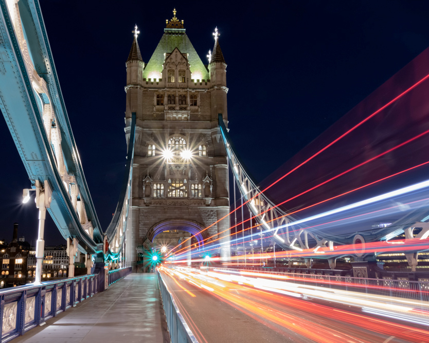
| 78 |
Oct 18 |
Comment |
Pretty lights and a nice colorful trail.
I find myself drawn more to the star patterned lights than the trailing colors. The two on the upper tower look a bit like eyes, though I find the one in the top left corner distracting. As well, the left side is not adding much to the frame imo as the buildings beyond take me out and away from the colorful bridge.
One idea is to crop to a 5:4 format and cut off some of that left side. This also might help to bring the eye through the frame more directly to that green star light at the arch.
On titles, how about "Tower Trails" or "Trails on the Tower Bridge". Or something with ghosts ?? |
Oct 2nd |
 |
6 comments - 5 replies for Group 78
|
6 comments - 5 replies Total
|


