|
| Group |
Round |
C/R |
Comment |
Date |
Image |
| 78 |
Aug 18 |
Comment |
Yup, I think Dave's version is the best |
Aug 20th |
| 78 |
Aug 18 |
Reply |
Thanks Alan. Glad it was a good learning exercise for you, and for me as well. |
Aug 14th |
| 78 |
Aug 18 |
Reply |
I don't know how much of an improvement it is, but for a different kind of image that brings out the layers more, maybe even a different aspect ration like this? |
Aug 9th |
 |
| 78 |
Aug 18 |
Reply |
Hi Dave. No overstepping at all. I appreciate you taking some time to work the image and I like the way your version brings the attention right into the action.
Could you possibly share with me your Photoshop file? I believe we all have each other's email address from the mailing Brenda sent us.
I noticed you kept the orientation flipped (from original). Do you prefer this way in the final image vs. birds facing the opposite direction like the original? |
Aug 8th |
| 78 |
Aug 18 |
Reply |
Hi Richard. Thanks for your suggestions.
I like your idea to frame the crow more with background, as well as darkening the grass to really bring home the dark on light, light on dark theme. |
Aug 8th |
| 78 |
Aug 18 |
Comment |
If there was anywhere to spice up a mildly boring afternoon, this is certainly the place.
Is that steam coming in from the top left of the frame?
As I stare into it, I'm feeling almost a vertigo sensation, as if the elements are undulating or moving through each reflected pane.
I also find myself seeing different things in the shapes. About 4 floors down from where you are hanging out and just to the left, there is a rectangle shape that looks a little like a fire engine with a ladder to me. It's kind of like finding forms in clouds only in metal, stone, and glass.
I'm with Brenda, I may have filed this one away and not done much with it, but your processing gives it new life. |
Aug 5th |
| 78 |
Aug 18 |
Comment |
The details and colors that you pulled from the original is impressive indeed. I would have thought it was daylight till I read your description.
I like the way the clouds are pulling from the long exposure, making the tower seem almost like it is broadcasting a radio signal. |
Aug 4th |
| 78 |
Aug 18 |
Comment |
Hi Richard. This photo really makes me feel like I'm in the experience of this unique cultural moment.
As for titles, the man looks to me like he is reflecting (uncomfortably) on the past, while preparing for an uncertain future. Don't have a title idea on that just yet, but maybe that will spur something for you.
On the yellow lines, they give me an impression of train tracks, somewhat reiterating the setting. Though perhaps if you wanted to deemphasize, you could desaturate them, matching the color of the text or lighter.
I know some people are sensitive about overusing vignettes, but in this case, a vignette might bring more focus to the man in the center.
Thanks for the link to the other photos. Those are some fantastic portraits. |
Aug 4th |
| 78 |
Aug 18 |
Comment |
Hi Sunil
This is a great scene to work with and you've captured it well. I get a sense for this old neighborhood feeling.
Lots of really nice shapes and patterns from the various windows to the fire escapes.
I like the truck at the front of the cars as it gives a more interesting variety I think to the line of vehicles and seems to fit the old neighborhood theme better than the cars.
I'm conflicted on the choice to black out the sky. On one hand, it makes the whole thing feel like a cutout or vignette, but on the other, feels a little sterile to me or somehow takes away from the charm of the neighborhood.
In your color example, this is remedied by the gradient of the sky, making it a little more natural. I guess you might lose some of that stark B&W going that way but might be worth experimenting. |
Aug 4th |
| 78 |
Aug 18 |
Comment |
Powerful image Brenda with two tigers staring right into the camera.
My initial thought was also to crop a bit tighter. I would not have thought about leaving the background to give the impression of a natural setting.
Still, I think cropping makes for a much stronger image as the tiger and his reflection is larger in the frame which to me seems more imposing and majestic.
In your version, he seems almost timid, as if he is cautious of an intruder in his space. In Richard's version he seems powerful, almost like a gatekeeper or guardian. It also feels more like I'm at eye level with this creature, vs. standing taller, also giving the impression of power and awe.
All in all a strong and sharp portrait of this force of nature.
|
Aug 4th |
| 78 |
Aug 18 |
Comment |
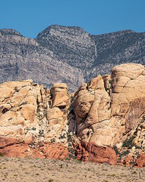
Hi Alan
I just visited the southwest for the first time and was blown away by the beautiful colors and textures in the rocks.
I like the contrast in this view, not only between the layers of the foreground rocks, but also against the greener mountain behind.
There is a nice flow in your composition, almost like an ocean wave.
My first thought was that the image might be more visually interesting if you play around with the cropping to frame the front rocks more symmetrically with the back. For example, putting that V shaped divot in the front rocks in the center of the image and clipping the sides.
But on second thought, maybe that would add more structure where the flow of the current composition stands on it's own. Might be worth trying just to see how the image feels both ways. |
Aug 4th |
| 78 |
Aug 18 |
Reply |
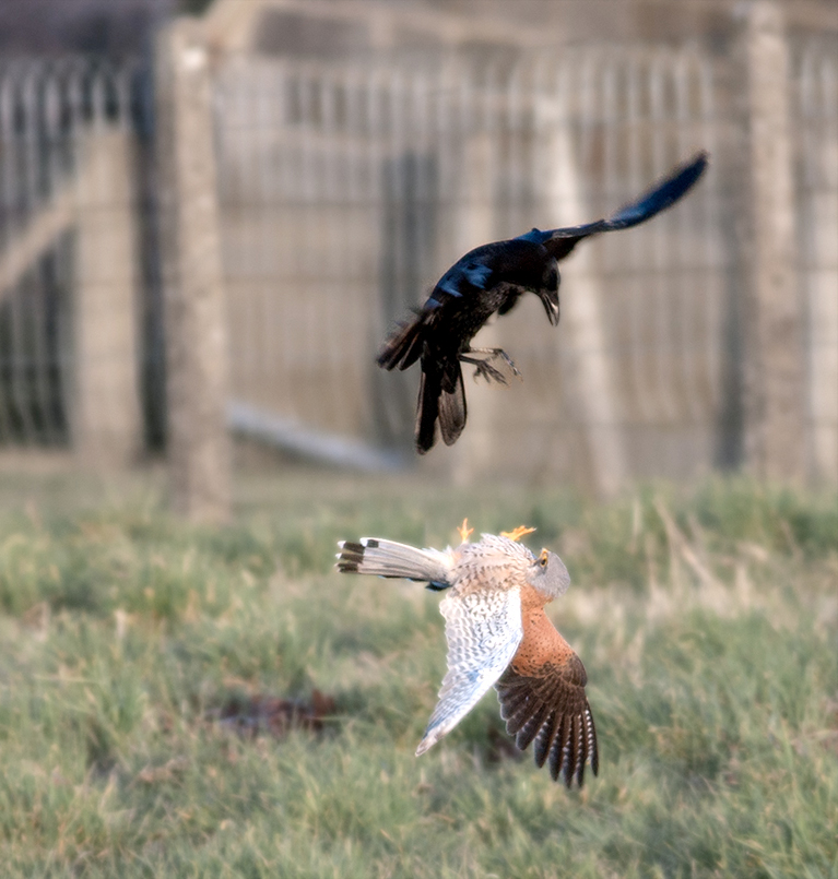
Thanks Brenda for your excellent feedback and ideas.
I'm with ya on the shutter speed, though I often shoot in Aperture Priority so it was likely slower due to the available light in the evening hour.
On the right vs left and cropping, you've made some good points. One reason I didn't like the first edit version is it felt too cluttered with the other bird and foreground elements. I was happier with this version as it isolated the birds. Though as you mentioned, there is a lot of empty space there.
Maybe an idea is to crop to a more vertical or square aspect. Here's a version with the birds flipped to original position and cropped for less empty space. The only issue is the frame cuts off a bit abruptly and there is not much room left from the original without getting some of those foreground objects. |
Aug 4th |
 |
7 comments - 5 replies for Group 78
|
7 comments - 5 replies Total
|


