|
| Group |
Round |
C/R |
Comment |
Date |
Image |
| 78 |
Oct 18 |
Comment |
Jason,
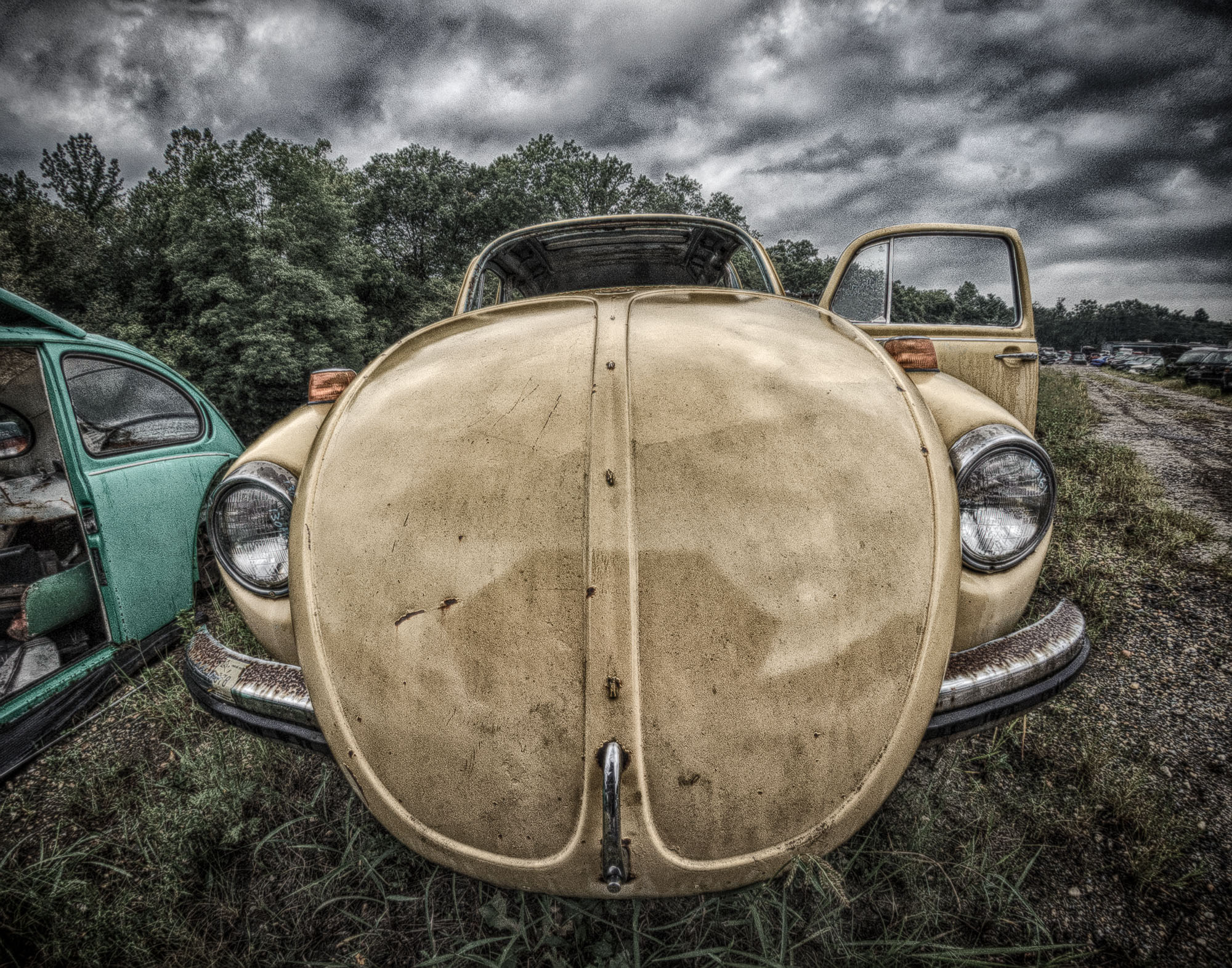
I like what you're trying to do here. I like the tobacco color however you end up using it. I suggest you take a look at the Post-Crop Vignetting slider in Lr. Perhaps with heavy "+" vignetting and a lot of feathering... your antique look might be enhanced. |
Oct 7th |
| 78 |
Oct 18 |
Reply |
I'm with you... it should be about what we like as well as what others think. |
Oct 7th |
| 78 |
Oct 18 |
Comment |
I like the shot. Brightening it up is essential. I like the crop as well. B&W works for me too. I like the lose hair on the crop a lot, but would clone them out on the vertical which is more formal for me. Adding a little background on the top of the vert might help as well. |
Oct 6th |
| 78 |
Oct 18 |
Reply |
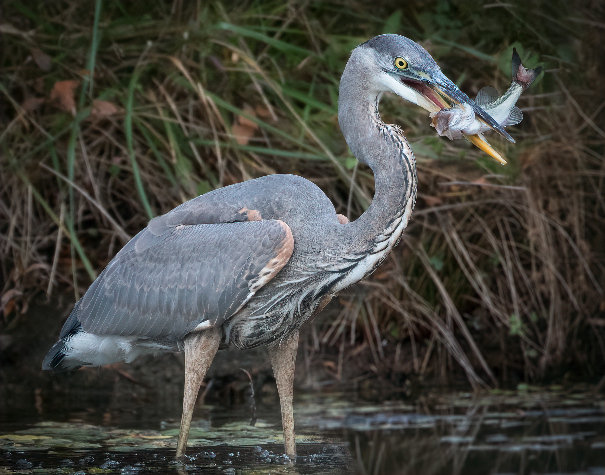
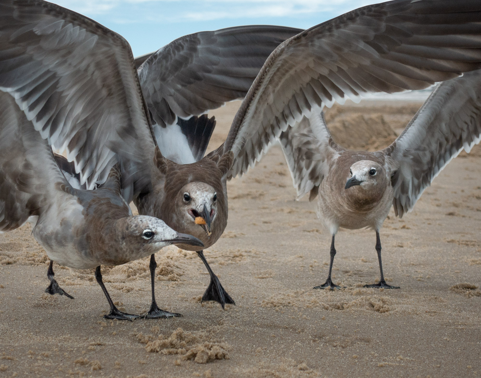
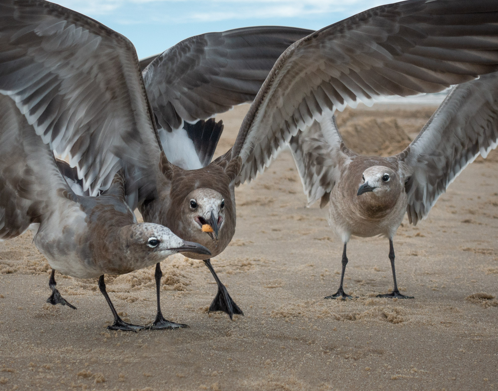
Jason,
I'm not quick enough with my point and shoot to control focus in an action shot. The camera did its thing and I was lucky it worked as well as it did. As you can see in the above, I worked on the eyes and beak with the sharpening tool to try and mitigate the situation.
Thanks |
Oct 6th |
| 78 |
Oct 18 |
Reply |
Richard,
I did as you suggested. I think it helps... Thanks |
Oct 6th |
 |
| 78 |
Oct 18 |
Comment |
Sunil,
I love the color and the crop. It might be easier to fix the shadow by cloning sand over the right end. You could shorten it a fair amount and it would still be long enough to be effective and make your point. |
Oct 6th |
| 78 |
Oct 18 |
Comment |
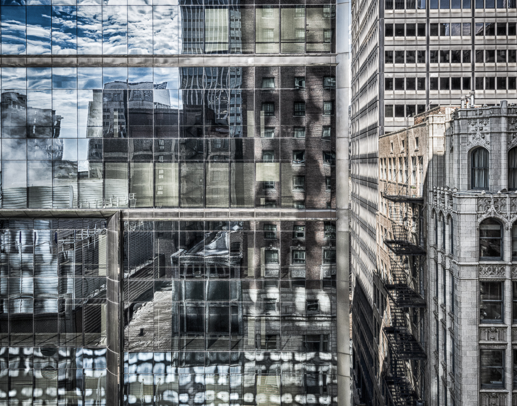
Thanks for sharing your image of an historic and important place. I remember where I was and exactly what I was doing when I heard on the radio that Kennedy had been shot. But,for me the image dose not transcend context. Without the story or a connection to the event it has little meaning. From a graphic point of view I find the post processing distracting rather than helpful. The lightness of the blue sky next to the building is for me, unrealistic. Is it HDR? |
Oct 6th |
| 78 |
Oct 18 |
Comment |
Brenda,
I too, like the tighter crop better. Two other things come to mind:
The image has a to the right tilt (not a political comment). I think I would straighten the tower at the very least.
And I would take out or extend the left most tail light streak.
|
Oct 3rd |
5 comments - 3 replies for Group 78
|
5 comments - 3 replies Total
|