|
| Group |
Round |
C/R |
Comment |
Date |
Image |
| 57 |
Sep 21 |
Comment |
Nice soft portrait with good color. I agree that it looks a little flat, maybe brush in some contrast everywhere except her face. For me, there are too many reflections/spots on the face, maybe just remove the one on her nose and the top of her cheek. Maybe a vibrance boost on the hat would add nice pop. And for sure, a vignette to darken the background would keep the viewers interest on the face. |
Sep 26th |
| 57 |
Sep 21 |
Comment |
Yup, love them 'ole tools, esp. the wooden handles, etc. Plastic just doesn't have the same appeal or texture. I don't mind the 'cluttered' look because that's the reality of many workshops. As others mentioned, added contrast would help bring out the detail. If you use software that breaks down Contrast adjustments into small, medium, and large, you experiment with sliders for different looks. I think that the wood could take more contrast adj. than the metal, could really bring out that cool wood grain. It sounds like this was a as-is photo shot, but if you had the opportunity to rearrange a few things, that may satisfy viewers like Marcela who see an abundance of subject matter, and long for a central point of focus. Maybe relocating the vertical piece of wood that in front, not sure what it is, allowing more view of the planer would make it a nice center. Just sayin.... but I still like it, the more tools the better, and wood, wood, wood, probably just a guy thing. |
Sep 26th |
| 57 |
Sep 21 |
Comment |
As others have stated, nice shot, good balance between the flower and bee. I agree that the be is a little dark but since the phone probably took the picture as a jPeg, there may not enough detail in that compressed file to open shadows - worth a try though. And I think the image could benefit from more Depth of Field, that f1.8 doesn't give you much to work with. I know the standard camera in most iPhones doesn't give you much creative control but there are other 'Apps' that allow the camera settings like aperture, speed, and even RAW file output to be implemented. I use the ON1 Mobile app on my iPhone because I also use ON1 software to develop/edit my photos but there are others. Take a look at Snapseed and/or Camera+, both are feature rich and open up a new world for iPhone users. |
Sep 26th |
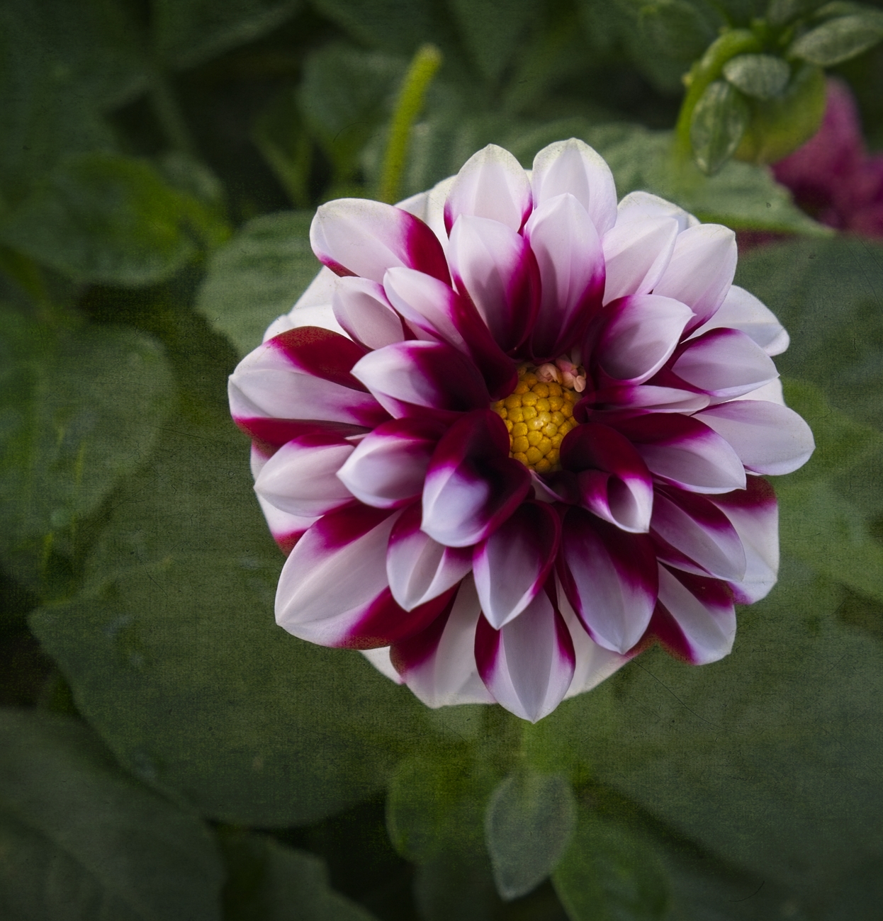
| 57 |
Sep 21 |
Comment |
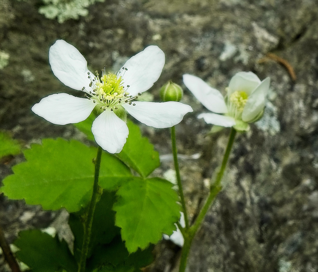
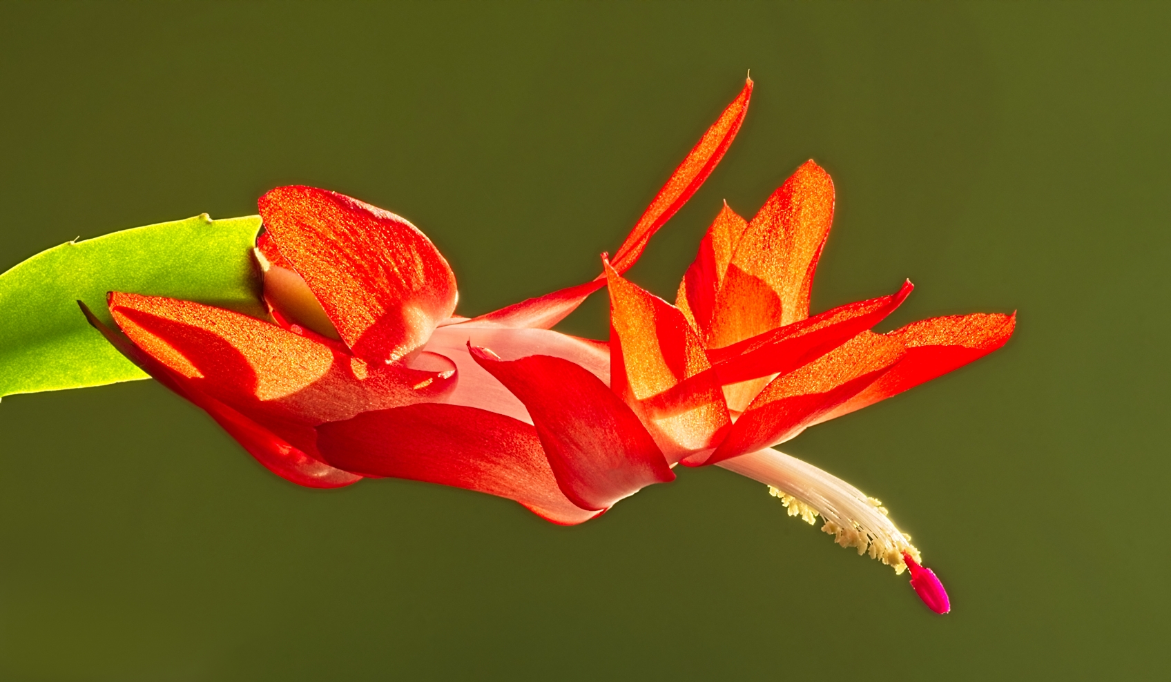
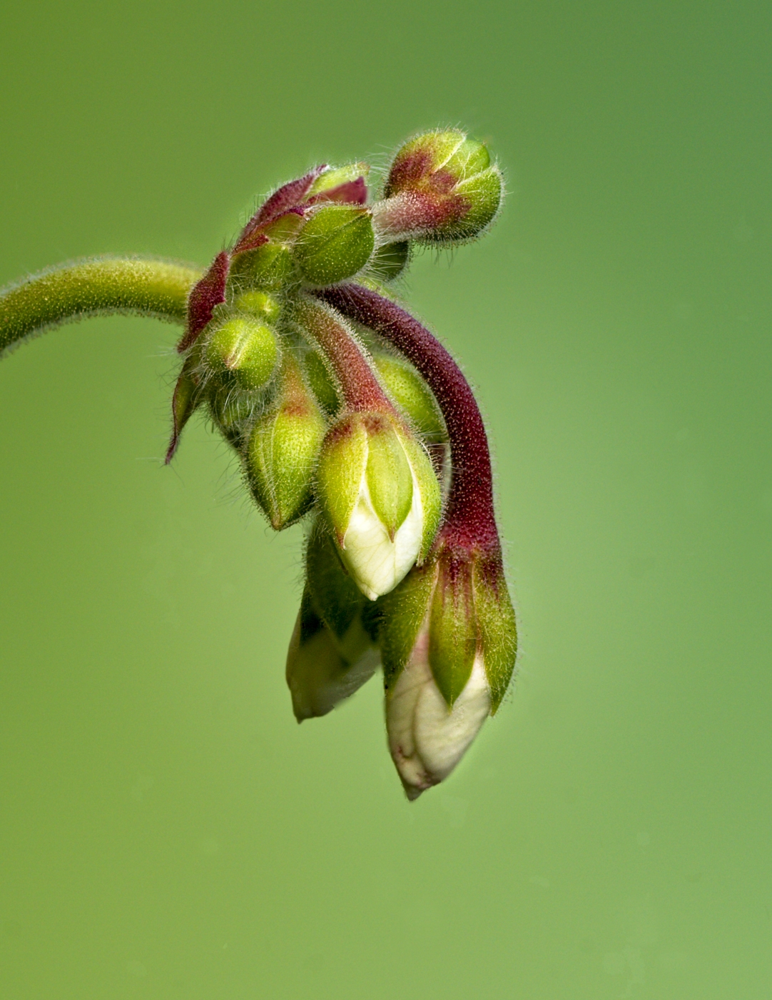
Nice capture Nelson. I like your vantage point of looking straight down on the flower which works well the the 1x1 format. I like the colors as well, nice blend between the purples and orange. My one suggestion might be, since the center of the flower seems to be the center of interest, more Depth of Field, IMHO, would strengthen the composition. Maybe there was not enough light, but f8 with a higher ISO could have given sharper center. The double line border with complementary color works well. |
Sep 12th |
| 57 |
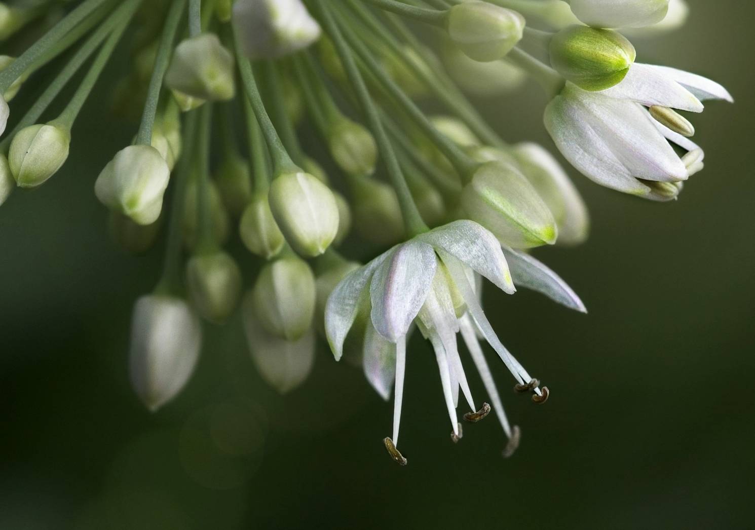
Sep 21 |
Comment |
Beautiful shot, Cindy. I agree with Andrew. The white against the green make a nice stand out contrast. And the circular path of the white flowers really draws my attention. Your presentation with the rule of thirds works well for this image. |
Sep 12th |
| 57 |
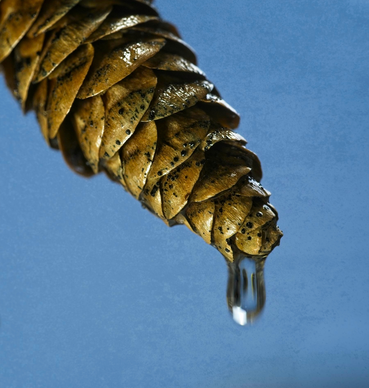
Sep 21 |
Comment |
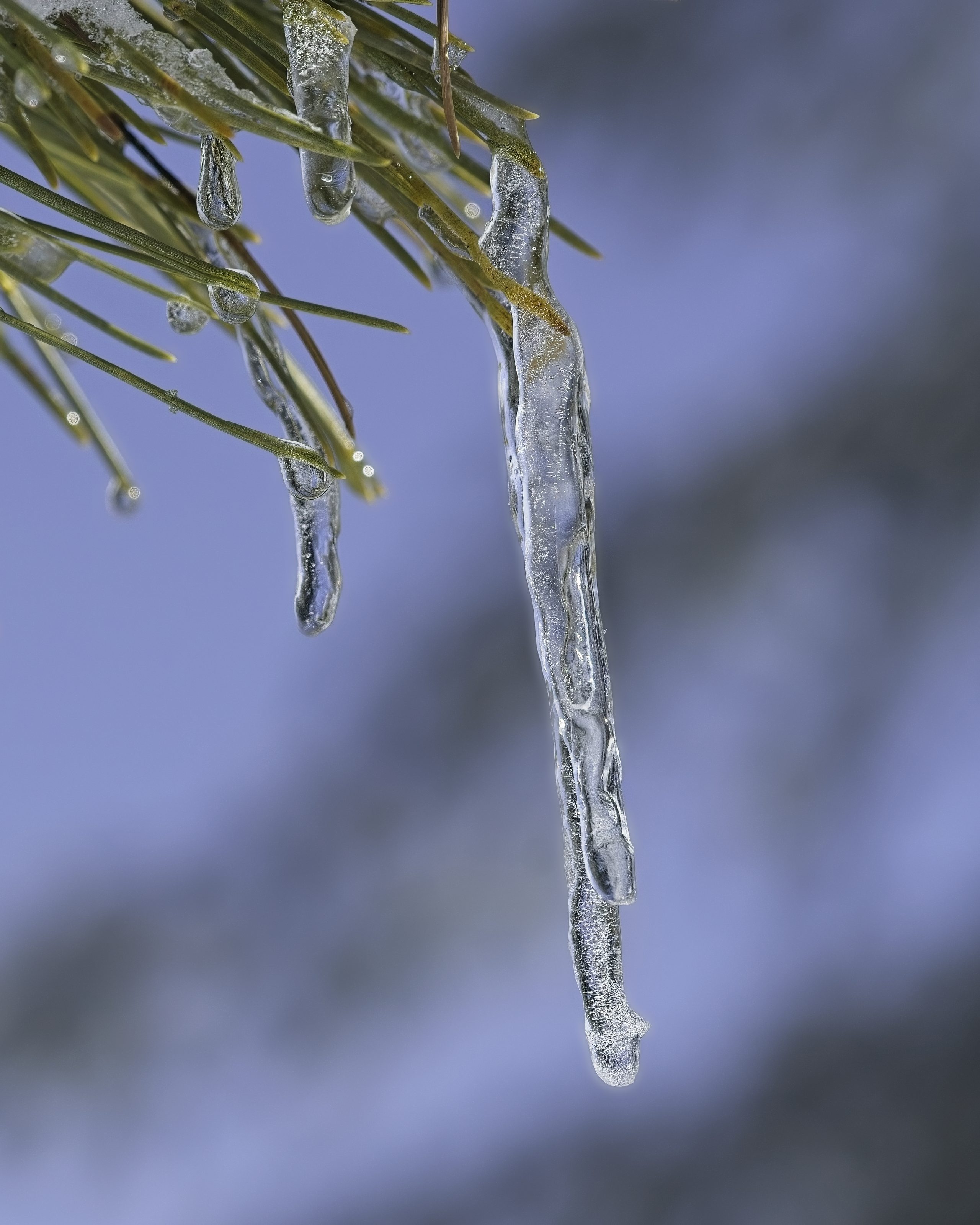
Nice capture with your phone camera, they are getting better and better. Since the stem and drops are the main focus, getting in closer, as Cindy stated would make a stronger composition. If you crop, maybe try making the stem go diagonal across the frame instead of horizontal. |
Sep 12th |
 |
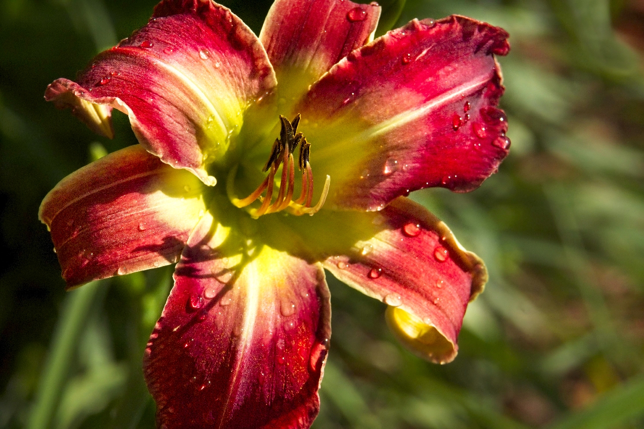
| 57 |
Sep 21 |
Reply |
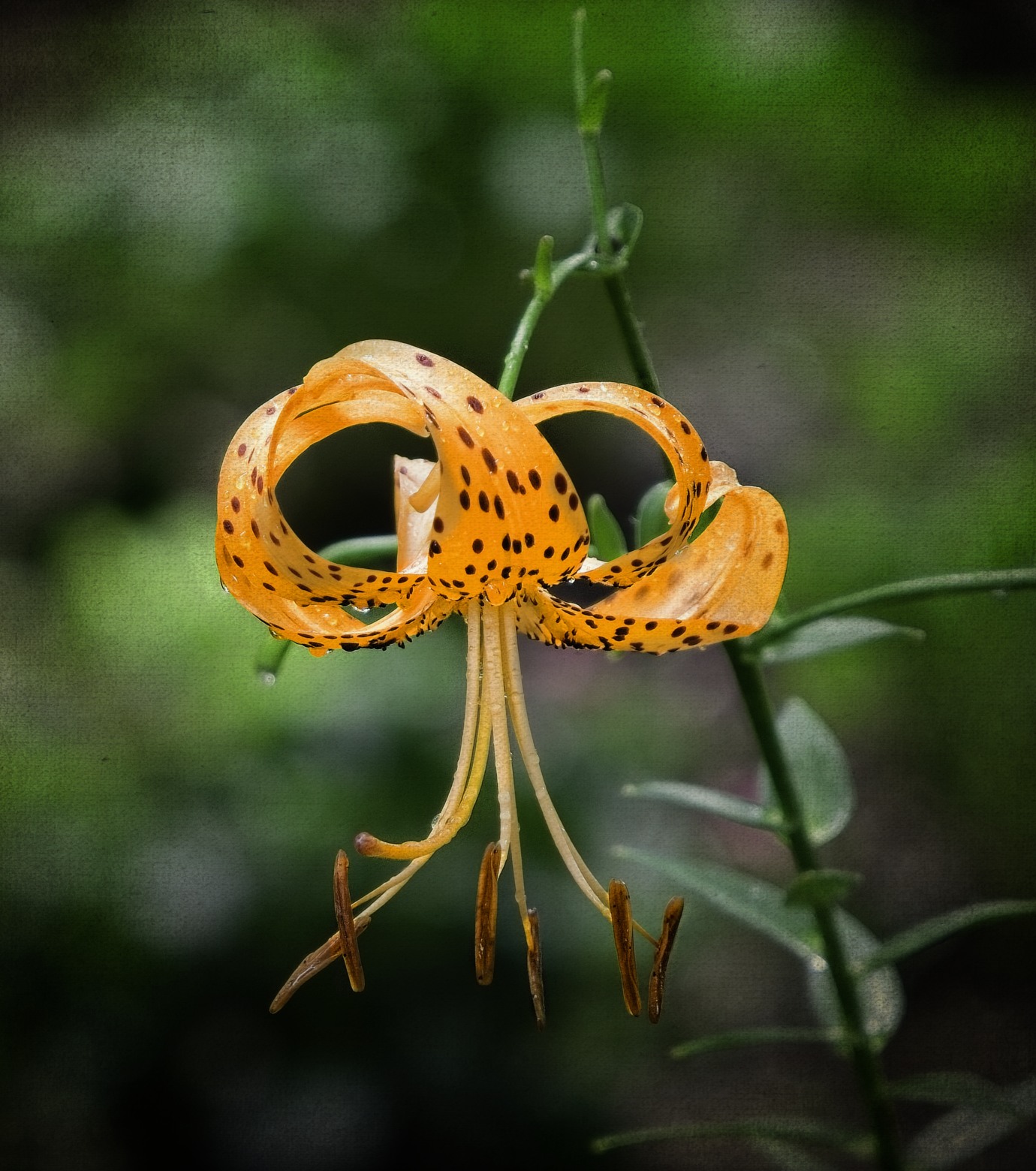
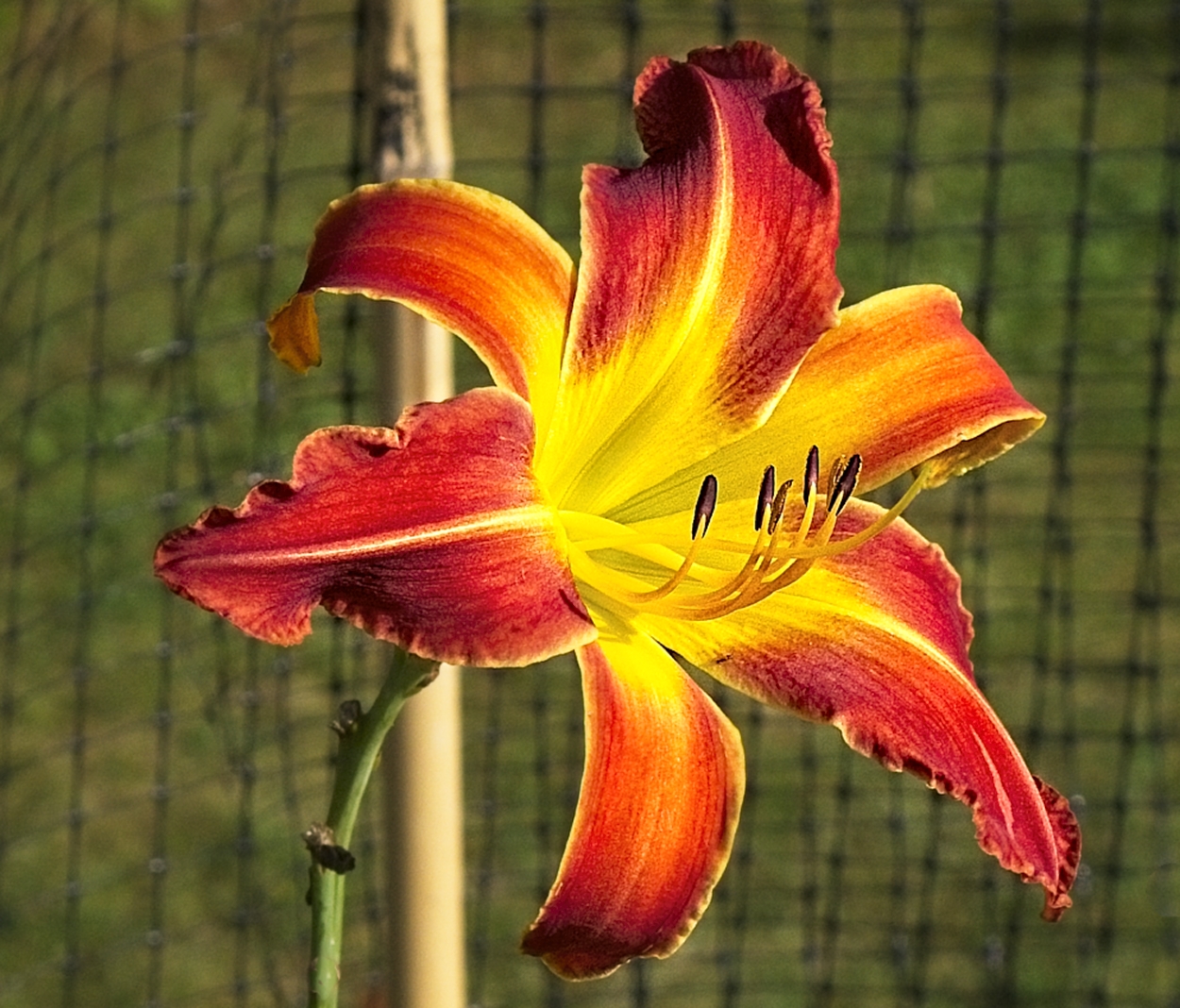
Thanks Andrew. Good point on light vs dark colors. The shot was a as-is garden photo, so the background is part of the garden. I appreciate your view on the supporting structures. We have had fun with the hybrid lilies this year. |
Sep 9th |
| 57 |
Sep 21 |
Reply |
Thanks Cindy, I understand your point. Next season I'm going to experiment with different backgrounds. |
Sep 9th |
6 comments - 2 replies for Group 57
|
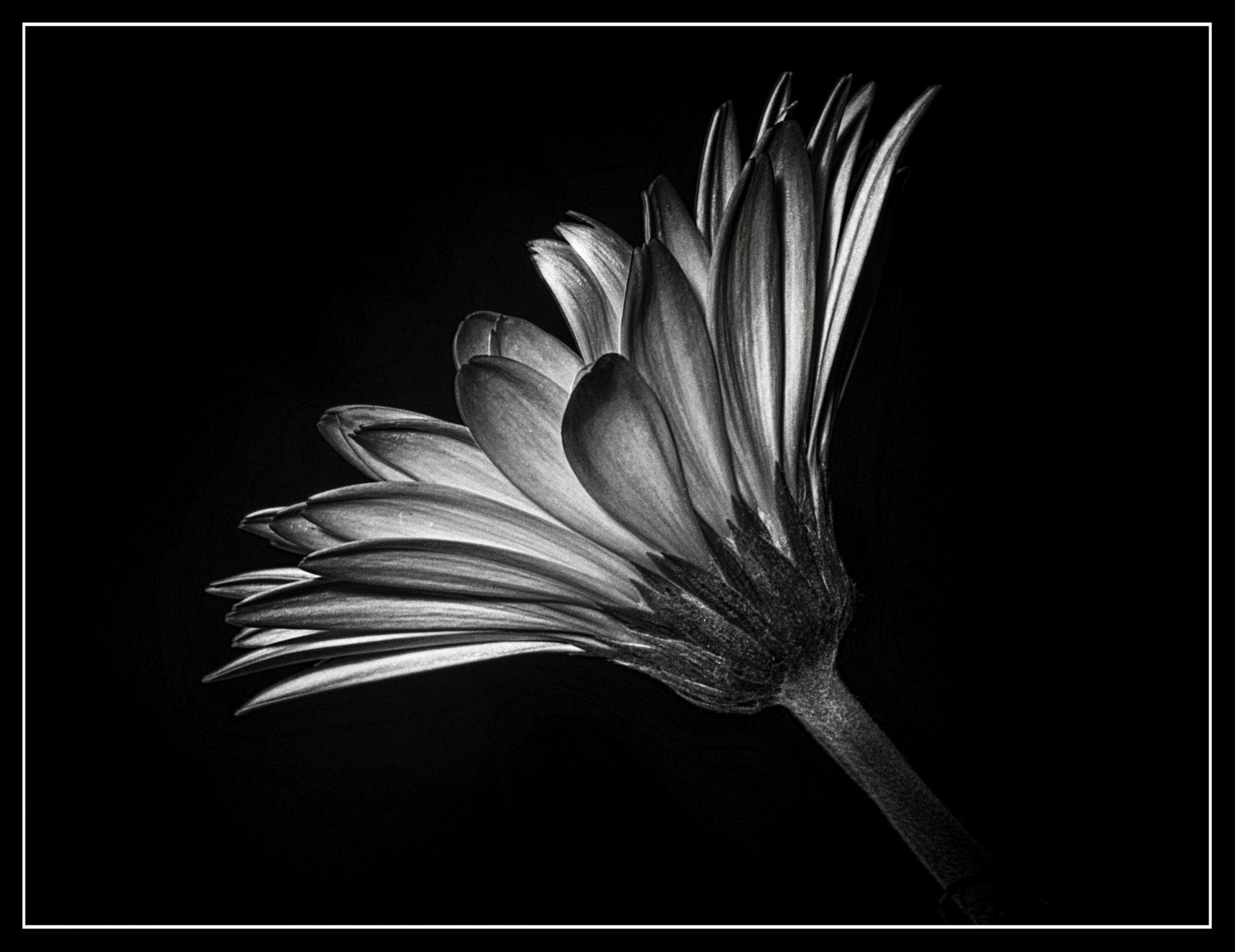
| 95 |
Sep 21 |
Comment |
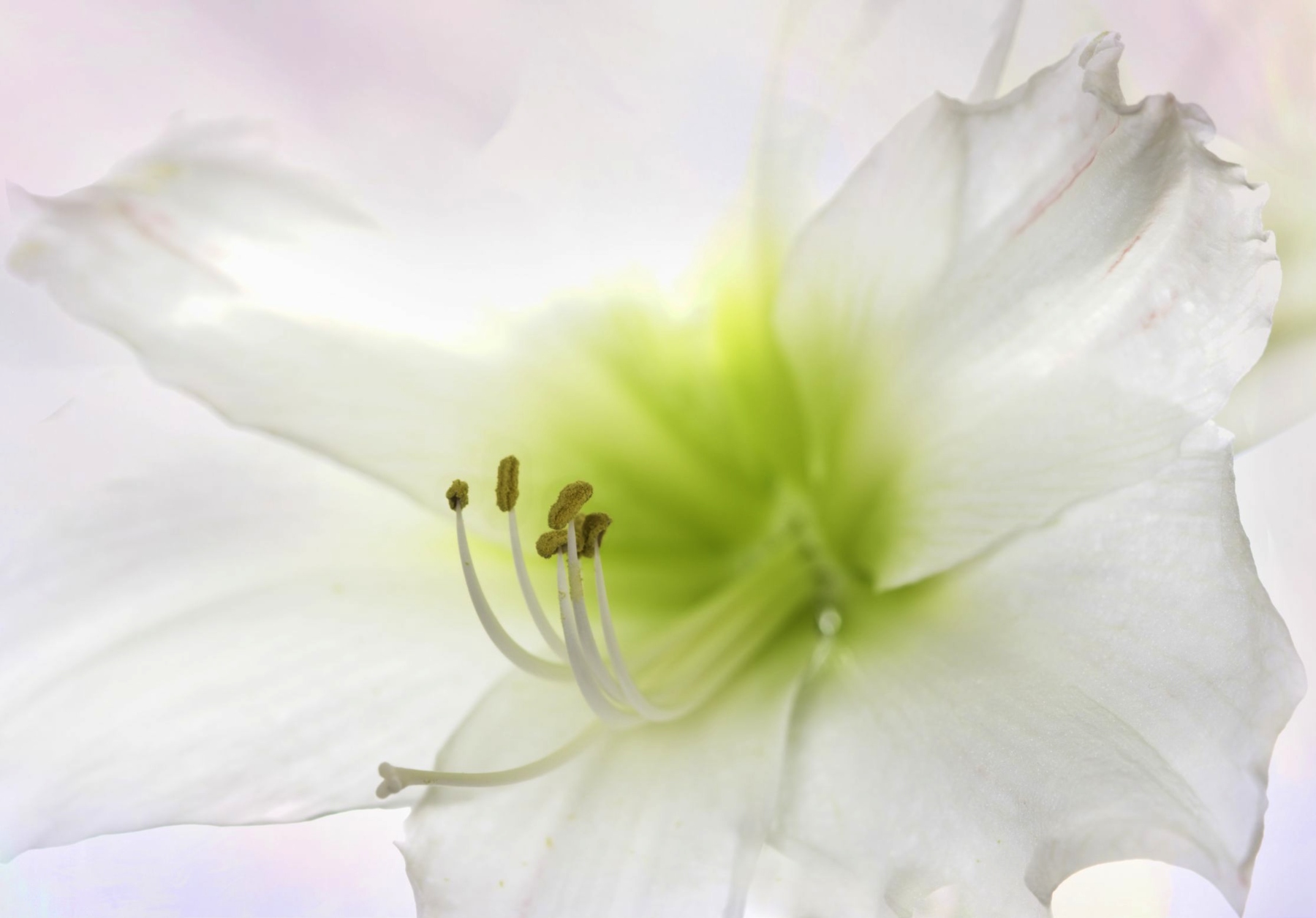
Nice capture, Bill. White flowers can sometimes be difficult in the 'wild'. No blow outs on you hilights; luv the lines in the petals, act as leading lines to the center. I like what you did with the background; never heard of using the Diffence blend mode in that way, nice ! The only thing I might think about is maybe boosting the 'yellows' brightness/vibrance on the Stigma/style a little more than you did with your burn. |
Sep 26th |
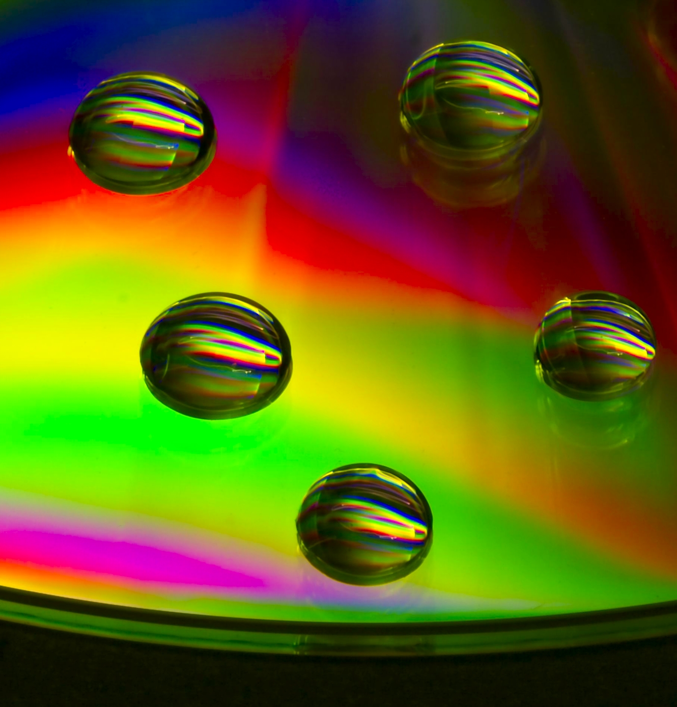
| 95 |
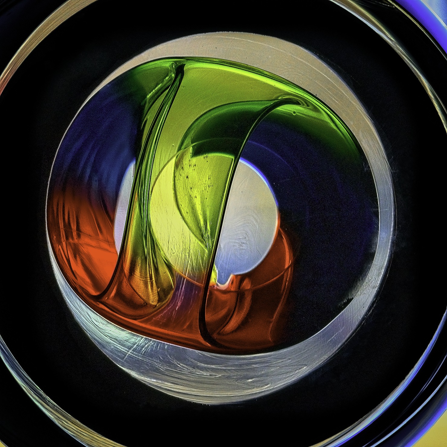
Sep 21 |
Comment |
Wow, nice shot and a cool idea. Seen many oil/water shots that give that bubbly impression but this is nice, it's different, seems to have more depth. How do you like that Nissin ring flash? Got my eye on that, but now Godox..... has that new MF12, what to do, what to do..... |
Sep 26th |
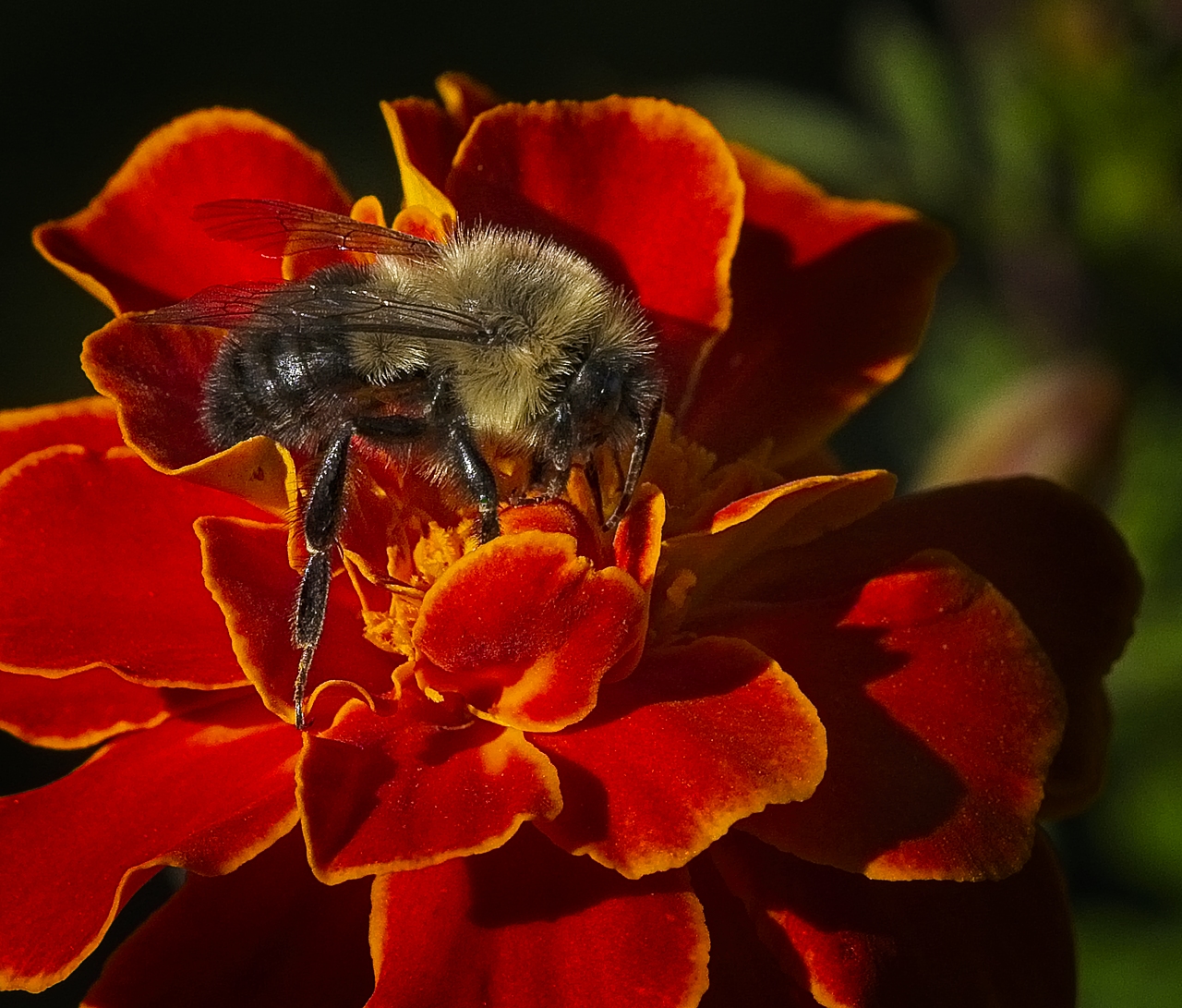
| 95 |
Sep 21 |
Comment |
Nice image, you got that dreamy thing goin again this month. As Stuart mentioned, I too like your original crop, it's the artsy photo that magazines love. But I also agree with Stuart, the bee is the subject. It brings us back to over beaten subject of close-up vs macro, ugh. But you nailed that bee, hand-held - great job. Also pretty amazing DOF for f4. |
Sep 26th |
3 comments - 0 replies for Group 95
|
9 comments - 2 replies Total
|