|
| Group |
Round |
C/R |
Comment |
Date |
Image |
| 57 |
Jul 19 |
Comment |
Hi, just visiting from group 60, luv the capture, Cindy, well done. The vertical (portrait) format is perfect for the image. Very sharp, nice color. |
Jul 13th |
1 comment - 0 replies for Group 57
|
| 60 |
Jul 19 |
Reply |
Thanks Bill, you are right, the newer digital are better at handling higher ISO. I have to force myself to go this route; I'm fighting my built-in bias. I've been shooting more and more at ISO 800 and getting nice results. For sure, a shutter speed of 1/1000 would be better I think for those moving butterflies and others. I was out shooting some flowers yesterday, and a bee came into view. Increase my shutter speed; didn't have time to adjust camera to auto-continuous tracking but will be loading and viewing those shoots now to see if I got anything decent on that moving bee. Thanks again. |
Jul 25th |
| 60 |
Jul 19 |
Comment |
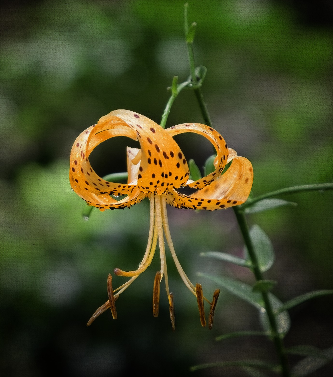
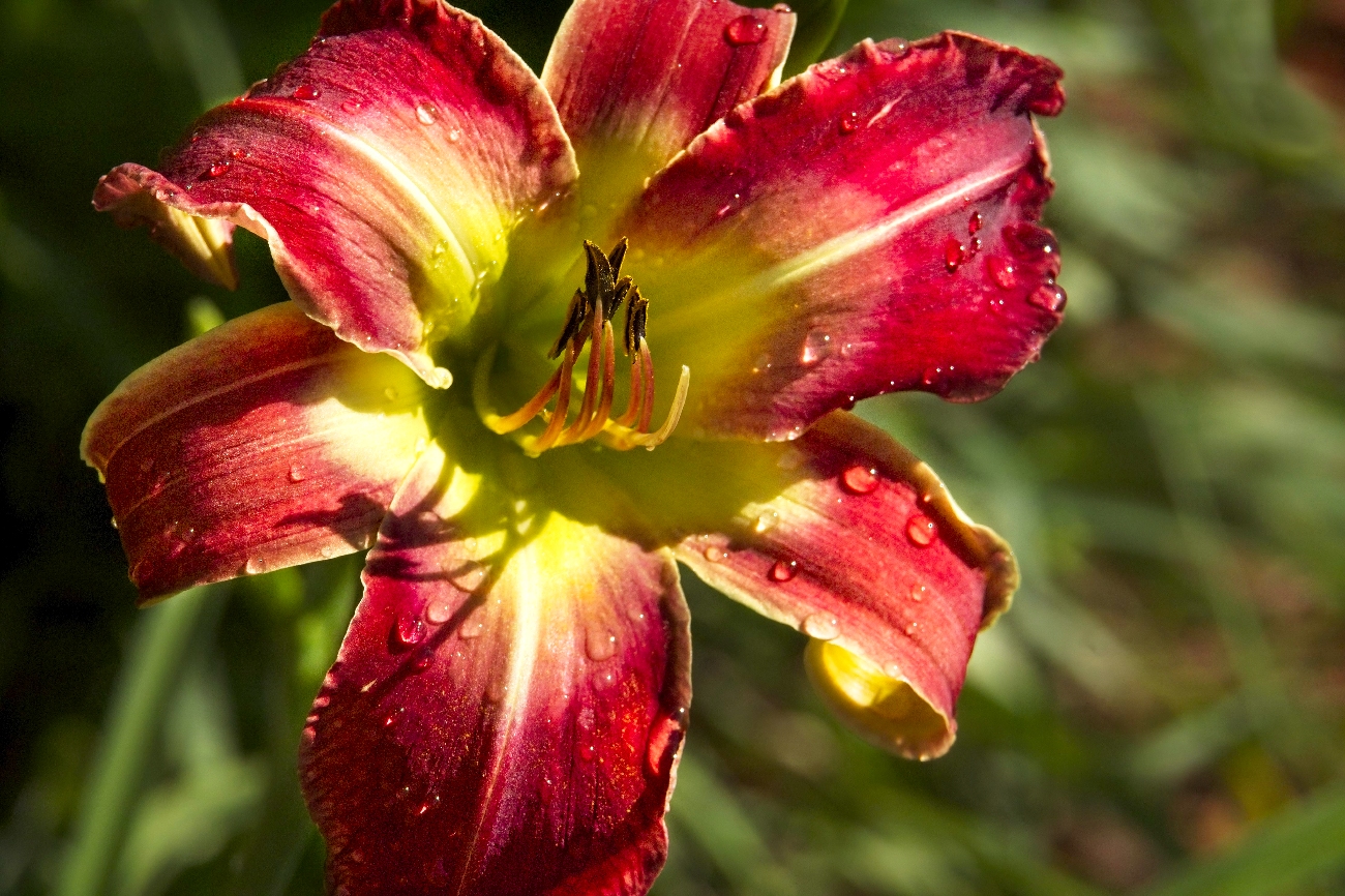
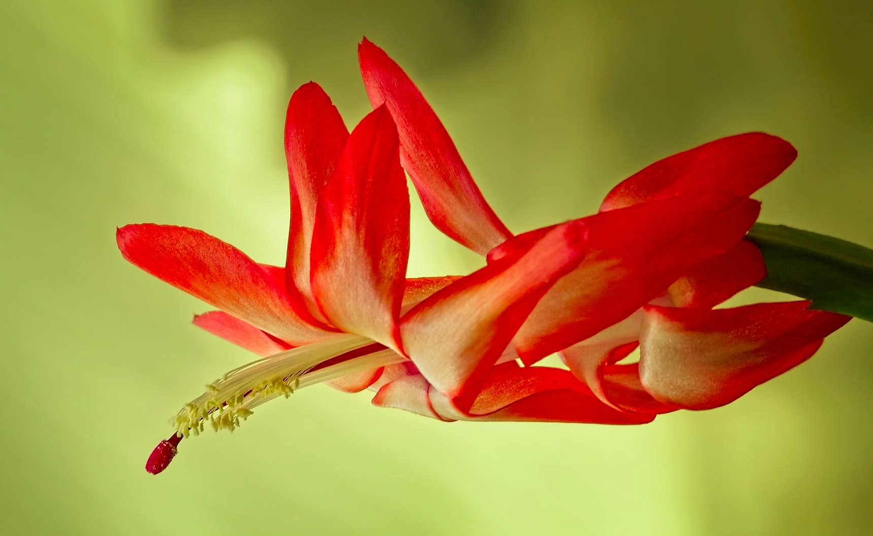
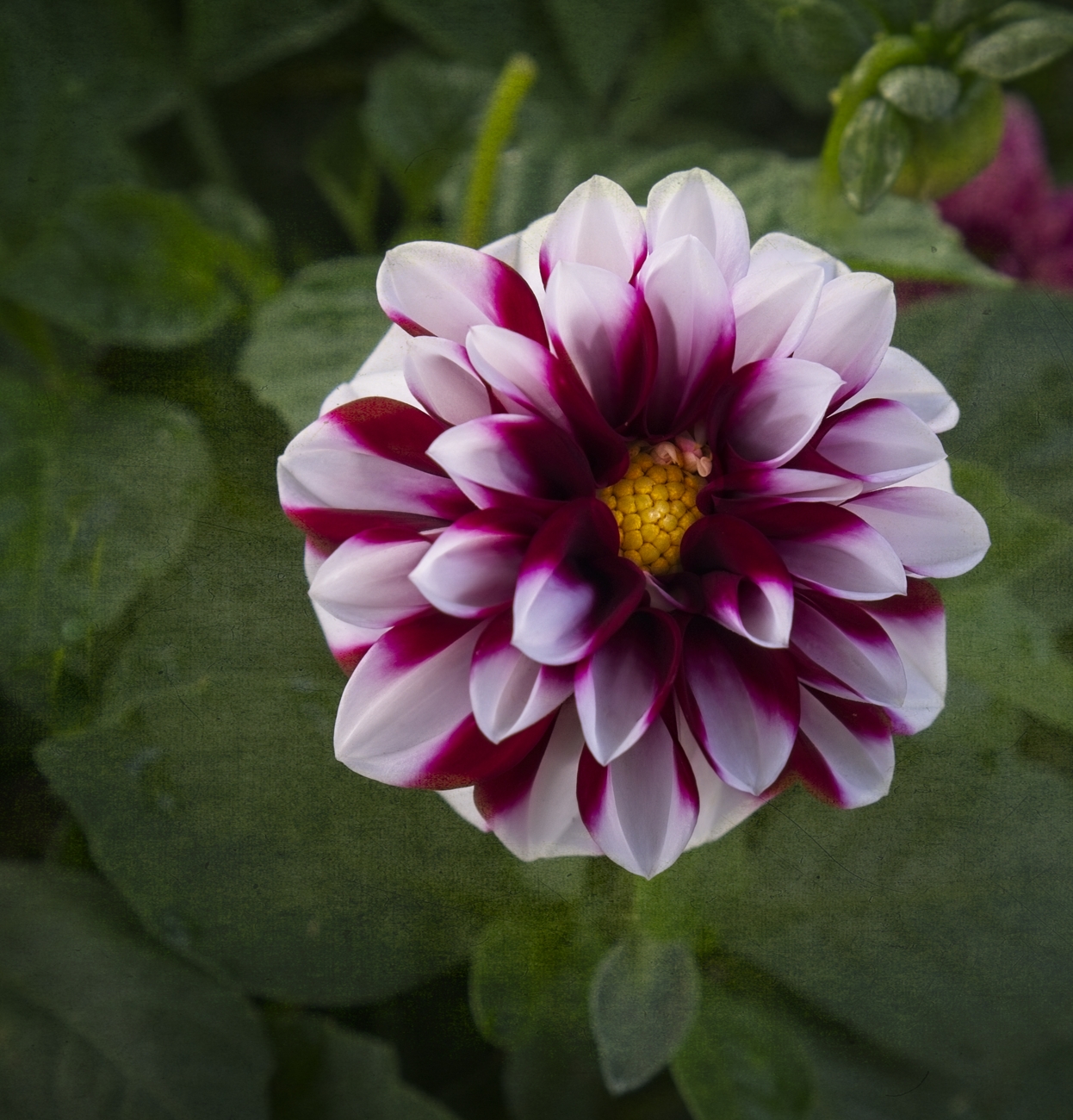
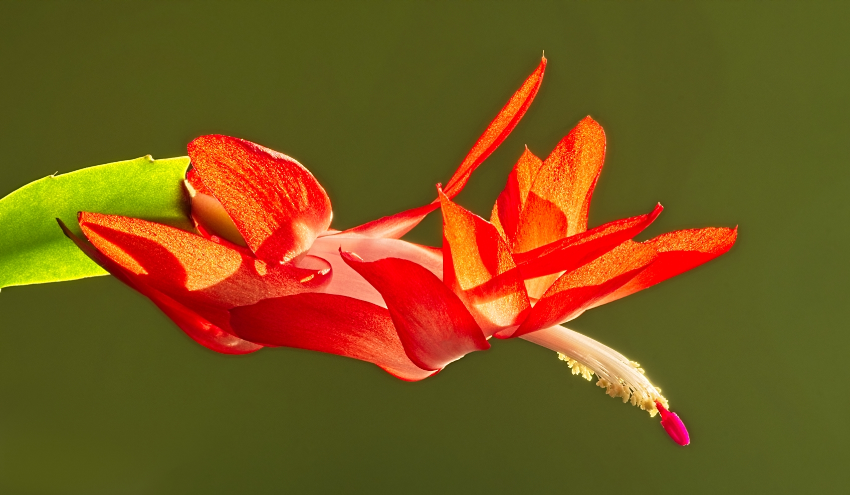
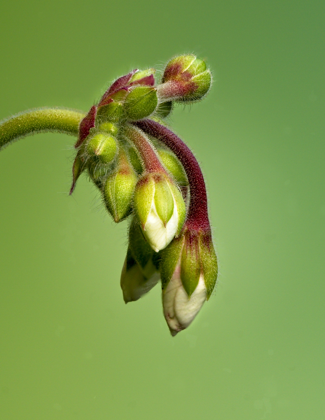
Very nice, Denise. I luv you interpretive styling on this image. As others mentioned, the dreamy, softness does invoke emotional responses from the viewer. I like the darkness of the red petals, maybe it's too much but it sets the mood. Maybe to give the boast Carol was talking about, just brighten the center stamens and then add in a little more vibrance. This might give an overall separation of the stamens from the framing of the red petals. |
Jul 13th |
| 60 |
Jul 19 |
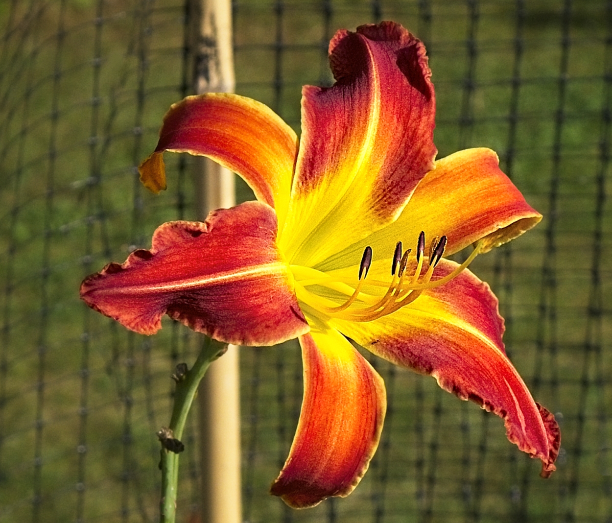
Comment |
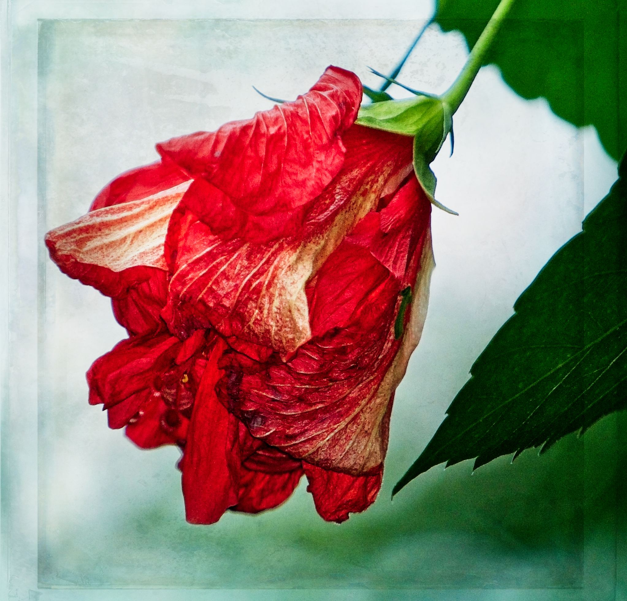
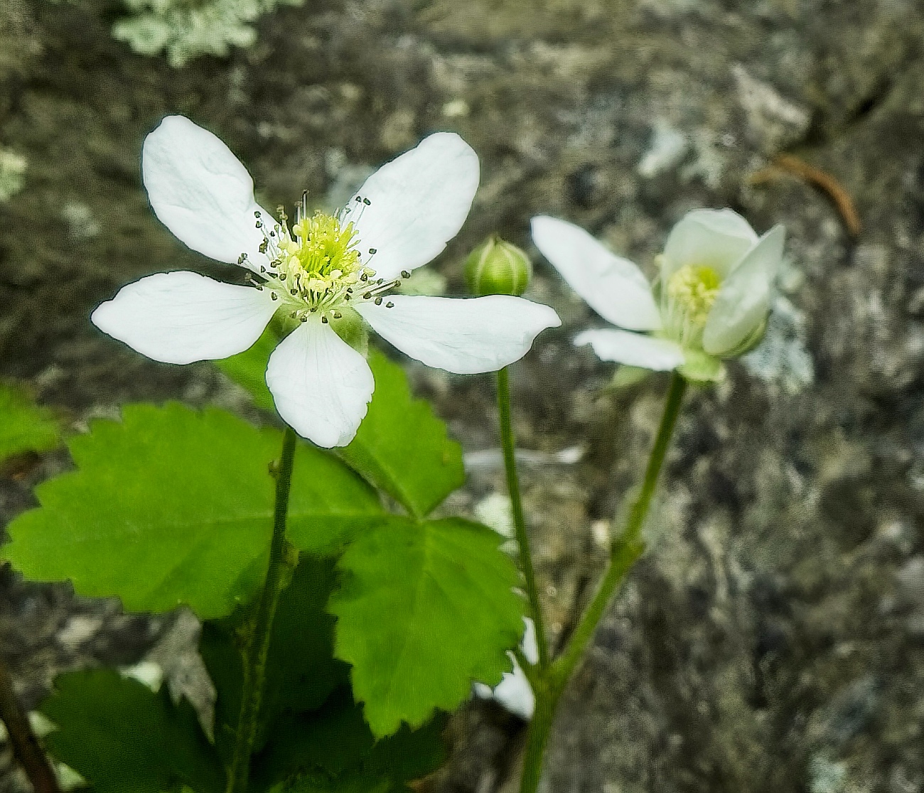
Nice image, Bill. Red flowers make such great subjects. I agree with the others that you captured the center focus perfectly. I'm with Carol, in that the foreground softness is not a fav approach for me, although I see a lot a macro photographers go this route. To address Carol's comment; I wonder if you flip the photo over, so that the in focus background, would be your new for foreground, and the new background would fade to soft might be an interesting alternative. |
Jul 13th |
| 60 |
Jul 19 |
Reply |
Good point Denise, would like to see the original to see how much cropping there was. |
Jul 13th |
| 60 |
Jul 19 |
Comment |
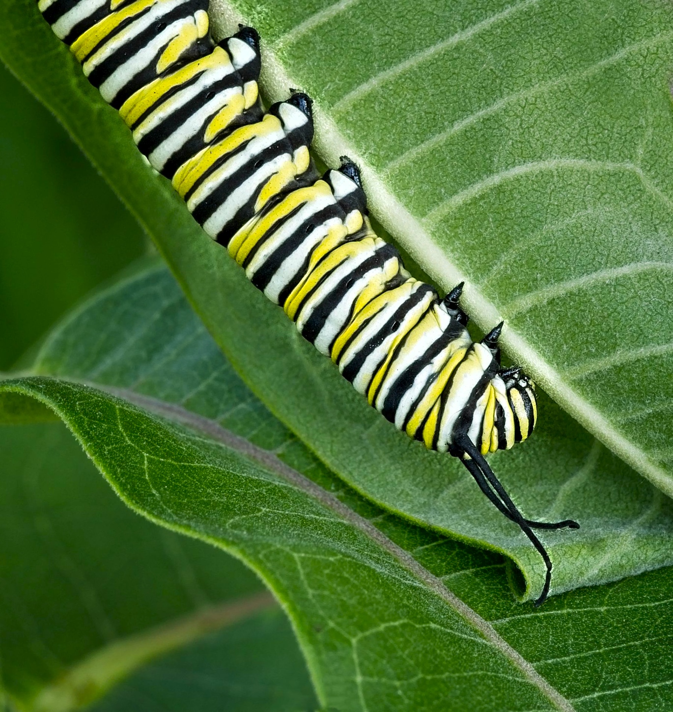
Very nice image John. I agree with the others, your composition is great, I luv the perspective - that I'm coming for 'ya approach. The wide angle lens may have added some distortion but if so, it works to advantage in emphasizing that long "snout", as does the selective focus and the ring flash. Nice even illumination from the flash. And I like the wood grain lines coming in from the bottom left, making a nice leading line for your central focus point. |
Jul 13th |
| 60 |
Jul 19 |
Comment |
I heard so much about Longwood Gardens, I know that Mike Moats goes there a lot and does workshops. I love this image, simple but effective. The center sharp focus really makes it pop. As Carol says, its very enjoyable image for the viewer. You controlled the lighting very well; I would have never figured a flash was used if you h hadn't mentioned it. My only suggestion might be to lighten up the center if you ever print this image. |
Jul 13th |
| 60 |
Jul 19 |
Comment |
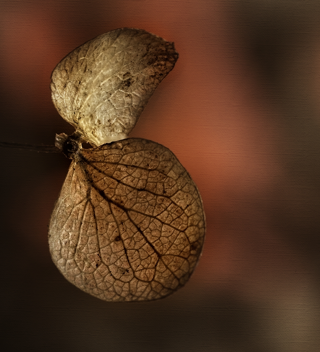
Nice image, Carol. I have a yard full of these guys and they are getting rambunctious. As mentioned above, I think the composition is perfect, your use of selective focus put the emphasis where it does the most good; his face, eyes, whiskers, all are sharp and really bring out his personality. I had a judge comment on a bird shot I entered into a contest one time where I had "cut off" part of the bird to focus attention on the head/ beak/eyes, so I wonder in that situation, whether the tail and leg going off the side and top would bring comment in competition. I think the soft focus you used handles that situation very well. It would be interesting if we could get some feedback from other PSA members who do print competition and/or judging to get some additional insight. |
Jul 13th |
| 60 |
Jul 19 |
Reply |
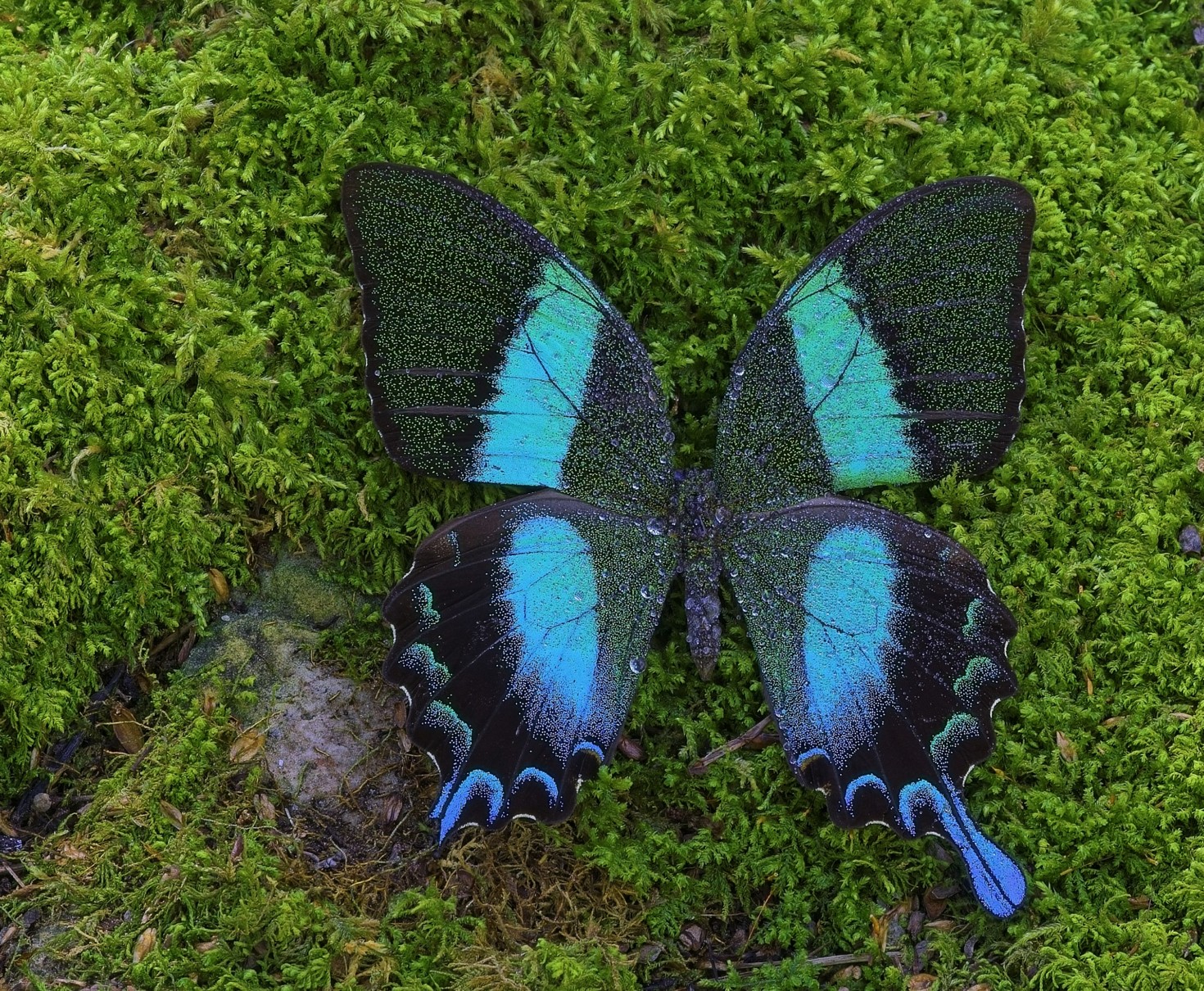
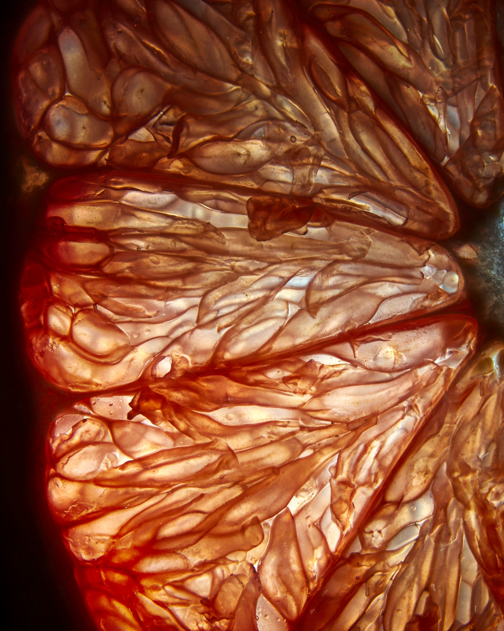
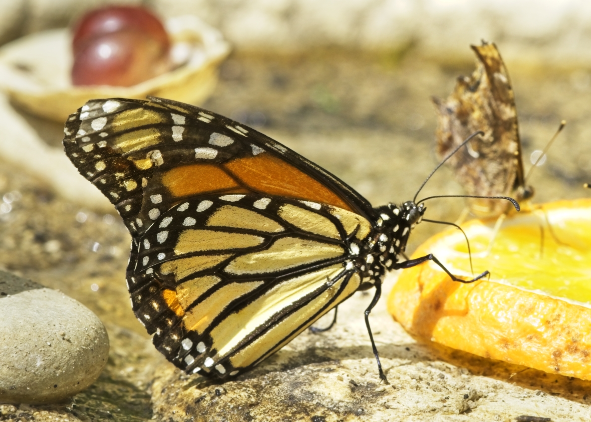
Thanks Bill. Trying to get things sharp when this close and hand-held is still a challenge for me. As mentioned above the image was over exposed to make sure I got some detail in the body and head but for sure made the background too hot; I did reduce it some in post but will try again to bring it down more. If I carefully mask the butterfly, I think that should help. If that red blob in the background is the stone your talking about, it's actually a grape. I did add some blur to it, trying to reduce it's impact but as with the rest of the background, everything is too bright. I may try working with the blending modes to see if I can tone things down. |
Jul 13th |
| 60 |
Jul 19 |
Reply |
Thanks John, as mentioned above, I thought the haziness was just me not seeing clearly but I'm going to try clarity or micro contrast adjustments and see what happens. May post a follow up, if I can get it to look better. |
Jul 13th |
| 60 |
Jul 19 |
Reply |
Thanks Carol. I did play around with the black, esp. an mentioned above, the original was over exposed for the background. When brought down the highlight slider, I thought I introduced some gray into those wing white spots, so I tried to bring them back to "normal" with the whites slider - that may have been too much. I didn't add much to the mid tones with clarity, as I remember but I'm going to go back and give it a try. I'm seeing more and more haziness lately because my cataracts have reached that point were it is affecting my vision, so surgery may be needed. |
Jul 13th |
| 60 |
Jul 19 |
Reply |
Thanks Denise, for sure the whole shot was over exposed. I was so intent on filling in the shadows, I neglected the highlights. If you think this posted image is hot, you should see the original <;-). I did bring the brightness down but it's too pretty bright, I agree. I need to figure out an easy way to diffuse that LED light I have because it's not adjustable; maybe I'll just put a white plastic over it and see if that tones things down a bit. |
Jul 13th |
5 comments - 6 replies for Group 60
|
6 comments - 6 replies Total
|