|
| Group |
Round |
C/R |
Comment |
Date |
Image |
| 78 |
Apr 20 |
Reply |
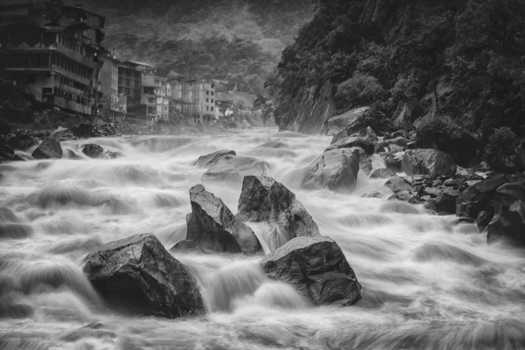
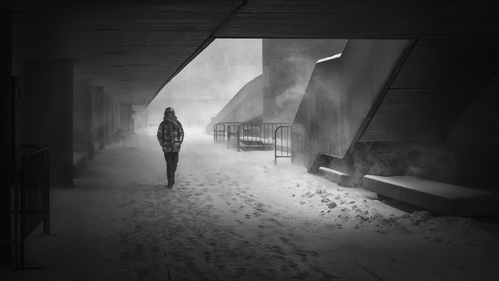
Not much to do on the post-processing. As I responded to Terry, two major change, 1) adjust the white balance to make it a bit cooler, 2) increase the details of the foot print.
That turns out not very successful. The reason why I try highlight the footprints is because 1) I tried to leverage it as another leading line, and 2) the surface of the bridge opens a large white area, which seems not good either.
As a conclusion, this kind of perspective/composition is not easy to manage.... |
Apr 7th |
| 78 |
Apr 20 |
Reply |
I think that cleaning up the sky gap at the edge is important.
Well, I do agree that when using the leading lines, it looks nicer to have something at the end of the lines. But do we feel bored to always have that, just like my picture in this month? Sometimes we do...
So, for your picture, if the purpose is to show a peaceful, calm green world, then I feel OK to leave it empty. To reduce the tunnel effort, maybe you can experiment to reduce the light at the end, and lighten the green in the middle, so the the eyes will go around the green, instead of immediately go directly to the end. With careful arrangement of the lights, this can be a nice picture.
Same thing to my picture, if my purpose is to show a calm and peaceful snow morning, I can remove the couple... It should work too, just a bit harder to manage. |
Apr 7th |
| 78 |
Apr 20 |
Comment |
Hi Terry. This is a nicely done post-processing. Very Nice. Other than the dirty area on the left hand side of the mat, the picture is perfectly done.
Though, here is my feeling. With the little dog sitting in such a clean and symmetry picture, I felt a bit lonely for her.
I would keep the original picture with very small change, 1) crop the bottom a little bit to get rid of the white line. 2) Remove the door corner at the left hand side. That is it.
Very interestingly, above is what had been in my mind when I first looked at your picture. But I haven't put down the words as I was busy.
Then I saw Jason's response to the 'little odd' thing...hmmm...the 'imperfection' is the right word to my approach.
The reason why I would keep the towel, chair, windows, etc. is because that imperfection makes it called HOME. That is where the warm and comfort comes from....
Cheers and stay safe...at...home. |
Apr 7th |
| 78 |
Apr 20 |
Reply |
Thanks Terry for your revision. You know.......there are two major things that I have done for the post, 1) added a little blue color for the snow world to make it cooler...and 2) increased the details of the footprint... LOL... seems that you like neither of them.
But they are valid points. I take them. Thanks. |
Apr 6th |
| 78 |
Apr 20 |
Reply |
Thanks Jim for your revision. Even though I tended to keep a cooler tone for snow world, I have to say that your revision looks great to me... thanks. |
Apr 6th |
| 78 |
Apr 20 |
Comment |
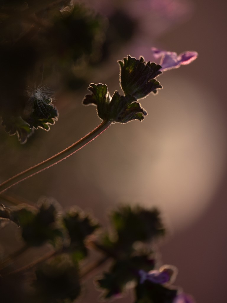
Hi Jason, you have a good photography eye and a kind heart for the nature. It turns our daily scene into an artistic image. Well done. I love it, even if in some aspects it might not be a 'perfect' image.
Even though I like the dandelion orb effect, it separate the image into two parts. To overcome that I turned the image 90% degree to make the main flower the center of the image.
I tried to cut the flower at the edge, but the flower seem lonely, and it doesn't look like there are many such flowers, so I tend to just keep them.
Cheers and stay safe. |
Apr 6th |
 |
| 78 |
Apr 20 |
Reply |
Hi Jim, I like it. Though personally I feel that the push is a bit too strong. I might do it in a softer way. I do like what you had done though. Thanks.
P.S. I changed to another computer with color calibration done. This revision looks good there. So it should be good. |
Apr 6th |
| 78 |
Apr 20 |
Comment |
Hi Sunil, this is a very powerful image. It is worth to do some work on it even if the original image quality might not be good.
I really like the rocks and the human figure. The muscles, the sitting pose and even the cloud are all in the good shape. Putting it into BNW is also a good fit for the expression.
For further experiments (unfortunately even I had downloaded the RAW file, mistakenly I still worked on the small file. Though it doesn't matter, I hoped that it still showed what I thought.)
1) While the rocks are strong enough, I wanted to show that the sky is also powerful. The truth is that the world is too big and human beings are too small. So I would expand the canvas with a large area of the sky. I might turn the picture to portrait mode to show the huge sky. I once wanted to push to an extreme to just keep a tiny portion of the rocks. End-up I gave up that idea to get to some level of balance.
2) Even BNW might be a good fit, I still like the color version, because it is a good contrast with the yellow ground and blue sky.
Here is what I thought. Cheers and stay safe. |
Apr 6th |
 |
| 78 |
Apr 20 |
Comment |
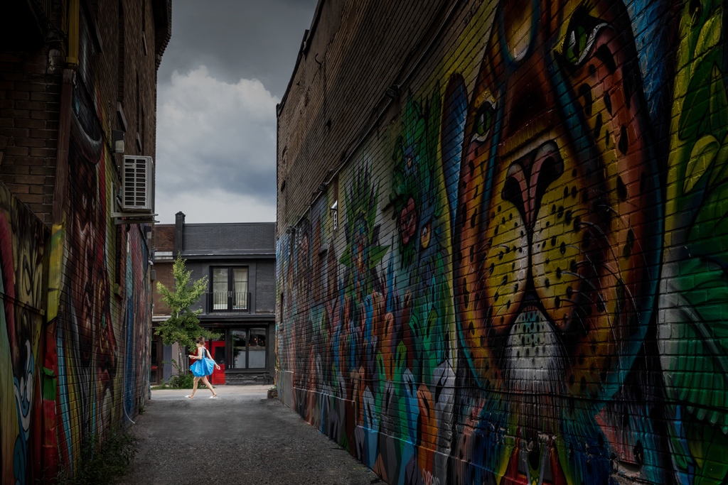
Thanks again for sharing your photo adventure.
The post-processing is amazing. I like the mood and the color. Very nice.
To do some experiment, I have tried the following...
1) I use free transformation tool to pull the left hand side down a little bit, so that the left bottom corner has some green. I believed that cloning some plants there will do the same.
2) I don't like the little sky gaps in the corners, except those in the middle, so I stamped them out. The purpose is to reduce those bright spot distraction.
3) I lightened the end of the path a little bit, and the eye is led to that end.
Cheers |
Apr 5th |
 |
| 78 |
Apr 20 |
Comment |
Hi Jim, it is a nice street picture. I like the color, the composition, the frame of the background and the captured moment of the couple.
I think that the revision with the soften skin is certainly nicer.
It might just be my personal preference that I tend to cut the bottom a little bit. For the background, it is a little busy to me. I think that Terry has a creative way to change it. If no object modification is preferred, I would manipulate the color saturation and luminance of the background to make the couple pop a bit more.
The true is though nothing need to be changed for your revision... cheers. |
Apr 2nd |
 |
5 comments - 5 replies for Group 78
|
5 comments - 5 replies Total
|