|
| Group |
Round |
C/R |
Comment |
Date |
Image |
| 78 |
Mar 20 |
Reply |
Congratulations! |
Mar 15th |
| 78 |
Mar 20 |
Comment |
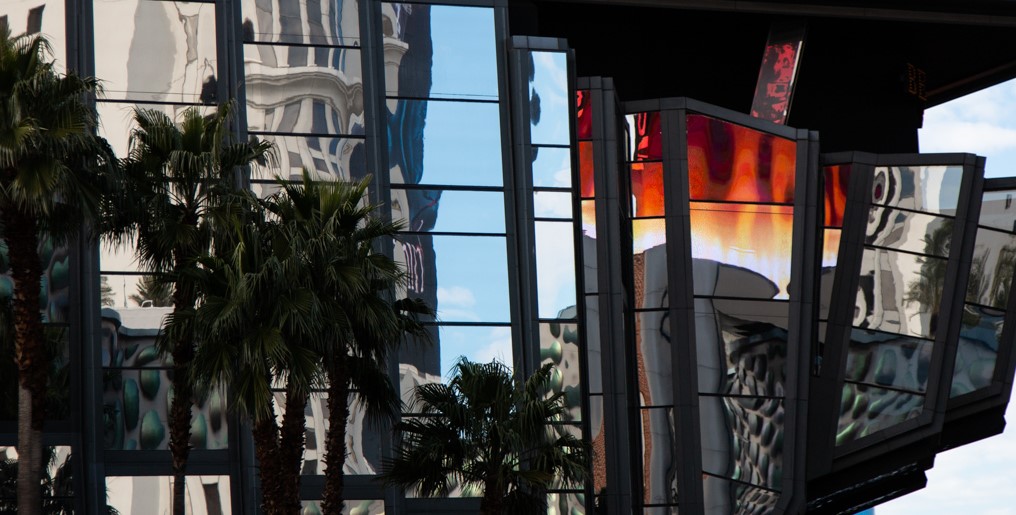
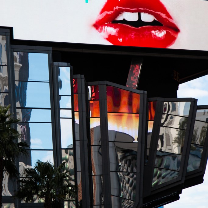
...or... you might want to lose the lips... I have to agree that either of the suggestion doesn't work that well. And the picture is a bit tight as the others had pointed out. |
Mar 11th |
 |
| 78 |
Mar 20 |
Comment |
Hi Jason, it is a nice find of the architecture and the lips sign. It is good wait for it.
I really love the big red lips. However the position of the lips is not so perfect. So to solve it, I might crop it as square, which might lose some part of the architecture, but put the lips as the subject...or... |
Mar 11th |
 |
| 78 |
Mar 20 |
Comment |
Hi Sunil, it is a perfectly done picture. I like the mood of the morning, the composition, the removal of the cones, and the HDR is nicely done here. Though I am not a HDR fan, this picture is an exception.
Color part, I like the contrast for blue sky and the yellow ground. However, I feel that blue is a little too strong, I would reduce it a little bit. And, for the cloud, I normally would blur it a little, and reduce the contrast of the cloud to reduce the distraction, and to mimic the nature of what our eyes see. It is always blurry in the far distance. Another reason to do so, the subject in this picture is not the cloud, so I would rather to work out more details on the car. I like the green windows though.
For the right side of the car, it is in the shadow, so it looks pretty good as what you have done. Nothing need to be changed. I would though increase the details of it, even not so realistic, in particular those two wheels.
Last point, I agree with Jason that your under image might be just good enough to work on, to avid the HDR effort.
Cheers, another nice picture. |
Mar 11th |
| 78 |
Mar 20 |
Comment |
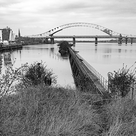
Hi Terry, this is an interesting composition and perspective. The leading line works pretty well. However the stairs are too big as per my point of view, which the bridge is too small. And the connection between the bridge and the stairs are not so strong other than functioning as the leading line. They are pretty much two different subjects (topics)
I would skip the stairs and the grass, and move much forward. The pier could be a nice leading line too. I noticed that there was a block. But photographer will always find its way... LOL
The color version is better than the BNW, as the green grass builds a better connection between the stairs and the pier, IMO. For the color version, the only thing is to work out a way to reduce the distraction of the mass yellow area of the weed.
|
Mar 11th |
 |
| 78 |
Mar 20 |
Comment |
It is nicely done for a first try! Cheers. |
Mar 11th |
| 78 |
Mar 20 |
Comment |
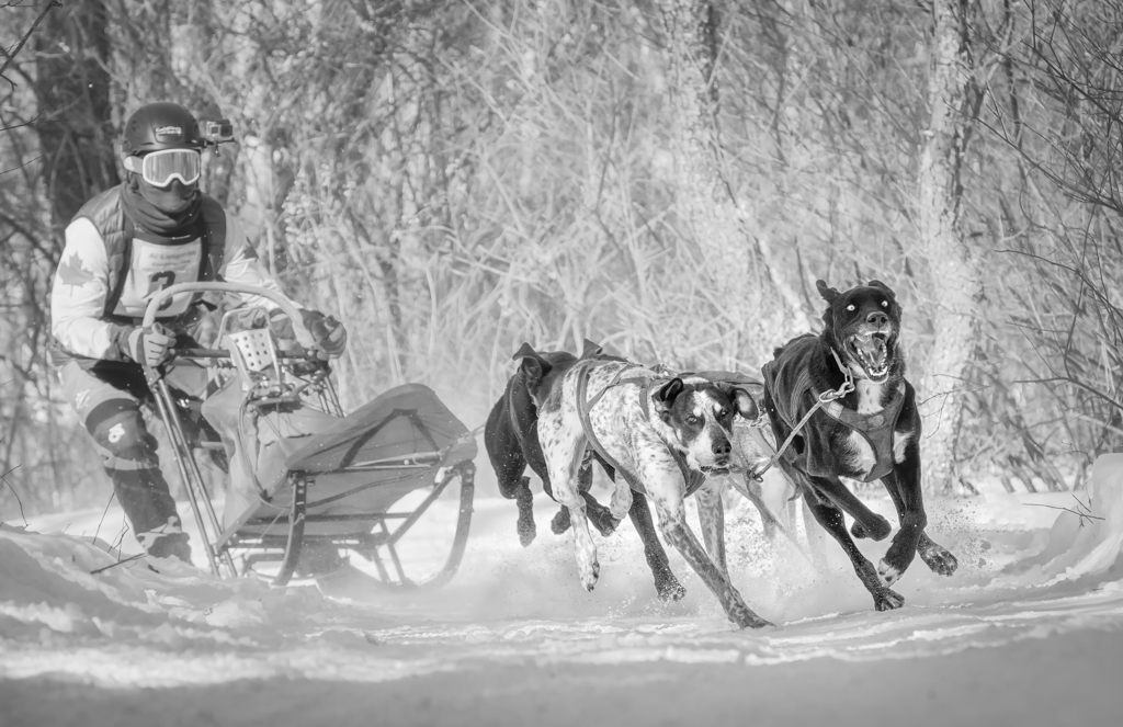
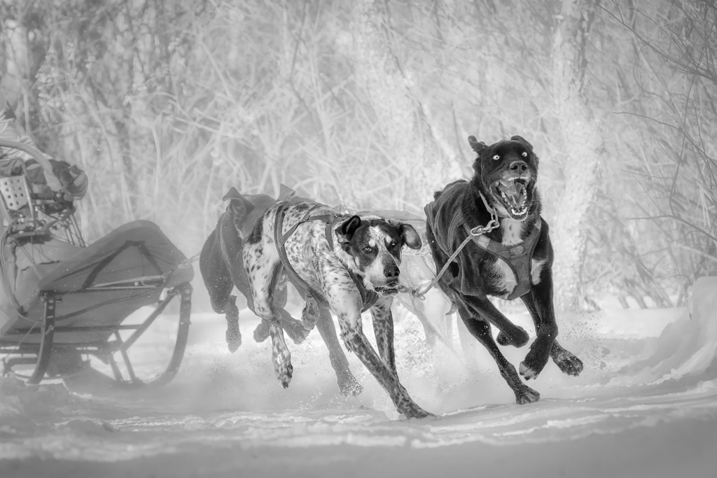
Just to show what I had tried. Again it was rejected. So as Brenda and Terry pointed out, the last dog seems one of the issues of this picture. I have stopped working on it. Cheers. |
Mar 11th |
 |
| 78 |
Mar 20 |
Comment |
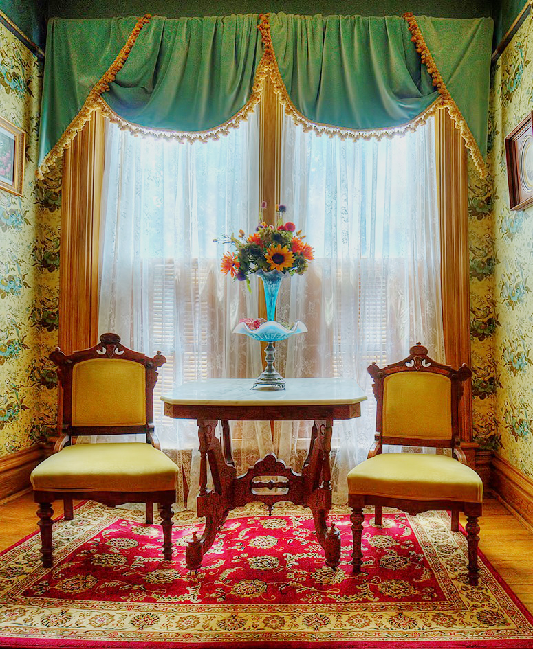
Hi Jim, nice picture with color and texture... Great capture and post-processing.
I would crop the right and the bottom a little, so that it looks more balance and remove the distraction of the floor. Or even a little from the top.
And I would lighten the curtain a little bit, as the light is really coming from there. That lightening will reduce the blue color and the distracting bright areas mentioned by Brenda, and it also creates a good contrast of the curtain and the followers... 2 cents.
...and... There is one little spot that I also fixed...see if you can find it out...:-) |
Mar 11th |
 |
| 78 |
Mar 20 |
Reply |
Well it is fun, in fact, not so fun in the cold perspective, to shoot the dogs in snow, in particular, I have to lay down on the snow in order to get a low angle. It is a bit painful to do that each time, but the joy of getting some good pictures always overcomes the hesitation. I think that you are right (Terry also mention the same) that the incompleteness of the last dog gives the picture less power. So pretty much not much I can do about this picture. Thanks. |
Mar 11th |
| 78 |
Mar 20 |
Reply |
Thanks |
Mar 11th |
| 78 |
Mar 20 |
Comment |
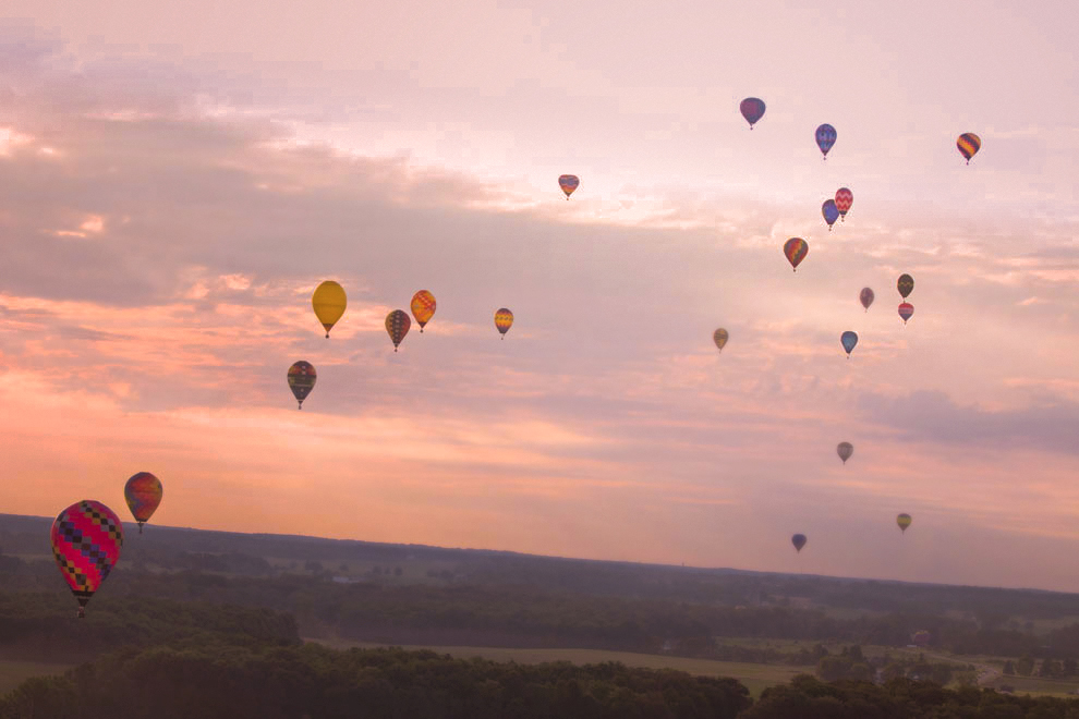
Hi Brenda, a pleasing and peaceful picture with wonderful color and full of balloons. I like it. After being the long exposure expert, you are now balloon expert. It must be an exciting adventure.
In terms of comments, I think that the biggest balloon is too close to the edge, so I might not highlight it to catch too much attention. Ideally it should be in a better position.
The horizon...if the picture is to be on the bedroom wall or some other formal places, yes, it should be better corrected. However, I do like the dutch angle composition, which brings in more dynamic and break through the tradition. If it is for experiment or creative work, I like to keep the tilt angle.
For the balloon, since there are so many in the sky, if they are all sharp, it will be too busy. As I mentioned previously, I would blur some of the far balloons, which will be simulating what our eyes see (the further, more blurry), and it will also bring in the depth and layers.
Since the sky is brighter in the upper right hand side, I would use the sharp balloons to guide the viewer's eyes going up and far....
Combining those thoughts, I did a quick edit. As the picture is in small size, so not much I can do. The blur of the further balloon has done much more than it should be just to show the idea. I would do it more lightly for a real work.
Thanks for the nice picture, and the experience sharing. |
Mar 11th |
 |
8 comments - 3 replies for Group 78
|
8 comments - 3 replies Total
|