|
| Group |
Round |
C/R |
Comment |
Date |
Image |
| 78 |
Nov 19 |
Reply |
like* |
Nov 5th |
| 78 |
Nov 19 |
Reply |
Hi Jason, it is a brilliant change. I live it... |
Nov 4th |
| 78 |
Nov 19 |
Reply |
Thanks Brenda,
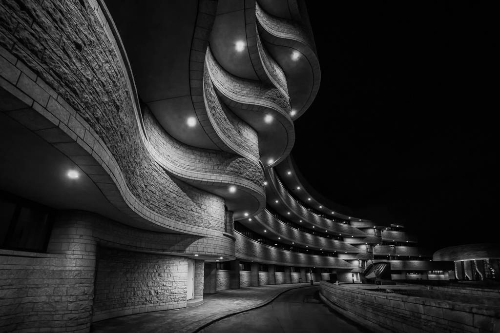
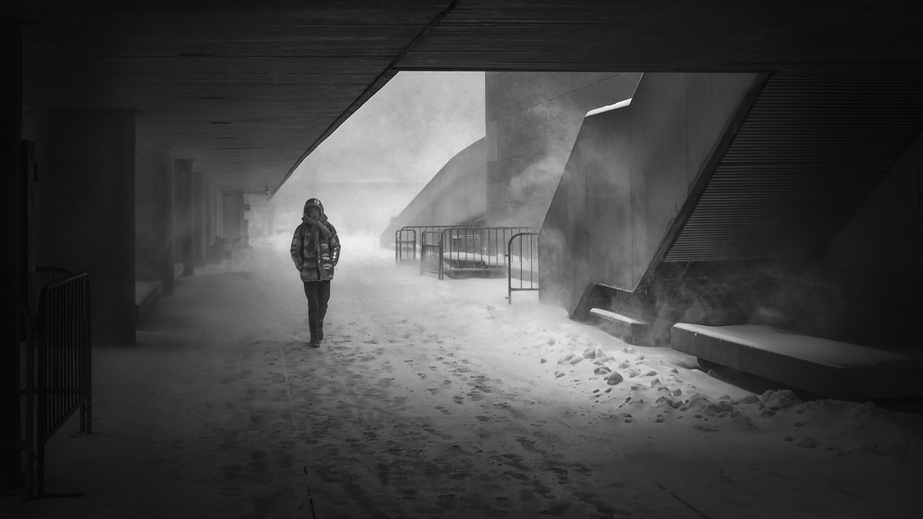
For the noise reduction, I apply that differently depending on the texture. On the dark sky and some smooth surface, i.e. the ceilings, I apply heavier noise reduction. For those with more textures, I did lighter.
For some strange reason, I cannot see the f/stop in the EXIF, maybe I was using a manual lens. Regardless, for the landscape like that I usually used 8 or 9. I am pretty sure about that.
For the focusing, since I am using a ultra wide angle lens, there is a hyper focal point. Everything beyond that will be sharp.
Usually, I use Nik sliver efex to do the bnw conversion. |
Nov 4th |
| 78 |
Nov 19 |
Comment |
A perfect picture. I like the shadow and the blue color in particular.
I agreed with Brenda that a richer blue may draw more attention and well separate the blue door and the yellow locks. If you like, maybe you can just further increase the clarity (details) of the locks, keeping the door as is.
The composition is perfect, nothing more to comment. ... Well, just to mention, I am trying to move away form 1/3 whenever possible nowadays, as it has tied me too much on my imagination. For this case, maybe it is a candidate to experiment a bit. The door open in the middle, so put the line in the middle, maybe also an option? :)
Again cheers for another nice picture. |
Nov 4th |
| 78 |
Nov 19 |
Comment |
Wow the recovery is impressive.
I would just keep the original 2, which is the color version. The BNW version looks a bit flat, while the color version brings in the depth and layers. Look at the light greens in the abandoned aged structure, they make the whole picture vivid.
|
Nov 4th |
| 78 |
Nov 19 |
Comment |
Interesting image, and well done. I might pretty much echo what Sunil had said.
Other than those, I feel the fake moon is too close to the tower...LOL. So, if I can only pick one option from Sunil's proposals, I might choose to remove the light. And by removing the light, I will then keep the ground, as the tiles become a part of what I want to show the viewers. (With the light, I could crop out some tiles, as what Sunil had said)
I really like the mood of the picture highlighted by the long exposure...Cannot wait to see more pictures from your trip like this. Cheers.
|
Nov 4th |
| 78 |
Nov 19 |
Comment |
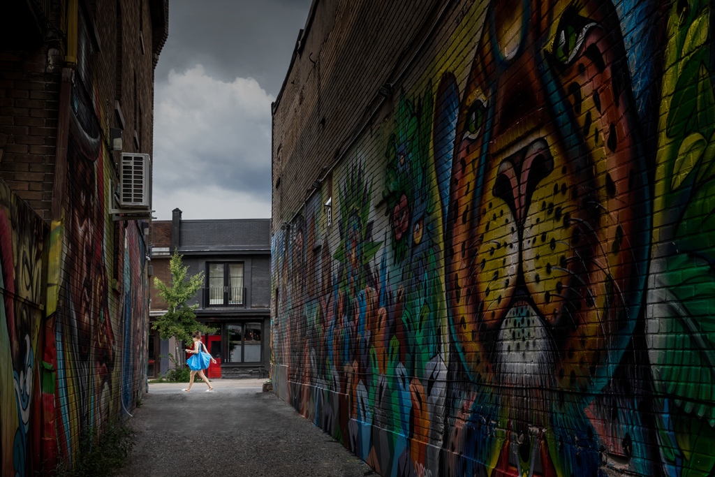
Hi Alan, very well post-processing. I like it, in particular the color.
When the crop is like that, it makes your picture just a copy of the graffiti. While the original picture reflects your vision of the world in the context of the graffiti, or, the graffiti in the surroundings context. So, I prefect the original much more because that is your perspective and your artwork now. On the other hand, if the purpose is to capture the graffiti only, why don't you just shoot the wall straightly, which helps to reduce the distortion as well? This proofs that what interested you is not only the graffiti itself but also the surroundings, at the moment you click the button.
So I might pretty much keep the original crop. The only thing is the white car is too bright. You can reduce the highlight only on the car. But this is not that important.
If I got the chance to re-take the picture, I might move the lens to the left a little bit, and wait for the white car to be gone, and ideally when there is a long hair girl coming out from the corn which the face is matching that of the graffiti... LOL...
Well, this is just my personal opinion. Nice pictures, both original and the post. |
Nov 4th |
| 78 |
Nov 19 |
Comment |
Hi Jason, it's an interesting picture. I like that facts that you are capturing the nature, the sun and moon, horses and birds. Very nice.
In terms of the picture, the sky is blown out, and the horses are a bit steady, so the replace of the sky with dramatic cloud image is something to improve it. Which Sunil had done a great job to make a nice bnw picture.
However, I might want to keep the color version. Blue sky, green grass and brown horses will give the picture a good separation via color. That said, in addition to replace the sky, I might also increase the brown color on the horses a little (If needed, I might also reduce the yellow on the grass, to make the grass greener, and to make the horses pop). |
Nov 4th |
| 78 |
Nov 19 |
Comment |
Like it. Very sharp on the focused area...I like Terry's crop. |
Nov 4th |
6 comments - 3 replies for Group 78
|
6 comments - 3 replies Total
|
