|
| Group |
Round |
C/R |
Comment |
Date |
Image |
| 78 |
Jun 19 |
Reply |
Thanks |
Jun 24th |
| 78 |
Jun 19 |
Reply |
Thanks Jason |
Jun 24th |
| 78 |
Jun 19 |
Reply |
Thanks. |
Jun 24th |
| 78 |
Jun 19 |
Reply |
Thanks Alan |
Jun 24th |
| 78 |
Jun 19 |
Reply |
Thanks |
Jun 24th |
| 78 |
Jun 19 |
Reply |
Wow...you work so hard...
I like your changes. For the bnw version, it is creative. I feel like to darken the background, in particular the grass, a little more. But I am not exactly sure unless I get the hands on it. |
Jun 17th |
| 78 |
Jun 19 |
Comment |
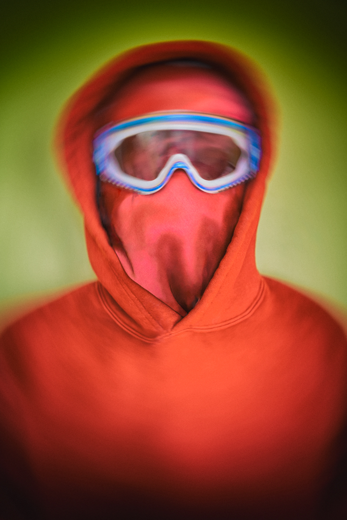
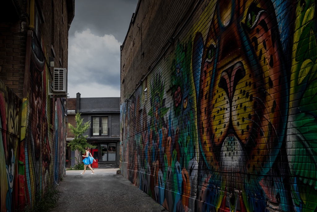
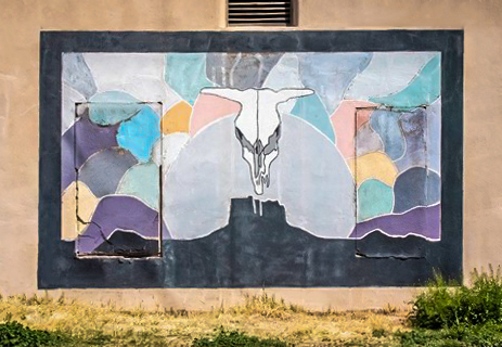
Hi Alan, it is an interesting and creative project. I like your first version and also all the revisions and comments discussed. All well said and well done.
Now come to my personal preference and thoughts. The mural is beautiful and the restoration gives the viewers a chance to see how beautiful it looks like. I think, though, it will be not only beautiful but also powerful to show where the mural was painted. I particularly like the crack of the two doors, which shows the difficulty of painting on the wall with doors, and also the texture of the wall etc.
I gave it a try. But the original picture was too small, so the processed picture looks not so good in terms of color, etc. But it shows what I thought... JMO... |
Jun 14th |
 |
| 78 |
Jun 19 |
Comment |
Hi Sunil. Nice and colorful work. It looks extremely good in your print. 5 stars out of 5 for your print.
But I have to say that your June picture has slightly different crop from your print... :-) Just kidding. I like it.
|
Jun 10th |
| 78 |
Jun 19 |
Comment |
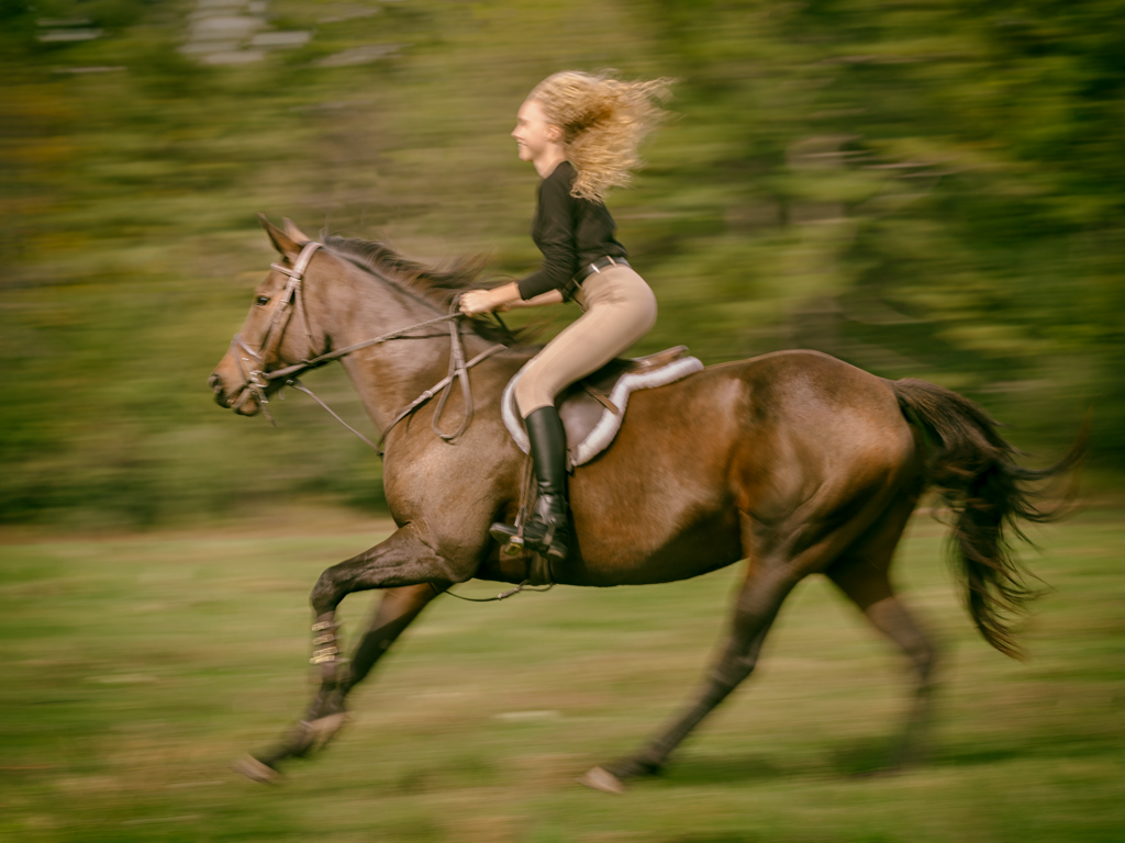
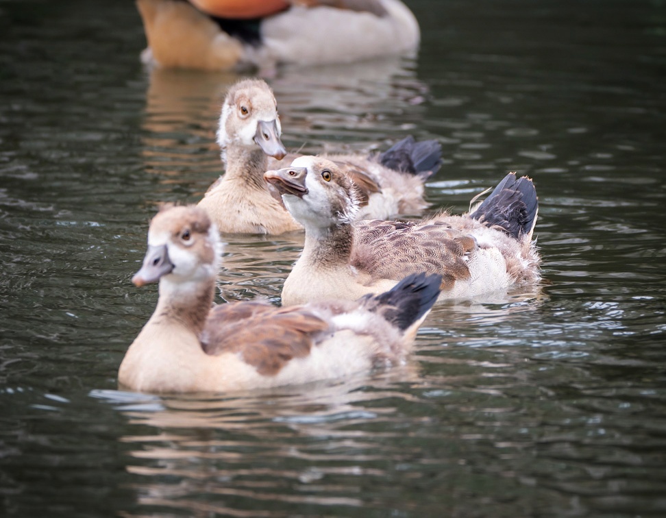
Hi Jason, what a lovely picture. I like what you photograph, the sun, the moon, horses and ducks, etc. Full of love to the nature.
Frankly speaking, the DOF seems a bit narrow to me. The main reason is that the little ducks are too close together. If they are separated, then the current DOF will be good. The mom is OK to be in the picture, and she should, but the contrasted but blurred eye is attracting too much attention.
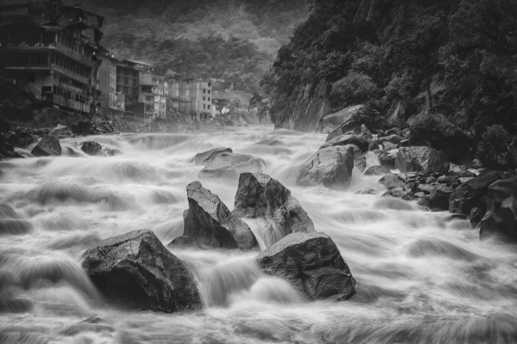
I am accepting the concept that a small part in the picture is enough to depict the whole thing. I have that in my June picture, which the building is just a a small part, but the viewer can image the whole building, maybe even more than it looks like... :)
That said, I think that we don't need the whole mom in the picture. I tried a corp just as an example. Cheers.
BTW, the ducks are too close and not separated well, so I also darken the dark feature a little bit trying to separate them. |
Jun 10th |
 |
| 78 |
Jun 19 |
Comment |
Hi Brenda, it is a nice picture as usual. I like the pose and the surrounding, the light and the color.
I couldn't say that I don't like the sun rays, but the shape of the tree doesn't look good, and it becomes a bit distracting. So I might go for a more tradition/common/boring/non-creative crop, which is to cut the top.
I did the crop using my cellphone, so please skip the color etc.
|
Jun 3rd |
 |
| 78 |
Jun 19 |
Comment |
Great job, and I agree with Brenda that the skin seems a bit over done. Cheers. |
Jun 3rd |
| 78 |
Jun 19 |
Comment |
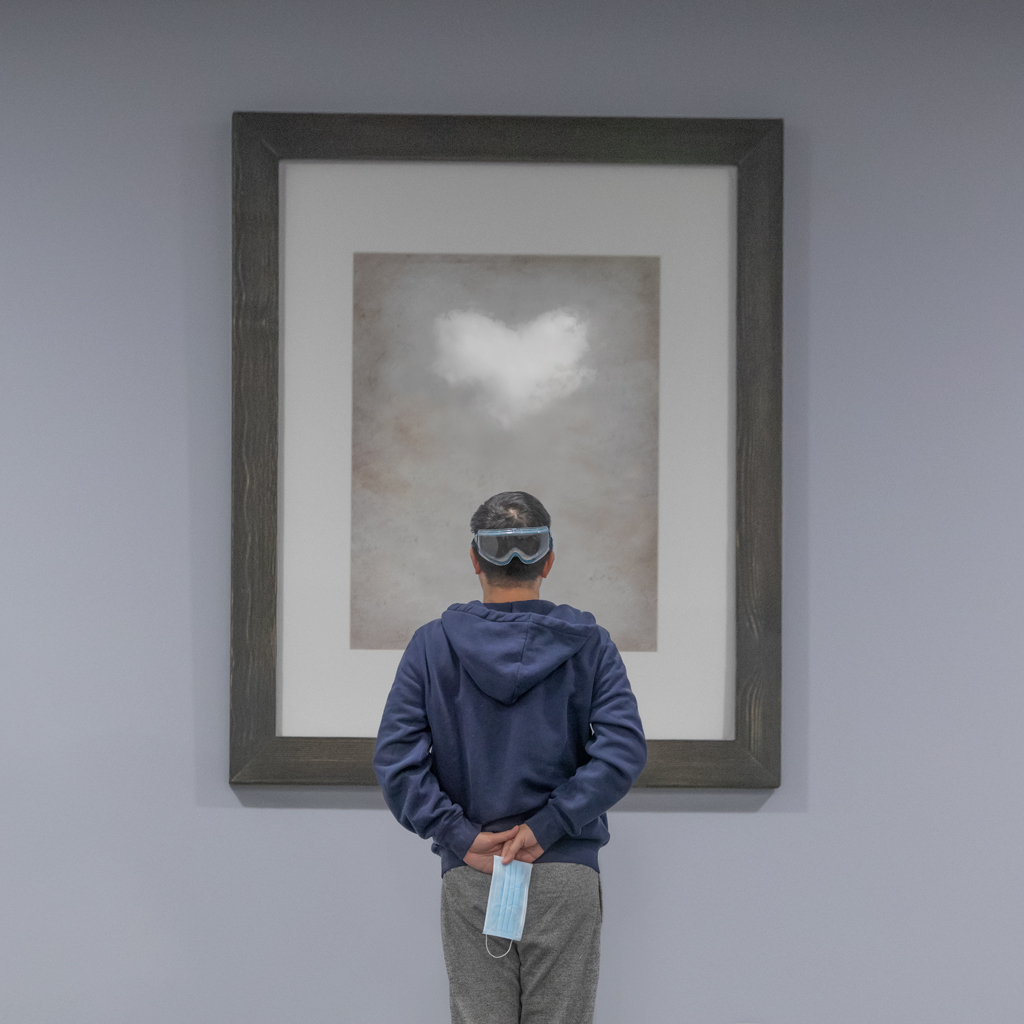
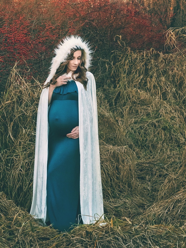
Hi Terry, a nice work. What a surreal feeling photo, which I like the most. I like that the reflection, the shadow and the body construct an interesting relationship. I am surprised that you can manage to avoid your own shadow appearing in the picture. Great job.
I would however fully keep the original crop, to include the cloud and sky, to make it more surreal (well, certainly it is just my personal opinion). With the clouds (which also look interesting), the clouds/statue/water makes a another relationship.
For the contrast and saturation, I would almost keep the original except to make the reflection a bit more visible. For my self, I tend to reduce contrast and saturation nowadays, just like my picture in last month. As I believe strong contrast and saturation picture will only catch the view's eye at the first time, but not be able to keep them for long. JMO. Cheers.
For the green stuff, if the intention is a surreal picture, I would just keep it. It adds on to it... :-) |
Jun 3rd |
6 comments - 6 replies for Group 78
|
6 comments - 6 replies Total
|