|
| Group |
Round |
C/R |
Comment |
Date |
Image |
| 24 |
Dec 18 |
Comment |
Hi I just dropped by from other group. It is an interesting picture. At the beginning I thought that the ponds are in the China side until I red the description.
Nicely contrasted story-telling picture.
I would cut some sky, i.e. 16x9, and darken the sky a little bit so that the ponds pop. It would be nice if the contrast of the building is enhanced...
Cheers... |
Dec 7th |
1 comment - 0 replies for Group 24
|
| 78 |
Dec 18 |
Comment |
Hi Dave, thanks for your time making the edit. I like it. Good point. I think that it applies pretty well here. Thanks again. |
Dec 10th |
| 78 |
Dec 18 |
Reply |
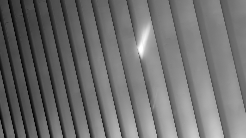
2) Use the pick color tool to pick a close-by color to fill the flare. Have to try a number of times so that the color is picked correctly. In some cases, change the slider of Brightness, Saturation might help too. Or other cases, the control point can be move slightly, or change the size of the control point slightly.
After all, it depends on the luck. Effort wise, it might not be less than the cloning, but it seems more real in my opinion. |
Dec 7th |
 |
| 78 |
Dec 18 |
Reply |
Here are the steps of what I did.
1) Open the Viveza of Nik Collection
Click Add Control Point, and place the control point at the center of the flare. |
Dec 7th |
 |
| 78 |
Dec 18 |
Reply |
Fair enough. It is a personal choice. What I tried to say is that there is no rule for a crop, but a crop is determinded in order to fulfill an objective. Cheers. |
Dec 7th |
| 78 |
Dec 18 |
Reply |
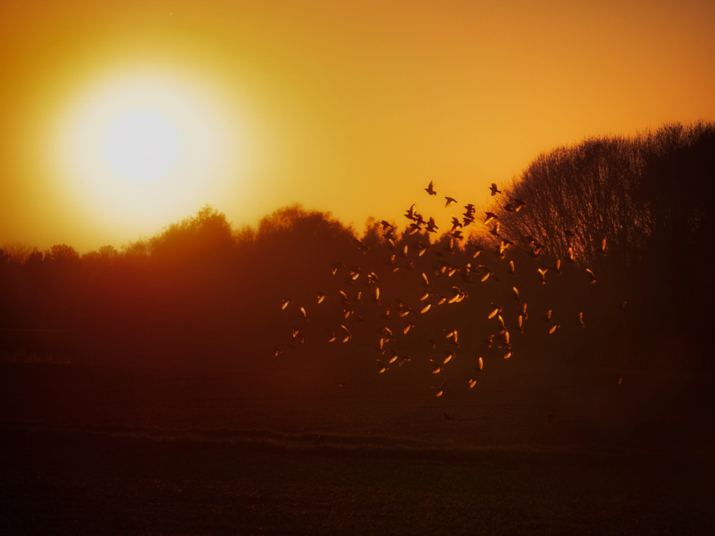
What will you do to remove the flare? I want to know too.
I just have to play around and this time it seems lucky. That is why I want to know how the others are doing. Once I get back to my computer. I will try to show what I have done, basically just using Nik filter...
I think that clone might work, but just too much work?
To avoid lens flare, the best way is to do it when shooting. Take a second shot with something cover the sun spot so that this one has no flare. In the post, stack these two layers to remove the flare. It is common for the landscape when the camera is on a tripod. In your case, it is a bit tough. I believe you handheld the camera chasing the birds...LOL |
Dec 6th |
| 78 |
Dec 18 |
Reply |
Thanks Sunil... |
Dec 5th |
| 78 |
Dec 18 |
Reply |
Thanks Alan...hmm..thinking to remove the background... :-) |
Dec 5th |
| 78 |
Dec 18 |
Reply |
Thanks for taking the time to do an edit. Good points... |
Dec 5th |
| 78 |
Dec 18 |
Reply |
Thanks Brenda.
Points taken. I did that in a rush mode. I hope that I can be prepared for next month. |
Dec 5th |
| 78 |
Dec 18 |
Comment |
I tried to remove the lens flare. I keep the crop as I do want to keep the feeling that the birds are up in the sky, and leave some room to show where they are flying from. I had tried a smaller crop, it did not work well for me. |
Dec 5th |
 |
| 78 |
Dec 18 |
Comment |
Nice picture. The only thing that I don't like is that lens flare.
It would be interesting to see how you remove it...LOL
Good job. |
Dec 5th |
| 78 |
Dec 18 |
Reply |
I would try this if the rocks are the main subjects... |
Dec 5th |
 |
| 78 |
Dec 18 |
Comment |
Perfect...everything works fine together to give me a peaceful timeless feel. In that sense, no moving car works perfectly for me.
If I would have to give some thoughts, which really no need for this picture, I would have brightened the Chrysler Building a little bit. But I would do it just a little bit, as I still want to keep balance of these two white buildings.
For the reasons:
1) My eyes need to stop somewhere, which the Chrysler Building is the perfect choice. Currently I stop at the left hand side building, as it seems brighter and bigger.
2) I need something which is brighter than the white frame otherwise my eyes are always caught by the frame.
Frankly speaking, that little change might not be needed, as for this picture the mood is more important, who cares where the eyes go...as far as the mind goes to the old time New York city, it is a done deal...LOL
|
Dec 5th |
| 78 |
Dec 18 |
Comment |
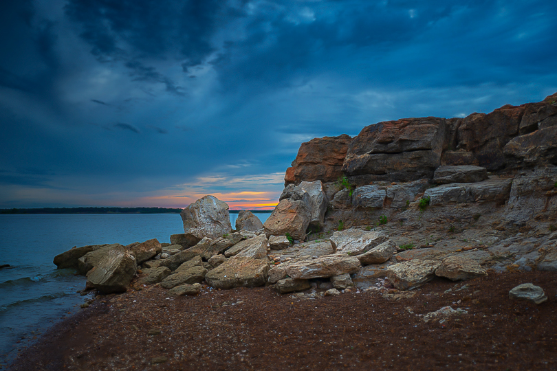
Hi Sunil. Nice picture. I like the color, The HDR effort is done perfectly. All well done...so if nothing else to talk, then composition is always the topic... :-)
What is the main subject of the picture? the rocks? the sands? the sunset? the cloud? or the water? If that is decided, the composition will go with that objective.
As examples:
If the sunset is the main subject, Rather than leaving some of the colorful sunset behind the rocks, I might walk ahead to the rocks to take the rocks as the foreground, water in the middle, and sunset as the main subject. Though it is a classical composition, it fulfills the purpose of showing the beautiful sunset. And, I might climb up to the top of the rocks to see if anything interesting as well.
If the rocks are the main subjects. I would crop out some of the sky and water, so that rocks are really the main things in the frame with color sky as the background.
Back to the composition of this picture, it is very difficult to handle. It is a bit heavy on the left hand side, with the foreground a lot of sands, which may or may not be interested. Jason's crop makes the unbalance even more, so it is not ideal either.
Well done. Cheers... |
Dec 5th |
| 78 |
Dec 18 |
Comment |
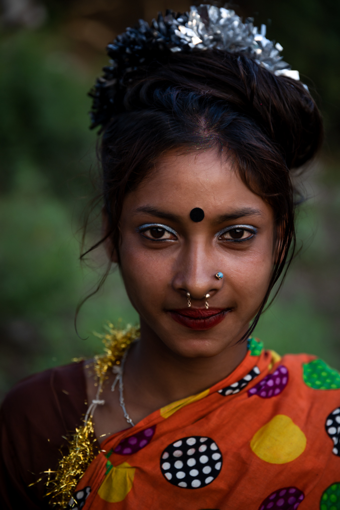
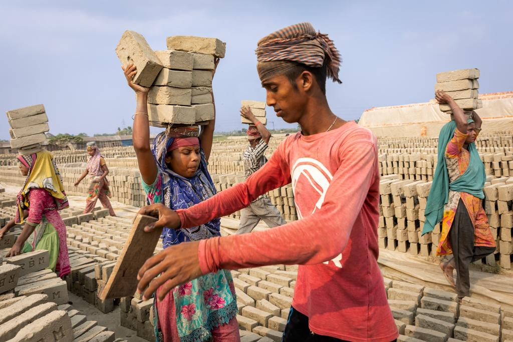
I like it, esp. the expression on the faces.
I might darken some bright spot a little bit. The one on the upper left hand side, the one close to the man's hand, and the two lines in the lower right hand corner.
Cheers... |
Dec 5th |
| 78 |
Dec 18 |
Comment |
I know nothing on Marco photography. So nothing that I can add. It is nice picture.
It is good to see the discussion of the tension and space...
I am on the tension side in general. I like to be creative and dynamic. I like to show personal character. I like to draw my viewer's attention...I really like that expression desire via the 'unusual' crop or 'uncommon' composition. I am right on it.
Step back on this picture. What is the purpose of taking this beautiful flower? If I were taking the shot, my intention could be showing the beauty of the nature. It will be nice, relax and eye pleasing etc. It might be hard to find the tension mood here...:-) In that sense, I would give it more space.
2 cents, and more of just personal thoughts.
Nice job, Dave. |
Dec 5th |
| 78 |
Dec 18 |
Reply |
I like this version. She is a lovely girl. If you are really serious, the only thing to touch is potentially the green color. Maybe you could lower the green saturation a little bit further. But it really doesn't that matter.
In this relax pose, it would be good to see her feet and hands etc to show her entire mood and status in a lower angel of your camera. "chop off any limbs" is seriously something to avoid unless no choice. If portrait is intended, I think that you should have the time to move yourself, or move the little girl to a place that has a nicer, i.e. maybe cleaner or darker, background.
It is a nice try for replacing the background. It looks good to me, other than some details, i.e. the shadow if applicable as Brenda has mentioned. And, if the purpose of replacing the background is to reduce distractions. A colorful brick wall doesn't help that much :-). If the effort is to be taken, I would pick something darker and cleaner, i.e dark wood fence or steel wall or something like that. The dark color is an import factor so as to separate the background and the subject, and make the subject pop.
Nice picture, and cheers. |
Dec 5th |
7 comments - 10 replies for Group 78
|
8 comments - 10 replies Total
|