|
| Group |
Round |
C/R |
Comment |
Date |
Image |
| 78 |
Nov 18 |
Reply |
I like the burn of the corners. But I don't want to brighten the inside, as I do like to see the dynamic of the light... Cheers. |
Nov 20th |
| 78 |
Nov 18 |
Reply |
Wow...thumbs up. |
Nov 5th |
| 78 |
Nov 18 |
Reply |
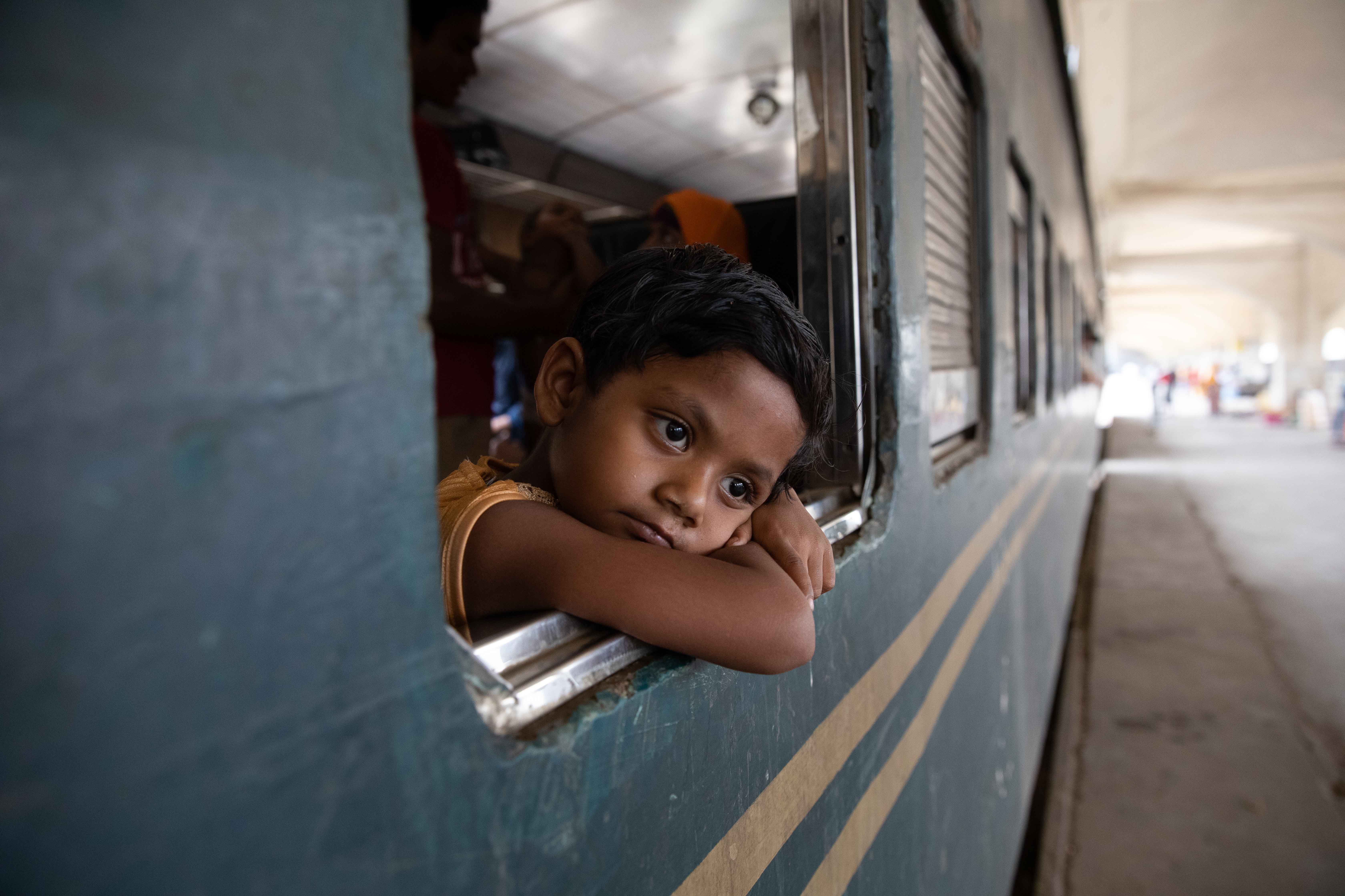
Hi Jason. Thanks for your inputs. Below please find the original file.
For the side topic, I think yes, it is harder and harder to photograph people nowadays, given that people are taking the privacy more seriously, and the quick transmission of the images in the Internet world.
For the photographers, though, on the legal side, we have the rights to take any pictures in the public place. We have studied that topic and came to that conclusion. So I will stand firm on my rights, but I will also respect the feeling of the people. So if anyone doesn't like to be photoed, I will stop or even delete the files if taken already.
On the culture side, it is huge different between the western world and that in Bangladesh. I found many people asking me to take their pictures, LOL, or even stood in my frame which impacts a lot to my composition. You know that I went a long way there to capture special characters or unique culture, not to picture the common people, :-). I found that very annoying in fact. Usually, I would take one or two pictures when requested, and moved on to my work... LOL. Very different experience... |
Nov 5th |
| 78 |
Nov 18 |
Comment |
Original file |
Nov 5th |
 |
| 78 |
Nov 18 |
Reply |
Thanks Brenda. The beauty of this forum is not only that I will receive creative ideas from other photographers, but also that it forces me to do something in a monthly basis.
I almost skipped this month's submission as I have written it to you. But end up I decided to catch the train to process an old picture.
The good news is that it is published in 1x.com today.
https://1x.com/photo/1606730/
For 1x.com, in quick, it is just another photographer community. The challenge is that it is not easy to get selected and published. The success rate is around 5%. There are two rounds of curation. First around is the members, if you can not get 50% approval ratio, pretty much you are out. If the common folks like it, it comes to the 2nd round, there are a couple of designated curators/editors who will do the final pick based on their favor. So the fun of 1x.com is pretty much the challenge to get picked. It doesn't mean they are all good pictures even if they are published.
BTW, please find the original file below.
|
Nov 5th |
| 78 |
Nov 18 |
Comment |
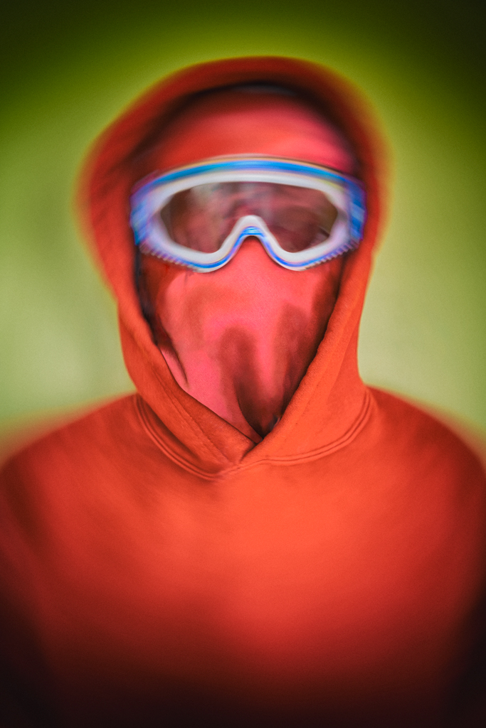
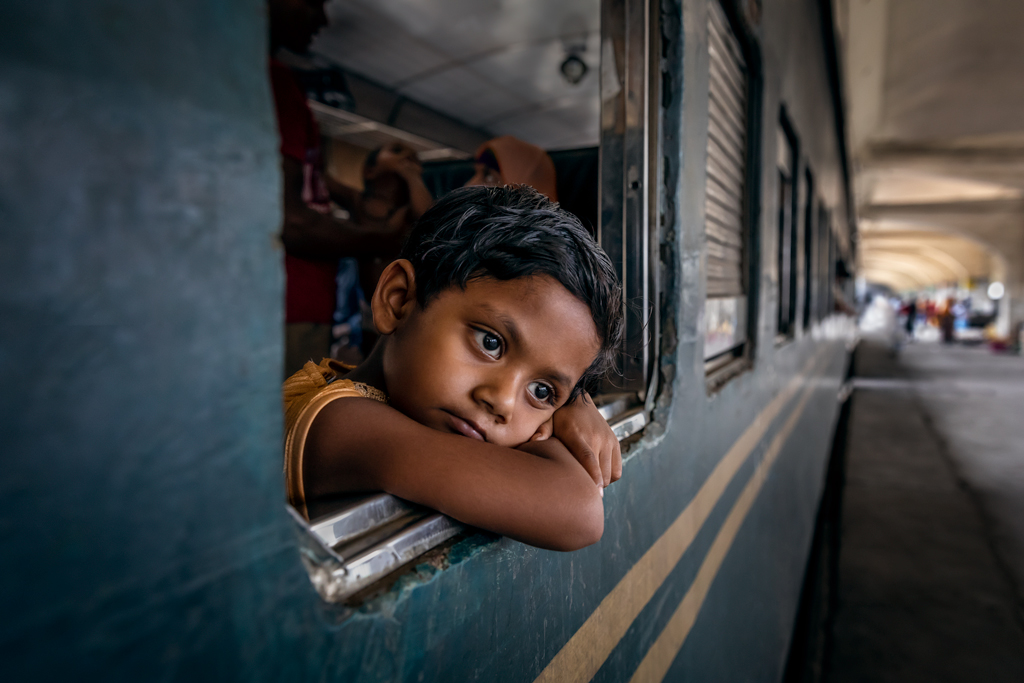
Brenda asked how the picture is processed. I think it is good to share here.
Well, it is hard to say if it is a candid shot or a posed one. I would consider that as a candid shot. As usual I took a couple of shots quickly when I decided to, different angles and distance, and waiting for different poses and gesture, etc. But I certainly don't know the local language that can instruct the boy to pose for me. LOL. This picture is picked among a number of pictures of the same boy though.
The reason why the boy drew my attention is because I believe that children are more pure to capture the expression through the eyes and body language. When I was wandering in the train station, if there were no interesting characters to catch, children will be the next that I would be interested in.
The post-processing is a bit complex and time consuming, but in short, I have done below major touches.
1) Clean up. Touch up a little of the face of the boy, clean up the train surface and the ground a little bit
2) Light. The inside of the train, and the far end of the platform is too bright. I darken it a little bit, so that the eyes of the viewers will focus to the face and eyes of the boy.
3) Clarity. The eyes of the boy is very important in this picture, so I added a bit clarity to the eyes.
End up there were a lot of small touches, but each one is really small, so that the final picture will look real��.. |
Nov 1st |
| 78 |
Nov 18 |
Comment |
It is an interesting picture with the creative use of the fish-eye lens, and maybe HDR effects.
I am not a big fan of HDR, reason being is that it flattens the image, and weakens the depth of the image. The cloud, trees and the car look like in the same distance.
HDR turns out working good here. It gives the surreal feeling to the viewers. Cheers. |
Nov 1st |
| 78 |
Nov 18 |
Comment |
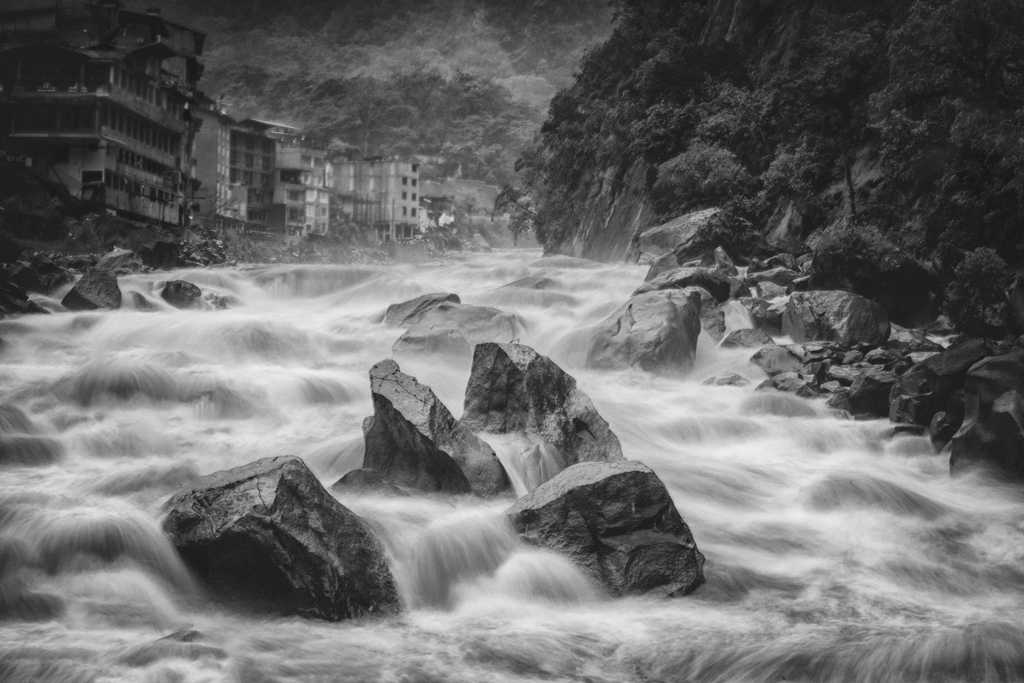
What a dramatic view..
I am picky on the corner. So the lower left hand side grass, I would darken it. Or even get rid of it.
I believe that on the far end there are mountains, but they don't look like mountains in the picture. I would suggest to either turn them into sky by cloning, or keep them looks like mountains by reducing the HDR effect only on that portion...
Though I am not a big HDR fan, the HDR effects look good in this picture. Cheers. |
Nov 1st |
| 78 |
Nov 18 |
Comment |
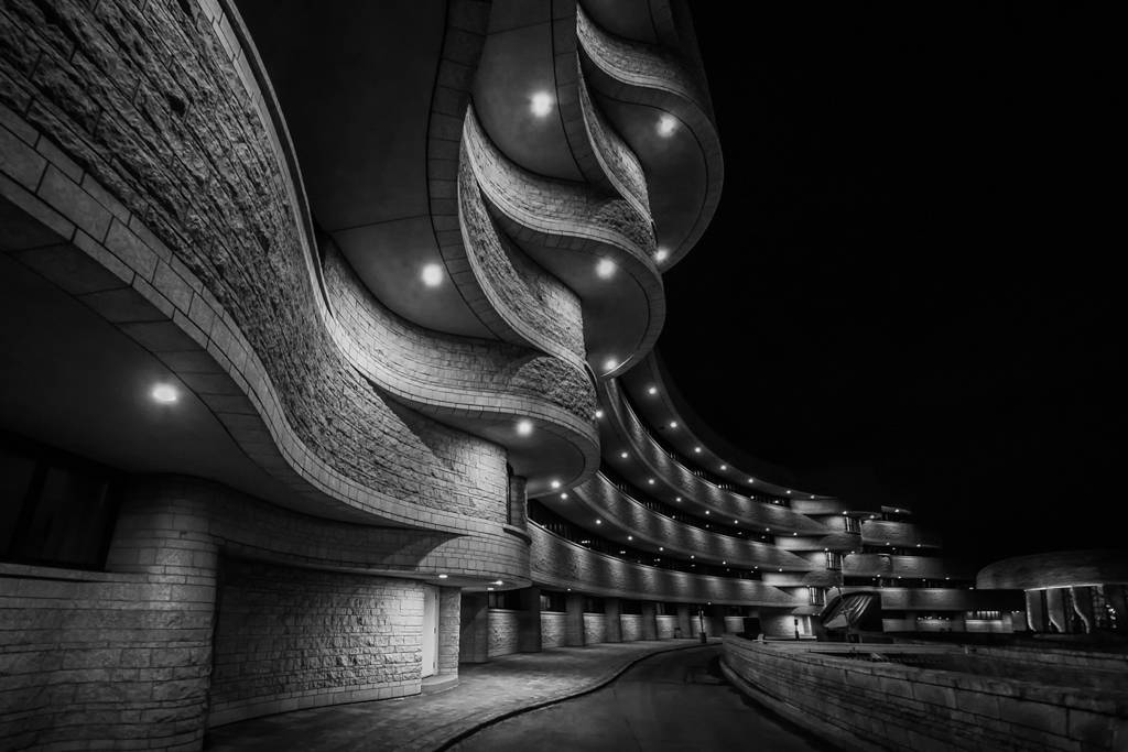
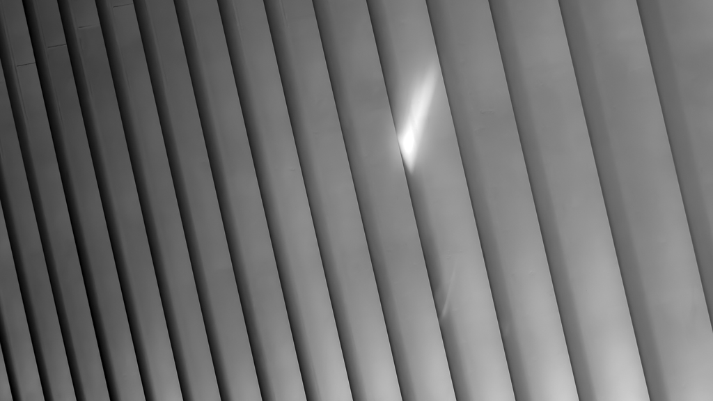
Nice architecture picture, Brenda.
It is a perfect picture, not much to comment. Except that I am picky on the corners, so I could vignette the corners a bit more, to hide those details.
Not sure why, it seems that I like the original picture a bit more (except for the corners). Maybe the contrast is a bit better...especially the light leading to the ceiling.
Cheers |
Nov 1st |
| 78 |
Nov 18 |
Comment |
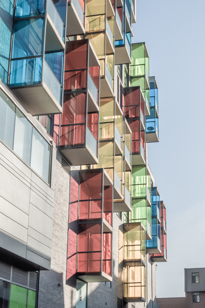
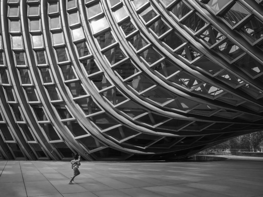
Nice abstract picture, and nice bnw conversion.
You know that I am picky on the balance of a picture. LOL. So putting the wall in the right middle doesn't do well to me. I would put the wall in the one-third location, one way or the other, leaving more or less white space.
On the experimenting side, capture a person in one of the corners (if you get the access), or PS a cloud in the white space, might be something interesting to try...
BTW, I like the original 2, with the cloud more than the final version.
Cheers for the nice bnw picture. |
Nov 1st |
| 78 |
Nov 18 |
Comment |
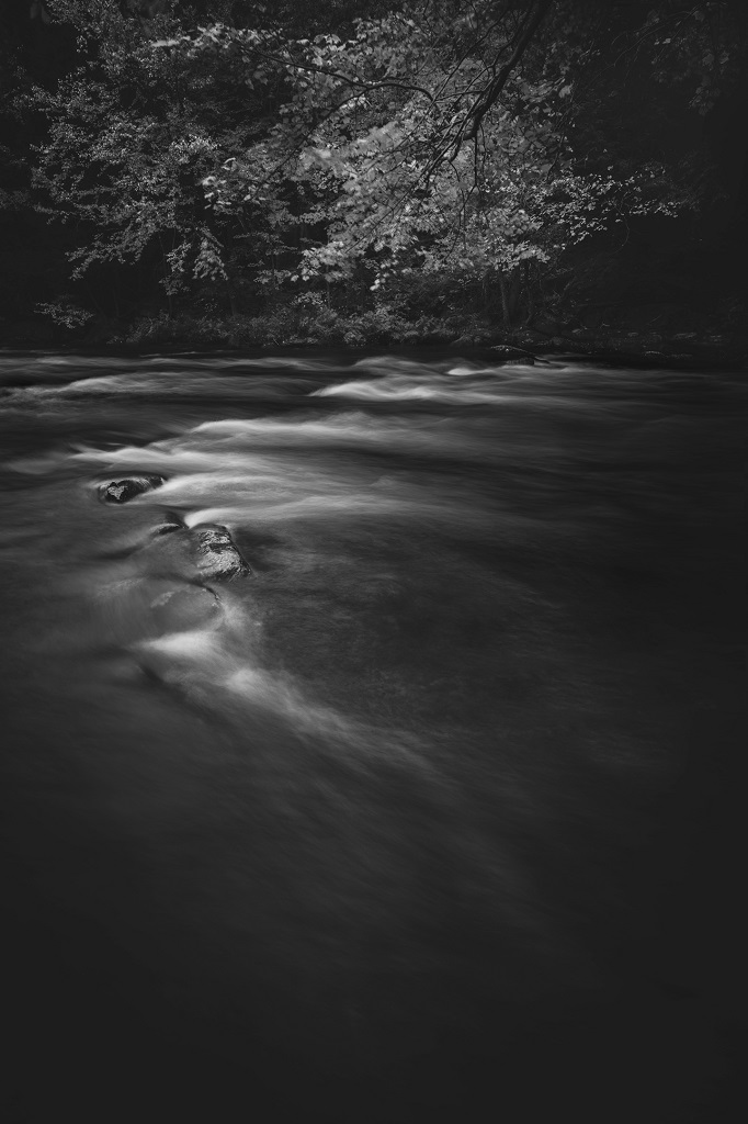
I do like the picture, creative, and surreal. The light, the subjects, all good.
In terms of thoughts, I would
1) darken the lower left hand side of the sands, so that there will be a light band in the middle. The viewer's eyes are kind of restricted to that, and the eyes will follow the line of the footprints and be led to the 2 human figures.
2) That said, I would also clean/darken some bright spots in the sands, and I would darken a little bit the bright waves in the right hand side. The branches...hard to say...it is too small and too bright to keep as a foreground...but it can be a foreground...so.. I have no idea.
3) Correct the color cast, the green color (particularly those close to the branches)
2 cents and cheers for the nice picture... |
Nov 1st |
| 78 |
Nov 18 |
Comment |
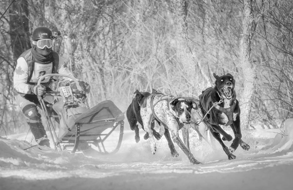
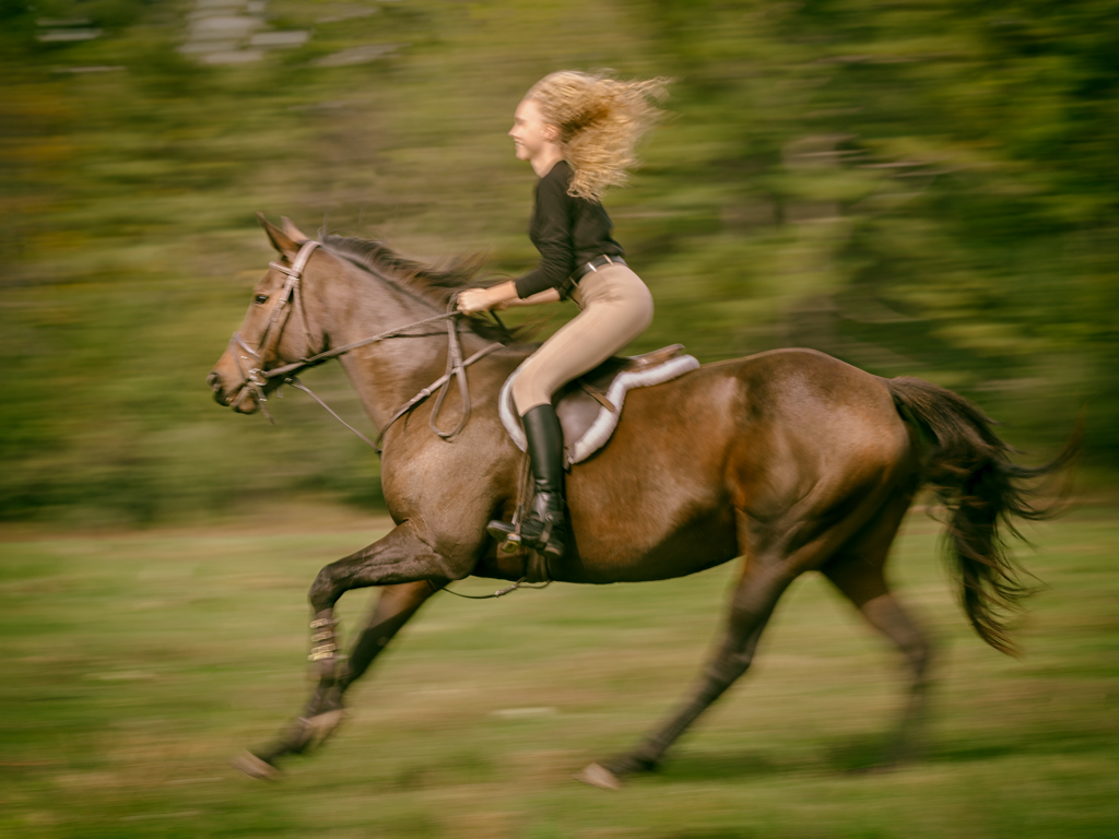
Nice picture, especially the color and the movement.
Nothing more I could comment, but up to my personal experiments and preferences, I might try,
1) Tilt the picture a little bit to add some dynamic feelings.
2) When I do motion blur, I used to try my best to keep a small portion, usually the important place, clear, that would create a contrast between clear and blur, move and still, and keep the viewer eyes on the clear part. If I have other clear pictures of the same racer. I would stack a small portion of the clear helmet, or a small portion of the head of the motorcycle, in a progressive way, so that that spot becomes the focal point of the picture.
2 cents, and cheers for the great picture. |
Nov 1st |
8 comments - 4 replies for Group 78
|
8 comments - 4 replies Total
|