|
| Group |
Round |
C/R |
Comment |
Date |
Image |
| 78 |
Aug 18 |
Reply |
I also reduced the clarity a little bit when using the graduated filters, so that the surface of the train is a bit smother.
A question is... should I crop the left hand side a bit? Thanks for your input. |
Aug 21st |
| 78 |
Aug 18 |
Reply |
I just did an updated version. Thanks. |
Aug 21st |
| 78 |
Aug 18 |
Comment |
Hi Brenda,
Certainly I would love to adopt the suggestions to adjust the image. A bit busy last few days. I have tried a new version, mainly use vignetting and graduated filters (upper and lower parts) to bring down the brightness of the train.
I also 'clean' the train a bit to bring down the attention to the scratches. Any comment is welcome. Thanks. |
Aug 20th |
 |
| 78 |
Aug 18 |
Reply |
Hi Brenda, if I feel my try is aggressive, then I would certainly feel that this is too aggressive... LOL. By getting a bit more space, there are more green in the frame, which will have better contrast with the yellow tiger as well. In your later version, the tiger is merging with the not so green background. Just IMO.
I like to have the grass in the foreground, in such way, the viewer feels like standing on the solid ground staring at the tiger on the other side over the water, instead of standing in the water. On the other hand, the grass of the foreground is a bit mess, and is distracting the eyes...So, at the end, I am not sure. LOL
|
Aug 7th |
| 78 |
Aug 18 |
Comment |
Hi Jason,
I like your latest version above more. It is not easy to see the birds fighting in such position.
In terms of the cropping, for the latest version, I would cut the left part so that the two main pillars form the frame for the crow. And I would expand the grass area as Brenda mentioned to give a bit more space for the kestrel.
Maybe it is just my monitor problem, I found difficult to differentiate the kestrel and the grass. It might be an interesting try to get the green back and darkening the grass. The idea is to have the contrast of the dark bird on the light fence, and the light bird on the dark grass.
The crow is a bit too dark to me. I would select it and increase the shadow a bit to bring back some details. and I might find a way to bright the eye of the crow.
2 cents... cheers.
|
Aug 7th |
| 78 |
Aug 18 |
Reply |
I also feel that foreground can be darkening a bit to shift the eye focus... |
Aug 7th |
| 78 |
Aug 18 |
Comment |
How should I handle the surface of the train? Just leave it there... or blur it... or clean up some of the scratches? Any comment is welcome. Thanks. |
Aug 7th |
| 78 |
Aug 18 |
Reply |
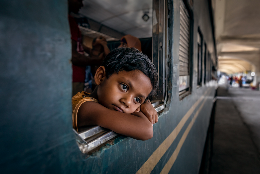
Thanks Brenda, I like the suggestion of the title... "Long ride to Nowhere". 'Nowhere' reflects the confusion feeling in the eyes of the person.
In terms of the language... I guess it should be the official language of Bangladesh. I have a local friend with me in the day time... so I don't really know what spoken and written language is used there...
I checked Wikipedia, it should be Bengali |
Aug 7th |
| 78 |
Aug 18 |
Reply |
I do like the jungle feel more than the zoo feel. Cheers. |
Aug 2nd |
| 78 |
Aug 18 |
Comment |
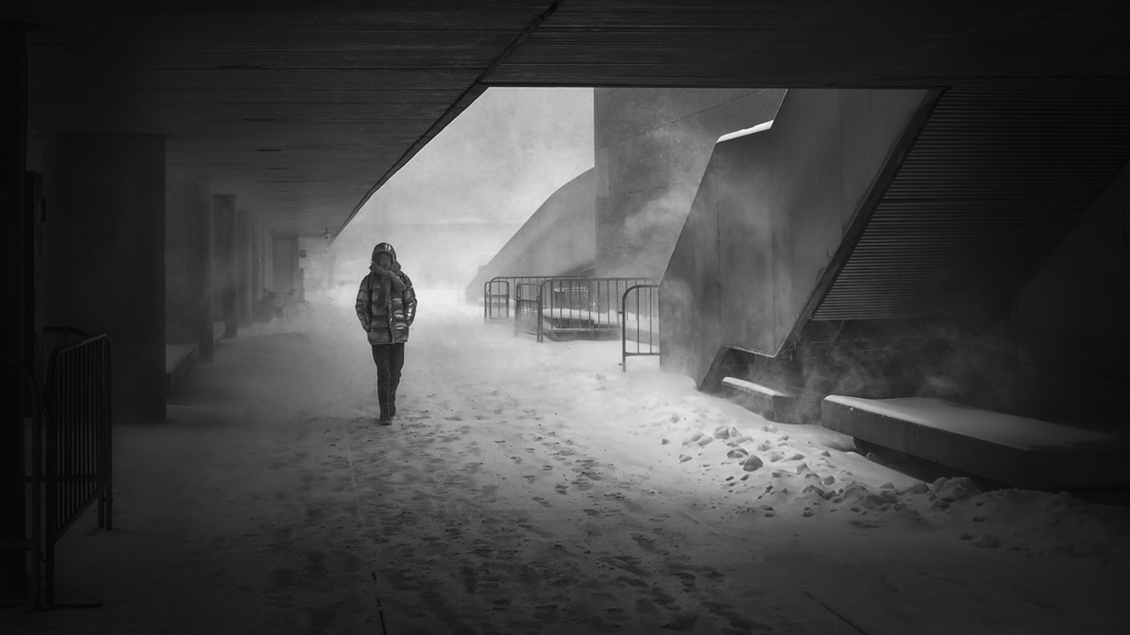
Great composition. A nicely contrasted and well post-processed image. It is surprised to know that it is taken in the moonlight.
Would you mind to share some parameters, i.e. the shutter speed and iso, etc.?
Also feel like interested to know how you handle the noise reduction. Thanks and cheers. |
Aug 2nd |
| 78 |
Aug 18 |
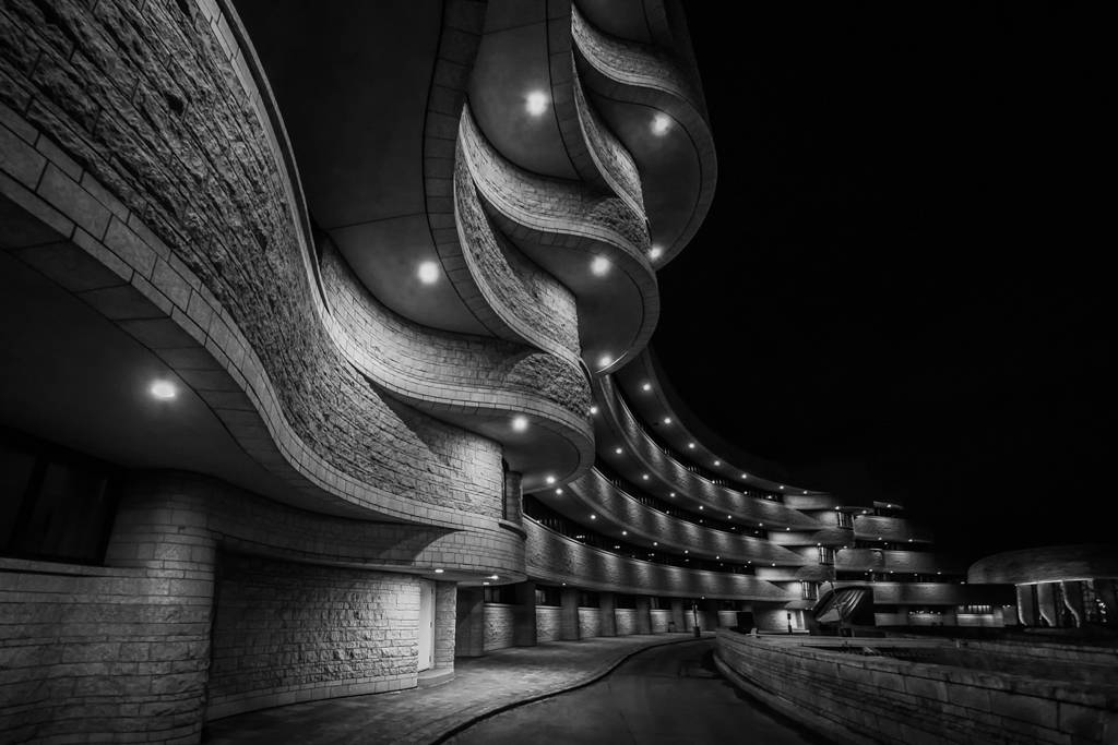
Comment |
Nice, interesting and perfectly post-processed image.
Would like to know how the shadow, the external stairs in the shadow, is handled. Thanks. Also Can you discuss in more depth what you did to "grunge it up a bit"?
It is interesting to see that you are almost hidden in the picture, which is good. What would happen if you would have found a way to show yourself clearly, particularly in a colorfully dress, so that there would be an interest spot in the mosaic feel image? But maybe that would destroy the whole mood. Don't know...Just a thought.
Cheers... |
Aug 2nd |
| 78 |
Aug 18 |
Comment |
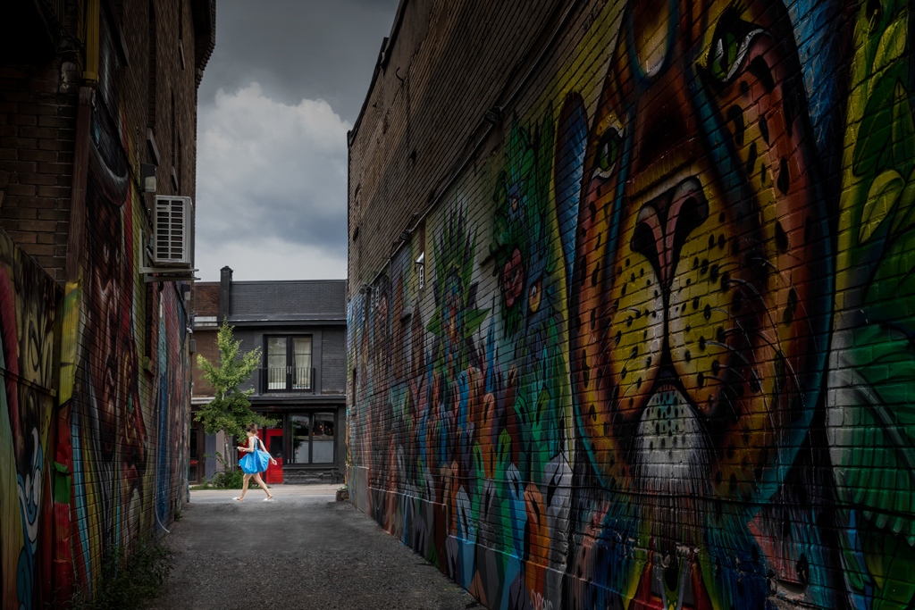
It is an excellent picture, sharp, great contrast and nice tone. It is certainly a success conversion into the black and white. And the handling of the shadow part of the building (with the external stairs) surprises me. If you don't mind, please share how that was done. Thanks.
In terms of the cropped tire. I think it is better to try to keep it. As Brenda mentioned, extend the canvas before crop might help. Or I might just manually adjust the distortion to a level that the tire is kept.
Though it looks great in bnw. It might be also interesting to see a color version, with the color popping in the middle of graffiti.
Cheers... |
Aug 2nd |
| 78 |
Aug 18 |
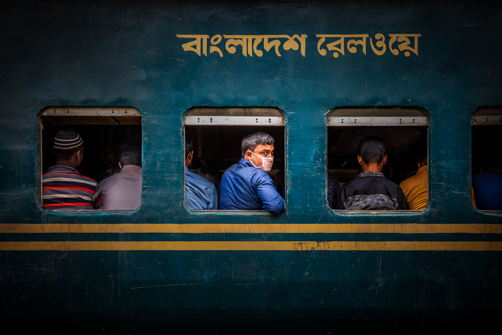
Comment |
The two yellow lines draw too much attention. Any suggestions? Thanks. |
Aug 2nd |
| 78 |
Aug 18 |
Reply |
Thanks Brenda.
The picture was taken when I was taking a photo trip to Dhaka in Bangladesh.I was taking street portraits there. In the train station, there are people in and out from time to time...That is why I went to the train station to capture different faces and stories.
The station was dark, that was the reason why I set the ISO to 1000. If I would do it again, I would have set it to 800 to get a better quality.
Since I was taking portraits, I set the aperture to 3.2, and set the camera to aperture priority mode, so that the camera will decide the speed. (Some portraits I took in this trip were published here: https://1x.com/member/Torlastman/photos/latest)
Since the train is about to depart, people went into the train and seated. I was just standing there waiting for the next train...and I saw the man with the mask looking at me, with others facing inside the train. With no time to adjust the camera setting, I took this picture with the portrait setting... LOL.
So this picture was taken unexpectedly. I did not even remember that I took it until I looked back to my files. That is why I don't have a name for it yet. Any suggestion is welcome. Thanks. |
Aug 2nd |
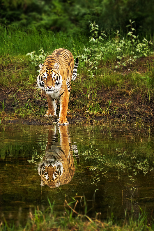
| 78 |
Aug 18 |
Comment |
Hi Brenda, it is a nice a capture. The sharpness, the color and the eye contact of the tiger make the picture a nice one.
In terms of the suggestions, below are what I would do. To demonstrate my thoughts, I did a quick version. I have to admit that this version is aggressive, i.e. crop too much, sharpening too much, etc. It is done on a Jpeg, so the quality isn't good, etc. Anyway, it is just to show the ideas.
1) Crop the image to reduce the distraction of the woods and make the subject a bit bigger. Again, my version is too aggressive. I should leave a bit more space.
2) Since the focal length is 7.1, the woods is clear enough to catch the eyes. So I would reduce the DOF by blurring the background, and also the foreground. Just be careful that it has to be done carefully to simulate the lens blurry. Different blurry degree should be applied based on the distance. As a result of that I blurry a little bit on the back of the tiger.
3) Use dodge and burn to darken the background, so the subject can pop.
4) Add some contrast and sharpen the image.
Above are just my 2 cents. I am still a learner, so some of the idea might not be correct. Great picture. Cheers.
|
Aug 2nd |
 |
8 comments - 7 replies for Group 78
|
8 comments - 7 replies Total
|