|
| Group |
Round |
C/R |
Comment |
Date |
Image |
| 78 |
Jun 24 |
Reply |
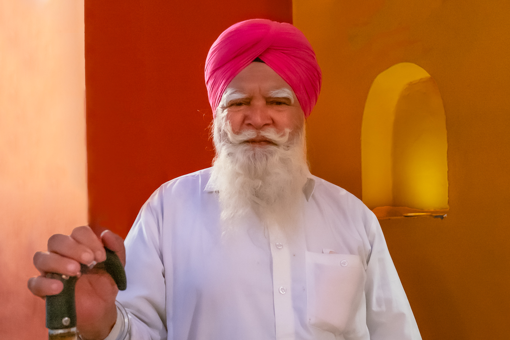
Thanks, corrected the spots on the shirt and the pocket and made a small adjustment to the eyes, as anything more would make it look flat. |
Jun 27th |
 |
| 78 |
Jun 24 |
Reply |
Thanks Ed,
Please check reposted image. |
Jun 26th |
| 78 |
Jun 24 |
Reply |
Thanks, appreciate your views. |
Jun 26th |
| 78 |
Jun 24 |
Reply |
Thanks for your views, please check reposted image. |
Jun 26th |
| 78 |
Jun 24 |
Reply |
Thanks Jim,
Reposted with some correction as suggested. |
Jun 26th |
| 78 |
Jun 24 |
Reply |
Check the image posted today with some corrections. |
Jun 26th |
| 78 |
Jun 24 |
Comment |
Made some corrections as suggested by the group. |
Jun 26th |
 |
| 78 |
Jun 24 |
Comment |
Very well captured and well processed. liked it. |
Jun 13th |
| 78 |
Jun 24 |
Comment |
Like before even this photo stacking is good, liked it. |
Jun 13th |
| 78 |
Jun 24 |
Comment |
This image is well captured, and the processing is good. However, without using AI and by completely removing the reflection, the image might look even better.
|
Jun 13th |
 |
| 78 |
Jun 24 |
Comment |
I liked the picture and the crop in the processed image. However, it looks oversaturated to me. Reducing the saturation might give it a more natural look |
Jun 11th |
| 78 |
Jun 24 |
Comment |
Your black-and-white conversion is well done and needs no further adjustments. However, I believe the original color photo, cropped the same way as the black-and-white version and with a slight vibrance adjustment, would look even better. Photos like this, with such vibrant colors and beautiful skin tones, generally look more appealing in color than in black-and-white. |
Jun 11th |
6 comments - 6 replies for Group 78
|
6 comments - 6 replies Total
|