|
| Group |
Round |
C/R |
Comment |
Date |
Image |
| 78 |
Feb 24 |
Reply |
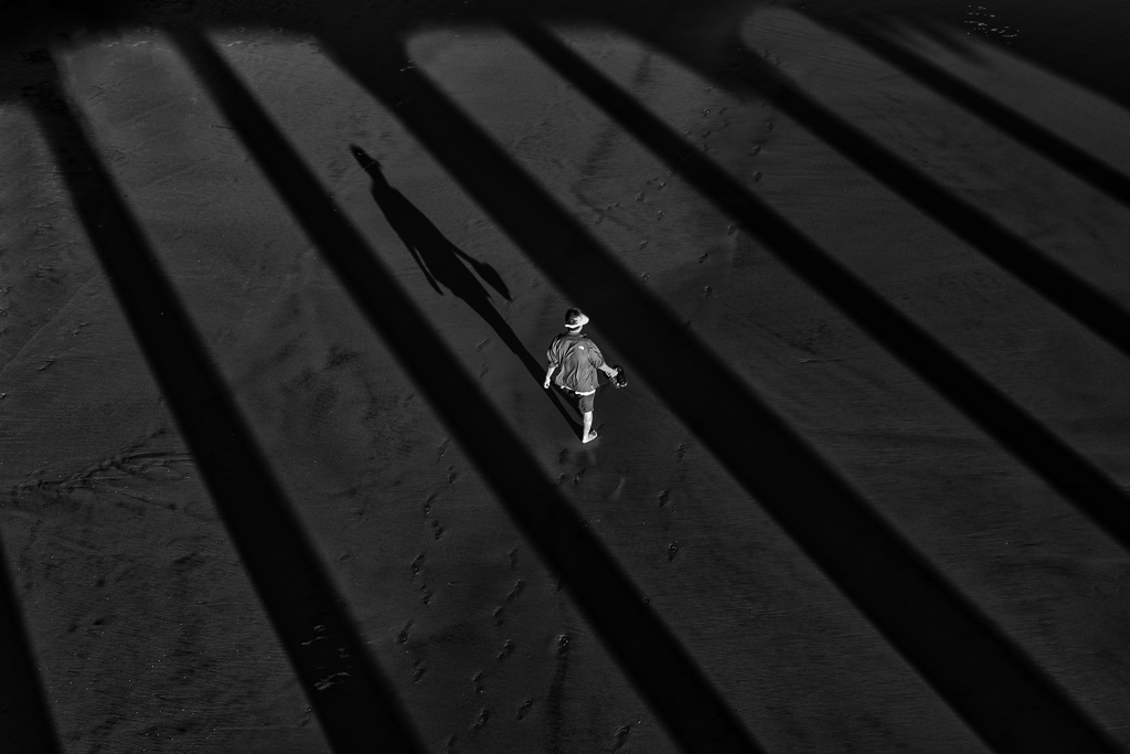
On my calibrated monitor, the originally posted photo had a three-dimensional quality, but with the darkening of the face, that is lost. I would not make any corrections to the original post. |
Feb 20th |
| 78 |
Feb 24 |
Reply |
Thank you for your views. |
Feb 15th |
| 78 |
Feb 24 |
Reply |
Agree |
Feb 14th |
| 78 |
Feb 24 |
Reply |
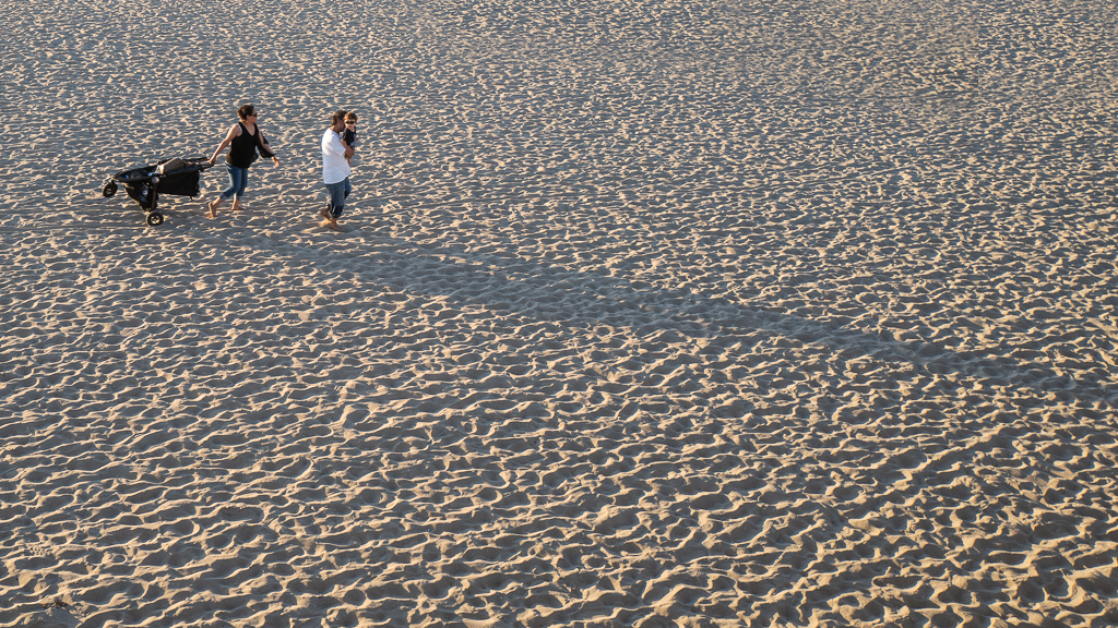
This is good, much different than the color, I liked this one more. |
Feb 14th |
| 78 |
Feb 24 |
Comment |
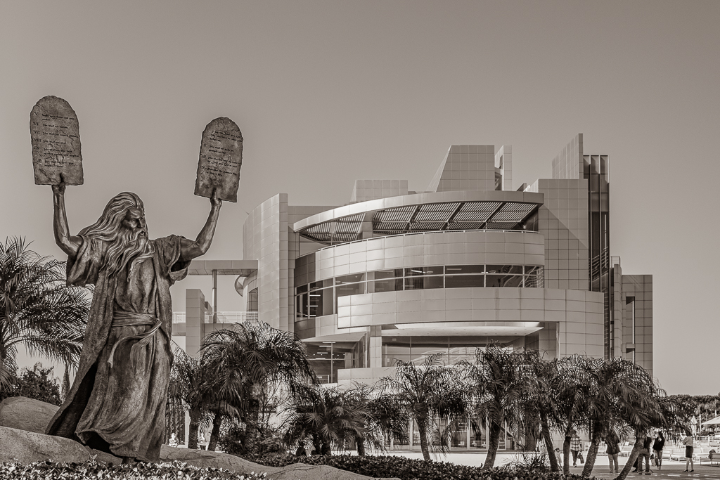
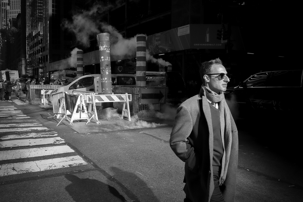
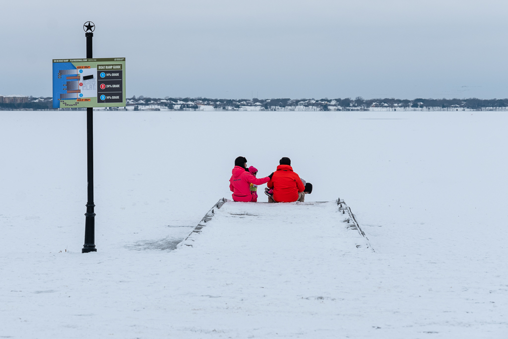
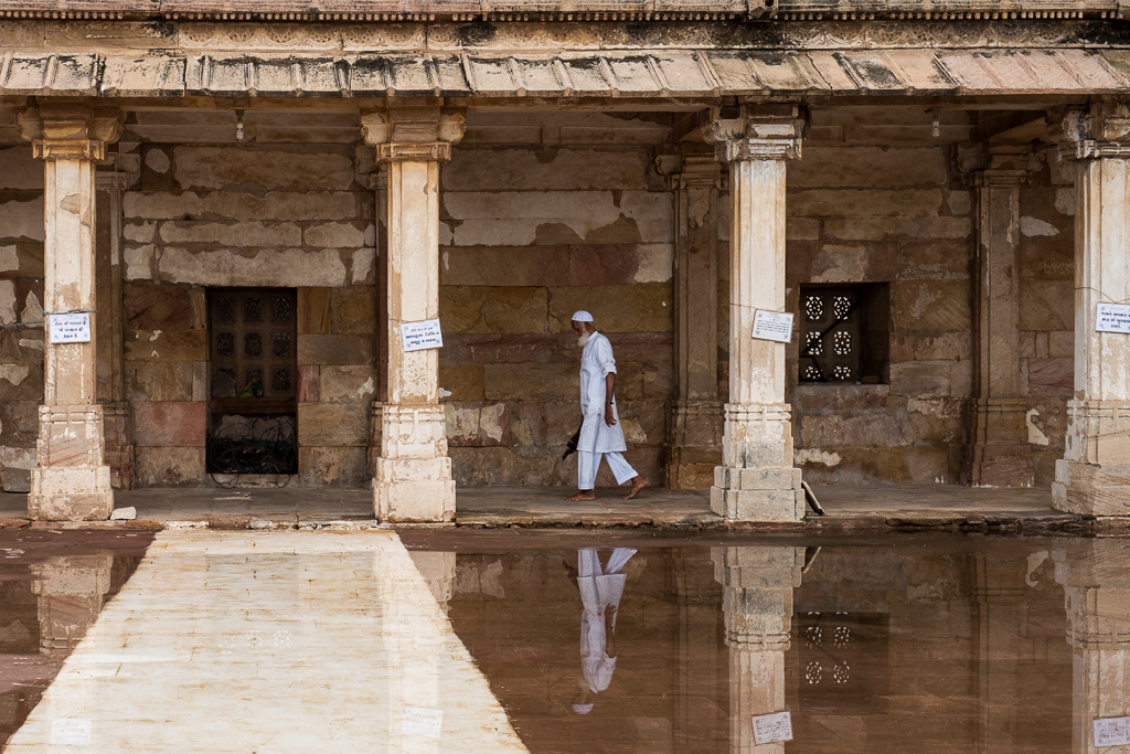
Ed,
This is a great picture and quite different from most moon photos we see. If the file quality is good, this would also look great if you print large size.
I wouldn't give much thought or worry about what some judges think. One of my photos was once commented on by a judge as just a snapshot and not at the competition level. However, the same photo was later selected by 'Leica Foto International' for gallery display. Interestingly, when Leica launched the camera 'Leica Q2,' it was included as part of their publicity campaign
|
Feb 14th |
| 78 |
Feb 24 |
Comment |
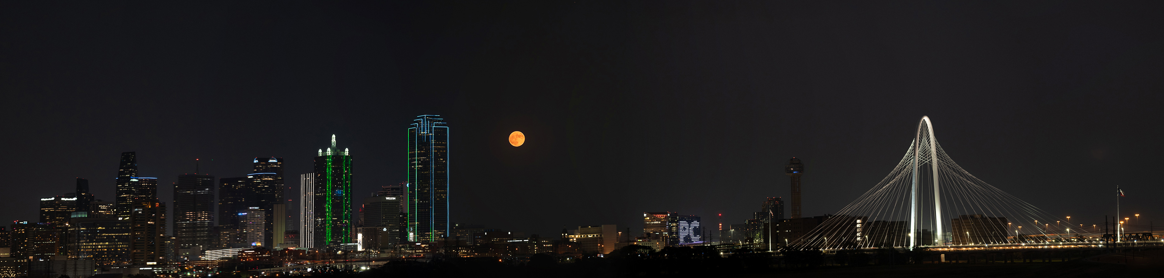
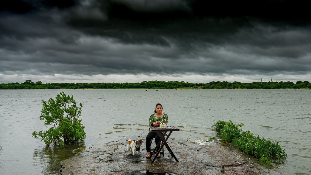
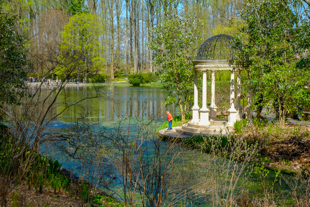
Robert,
I liked your image. The lighting is good and well-captured, and the depth of field is appropriate. Your processing is good, and I also liked what James did. Would you please post the image you took in black and white before? I'm curious to see how both versions look.
We have a Japanese garden in Fort Worth, Texas. I took some photos in early December when the fall colors were at their peak. I may post them next month.
|
Feb 14th |
| 78 |
Feb 24 |
Comment |
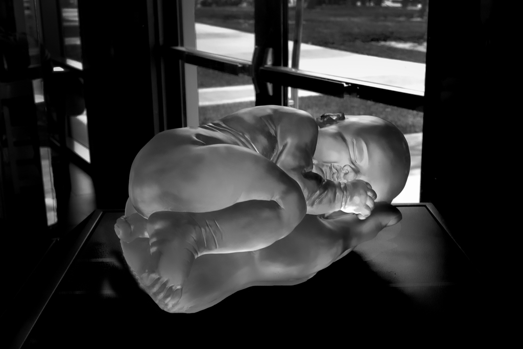
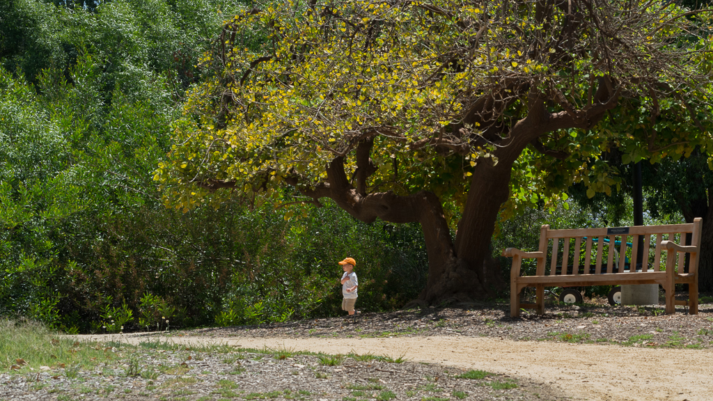
Mu,
"Welcome to the group. You've done a very good job capturing and composing this image. Everything is in its right place, the three boys and the ball. The only thing I would add is that it's a bit over-processed; toning it down slightly may enhance its appearance."
|
Feb 14th |
| 78 |
Feb 24 |
Comment |
James,
Looked at your image for several times and read discussion by others.
Your processing and crop are good, liked it.
|
Feb 14th |
| 78 |
Feb 24 |
Comment |
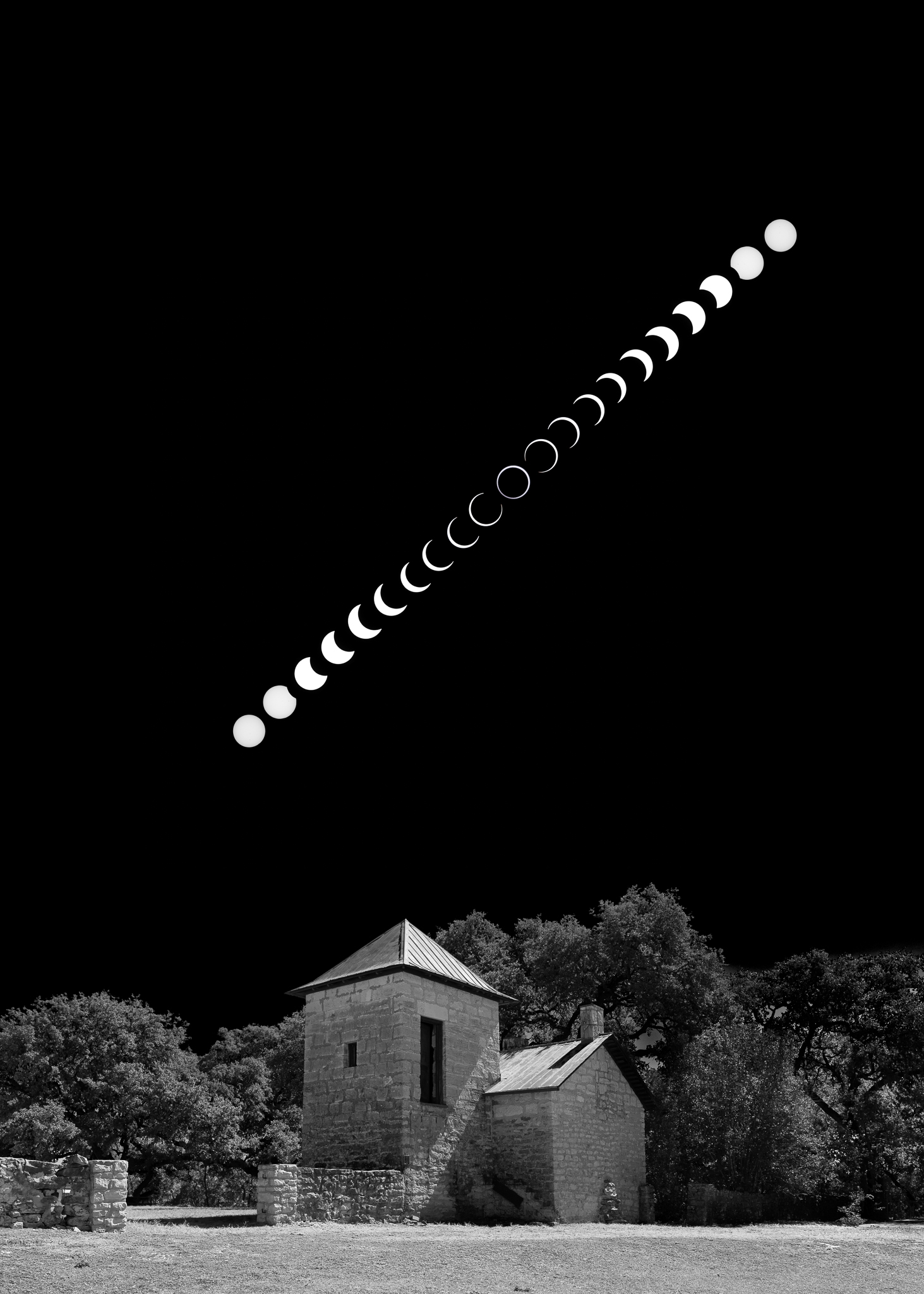
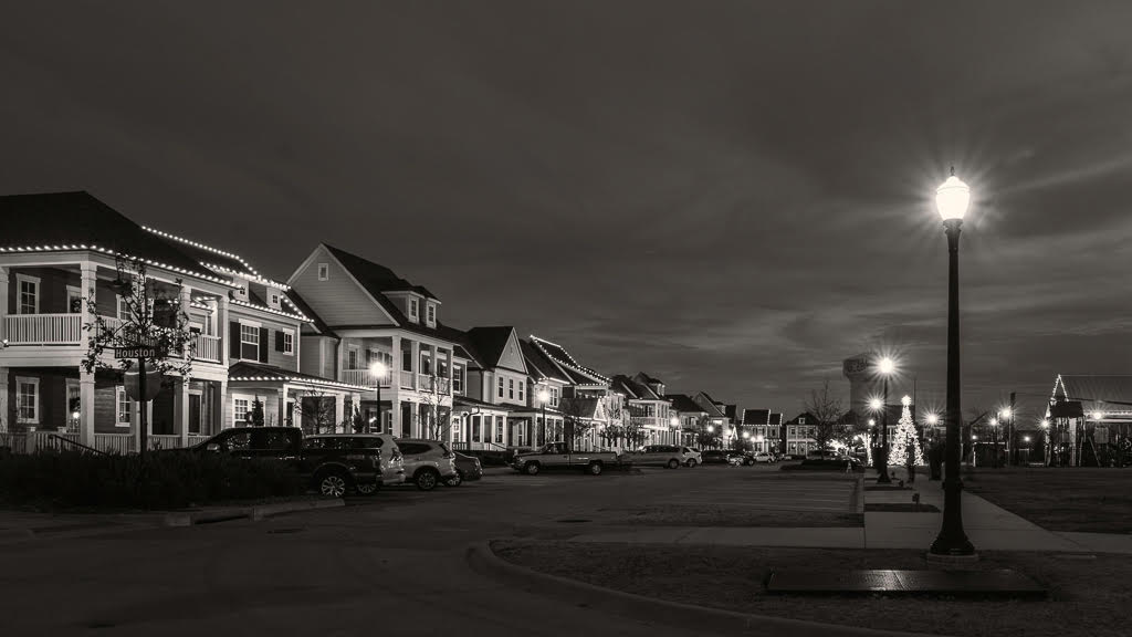
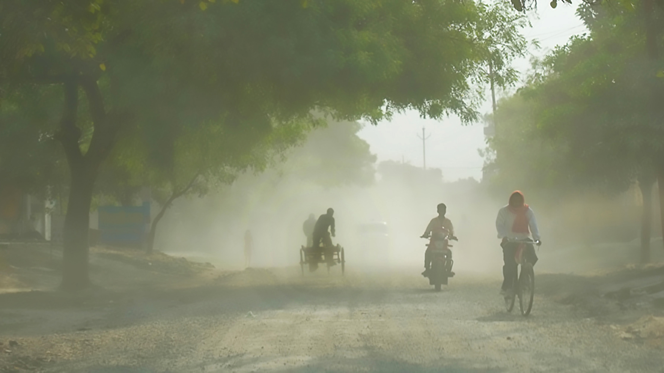
Jim,
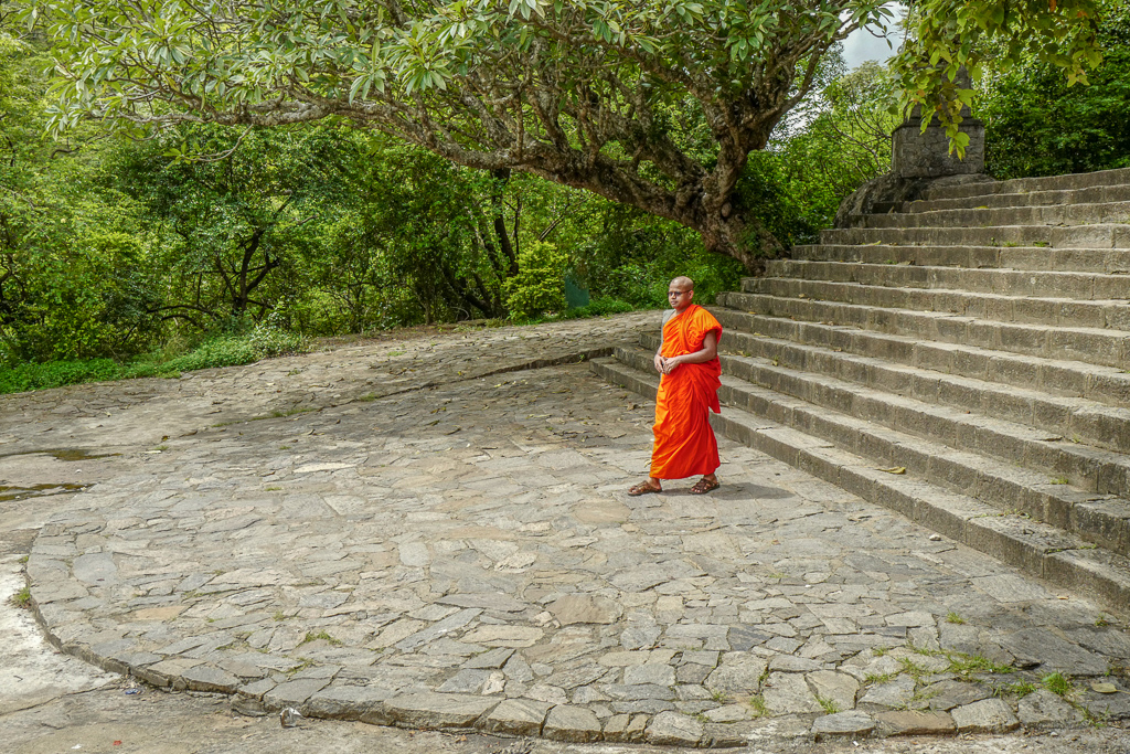
You've captured the mood of history very well. I liked your processing; there's nothing to add. However, since this image represents the past, it may look good in black and white or sepia. |
Feb 14th |
| 78 |
Feb 24 |
Comment |
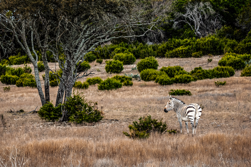
Brenda,
As always, this is indeed a great bird image. I preferred the background processing by James, but the brightness and contrast on the bird in your posted image are good. |
Feb 14th |
| 78 |
Feb 24 |
Reply |
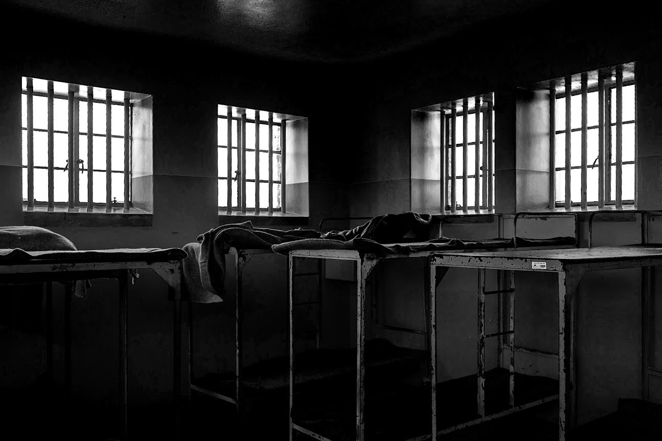
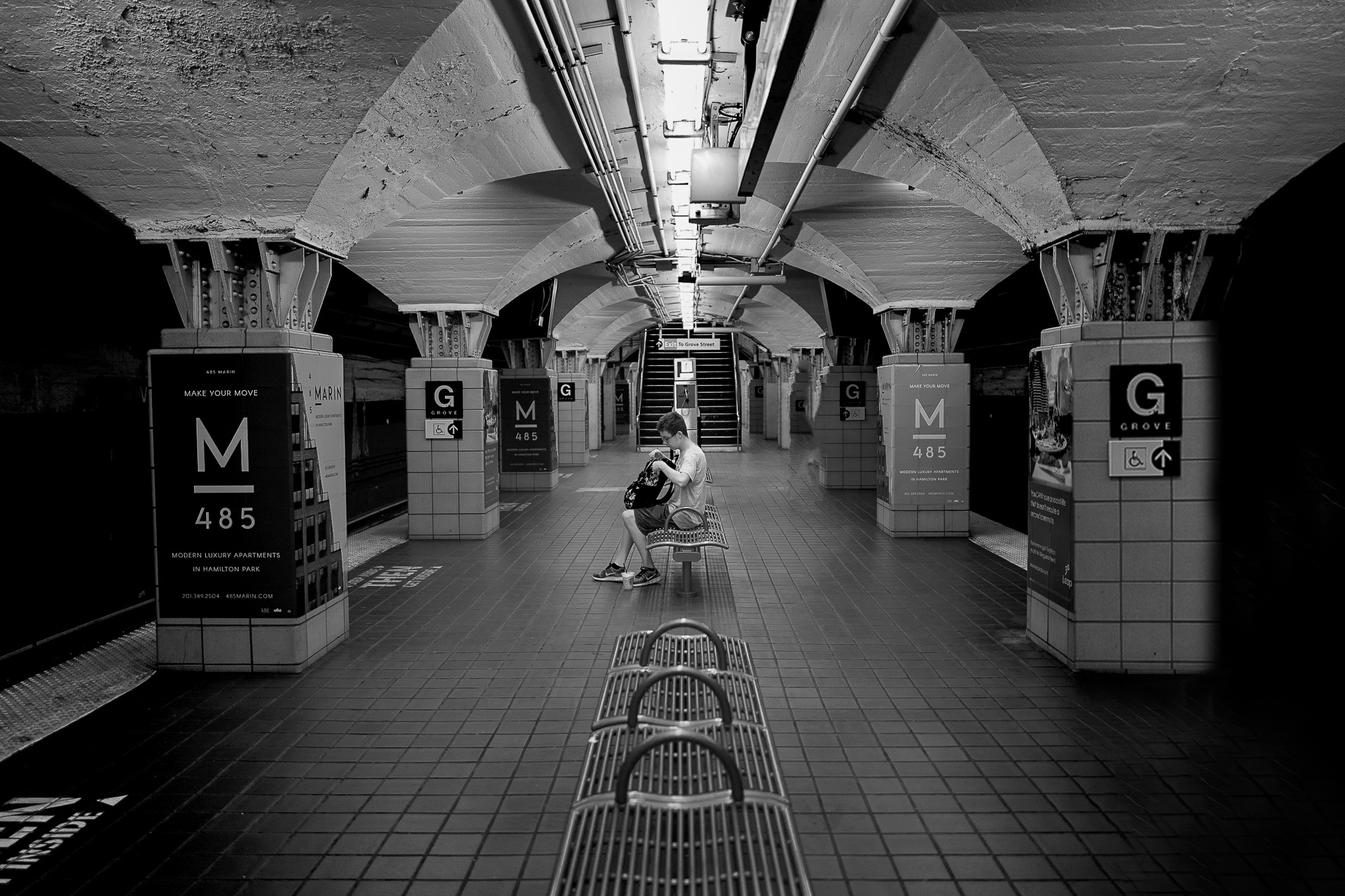
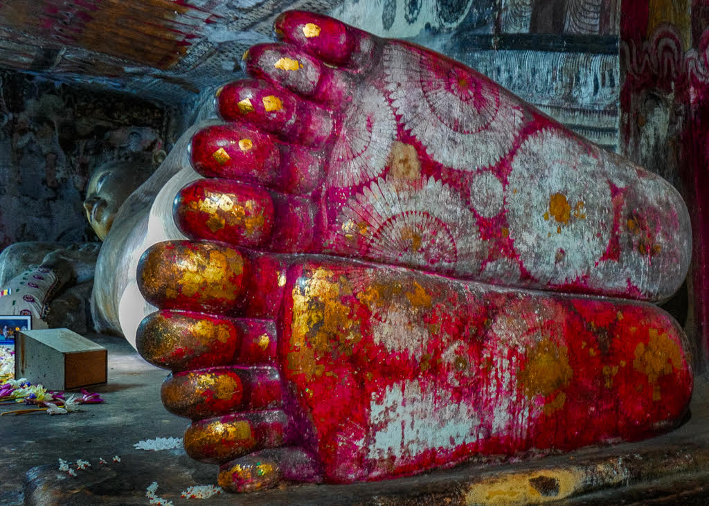
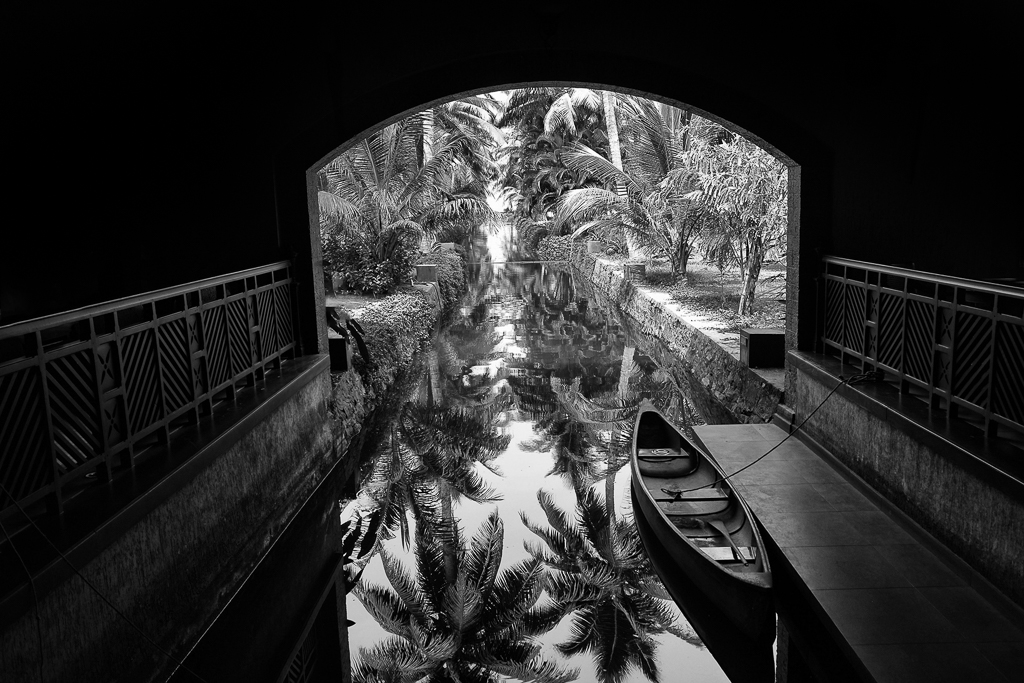
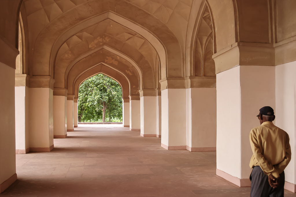
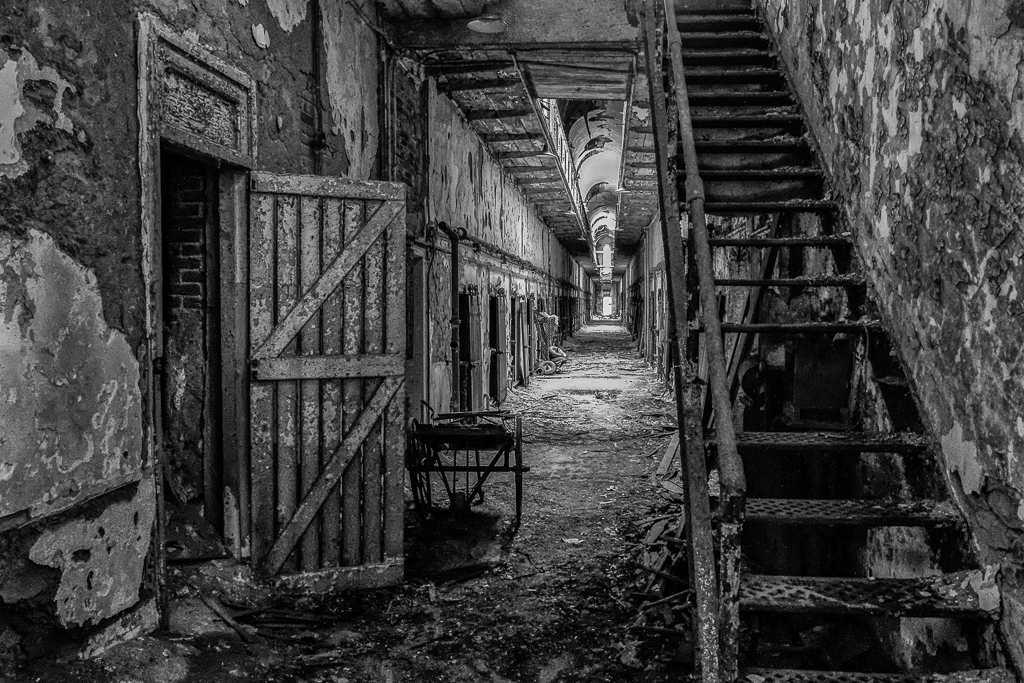
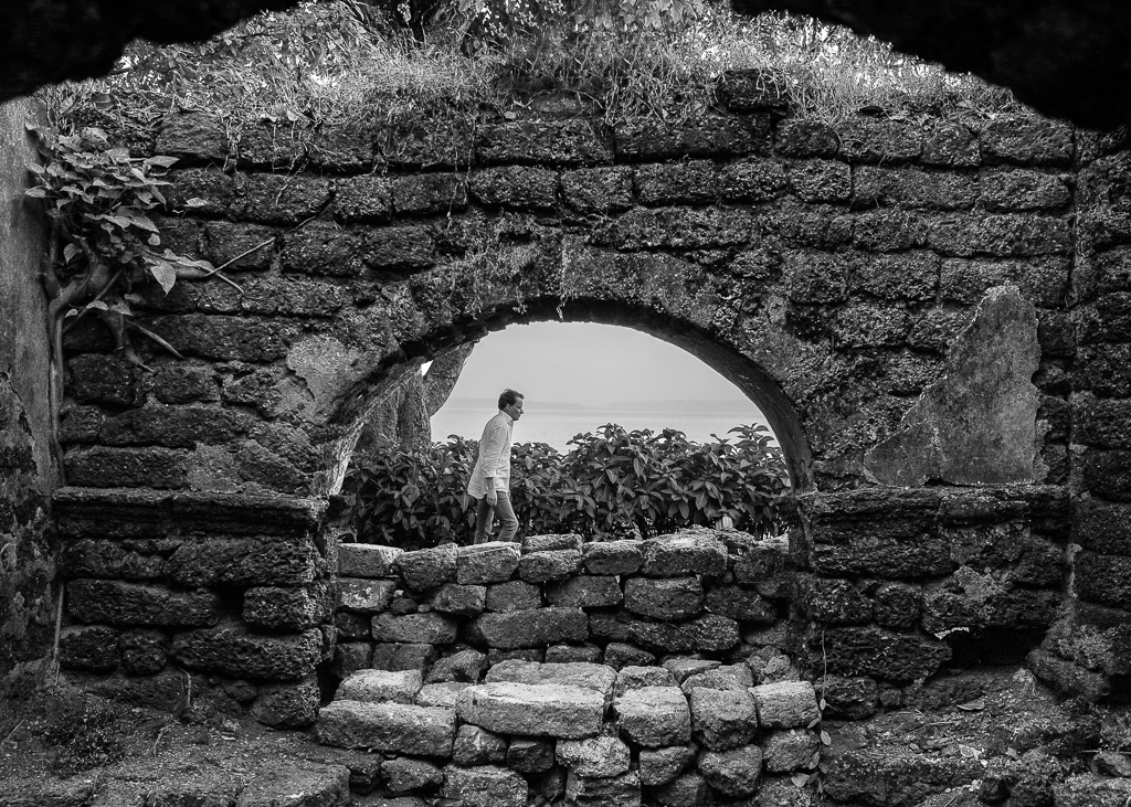
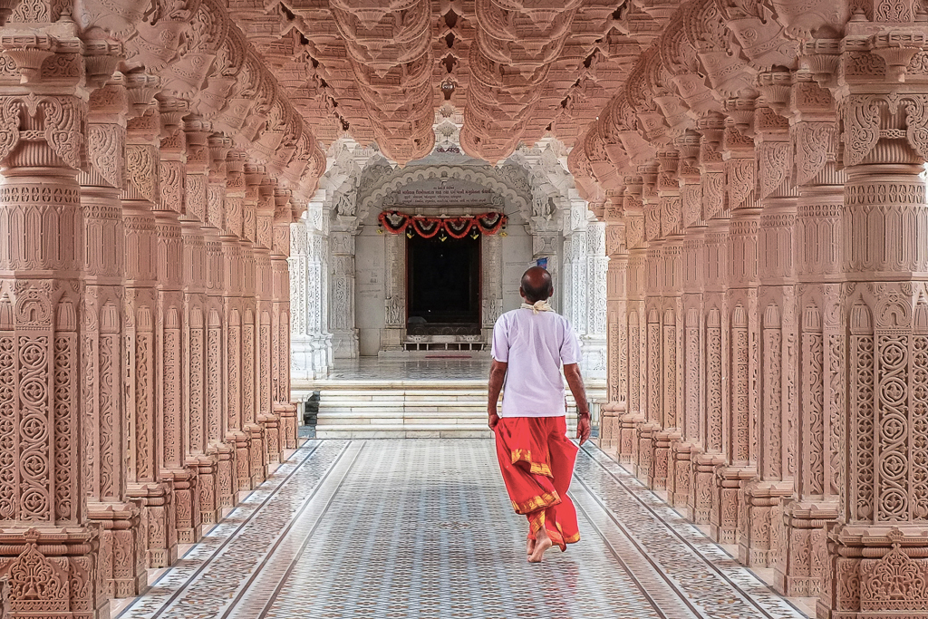
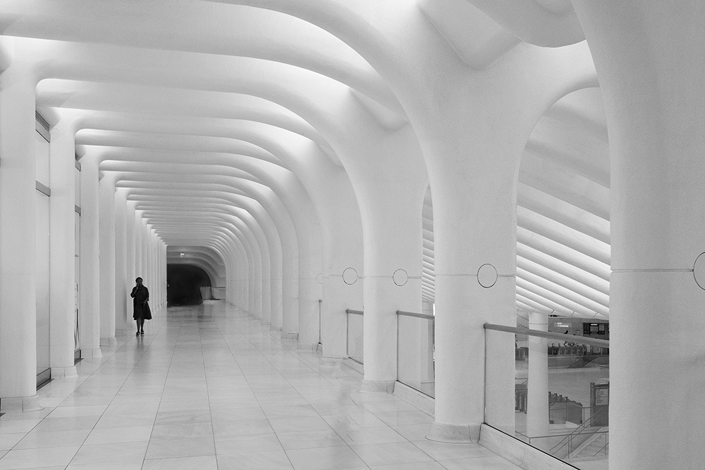
ED,
Thank you for sharing your views. I appreciate your efforts in working on the image near the pillar. I overlooked that detail and posted in a hurry. Your corrections are perfect and improve the image significantly.
|
Feb 8th |
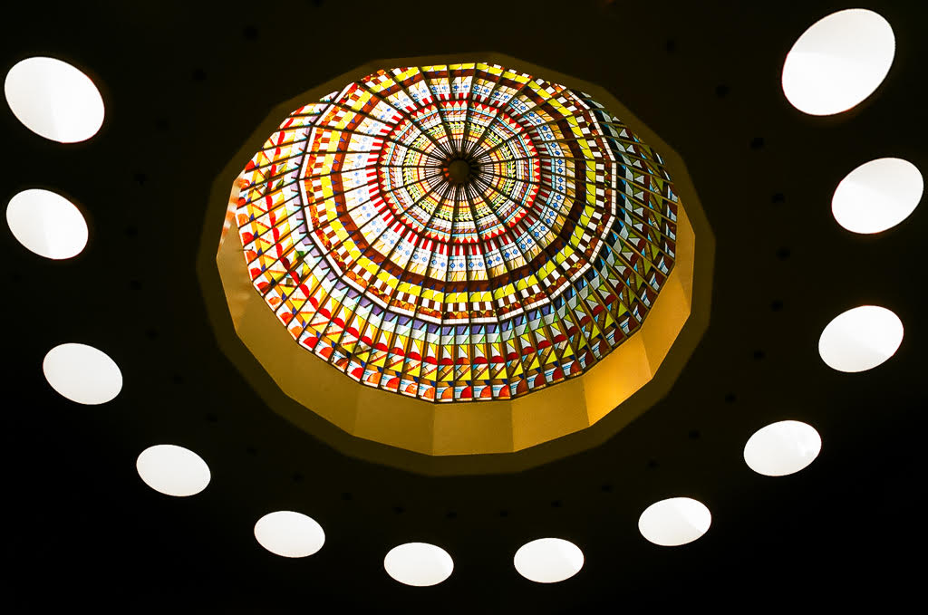
| 78 |
Feb 24 |
Reply |
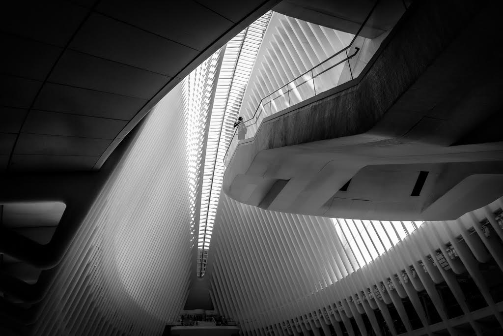
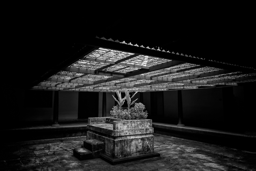
Robert,
Thank you for your input. I realize that I didn't do a thorough job before posting. You're correct about the ghost image. As for the contract, I believe the posted image already has an adequate amount of contrast. Any further increase might result in graininess in the ceiling area, and overall, it would make the image too dark.
Check corrected image posted by ED, looks much better than what I did. |
Feb 8th |
| 78 |
Feb 24 |
Reply |
Jim,
Thank you. |
Feb 4th |
| 78 |
Feb 24 |
Reply |
Thanks,
Appreciate your views. |
Feb 4th |
| 78 |
Feb 24 |
Reply |
James,
Thanks for your views,
Paper glass in front of right feet, that was a good catch, as suggested, I tried to remove, attached with this replay. |
Feb 4th |
 |
6 comments - 9 replies for Group 78
|
6 comments - 9 replies Total
|