|
| Group |
Round |
C/R |
Comment |
Date |
Image |
| 78 |
Jan 23 |
Reply |
Thanks James, Liked your treatment.
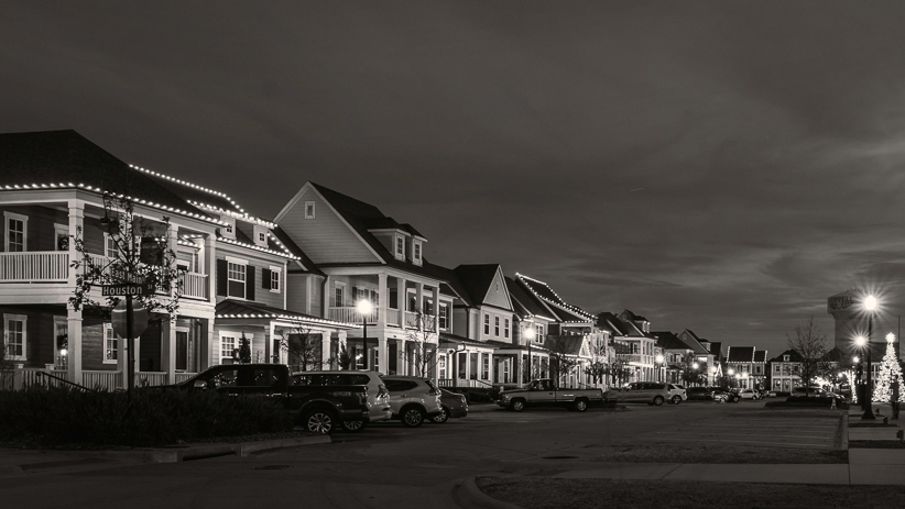
Original and reposted image is toned in very light Coffee Tone. Strong sepia tone some times kills the fine texture of monochrome (IMO) and for that reason I prefer very light either Coffee or Sepia. |
Jan 15th |
| 78 |
Jan 23 |
Comment |
Mitch
Well captured and processed.
Thanks for sharing your experience. |
Jan 15th |
| 78 |
Jan 23 |
Comment |
Very well captured, color ver looks good but BW sepia ver looks much better. Liked it. |
Jan 15th |
| 78 |
Jan 23 |
Comment |
Jim, I liked the pop and the separation and overall treatment, well captured image. |
Jan 15th |
| 78 |
Jan 23 |
Reply |
Well captured, overall processing done is good but little over saturated, which turns highlights little over and burned, choice of aperture makes background out of focus and it helps in subjects coming out but a stop less may even further help by making front wood little less sharp, try selecting only front wood and reduce contract and brightness which may help in focus remaining on the subject.
Your crop is good, try vertical and little tighter may look good too.
Tried looking at converting in BW but both background and subject falls on the same gray scale separation and pop is lost, keep it in color.
|
Jan 15th |
 |
| 78 |
Jan 23 |
Comment |
Welcome, James.
Liked the image, post processing is good, but the sky looks over processed. As suggested by Brenda try working on blues. |
Jan 9th |
| 78 |
Jan 23 |
Reply |
Thanks Brenda,
Did some changes as suggested by you and Terry, attached in replay to Terry. |
Jan 2nd |
| 78 |
Jan 23 |
Reply |
Thanks Terry,
I tried as suggested, it improved a lot. |
Jan 2nd |
 |
4 comments - 4 replies for Group 78
|
4 comments - 4 replies Total
|