|
| Group |
Round |
C/R |
Comment |
Date |
Image |
| 78 |
May 21 |
Comment |
Mitch,
Good closeup, liked Terry's suggestion. |
May 23rd |
| 78 |
May 21 |
Comment |
Jason,
Good image and very good processing, liked it, removing tilt will look better. |
May 23rd |
 |
| 78 |
May 21 |
Comment |
Terry,
Liked it, very well processed. |
May 23rd |
| 78 |
May 21 |
Comment |
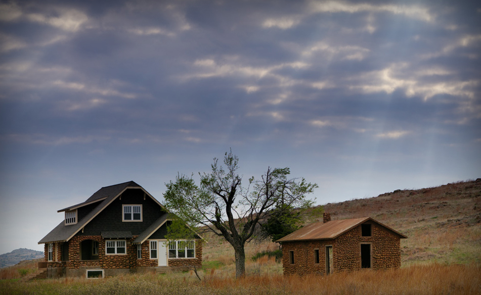
Helen,
Very good strong image, liked it. Can be cropped differently to make it more interesting, I would crop as attached. |
May 23rd |
 |
| 78 |
May 21 |
Reply |
Thanks Jason,
Appreciate your views. |
May 23rd |
| 78 |
May 21 |
Comment |
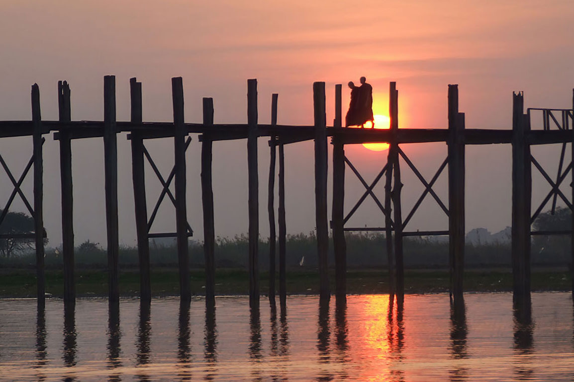
Jim,
Very well captured and exposed, in the absence of the original image, can not compare / suggest what more can be done, liked the square crop suggestion of Jason. |
May 23rd |
| 78 |
May 21 |
Comment |
Brenda,
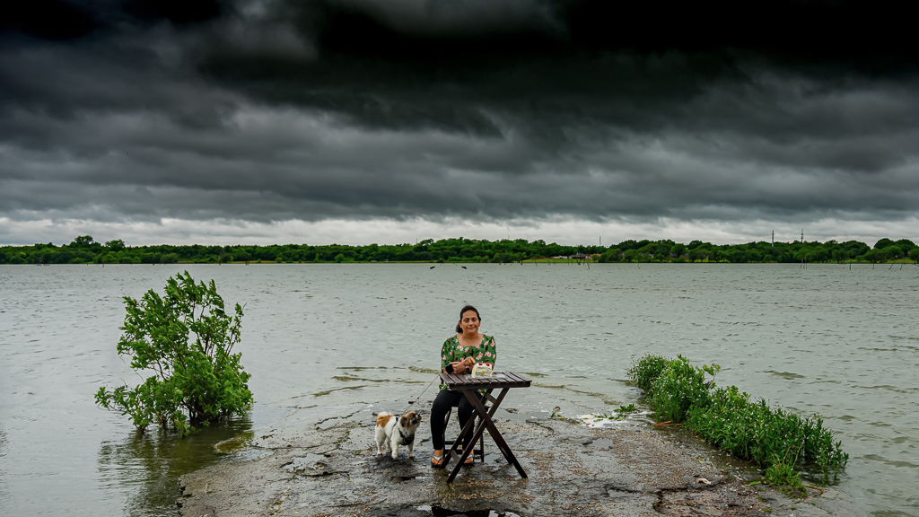
Great image, perfect travel picture, lots of discussion on crop, what I like is the crop suggested by Terry, by keeping the kid between left side bushes and right side trees gives death and represents a true African village side, reminds me of my years in Africa (worked in Congo for long 26 years) |
May 23rd |
| 78 |
May 21 |
Reply |
Thanks Brenda,
Yes agree, Jim's crop is very good and that is what I would do in future use. |
May 14th |
| 78 |
May 21 |
Reply |
Jim,
Thank you for your suggestion, your crop looks good and much better than what I did, if i have to use this image again then I would crop as suggested by you. Thanks.
|
May 14th |
| 78 |
May 21 |
Reply |
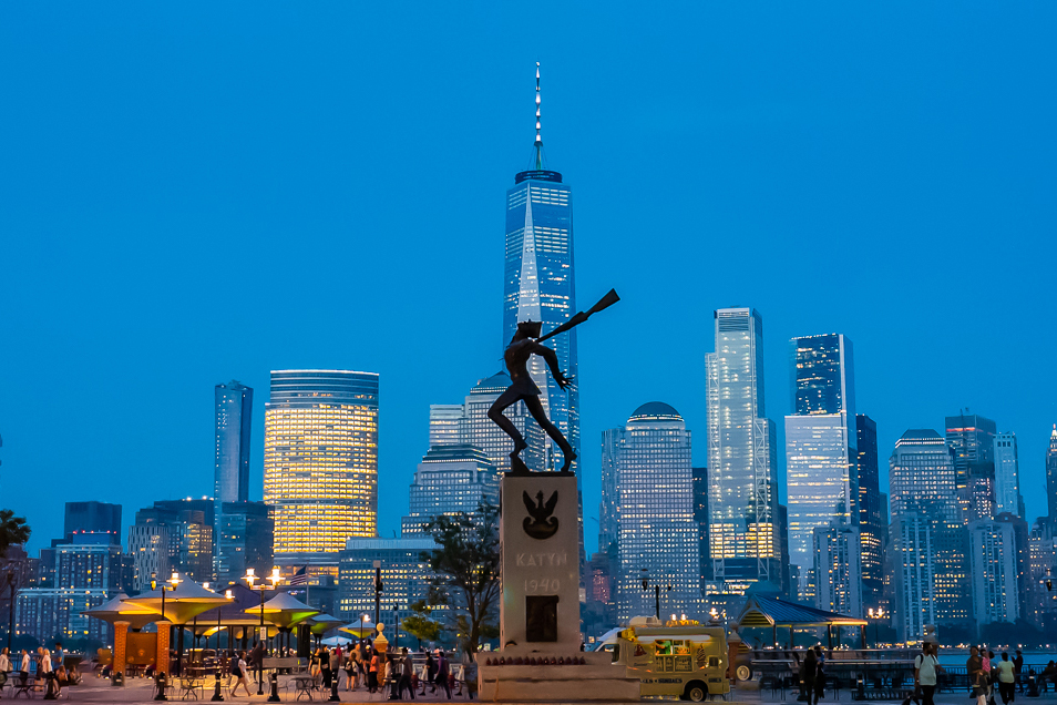
Helen,
Agree, Original 2 is good picture but is more like a picture postcard we normally see in the tourist souvenir shops, my focus is more on serious side of the history and for that reason I cropped more and focusing on two structures.
Appreciate your views.
|
May 14th |
| 78 |
May 21 |
Reply |
Mitch,
Thanks, agree, people in the picture add value and that is what I originally wanted to post, but then it makes it just a nice image normally we see on Picture Postcard. Look at the crop suggested by Jim, that is really good and well-balanced crop. It is not difficult to edit bright food truck and some of the people in the front, attached quick edit for reference.
If I have to use the image in Original 2 then I will keep bright food truck and people as it is as they are part of any tourist place.
|
May 14th |
 |
| 78 |
May 21 |
Reply |
Thanks Tarry.
If observed closely you will notice the bottom crop is where the word "Katyn" is on the monument, most knows about Freedom tower but few knows about "Katyn" monument, even most residents of NJ do not know much about it and for that reason my crop includes the word "Katyn" for those curious to google about it.
Light on left building is actually balancing the dark side of history behind both the monuments, but yes crop suggested by Jim makes the picture stronger than my crop.
About the empty sky, look at the whole picture, it is bottom heavy and empty sky is in balance to it, adding Moon may make this image prettier but will take away the serious side. Also, to note, if the subject is a known monument and is not East facing then Moon cannot be in that direction.
|
May 14th |
6 comments - 6 replies for Group 78
|
6 comments - 6 replies Total
|