|
| Group |
Round |
C/R |
Comment |
Date |
Image |
| 65 |
Apr 19 |
Comment |
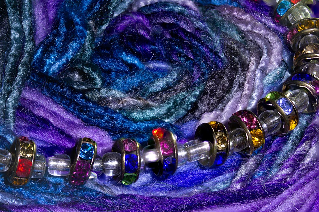
Great choice for an object! I love the colors and the interesting textures. I do agree with Charlie that cleaning the lint/marks off makes for less distracting bits. I found this on my yarn photo a couple of months ago... while the white provides good contrast, it's a bit overpowering. I actually would have cropped the photo way down from the top so the background peeks out from behind the last row of bristles and just concentrate on the fabulous beads and lines. |
Apr 30th |
| 65 |
Apr 19 |
Comment |
Oscar - love this photo too! I didn't find the saucer flowers to be distracting at all at this focus. I especially like the angles of the rim vs the handle and the curves. I actually didn't notice the handle reflection until I read the comments. But that's because of the glaze on the cup.
One thing I learned from old theatre props was to spray shiny things with a bit of hairspray (clear) and not very much. This can take the shine of a glazed object without distorting the pattern. But it's a very fine line because then you'll get some comments that the picture may be out of focus if you overspray it. And then make sure to wash the object afterwards.
There's probably some photo stuff specifically for this. ?? |
Apr 30th |
| 65 |
Apr 19 |
Comment |
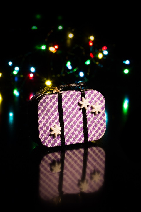
Charles! Rats... you took my May idea! I do like the photo with the depth of field but agree with Lynne & Janos that the foreground blur is a bit much... either a crop or 1 or 2 layers to move the blur down a bit. I like the wood vs metal but I'm finding the multitude of lines (grain of wood at angles) is drawing my eye all over, maybe because of the blur isn't allowing the lines to lead me back to the pin? |
Apr 30th |
| 65 |
Apr 19 |
Comment |
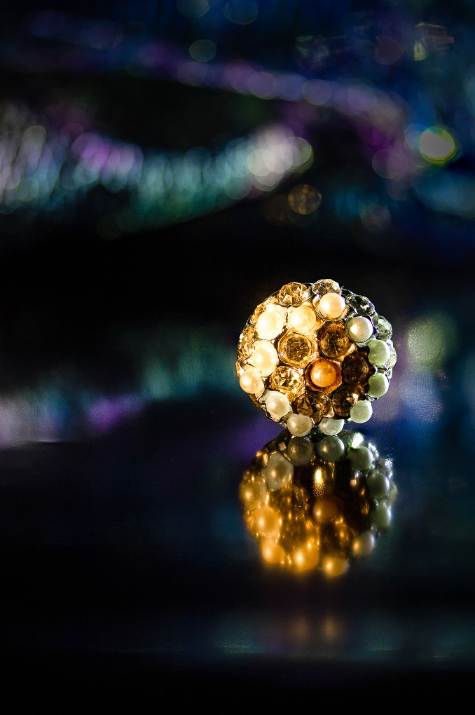
I love this photo! The diagonal placement of the cork with the spiral of the metal is great. The contrast between the two materials is nicely lit and great colors. I was distracted by the greenish wispy things as well. Don't know if that's the bottle or background or ?? But I would have really liked seeing it just on a completely black background. |
Apr 30th |
| 65 |
Apr 19 |
Comment |
I do find the texture distracting but only over the Cheerios themselves. I love it on the background of the photo. I wonder if there's a way to combine the background texture photo with the layer of the Cheerios so that the subject wasn't overlaid? Not sure -- i'm still navigating my way through what PS can do.
And ditto on the baby pictures. :) |
Apr 30th |
5 comments - 0 replies for Group 65
|
5 comments - 0 replies Total
|