|
| Group |
Round |
C/R |
Comment |
Date |
Image |
| 15 |
Sep 18 |
Reply |
Thank you Joan. |
Sep 26th |
| 15 |
Sep 18 |
Comment |
Hi Linda - I love your street photography! Wow what a moment. I like how they are both looking at you. Because the couple are different in height those lines in the flag, appear to me to be accentuated as they lead me from the woman up to the man. I like that the background and path are dull in colour and then the flag's Blue and Red, both primary colours, further stand out and strengthens it as a primary fixation point. I like how there is a fence just behind them and how the lines of the fence, perpendicular, contrast with the horizontal lines in the flag. Great detail across the image as well Linda. Its a fantastic image. cheers Nadia |
Sep 25th |
| 15 |
Sep 18 |
Comment |
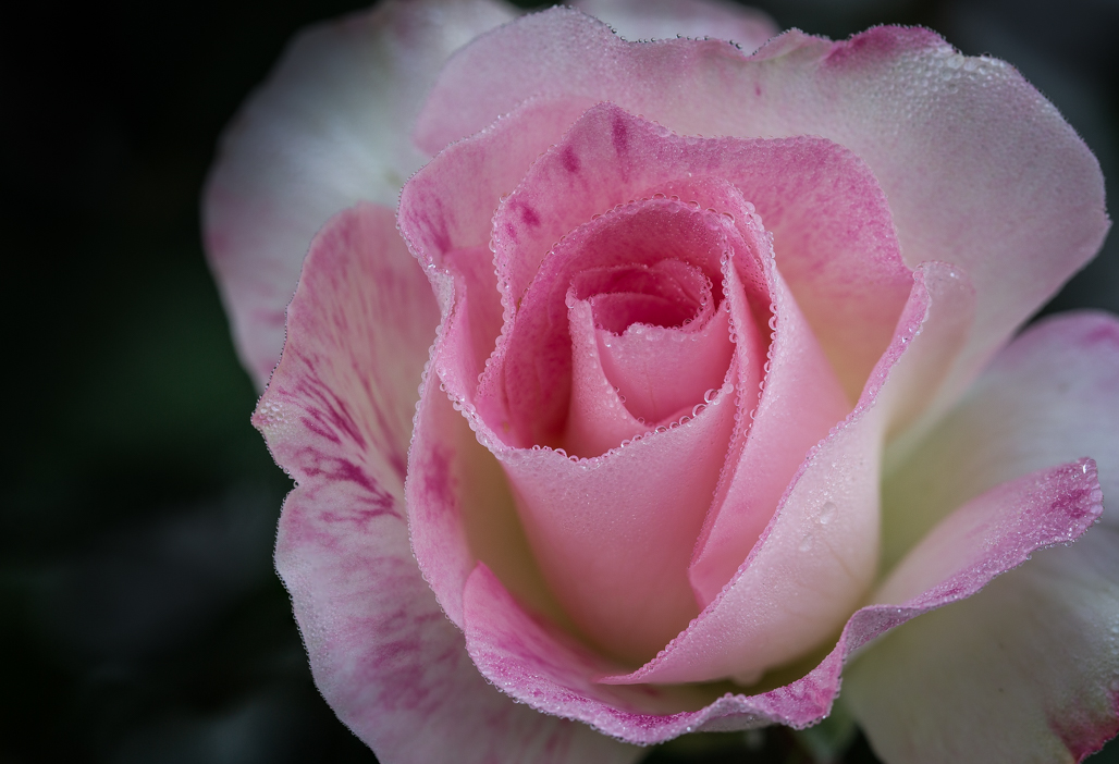
Hi Carmen - I am so impressed with your knowledge of post processing - I am going to google some of the treatments you used - it all sounds wonderful. I love the powerful colour statement you utilised - I was mesmerised by the tones of orange, yellow and a touch of green. The reflection is beautifully done and it blends in seamlessly with the top half of the image. The composition is strong as the centre of the flower is right on the point of thirds. The edge of the flower petals where there is a touch colour create beautiful leading lines, and these warm colour tones of yellow and soft red further strengths that fixation point. There is detail right across the flower and I like the texture that you captured in the stamen area. (I think it could be called the floret). Great Image Carmen. cheers Nadia |
Sep 25th |
| 15 |
Sep 18 |
Comment |
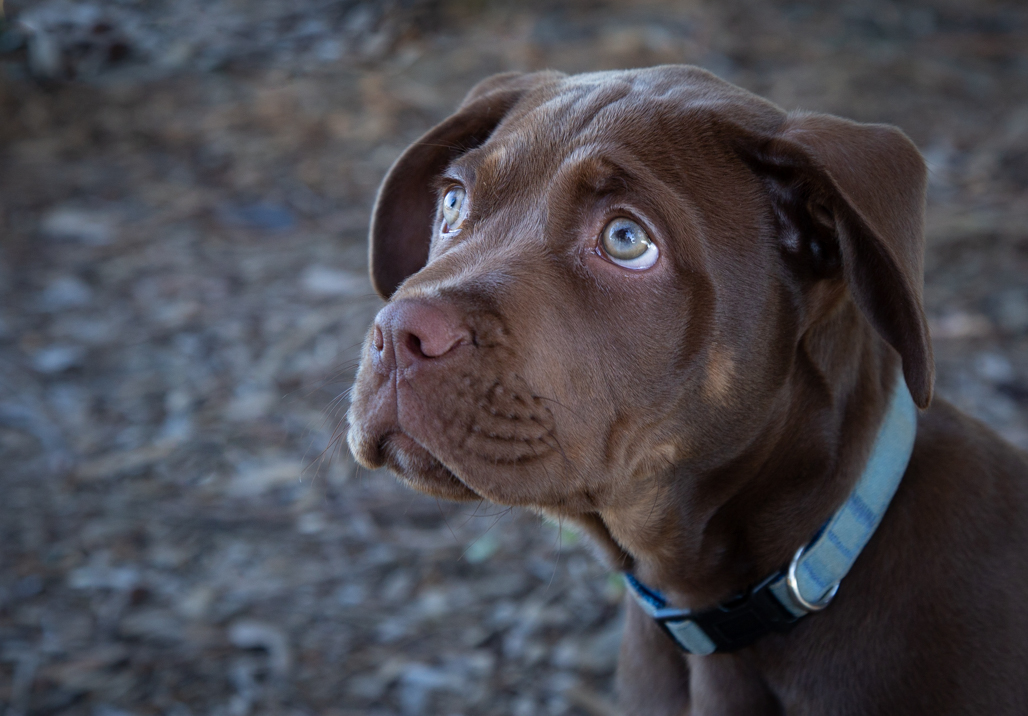
Hi Rick, Wow! Love that you have presented this in Mono - I think it makes a much stronger impact than the colour version.( in the colour version my eyes seem to want to focus on the light in the background yet in the Mono all I see is the wonderful rake). I love the repetition of the rake, for me it adds structure to the image. I also like how you didn't include the full front wheel - for me it forms the entrance to the image enticing me to look along the length of the rake and then taking in all that beautiful repetition. I suggest you look at some of the white areas, not sure if it is my screen, as some small areas of the sky look blown out and you may find toning these areas done might improve the tonal range. Great Shot Rick! cheers Nadia |
Sep 8th |
| 15 |
Sep 18 |
Comment |
Hi Joan, I really love how you captured the soft light in the trees. The leaves look to me almost translucent and ever so delicate. I think the soft band of shadows going in between the outcrops of white trees add depth and interest to the image - especially where the white on the tree top has the dark background behind it - it really defines and emphasises the beauty of the white leaves. For me the tree trunks form great leading lines. I particularly like the fine detail you captured in the smaller white branches of the top trees. I like the dark vignette and the fine black border. Beautiful Image. cheers Nadia |
Sep 8th |
4 comments - 1 reply for Group 15
|
| 60 |
Sep 18 |
Reply |
Thank you so much Bill |
Sep 25th |
| 60 |
Sep 18 |
Reply |
Thank you Carol and I appreciate the tip about cloning. Cheers Nadia |
Sep 17th |
| 60 |
Sep 18 |
Reply |
Thanks Will. |
Sep 8th |
| 60 |
Sep 18 |
Comment |
Hi Will, welcome to the group. I like the fine detail that you have captured in that central leaf. I love how it is trimmed with an edge of red and how the lines on it have tones of yellow - both strong primary colours that draw my attention. You captured great leading lines which come from the main stems of the outer leaves, all taking me to the main fixation point of that dark new leaf. Well seen. cheers Nadia |
Sep 8th |
| 60 |
Sep 18 |
Comment |
Hi Bob, I like everything about this image. For me the colour tone adds to the overall impact of the image. I like the soft light coming in from the left and how it gently emphasises those fine, delicate knife cuts. My favourite part of this image are those holes, especially the one on the left, sloppy, soft and about to cave in - it makes a great fixation point. I think the F stop used works well here as the front of the slice of cheese has good detail in it yet the background is nicely blurred. I also like how you have more cheese in the background which I think adds depth to the image. I can see this image being used for an advertisement. Great Shot. Nadia |
Sep 8th |
| 60 |
Sep 18 |
Reply |
Thanks Rick. |
Sep 8th |
| 60 |
Sep 18 |
Reply |
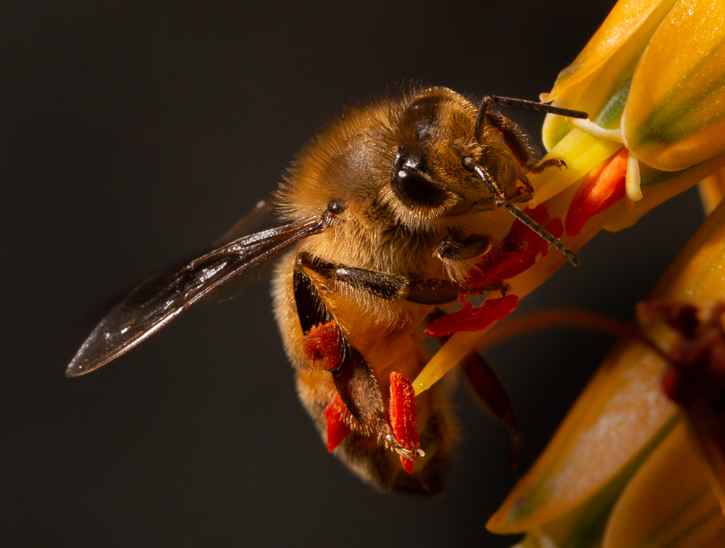
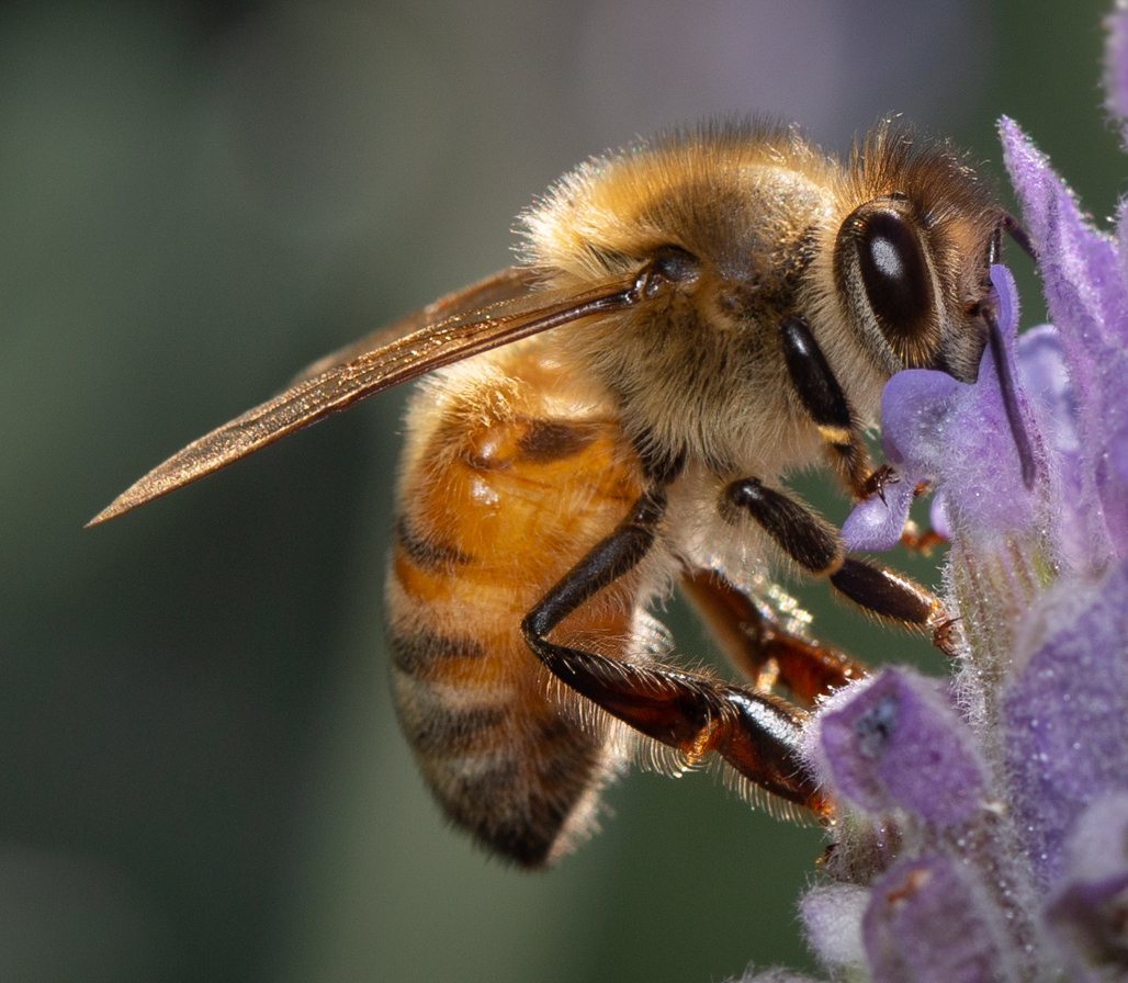
Thank you Bob - I started off using a tripod but the Bees kept away from me - so in the end I just hand held the camera with the flash in the other hand. The Bee never ever stayed still enough for me - was lucky to ever get one focused shot. |
Sep 8th |
| 60 |
Sep 18 |
Reply |
Hi Bill - thanks for that . Re the 'black spot' must be my eyes playing up on me. cheers Nadia |
Sep 4th |
| 60 |
Sep 18 |
Comment |
Hi Bill, I love the lines - just sublime. I like how the leaf in the background is much darker than the front one, for me that adds beautiful depth and structure to the image. My favourite part of the image is that striking edge of the front leaf and how that rim meanders across the image. I particularly like how you have not used any vignette on that front lighter leaf, for me it adds to the strong visual impact.
I am being picky here but I would suggest you clone out a little black spot on the back leaf just to keep my eye on the lines.
Could you let me know if the speed was 1/15? or did you mean 1/150?
cheers Nadia |
Sep 4th |
| 60 |
Sep 18 |
Comment |
The image certainly makes me think of fall Carol - beautiful shot. I find the primary colours of red and yellow extremely striking and for me they add to the overall autumn feel. My favourite part of the image are the two red stems, and how they form wonderful leading lines taking my eye to the central leaf with its intricate continuous ingrained lines. For me those two red stems add to the great composition of the image because they land on the rule of thirds. I also like how your main leaf is all in focus and how you have successfully blurred out the background with a large aperture setting.
I would like to suggest you try a black vignette to see if that would strengthen the visual appeal of the image but I see from your write up that you prefer the white.
cheers Nadia |
Sep 4th |
4 comments - 6 replies for Group 60
|
8 comments - 7 replies Total
|