|
| Group |
Round |
C/R |
Comment |
Date |
Image |
| 32 |
Aug 18 |
Comment |
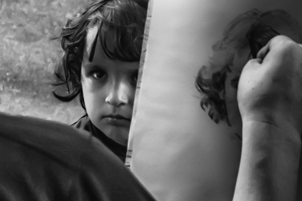
I was wondering if you think it is acceptable to be slightly out of focus. |
Aug 12th |
| 32 |
Aug 18 |
Comment |
That is and interesting perspective on the photo. My intent was to show what I see as earnest effort on the child's face to be still and pose correctly for the street artist. I included the artist because it's not only about the child's face (somewhat out of focus and pixilated) but about the story. |
Aug 12th |
| 32 |
Aug 18 |
Comment |
This photo truly evokes Little Mermaid dreaming of being human, therefore the pose and the Fractalius plug in on the fishtail from her waist down works well. The way you smoothed her skin in the original seems sufficient for the conversion to b and wh to look almost animated, adding to the effect, perhaps with some added emphasis on the shadows. Her hands in the original are just right, I think, but with the Fractalius effect they are blurred.
Before seeing this photo with the effect on the bottom but not the top it's difficult to be sure it would work. |
Aug 9th |
| 32 |
Aug 18 |
Comment |
Nice perspective in this shot. In my opinion the removal of the cars which I find distracting would add to the majesty of the building and its reflection. Tonally it seems slightly flat. In Silver Effects full dynamic range might help or I'd suggest checking the range with the gauge in Silver Effects to see if there are indeed too many mid tones particularly on the bottom half where those lines make such interesting angles and leading lines. Great to see this building without people also.
|
Aug 9th |
| 32 |
Aug 18 |
Comment |
What I like best about this shot is the mountain layering. A black and white a panel shot may work well as if we were peering under the tree branches to focus on the top of the lake and the mountains which could use a little more contrast. I'd suggest cropping in on the left and up from the bottom. If some of the pilings still show, they could be removed. Very pleasing photo without as much of the front distractions even if you left in a couple of the poles. |
Aug 9th |
| 32 |
Aug 18 |
Comment |
If you do make it a vertical, I would erase the lettering on the upper left because it would cause the eye to go there for no real reason. |
Aug 9th |
| 32 |
Aug 18 |
Comment |
What I like about the crop that Stephen suggested is that it leaves out the people on the right who are looking out of the frame, but I think the singer needs more headroom and therefore a vertical with the angular stairs above her would be a better choice. I like the person in the background looking at her phone because it is a sign of our times. People are always checking their phones in 2018 and perhaps missing the wonder around them like Lucy May Walker's song. |
Aug 9th |
7 comments - 0 replies for Group 32
|
7 comments - 0 replies Total
|
