|
| Group |
Round |
C/R |
Comment |
Date |
Image |
| 32 |
Jul 18 |
Comment |
Much improved! |
Jul 17th |
| 32 |
Jul 18 |
Comment |
Another thought. Could you keep the whole image and darken the sky? I like that side window open and the texture of the wood behind the car for contrast. If you were to erase the letters, you wouldn't have to crop. |
Jul 17th |
| 32 |
Jul 18 |
Comment |
Great perspective on a nice old relic, Tom.
I like the improvements that Diana made. The image was a little flat and needed contrast. I agree with Diana that the sky was distracting, but I think the vignette is too darkening although it did make the sunlight on the grass more intriguing. Words are distracting and when I'm looking at this photo I'm missing the emphasis on the grill because my eyes keep going to the letters even when they were minimized by the vignette.
Could you erase the letters? I'm not sure they add to the image, are you? That way the rest of the car would keep me interested. |
Jul 17th |
| 32 |
Jul 18 |
Comment |
Interesting subject! I like the improvements that have been made. Might I add that you could try toning down the white tubes on his instrument so they don't compete with his shirt which I think should be the brightest part of the photo. I would also darken the base of the statue slightly and the sky on top of the photo for the same reason. |
Jul 17th |
| 32 |
Jul 18 |
Comment |
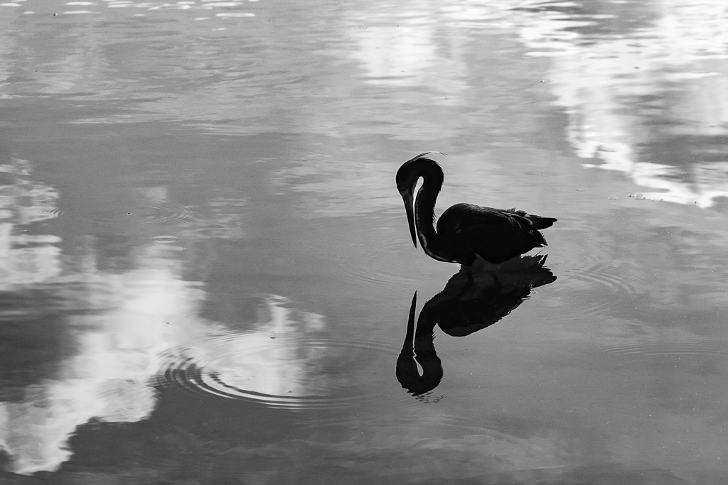
Your Ibis stands out well from the background and its iridescence shows up brilliantly. I prefer your monochrome image to the color, and your work on darkening the grasses was a good idea. Eye is perfectly sharp and I love the stark white around it. No halos anywhere. That's impressive.
I also appreciate the shadows in the mouth, the lighting on the tongue, and every feather separate and clear. Can you work on the tip of the beak to make it more distinct? |
Jul 17th |
| 32 |
Jul 18 |
Comment |
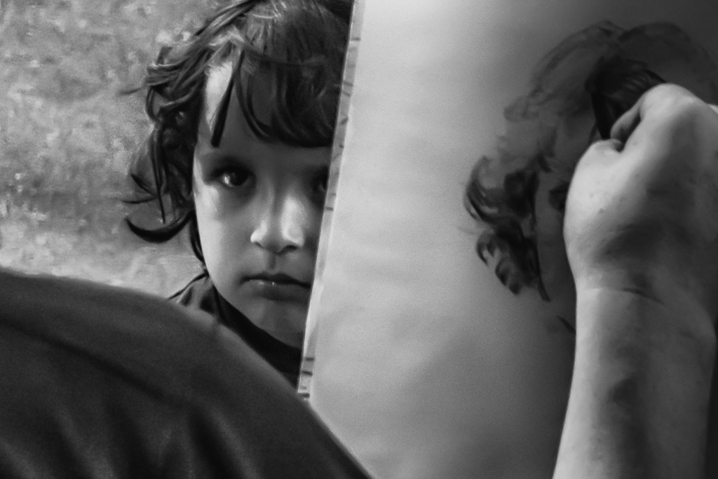
I appreciate the comments and improvements made to this photo. The original image included more of her right arm which I also liked. Her hand can look somewhat disembodied without more of it included, but if you cropped in from the top left down and kept her draped arm on the right it would alleviate the hand in her neck but would take away from the beautiful close-up of her face. |
Jul 17th |
| 32 |
Jul 18 |
Comment |
Thank you for your comments. As soon as I prepare this print and one other for an exhibit I'll focus on commentating on your photos as well.
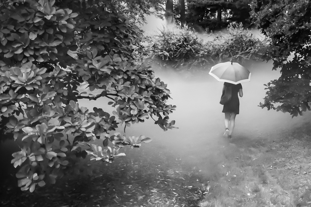
As a result of your feedback I will tone down the distracting white spots and cut down the environment a bit. My intention is not completely abstract. The element of this photographic process I live the most is being in nature, blending with it, if you will, and letting it speak to me soul to soul. Since my inner grieving was with me on this recent walk through the wetlands I noticed the wildlife with a sorrowful gesture. So I still want the print to be a bird in its environment, but I want it to look like it is sad, like me.
I was wondering about making it a complete sillouette so thanks for the encouragement that way. I think I'll darken it more so you can't see the white parts of it so prominently.
I also like the idea of raising the Heron up in the frame looking down at the light. Thank you all so much. |
Jul 16th |
7 comments - 0 replies for Group 32
|
7 comments - 0 replies Total
|