|
| Group |
Round |
C/R |
Comment |
Date |
Image |
| 20 |
Jun 24 |
Reply |
Good idea. Thank you for your second pair of eyes |
Jun 27th |
| 20 |
Jun 24 |
Comment |
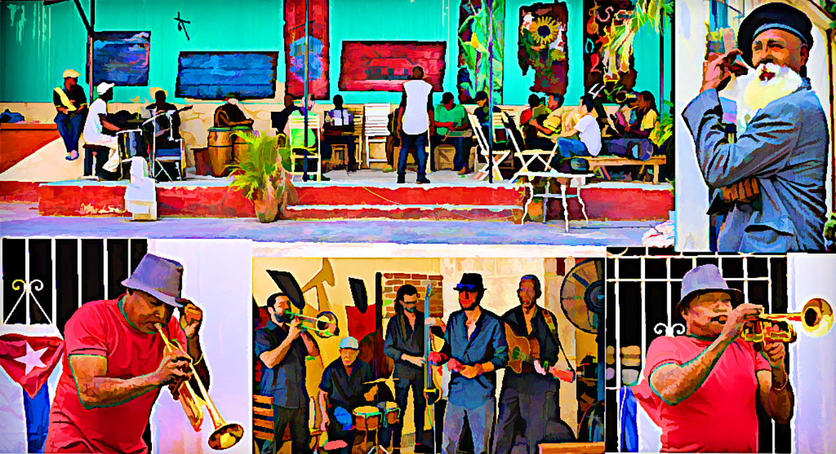
It's an interesting and thoughtful composite. Each element would make a nice image, yet they all relate to each other. Nicely composed and exposed. To my eye, the image looks oversharpened, as indicated by the halos, and the skin of the humans has a plastic look that is possibly caused by the overapplication of artifact removal. If you intended to have a cartoonish look, go for it. As a suggestion, I applied a cartoon look using Topaz Simplify. There are tons of tools, that can give you almost any look you desire.
|
Jun 12th |
 |
| 20 |
Jun 24 |
Comment |
Good story with lots of impact. You did a great job of telling us what could have been going through his mind. I wouldn't change a thing. |
Jun 12th |
| 20 |
Jun 24 |
Comment |
Good story with lots of impact. You did a great job of telling us what could have been going through his mind. I wouldn't change a thing. |
Jun 12th |
| 20 |
Jun 24 |
Comment |
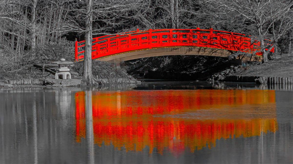
Good concept requiring planning and thought. The highly saturated red brings my eye straight to the bridge. I wish that the bridge wasn't so centered, and I would like to see more of the environment. My VF will give you an idea of what I mean. |
Jun 12th |
 |
| 20 |
Jun 24 |
Reply |
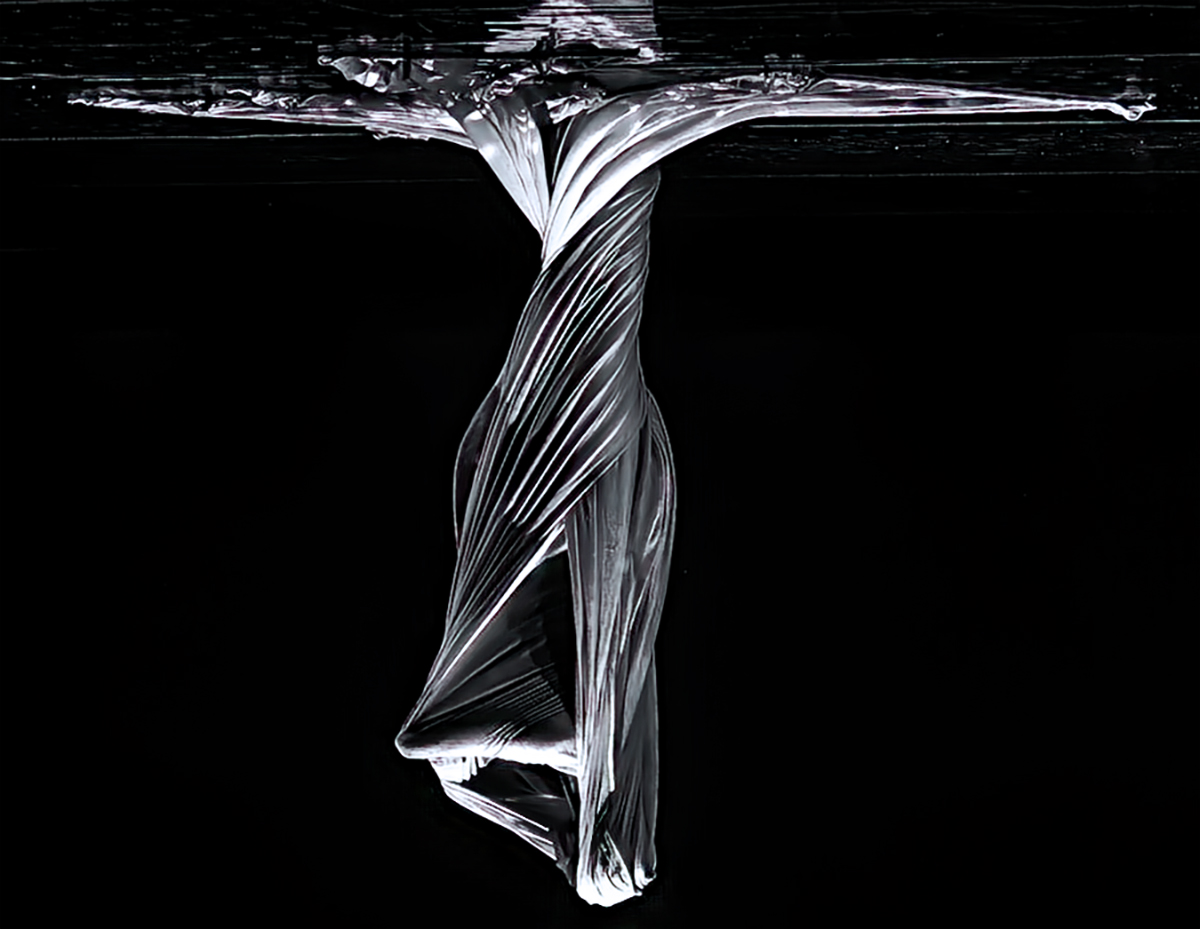
Hi Deborah - I agree with your suggestion. The issue is that like many of my other butterfly images, this butterfly did not want to look like a "traditional beautiful butterfly." It wanted only to be the essence of a dominant butterfly, at night. I obliged. |
Jun 12th |
| 20 |
Jun 24 |
Comment |
Hi Angela - What a fun and creative image. Your concept is neat. The image looks a bit crowded. I wonder if one or more of the following would help: use only three apples; make the apples smaller and/or spread them apart; and try using a vertical motion blur on the apples, with a longer blur on the bottom, and less on top. |
Jun 9th |
5 comments - 2 replies for Group 20
|
| 79 |
Jun 24 |
Comment |
Hi Lauren - Well photographed and processed. The geometric patterns nicely complement each other. The stairway on the right reminds me of an Escher image. The illusion is caused by the left handrail appearing to be wider at the top than at the bottom. |
Jun 20th |
| 79 |
Jun 24 |
Comment |
Hi Freddie - Imaginative and dynamic. Your image communicates your feelings, which is what a fine art image should do.
Just as a matter of personal taste, I made some minor adjustments that I hope didn't change your vision: the image has a colder tone; eliminated artifacts; and brought out more detail in the shadows and bright areas. |
Jun 20th |
 |
| 79 |
Jun 24 |
Reply |
Lauren - I wanted to keep the AI issue separate.
I think that there is a conflation between the art and the craft of photography, and/or using AI to process, as opposed to create an image. Some forget that Ansel Adams did not personally process his images. He had assistants who did the developing and printing. He gave specific instructions and his assistants did the craft. Simmerlaly, Andy Warhol called his studio, his "factory," for a similar reason. My above statements are made with personal knowledge. |
Jun 19th |
| 79 |
Jun 24 |
Reply |
Thanks Lauren - I played with the green as you suggested. While I was at it, I reduced the red in the arm of the woman, and the long shadows told me to warm up the image. Is this what you meant? I still have some more touchup work. |
Jun 19th |
 |
| 79 |
Jun 24 |
Comment |
Hi Mariann - I echo Karl's comment on your work in post helping the image. I wish you had gone q bit further so that the new sky is reflected in the water. |
Jun 13th |
| 79 |
Jun 24 |
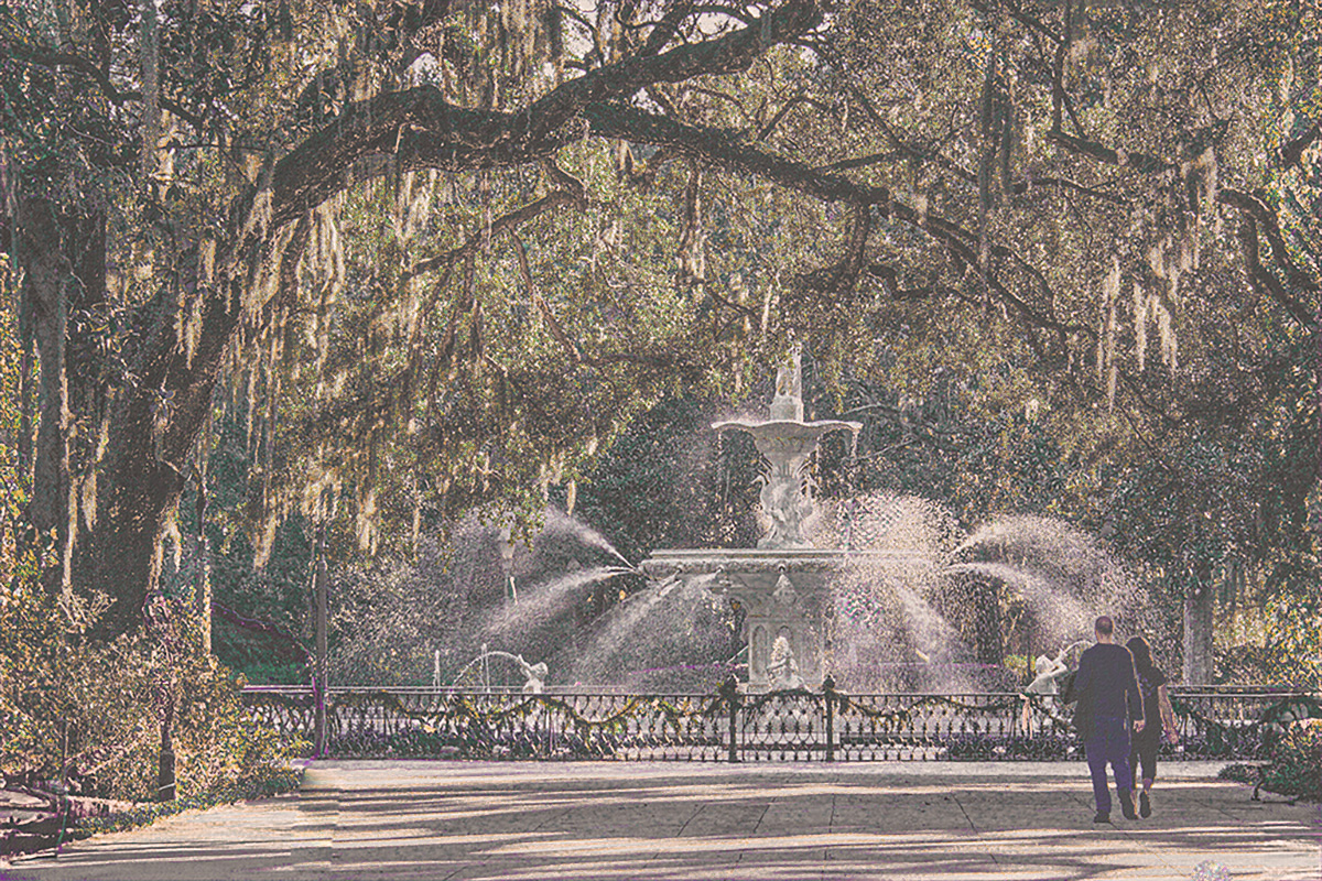
Comment |
Hi Karl, The image conveys a feeling of pure relaxation. If it was hanging on my wall, I would become so relaxed looking at it, that nothing would get done. While I can think of multiple crops that would retain the image's mood, I none would improve it. Well done. |
Jun 12th |
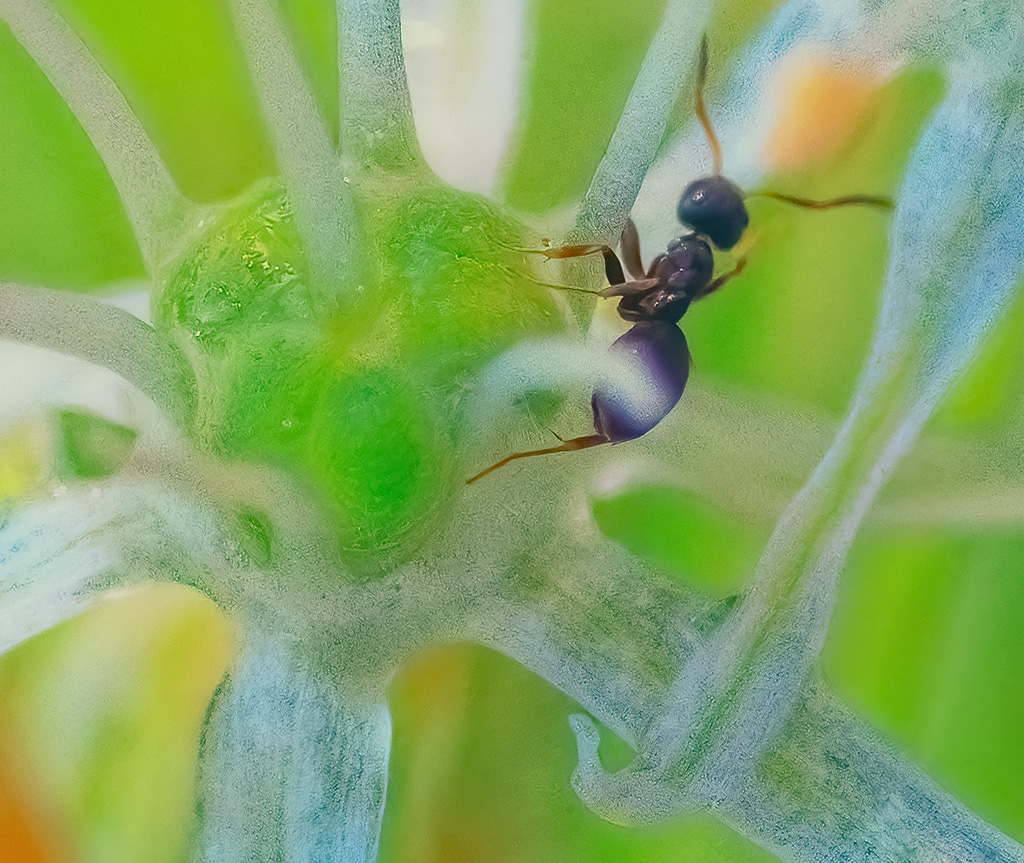
| 79 |
Jun 24 |
Comment |
Hi Judith, One of the wonders of macro is that it allows you to make more than one image from one object. I agree with Karl that the color version has more of a garden feel. For my personal work, I do not spend much time turning my image into something that a judge might like. The only person who has to like it is me.
Since I think that the ant should be more prominent I played with your image to see what would happen. |
Jun 12th |
 |
5 comments - 2 replies for Group 79
|
10 comments - 4 replies Total
|


