|
| Group |
Round |
C/R |
Comment |
Date |
Image |
| 20 |
Jan 24 |
Reply |
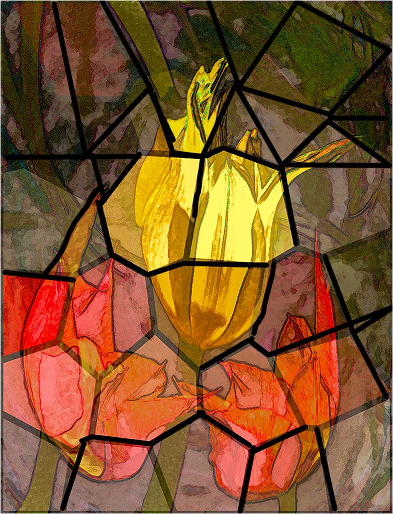
Hi Fred, Thank you. Candidly I agree with you. I just wanted to see how this image would look as stained glass. When I put a glass texture, actually a PS cellophane, on the image there was a completely different feeling to the image. I should have stopped after the original, but the experimenter in me persisted. |
Jan 22nd |
| 20 |
Jan 24 |
Reply |
Most of the time when I make a creative category, I just let the image tell me what to do. I think that this image said different things to each person who saw it. There are times when the exposure, saturation and other elements depend on whether I ate scrambled eggs with artichoke hearts or, spinach.
IOW, with creative images, there is no right or wrong. |
Jan 22nd |
| 20 |
Jan 24 |
Reply |
do you mean something like this?
RTW Painting the straight black lines is easy: I take a hard brush make it an appropriate size for the image, make it black, click it anywhere in the image then place the brush a distance from the first and click it while pressing the shift key, you will get a straight black line from the first placement to the second: keep repeating as you like. The shift-click technique works for other tools as well. (erase, healing tools, etc.) |
Jan 21st |
 |
| 20 |
Jan 24 |
Comment |
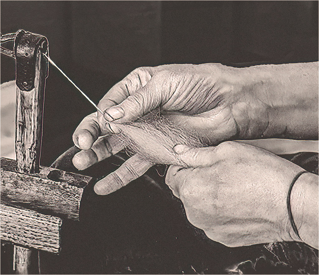
I like the concept of of time shifting in your image. I would think that putting your own spin on the image, (sorry, I could not resist the pun,) is being creative. To my eye you would have a stronger image if the spool of yarn was not brighter than her hands. When I first looked at the image the yarn was the first thing I saw. Fram a technical POV I wish that the top of the spinner's right hand didn't look muddy. I took liberty of doing a quick and dirty image which puts the emphasis on her gnarled hands, including the dirt under her fingernails. I am too lazy to clean up my technical defects, but just wanted to give you a rough idea of what I mean. |
Jan 12th |
 |
| 20 |
Jan 24 |
Reply |
It would be a boring world if we all had the same thoughts and tastes.
|
Jan 11th |
| 20 |
Jan 24 |
Comment |
Hi Fred. You did a great job of turning an ordinary image into an interesting work of art. I wonder how the image would look if the bird's foot was sharper than the branch. And a very thin border would immediately distinguish the image from the background. |
Jan 11th |
| 20 |
Jan 24 |
Comment |
Hi Angela, Nicely done. The image has a lot of impact. To my twisted mind it somehow conveys a feeling of anxiety. I see a guillotine in the center of the image, and the sparks show a vision of hell. As with any good abstract, interpretations are in the eye of the viewer. I can't think of anything I could do to improve your image. |
Jan 11th |
| 20 |
Jan 24 |
Comment |
Hi Fran. Welcome to the group. You have created a nice image. Your composition is very nice, and the red car tells a nice story and brings my eye straight into the image. Just some of my thoughts: in PS I always work with layers, they make edits non-destructive; to change the size of an object select the object/place it on its own layer/select the layer/move the handles in, or out, this will change the size without pixelization; don't get upset if you don't score well in a CC competition, the only one you have to please is yourself, the work of some of the most famous artists would get very low scores; judgements of art are highly objective; please don't be afraid to experiment, that is the best way to improve; look at the work of artists of all kinds, you might very well get inspiration and/or see what types you might like to play with. etc; for "how to" instructions there are some fairly good free or low-cost presentations on the web look at "Pix Imperfect," the Maryland Photographic Society, B & H Photo, and tutorials produced by the publishers of the software that you use are just some examples. BTW: I think that all artistic images are creative. PSA's definition for the "creative" category includes an element of altered reality. |
Jan 11th |
| 20 |
Jan 24 |
Reply |
Thank you for your comments. Please see my reply to Angela. |
Jan 11th |
| 20 |
Jan 24 |
Reply |
Thank you for your comments. Please see my reply to Angela. |
Jan 11th |
| 20 |
Jan 24 |
Reply |
Thank you for your comments. I decided to see what the image would look like as painted glass. I emulated stained glass by making some selective adjuncts to brightness, and painting lines with a hard black brush. This version is a bit crude, but I wonder if it is worth doing with more precision. |
Jan 11th |
|
4 comments - 7 replies for Group 20
|
| 21 |
Jan 24 |
Comment |
Mike, while browsing your image caught my eye. As a nature image it tells a strong story about the natural behavior of mute swans. To my eye it has impact and is well composed. To me the slight burnout is overcome by the strength of the story. Very well done.
As to the AI issue discussed above, I would think that the use of AI as a quick way of making an edit that could also be done in your editing program is OK, as opposed to using AI for image creation.
|
Jan 21st |
1 comment - 0 replies for Group 21
|
| 79 |
Jan 24 |
Reply |
Thank you
|
Jan 21st |
| 79 |
Jan 24 |
Comment |
Happy New Year to you too. Abstracts are so much fun. Your image tempted me to try an abstract. I used your original, and the image told me what to do. It came out as either an alien bug, or a dragon dancer at a Chinese Spring festival.
|
Jan 17th |
 |
| 79 |
Jan 24 |
Reply |
See revised in reply to Karl |
Jan 14th |
| 79 |
Jan 24 |
Reply |
See revised in reply to Karl |
Jan 14th |
| 79 |
Jan 24 |
Reply |
See revised in reply to Karl |
Jan 14th |
| 79 |
Jan 24 |
Reply |
After I corrected the sky, I played some more using the Flaming Pear "Sphere" filters. |
Jan 14th |
 |
| 79 |
Jan 24 |
Reply |
As requested. |
Jan 14th |
 |
| 79 |
Jan 24 |
Reply |
Thank you for your accurate comment and observation. I did not notice my error before I posted. |
Jan 13th |
| 79 |
Jan 24 |
Comment |
Happy New Year to you too. Abstracts are so much fun. Your image tempted me to try an abstract. I used your original, and the image told me what to do. It came out as either an alien bug, or a dragon dancer at a Chinese Spring festival.
|
Jan 12th |
 |
| 79 |
Jan 24 |
Comment |
Nice concept. While I don't think that every image should be sharp, I think that this image would be stronger if the leaf was sharp, and not folded, against either a solid, or natural background, with complimentary color[s]. If the leaf had its natural color, think about Wabi-sabi. But that's only my opinion. |
Jan 12th |
| 79 |
Jan 24 |
Comment |
Nice simple retro image. The diagonal clothesline gives a sense of motion, while the gradually increasing luminescence creates a subject from otherwise identical objects.
For me the frame that you used is part of the image and consistent with the retro theme. To my eye without the frame, the image would be incomplete. Now you have to find a washing machine with rollers. |
Jan 12th |
4 comments - 7 replies for Group 79
|
9 comments - 14 replies Total
|


