|
| Group |
Round |
C/R |
Comment |
Date |
Image |
| 20 |
Jul 23 |
Comment |
Hi Angela, sorry about your shingles. If severe pain would cause me to do such high-quality art, I would learn to live with the pain. Very well done. |
Jul 24th |
| 20 |
Jul 23 |
Comment |
Shirley. Well done. Creative with loads of impact. The monochrome stripes with changing angles give a nice feeling of motion. the posterized mask with the colored reflecting balls provide a break for my eyes. My only suggestion would be to either remove the frame or make it no more than two pixels wide. Bob's suggestion is valid but, I see it as falling into the artists choice category. Both versions are strong. |
Jul 24th |
| 20 |
Jul 23 |
Comment |
Deborah- Very nice composition. Your black and white conversion brought up the character. Though, with the originals a color would have worked, if you desaturated the color a tad. I often do a mild desaturation by making a BW layer, and reduce opacity. I do not agree that the left side door needs perspective correction. In your image that door has an illusion of an angle. To my way of thinking the unusual angle enhances the feeling of your image though I am not sure whether the unusual angle is sufficient to be considered "altered reality," to qualify as creative. Think of some changes, put animal or distorted human parts to integrate with at least one door. etc. |
Jul 24th |
| 20 |
Jul 23 |
Reply |
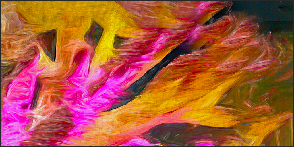
I agree that the original background was a distraction. I love to mine images to find multiple images within the original. For this image I used part of the upper left original. The title is hands. I put a surface blur; and an artistic cellophane wrap, with very low highlights. Then lowered contrast and made a levels adjustment with blend mode set for color on the levels layer. |
Jul 24th |
 |
| 20 |
Jul 23 |
Reply |
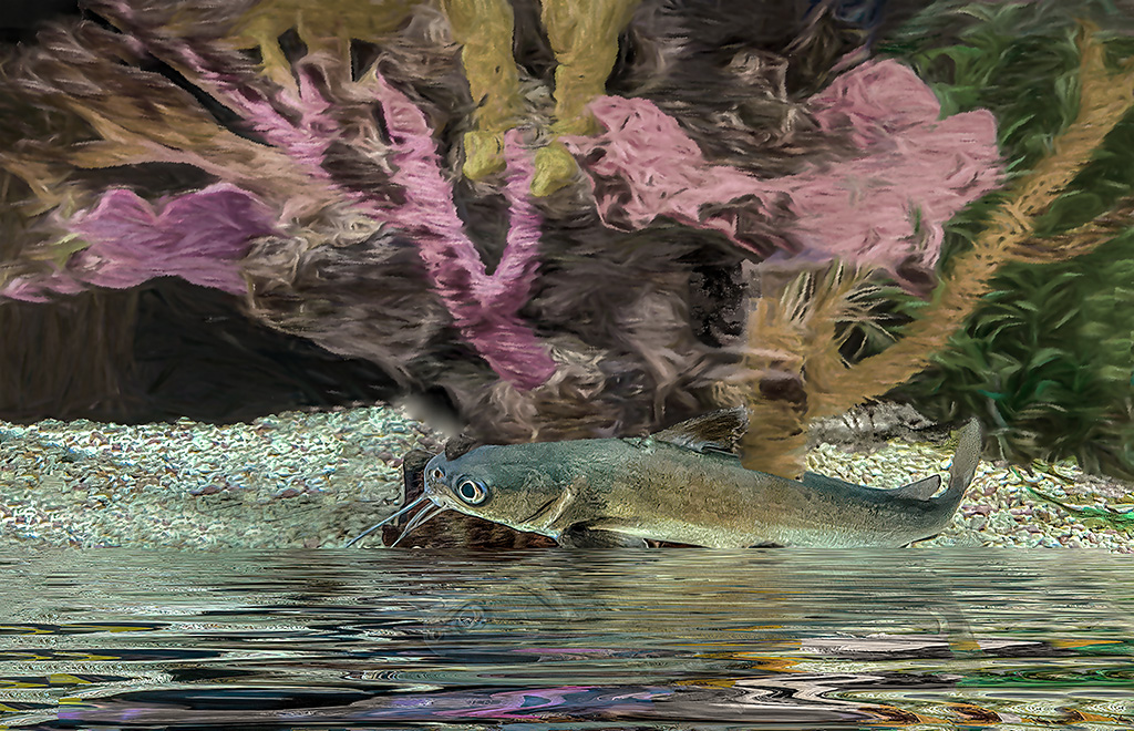
I agree that the background was oversaturated to the point where it detracted from the catfish as the intended subject. I revised the image by desaturating the background, and its reflection. If you look closely at the background you will see abstracts of various forms of aquatic life. |
Jul 24th |
 |
| 20 |
Jul 23 |
Reply |
It's in PS. Filters/Pixelate/Mezzopoint. That filter has 9 choices, plus opacity options. Play with all, so you will get a feeling for the option that you think works best with your image. HTH. |
Jul 15th |
| 20 |
Jul 23 |
Comment |
Bob- Nice creative image. I played around just a tad, made some minor color changes in ACR, and applied the mezzopoint filter using short strokes. Just a minor adjustment but, I think it gives a bit more oomph. |
Jul 14th |
 |
| 20 |
Jul 23 |
Reply |
Yup! Even tried using neural filters, but they didn't help. |
Jul 12th |
| 20 |
Jul 23 |
Comment |
Hi Fred.
Good work in showing what Cider is thinking. He can't make up his mind: scratch me; play with me; not shown is the uppermost thought, feed me. But, that's a given. Nice image.
|
Jul 11th |
| 20 |
Jul 23 |
Reply |
I took the liberty of playing. select to new layer; move; content aware fill; crop. But for some reason he does not have the same connection to the young girl, so I will take distance with relationship. |
Jul 11th |
 |
| 20 |
Jul 23 |
Comment |
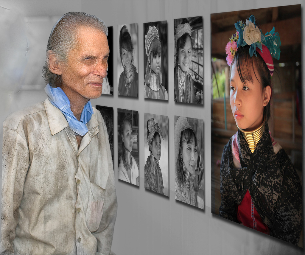
Hi Sam,
Too many images of people looking at images are bland snapshots. In this image, your originality and creativity has turned that theme into a work of art. I wish that the subject was standing closer to the color image on the wall. |
Jul 10th |
6 comments - 5 replies for Group 20
|
| 79 |
Jul 23 |
Reply |
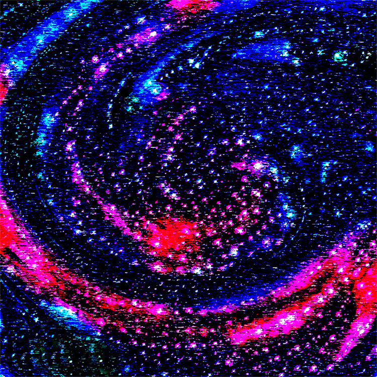
That does make for fun images. This month I submitted an image in DDG 20, there are valid comments about the over saturated background. Nobody noticed the fish impressions in the background.
|
Jul 15th |
| 79 |
Jul 23 |
Comment |
Gerrard- Thanks for your comment. When processing I try to think of where is it going to live. e.g. for a nature image, I would use the original, for a PID competition, your version would work. my submitted image is intended as interpretive. Even in that category, there is no right or wrong, only personal preferences. That's why cars are made in a choice of colors. |
Jul 15th |
| 79 |
Jul 23 |
Reply |
Oops! The next to last sentence should have said: ...slight adjustment with "levels." |
Jul 14th |
| 79 |
Jul 23 |
Comment |
Karl - For me the use of IR was a great choice because it adds a lot of drama, to an appropriate image. Your image is a great example of when to use IR. While I agree with Judith about removing the shark, I have a personal preference for a pano. I think the image would be stronger if about 2/3 of the rock was cropped. But,that's just my thinking. |
Jul 14th |
| 79 |
Jul 23 |
Comment |
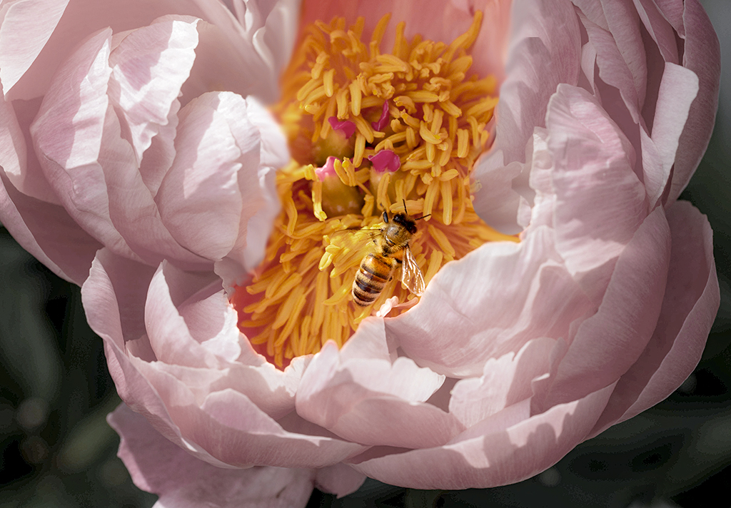
Judith, I like the concept of your image but, the monochrome version looked too busy. I agree with the color just not feeling right. I started with the original; did some masking; and converted to monochrome using high contrast blue. Reduced the fill on the converted layer to get a pastel color on the petals; did a color selection on the yellow to increase saturation and luminosity; selected the original bug placed it on the top layer. Slight adjustment with layers. I was too lazy to crop. |
Jul 14th |
 |
| 79 |
Jul 23 |
Reply |
Karl,
Wow! Your version has a great three dimensional look. I tried, without success. Great job. |
Jul 10th |
| 79 |
Jul 23 |
Comment |
Lauren
I think that you did a beautiful job with this image. As others have said here there is hey beautiful abstract quality to the curves and blending of the tones. As others here have done I tried placing a color layer on top of a monochrome conversion, in which are used high contrast blue pair I then cut down luminosity of the color layer buy 50%. Next I played around with the colors in ACR, ran it through Topaz the noise, added a gradient fog layer and this is the result. The shadows do not have as high a contrast, and the image itself has a smoother look to it. What do you think? |
Jul 10th |
 |
| 79 |
Jul 23 |
Reply |
Thank you for your comment. The low angle happened because the birds were on an elevated branch, I did not include the branch when I shot the original. I got the glassy look using the gradient map tool in the new PS beta, switching the blend mode to overlay, and playing with opacity. |
Jul 9th |
| 79 |
Jul 23 |
Reply |
Here is another suggestion based upon your sharp version. Selected the blossom to a new layer, darkened and radial gradient blur om the background, combined and touchup, changed aspect ratio. |
Jul 2nd |
 |
| 79 |
Jul 23 |
Reply |
Far be it for me to criticize your wife's taste. (:) |
Jul 2nd |
| 79 |
Jul 23 |
Reply |
Gerrard-Actually I was thinking of something like the image below. It is a double exposure. one is a normal image of the flower, and the background is an OOF sot of the petals of the same flower. They were combined in camera. I am not sure which cameras will do multiple exposures, if it does you can make a lot of unique and different images,
|
Jul 2nd |
 |
| 79 |
Jul 23 |
Comment |
Gerrard-IIRC the bridge of flowers is a place where you can spend hours shooting. What you tried to do is neat, but there were some technical errors made. To my eyes too much of the image is blurry. Your Tameron is a macro lens, with the smallest aperture of f32. (f18 is the smallest usable stop.) Since you used a tripod, the image could have been shot at a slower speed, and a smaller aperture. If there was a breeze consider this: I have several sets of what I call stabilizers, each consists of a pair of small alligator clips joined together with thin fishing line, of various lengths. They work fairly well, though you may need more than one pair, depending on conditions, and they are cheap.
|
Jul 1st |
| 79 |
Jul 23 |
Comment |
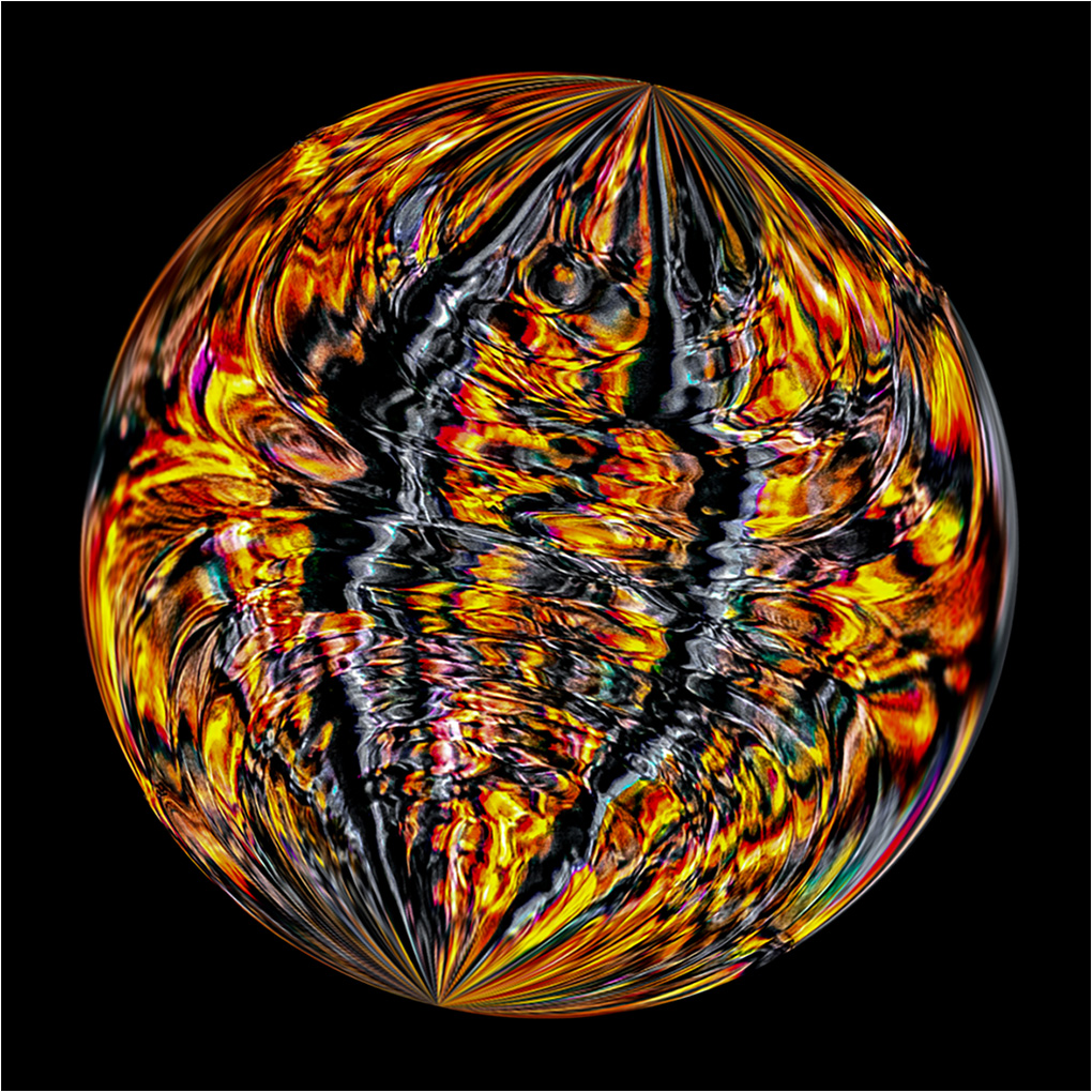
Freddie-most abstracts can have multiple interpretations. In this variation I started with my above suggestion: Applied Flaming Pear's ornament filter; resized to a square format; applied Flaming Pear's square to circle; selected the circle on a new layer, black background; rotated the circle layer so that the poles would not be vertical. Just another variation. |
Jul 1st |
 |
| 79 |
Jul 23 |
Comment |
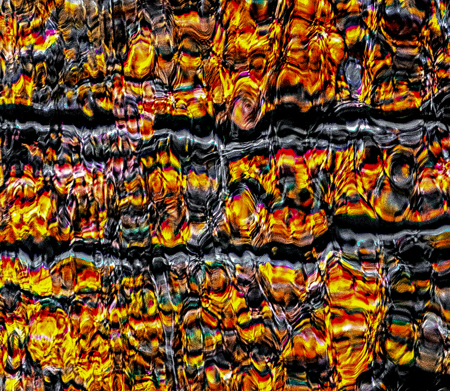
Freddie- Interesting and imaginative idea. Your creative thinking has created a nice abstraction. I wish that it had a bit more oomph. I started playing, and: desaturated the light blue; applied the emboss filter; blend mode overlay; stamp & sharpened in Topaz Sharpen AI; used ACR to adjust contrast, white, shadows, & haze. I am thinking that the image would make an interesting triptych, but I was too lazy.
|
Jul 1st |
 |
7 comments - 7 replies for Group 79
|
13 comments - 12 replies Total
|


