|
| Group |
Round |
C/R |
Comment |
Date |
Image |
| 21 |
Jul 21 |
Reply |
It should be made clear that I took short breaks for necessities. |
Aug 5th |
| 21 |
Jul 21 |
Reply |
It should be made clear that I took short breaks for necessities. |
Jul 23rd |
| 21 |
Jul 21 |
Reply |
When I get involved with something, I tend concentrate intensely. My record is at a poker table in Vegas: 18 hrs. (Yes I was winning, and took it home.) |
Jul 17th |
| 21 |
Jul 21 |
Reply |
Brian, That happened to me, not long ago. I started working on an image at about 9:30 A.M. I was so involved with permutations that all sense of time was lost. I felt a bit hungry and went for a snack. It was 11:00 P.M. |
Jul 16th |
| 21 |
Jul 21 |
Reply |
Brian, I should have made it clear that I meant symbolically represented. |
Jul 13th |
| 21 |
Jul 21 |
Reply |
Joan, You are right. Corrected version below. Thanks. |
Jul 12th |
 |
| 21 |
Jul 21 |
Reply |
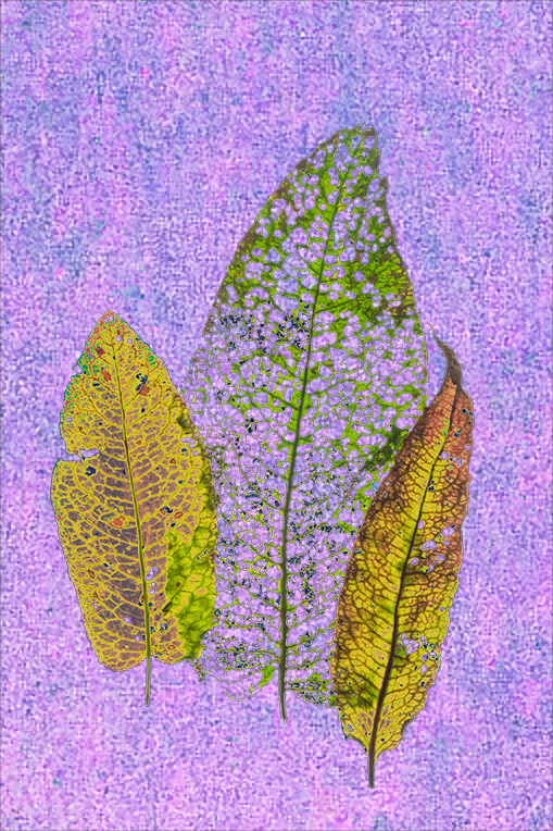
Joan, I agree with you, and think the posterization works for Hazel's image. I took your version and made two different versions. One was used in this reply, and the other in my comment. |
Jul 12th |
 |
| 21 |
Jul 21 |
Comment |
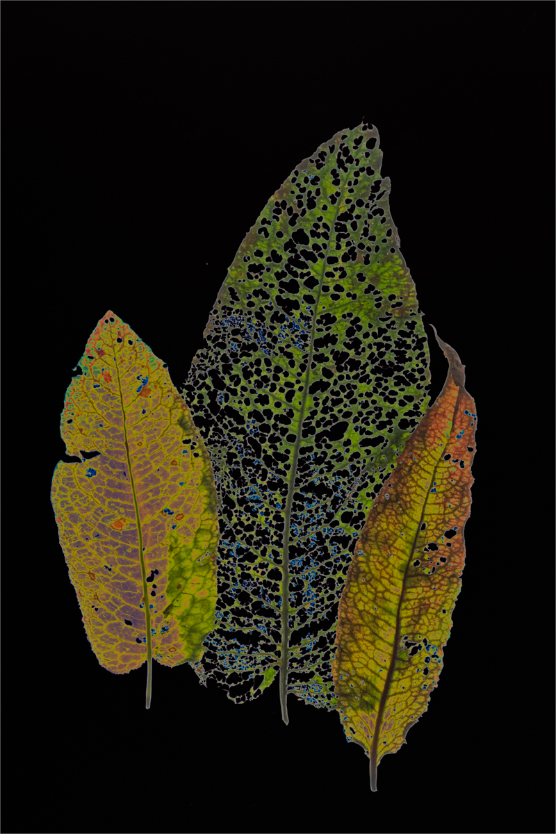
Hazel, Welcome to the group. I really like the concept of your image. I see it as a Wabi-Sabi. I agree with Joan about the white background. To give you an idea of some possibilities, I played in PS and substituted one of my home-made backgrounds, (An extreme crop of a sky at sunrise, enlarged about 15 times to get grainy pixels.) I then made some selective adjustments to the leaves. |
Jul 12th |
 |
| 21 |
Jul 21 |
Comment |
Joan, that's one way of avoiding a flooded house. You did a good jpg of color blending. I think that a mild blur around the house and balloons. I can think of two quick ways: run the blur tool around the edges, cut the flow to a about 10% and brush it multiple times to taste; or, make two new layers, on one layer select the subject shrink by two or three pixels, then using the original selection invertshrink, slight Gaussian blur on each MASK. You should end up with a blur on the edges.
|
Jul 11th |
| 21 |
Jul 21 |
Comment |
Brian, I see an interesting image that indeed tells a story. Your creativity is superb, I cannot think of anything to improve your image. Except perhaps the story would be more realistic if some battle horrors were depicted. |
Jul 9th |
| 21 |
Jul 21 |
Comment |
Brian, I see an interesting image that indeed tells a story. Your creativity is superb, I cannot think of anything to improve your image. Except perhaps the story would be more realistic if some battle horrors were depicted. |
Jul 9th |
| 21 |
Jul 21 |
Reply |
John, Thank you for your comment. My images are rarely pre-planned. Sometimes they work, and often they don't. |
Jul 6th |
| 21 |
Jul 21 |
Reply |
Bev, Thank you for your comment. |
Jul 6th |
4 comments - 9 replies for Group 21
|
| 65 |
Jul 21 |
Reply |
Charles, Thanks for pointing that out. I should have left more negative space on top and on the right. |
Jul 29th |
| 65 |
Jul 21 |
Reply |
Thanks for your comment. I completely agree from a pictorial POV. But in nature you have to take what you can get, and I'm not certain whether nature division rules permit the proposed adjustments. |
Jul 28th |
| 65 |
Jul 21 |
Reply |
How soft or sharp to make an image is always the artist's choice. I'm sure you noticed that I applied no sharpening at all. |
Jul 28th |
| 65 |
Jul 21 |
Comment |
Charlie, Very interesting result. Thank you for the detailed explanation of your process. I would never have thought of making those small grains look like jewelry. That certainly shows that you are worth your salt. (Sorry, I couldn't resist.)
Your discussions and showing of stacked images piqued my curiosity, and I have started looking into it. Below is a link to a basic discussion of FS, which contains many additional links.
<https://www.canadiannaturephotographer.com/rberdan_focus_stacking.html>
I see auto stacking rails vary in price. Am I correct in thinking that it should be able to focus in steps of 1 micron? I imagine that the number of slices would vary with the number of steps and length of the rails. |
Jul 16th |
| 65 |
Jul 21 |
Comment |
Jeff, You are showing us really interesting image. I like the way the curves of he puff interact with each other and the lines of the Anthers and Ligules. To my thinking, your image has a close to ethereal quality that would not be present if your image was tack sharp. Its abstract quality keeps me looking and I see something different every time. Just a nit. I thought that the image would benefit if it had a little more pop. So I played with your image in Photoshop: and lowered contrast by .14, to bring out a bit more tonal variety; and applied a curve adjustment. |
Jul 16th |
 |
2 comments - 3 replies for Group 65
|
| 79 |
Jul 21 |
Reply |
I don't know what happened. In my reply even though I clicked on the correct image, a different image came up. Sorry for the multiple postings.
|
Jul 21st |
| 79 |
Jul 21 |
Reply |
Sandra, In the image the petals look merged. If there was a subtle separation of the petals I think you would have a stronger. I used an adjustment brush in ACR and made very slight adjustments: lowered saturation, contrast and exposure; increased clarity and texture; slightly adjusted the hue in red, blue and magenta. |
Jul 21st |
 |
| 79 |
Jul 21 |
Reply |
Karl, Your comment about warming the image is a perfect example of how color can affect the meaning of an image. Its overall cool tone is why I saw Freddie's image as a statement that humanity needs improvement. I would think that only Freddie can state the intent. Of course, others may feel differently. That's what makes the world fun. |
Jul 15th |
| 79 |
Jul 21 |
Comment |
Lauren, Nice seeing. Good composition. It's always fun to capture a rainbow. I like the juxtaposition of the rainbow and the tree. To me, the tree was so sharp it looks pasted. I played around and put a mild blur on the edges of the tree, slightly reduced contrast in the clouds to bring up more tonality, and put a subtle vignette to bring my eyes to the rainbow. |
Jul 9th |
 |
| 79 |
Jul 21 |
Comment |
Karl, Very well done. I am fascinated by water drops. It takes lots of practice to get the the image you are looking for. Thank you for sharing your image. |
Jul 9th |
| 79 |
Jul 21 |
Comment |
Freddie, I like the story told by this image. To me it illustrates our unfortunate societal feelings about folks who are part of the LBGT community. Abstraction is a great tool for telling a story. Well done. Although a different technique was used, for some reason when I saw your image it reminded me of Picasso's Bombardamento di guernica.
|
Jul 9th |
| 79 |
Jul 21 |
Comment |
Sandra, Nice capture. I like the soft feeling to the rose, and that you left in some of the texture. I agree with Lauren that red is difficult to shoot, and add work with. I like the blurred red on the upper right corner. I would like to see more separation in the areas I have circled. |
Jul 9th |
 |
| 79 |
Jul 21 |
Comment |
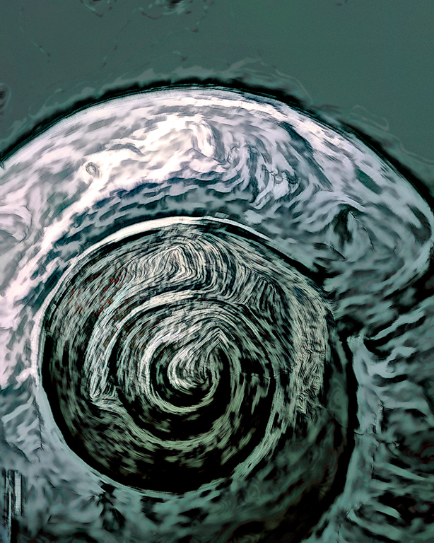
Hi Subramanya, Welcome to the group. I like the concept of your image. Nature gives us the foundation for neat abstracts. I would prefer to see a more abstract look with less glare on the shell. I took the liberty of reworking your image to give you an idea. I used Topaz Studio 2, and Topaz Adjust AI, in PS I made some additional to contrast; brightness; curves; color filter; and sharpen. I encourage you to play to get an abstract look to your taste. The only one you have to please is you. |
Jul 9th |
 |
| 79 |
Jul 21 |
Reply |
Sandra, Thank you for your comments. The green and shades of blue came from color reversing with a mask.
|
Jul 9th |
| 79 |
Jul 21 |
Comment |
Judith, I think you are showing us a clever and interesting image. I prefer your version because it has a bit of mystery. I think that placing Barbie in front is like starting a novel with: "It was a dark and stormy night." However, agree with Lauren about the "acupuncture," look. If you place a fading blur on the filaments, fading more from the bottom, to less than 1/8 of the way up, you will lose that look. |
Jul 9th |
7 comments - 4 replies for Group 79
|
13 comments - 16 replies Total
|


