|
| Group |
Round |
C/R |
Comment |
Date |
Image |
| 21 |
Jun 21 |
Reply |
Brian, I much prefer your revision. In the original the black vertical lines were distracting to me. Your revision cured that, for my eyes.
BTW. Which flood filter did you use? I started playing with the Flaming Pear, but the type size on the menu is too small so I have to struggle to read it. |
Jun 28th |
| 21 |
Jun 21 |
Reply |
Brian, What you see is the original. Which was made by taking three multiple hand held exposures, in-camera. I used the PS wave filter. For some reason, the titled image and original were conflated. However on second thought I like it better without the war plane composite. I will attach a different version, as soon as I finish resolving two issues, PS and attempted identity theft. |
Jun 11th |
0 comments - 2 replies for Group 21
|
| 65 |
Jun 21 |
Reply |
Charles, I think that the balance in DOF is usually the artists choice. Therefore, I agree with you that it should never become a "point of contention." However, we should all be free to have differing opinions on whether we like the artist's choice and be free to discuss the issue. |
Jun 25th |
| 65 |
Jun 21 |
Reply |
Lynn, did you intend that pun, referring to viewing the back legs of the critter as hindsight? |
Jun 25th |
| 65 |
Jun 21 |
Reply |
Charles, you brought up an interesting point about ISO. My feeling is that given a choice of an image that is either: inappropriately blurry, no image; or noisy, I will settle for noise, within reason. |
Jun 25th |
| 65 |
Jun 21 |
Comment |
Nancy, I have a similar opinion to that already said by others. I cropped your image to illustrate my version of a crop. While I was at it, I also toned down the bright leaf to the right of the main. |
Jun 25th |
 |
| 65 |
Jun 21 |
Comment |
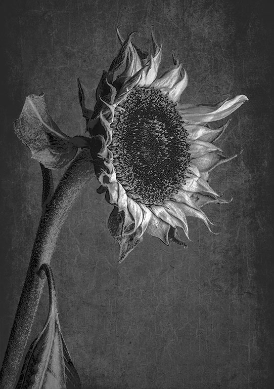
Hi Charles, Your image is proof that a good image doesn't have to be at the peak of perfection. Indeed you have proved that an old and dying flower can make a beautiful image. To my eye for some reason the leaf in back of the flower head was a bit distracting. Just for play I was wondering how your image would look in monochrome. What do you think? |
Jun 9th |
 |
2 comments - 3 replies for Group 65
|
| 79 |
Jun 21 |
Comment |
Judith, your image is very clever and imaginative. I fully understand your inclination to leave things as you found them. And doing so is not wrong. However, I think that Karl's version adds some abstract humor. I cannot make up my mind whether the image is Fred Flintstone or Yogi Bear. |
Jun 20th |
| 79 |
Jun 21 |
Reply |
Freddie, it would be a very boring world. If we will agree on everything. To my eye that wispy cloud adds just enough balance to the otherwise empty space. IOW without that wisp of a cloud, I think that there would be too much negative space. |
Jun 20th |
| 79 |
Jun 21 |
Comment |
Loren, beautiful image. I love your composition and the color you have achieved. Several years ago I converted an old Nikon Coolpix, simply by removing the IR filter. it works nicely at a wavelength of 720. Your image has convinced me to have another camera converted at about 520 or 540. Now of course my problem is which lens do I send to them for a focus adjustment. Also, I don't have the confidence that my hands are still steady enough to do that procedure. It's like getting a hole-in-one in golf. I know what to do, but I simply can't do it myself. |
Jun 20th |
| 79 |
Jun 21 |
Reply |
Freddie, thanks for your comment. I completely agree that I should have toned down the stems. |
Jun 17th |
| 79 |
Jun 21 |
Reply |
Judith, Because I I messed up when installing a new drive for my images, I cannot readily find the original. cannot find the original. However here's what I do. I have my strobe setting to high speed sync, and the camera set to manual, with ISO, speed and aperture set so that the background will be black when I hit the shutter button and the only light comes from the strobe. It often takes several tries to get it near right. On my Nikons, this technique will not work with the built in flash. And on any camera, it will only work if you have a high speed sync setting. |
Jun 17th |
| 79 |
Jun 21 |
Reply |
Hi Karl, good point. |
Jun 9th |
| 79 |
Jun 21 |
Comment |
Karl, When I first look at your image. It reminded me of a slice of grilled cheese on toast. Perhaps that's because I was hungry. :-) Actually, I think you have created a fun image, which I like very much. I wish I had gotten the memo about submitting abstracts this month. |
Jun 6th |
| 79 |
Jun 21 |
Comment |
Hi Freddie, I appreciate I like its complementary varying shapes and curves. Overall, I consider a strong image. The color palette you used is great for that image. However, to my eyes pattern in the upper right corner creates a bit of dissonance that makes your image a tad busy for my eyes. I would also like to see a bit more variance in the color tonality. I took the liberty of playing with your image to show you what I mean. I cropped the left portion of your image to make it look a bit less busy. I then applied a curves layer and then randomly adjusted the luminosity. I tried to keep your original concept. |
Jun 6th |
 |
4 comments - 4 replies for Group 79
|
6 comments - 9 replies Total
|


