|
| Group |
Round |
C/R |
Comment |
Date |
Image |
| 21 |
May 21 |
Comment |
Joan, I agree with Brian's comments, except I would like to see a bit more perspective in the road. In my version I added a bit of tonal variation to the top and left. |
May 24th |
 |
| 21 |
May 21 |
Reply |
Joan, I felt that the position of the shack indicated the present. I made the field much larger, to indicate my hope that there are more good things in life than we me feel at present. |
May 24th |
| 21 |
May 21 |
Reply |
Brian, Thanks for your comment. I accidently did not send the version with some yellow sunflowers in front of the shack. |
May 24th |
| 21 |
May 21 |
Comment |
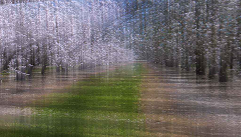
Janice, Your ICM combined with your color palette, have created a beautiful scene. As I look at it, I keep waiting for something to happen. my eyes keep wandering all over, but they can't rest. I think that if you made a composite with some suitable critter, you would have a stronger image. |
May 21st |
| 21 |
May 21 |
Comment |
Hazel, welcome to the group. I agree with the comments made by Brian and Janice, except that on my monitor Brian's version looks a a tad flat. I made a curve adjustment for comparison. |
May 21st |
| 21 |
May 21 |
Reply |
Brian, I would think that Your general statement about color is specific to the image. There are many images where color enhances the image, rather than distracts from the meaning. |
May 15th |
| 21 |
May 21 |
Comment |
Brian, Thank you for sharing your image. While my interpretation of your image is probably influenced by everything that is going on today, to me it looks like a person who is confused, and unsure. I much prefer the final, as the multi colors reinforce my interpretation. |
May 15th |
4 comments - 3 replies for Group 21
|
| 79 |
May 21 |
Reply |
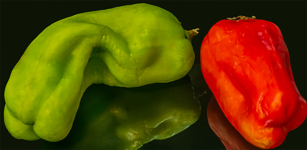
Freddie, thank you for your comment. It is not my intention to do food photography. I am trying to learn the interplay between lighting, and lines and curves. I think that color would just be a distraction. |
May 21st |
| 79 |
May 21 |
Reply |
Thank you for your comment. I may play around with peppers in a funnel. By coincidence, about two weeks ago I bought a 5.5" funnel. I never thought of photographing peppers in it. |
May 21st |
| 79 |
May 21 |
Comment |
Karl, Interesting image. To me the bird does indeed act to create an asymmetrical image, without distraction. The cross light on the original brings out beauty in the bark. I think something happened to the texture in post. |
May 15th |
| 79 |
May 21 |
Comment |
Hi Freddie, welcome to the group. Looks like you had a lot of fun playing with ICR motion. I like the color palette you used. If you are shooting RAW, and bracket the exposures, you should get some right. You will also get a set of interesting images. You might also want to try longer exposures, without ICM. Let the subjects create the motion. Your camera has both speed control and auto ISO. If you like abstracts, Set ISO on auto; Try taking a two images, one sharp, and with a quick twist of the shutter control a long exposure. Then combine them to taste in post. Have fun.
|
May 15th |
| 79 |
May 21 |
Comment |
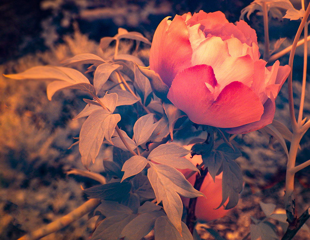
Lauren, Color IR can be a lot of fun to play with. I like your composition, but I see a focus issue, where the leaf on the left is sharp, but the rest of your image is soft. This may be due to the lens focusing not being converted. I wanted to stay close to your vision, so I softened the leaf, reduced the overall haze, and darkened the stem on the bottom.
BTW. Which conversion was done? |
May 15th |
 |
| 79 |
May 21 |
Reply |
Lauren, The dark triangle is an effect of the lighting.
|
May 12th |
| 79 |
May 21 |
Comment |
Judith, You have presented us with an interesting abstraction. It's a fun image that's colorful, original, and enjoyable. To my eyes it looks a bit busy on the bottom. I played to see if you could make your image a bit stronger if you used a horizontal format, by cropping most of the top portion, and use a gradient filter to darken one side of the image. You decide. |
May 10th |
 |
| 79 |
May 21 |
Reply |
Judith, thanks for your comment. I agree, now that you mention it. The red is not that interesting. Next time I get a bag of minis, I hope for more interesting ones. The best way is to pick them out myself. As soon as I can do so, I will have to look harder. I am working only in monochrome, as my objective is to learn lighting. For this purpose, I think that color is only a distraction from what I am trying to learn, and from the beauty of the shadows and curves.
As you requested I attached a cropped and color corrected original. |
May 9th |
 |
4 comments - 4 replies for Group 79
|
8 comments - 7 replies Total
|


