|
| Group |
Round |
C/R |
Comment |
Date |
Image |
| 65 |
Jan 21 |
Reply |
Hi Nancy, If you are thinking about infrared, I would suggest that you do some research, as there are multiple methods of making infrared images. I originally started IR by converting an old Coolpix. My conversion was to 720 nanometers. The advantage/disadvantage, with this range is that you will not get the faux colors that Jeff shows. The clearest explanation of choices that I have seen is in an e-book by Tony Sweet. (I am not sure if it is still available, but he talked about it the other night, at a presentation.) Contact Susan or Tony directly through his website You can also get more information at <https://www.lifepixel.com/photo-tutorials/10-tips-for-getting-better-infrared-landscapes> |
Jan 23rd |
| 65 |
Jan 21 |
Reply |
Thanks for your comment. At f16 the entire image should be sharp. next time I will use a tripod, as it if clear that I can no long handhold a 105mm for half a second.
Even tough I am replying to Charles, I am thanking everybody fpr their comments.
|
Jan 22nd |
| 65 |
Jan 21 |
Reply |
That's happened to me, more than once. There have also been time where I was so intrigued by the scene that I forgot to that I had a camera with me. |
Jan 22nd |
| 65 |
Jan 21 |
Comment |
Lynn, As I understand things, the purpose of DDG is to learn. There is no need to "redeem." BTW I prefer the rose you originally posted, for the same reasons stated by Tom & Larry. That said, to my eyes, your second version here is an improvement. I used Topaz Gigapixel AI to increase the pixel count and avoid banding: I then reduced the contrast a little to bring out more details in the yellow, and made a minor adjustment in levels.
Let us knw what you think.
|
Jan 14th |
 |
| 65 |
Jan 21 |
Comment |
Hi Angela, I like your treatment of the Lilly. The gently curves and tonality force me to relax. What a pleasant image. I wish I could see a tad more emphasis on the stigma. Its bright green stem dominates and tends to draw my eye away from the stigma. Otherwise, beautifully and artfully done. |
Jan 12th |
| 65 |
Jan 21 |
Comment |
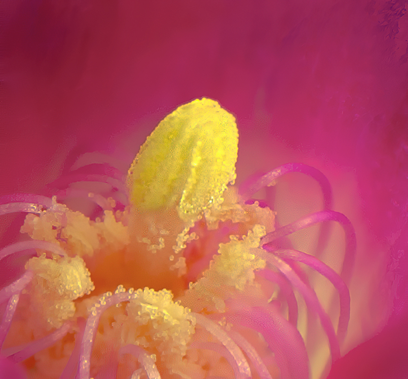
Hi Jeff, I love your use of false color near infrared. I have seen too many where the effect is used because the maker can, instead of using it to create an interesting image, as you have been kind enough to share. I like the way the flower appears to be floating above the background. Only one minor nit: at about 1 O'clock on the flower the tip of a petal appears to be separated from the flower. Very well done. |
Jan 12th |
| 65 |
Jan 21 |
Comment |
Hi Lynne, I like your brave attempt. I don't know enough about focus stacking a super macro to suggest all corrections, therefore I can mainly comment on how I view the image. To me: the petals and the stamen look blurry; there are a lot of distracting highlights; the petals don't seem to have that soft feeling; and I understand your desire for context, the white thorns, which I first thought were daises, keep drawing my eyes from the pollen. The only suggestions I can think of would be: to use a diffuser to further reduce contrast; and before any other processing, apply a noise reduction program. |
Jan 12th |
| 65 |
Jan 21 |
Comment |
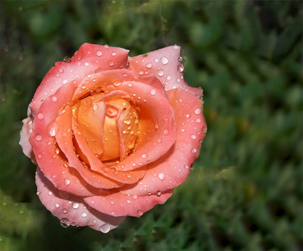
Hi Vinod, That is one beautiful image of the flower itself. I like the tonal variations in the rose, and the raindrops add to the interest. I see some items that should improve your image. I would: eliminate the blurred rose to the right of the sharp one; and change the position of the rose, so that the top is pointing towards more negative space. I did a quick and dirty change to give you an idea of what I mean. |
Jan 12th |
 |
| 65 |
Jan 21 |
Comment |
Hi Nancy, I like the swirling lines and your use of both complimentary and blending colors. It is a nice attempt. I have some issues: The human eye is first drawn to the brightest part of an image, and then to the sharpest portion. When there are multiple blurred & bright areas combined with disconnected darker sharp areas, the image fails to look coordinated. I usually try to walk around the subject[s], and change my camera direction to look for an interesting shot. You might also want to try high speed sync to control background luminosity. |
Jan 11th |
| 65 |
Jan 21 |
Comment |
Charles, When I first looked at your image I was concerned that the succulent was going to roll off my screen and stick me with its thorns. I like the three dimensional effect. My eyes are drawn straight to the image. I think that if the rock on the lower right was a tad darker and a bit less sharp your image would be even stronger. Very well done.
|
Jan 11th |
 |
7 comments - 3 replies for Group 65
|
| 79 |
Jan 21 |
Reply |
Sandra, Thanks for your comment. You are absolutely correct about my not using VanGogh's color palette. Had I done so, I would not have made the statement I intended. That said: If I think I would like to try an impressionistic image, I will frequently be influenced by various styles to create my own.
|
Jan 30th |
| 79 |
Jan 21 |
Reply |
Hi Judith, Murphy strikes again. Just after I posted my original reply, This turned up. |
Jan 29th |
 |
| 79 |
Jan 21 |
Reply |
Sandra, Thanks for your comment. You are absolutely correct about my not using VanGogh's color palette. Had I done so, I would not have made the statement I intended. That said: If I think I would like to try an impressionistic image, I will frequently be influenced by various styles to create my own.
|
Jan 29th |
| 79 |
Jan 21 |
Reply |
Hi Judith, in the original all I did was a crop. Otherwise it is a straight conversion of the RAW file to jpeg. I did the painting as a statement. |
Jan 29th |
| 79 |
Jan 21 |
Reply |
Hi Judith, Murphy strikes again. Just after I posted my original reply, This turned up. |
Jan 27th |
 |
| 79 |
Jan 21 |
Reply |
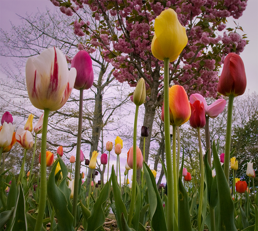
Hi Judith, Thank you for your comments. I have been looking high and low for the original, and the other images I shot that day, with no success. The image I showed was from a .jpg file that I entered in my CC competition many years ago. The image was shot in Heckscher Park, Huntington, N.Y. at their annual tulip festival. I think Corel Painter Essentials gives you a lot more choices in styles if you want to auto-paint, and is easier to use. However f you plan on also doing hand retouching, Painter is the one. If you have an .edu mail account the prices are significantly lower. Corel will give you a free thirty day, full functioning trial. |
Jan 27th |
| 79 |
Jan 21 |
Reply |
Hi Karl, I use high speed sync to darken the background, but I found that technique causes the petals to lose their translucence. Or, are we talking about two different techniques? |
Jan 15th |
| 79 |
Jan 21 |
Comment |
Hi Lauren, That is a nice portrait of the Orchid. It has a beautiful, pastel tonal range. Its center placement works for me.
If I was to place a bet on reality: I think that the moth orchid is real, and you did not make it blue in post. But, AFAIK, blue is not a natural color of that flower. The Moth Orchid was dyed.
I am not sure that high key works for this image. the white background keeps drawing my eye away from the subject, and I find the background too cluttered for my taste.
|
Jan 13th |
| 79 |
Jan 21 |
Comment |
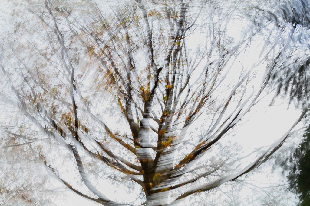
Hi Karl, Your image looks like a fun image. All the work you did looks like a labor of love that paid off. When a step back a few feet, I see an interesting mélange of complimentary curves, and colors that are both complimentary and blended.
One of the things I like about abstracts is that they can be anything the viewer thinks they are. When I first looked at the original I thought it was an iced covered front bumper. I am not sure which version I would hang on my wall. I very much like both. I think both have interest and originality. |
Jan 13th |
| 79 |
Jan 21 |
Comment |
Hi Sandra, That basket of veggies makes me hungry. I like the composition and theme of your image. This is only a matter of taste. (no pun intended.) My eyes keep being drawn to the cauliflower, so I cut back on the highlights, lightened the shadows, and played separately with the the red & green saturation and lightness, to give you an idea of what I mean. |
Jan 13th |
 |
| 79 |
Jan 21 |
Comment |
Hi Judith, I like the effect you got with ICM. It does indeed tell a story of 2020. To my eyes the opposite circular corners are distracting. I took the liberty of adjusting them; darkened and saturated a tad; and made a very mild perspective adjustment. |
Jan 13th |
 |
4 comments - 7 replies for Group 79
|
11 comments - 10 replies Total
|


