|
| Group |
Round |
C/R |
Comment |
Date |
Image |
| 21 |
Nov 20 |
Reply |
Charles, It was the result of painting out the internal edges with a watercolor brush, and applying a very mild surface blur to the painted areas. I felt that the rust texture, which I originally enhanced by embossing the image, did not match a watercolor feeling.
|
Nov 11th |
| 21 |
Nov 20 |
Reply |
Charles, It was the result of painting out the internal edges with a watercolor brush, and applying a very mild surface blur to the painted areas. I felt that the rust texture, which I originally enhanced by embossing the image, did not match a watercolor feeling.
|
Nov 7th |
| 21 |
Nov 20 |
Comment |
Brian,
I am in awe. There is little I can say, except that you have created one magnificent abstraction. Based on your description of post, I strongly suspect that you knew exactly what look you wanted, before you put a finger on the keyboard. My preplanning ability in PS is significantly more limited, and you have encouraged me to learn even more about how the filters interact with each other. Thank you for sharing this image, and your inspiration. |
Nov 5th |
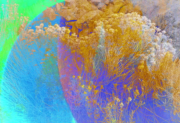
| 21 |
Nov 20 |
Comment |
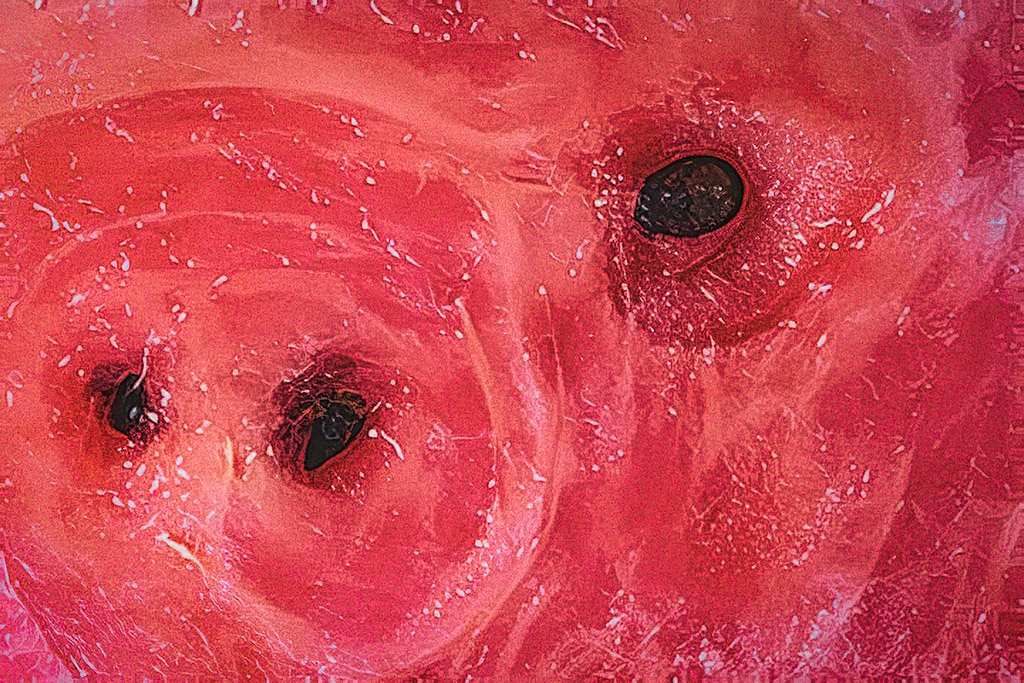
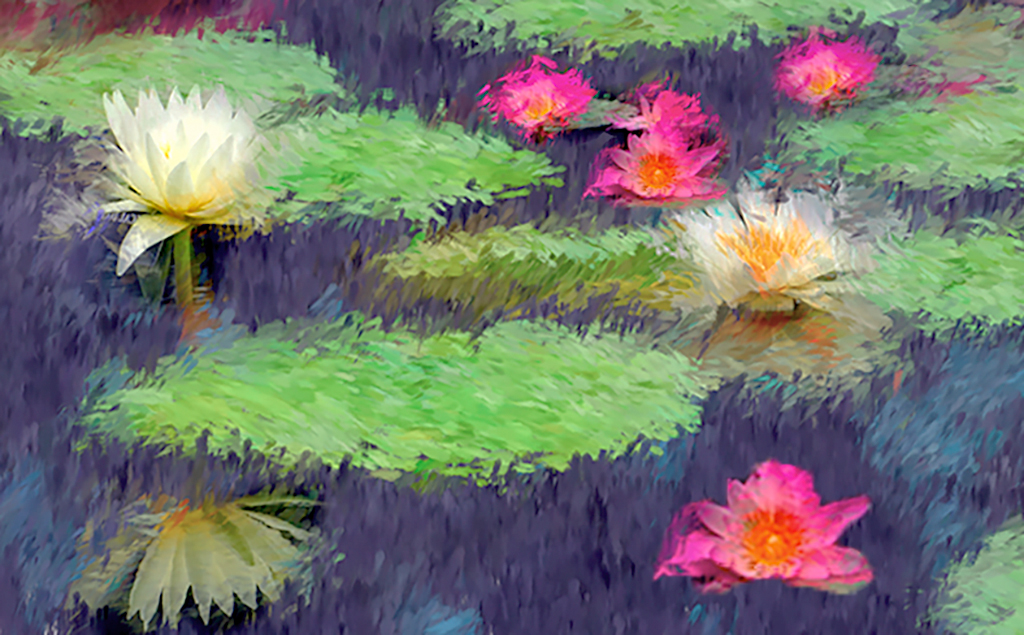
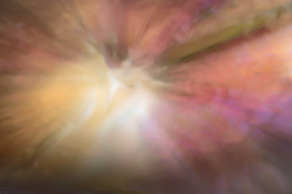
Joan,
I love the feel of explosion that you have created. There is a positive feel of motion caused by your use of subtle color tonality changes in the warm areas, adjacent to the abrupt complimentary colors, where the tonality changes are not as subtle. I would almost analogize your image to the 2nd movement of Haydn's Symphony #94. Just to see if I could get closer to Haydn, I flipped your image horizontally, and inverted the color. While the look of my change is completely different from yours, I think it is more Haydnesque.
|
Nov 5th |
 |
| 21 |
Nov 20 |
Comment |
Phillipa,
Your image reminds me of the beauty of the fluorescence induced by viewing objects under a UV light. Your use of multiple dark S curves give a nice sense of motion, which is not often seen in a still life. Your use of complimentary color areas in the flowers, is hinted at in the lower right, create the interest that makes me want to keep looking at your image. Your imagination and hard work have paid off handsomely.
|
Nov 5th |
| 21 |
Nov 20 |
Reply |
Thank you. Yes it was deliberate. With this image I felt that all blue green was too boring, and all reddish was too hot and "in your face." The color transition was simple, red was the original color, I simply inverted the red, which gave me the complimentary colors. |
Nov 5th |
| 21 |
Nov 20 |
Reply |
Brian,
I agree with most of your comments. However, this is an international organization, and not all cultures read from left to right, so I wrestle with that issue.
|
Nov 4th |
| 21 |
Nov 20 |
Reply |
Brian I felt there was something not quite right. Thank you, I think that your comment about the border is spot on. I added a darker and textured border. While I was at it, I decided to give the image a painterly look.
|
Nov 4th |
 |
3 comments - 5 replies for Group 21
|
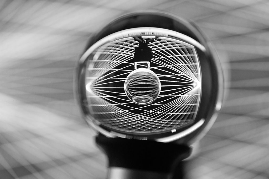
| 34 |
Nov 20 |
Comment |
Your image caught my eye. To me it is a simple, yet striking and well done graphic image. I noticed that some here have made suggestions, and their concepts are also valid, and in my eyes good images. In the creative world, there can be many iterations of the same image, and whether one iteration is is better than another would be at best a difficult choice.
I have my crystal balls for about a month. (By accident I wound up with two,) one 80mm and the other 50mm. So far I prefer the 50mm. Just for play I wondered what would happen if I shot your image through my 50mm lensball. My image is unretouched, except that because of chromatic aberrations, I converted to BW. I focused on my lensball. Had I not been too lazy to setup a tripod, there would have been a plethora of different images. |
Nov 7th |
 |
1 comment - 0 replies for Group 34
|
| 65 |
Nov 20 |
Reply |
Thank you very much. I will be ordering one . |
Nov 19th |
| 65 |
Nov 20 |
Reply |
Lynne, Yu may be right. I am out of artichokes, as is my local store, and a canned baby artichoke would have a different look and taste. (I use those only to make a mushroom and artichoke omlette.)
|
Nov 14th |
| 65 |
Nov 20 |
Reply |
Thanks Lynne, I never thought of spray painting. I taped a black matboard under a glass table. Although I got a black reflection, the board under the glass did not keep its black due to ambient light. I think that the thick table glass lets in too much through the edge. Therefore a light blocker around the edge of the glass should solve the problem. That would not work for me because it is my living room coffee table.
In my darkroom days I used to enlarge through glass. I learned the hard way that the glass should be polished around the edges, and be about about 1/4" thick to it has some strngth. |
Nov 14th |
| 65 |
Nov 20 |
Reply |
Charles, I agree with what you said, but to me your version seems to have lost some of the subtly in Angela's version. |
Nov 13th |
 |
| 65 |
Nov 20 |
Comment |
Charles,
I like your image. Your semi-circular arrangement anchored by the largest bolt, all of which supported and mimicked by their reflections, creates a unique and interesting composition. Yur image is simple and interesting.
BTW: After your posting last month I wanted to try shooting reflections through a black mirror. I could not find one that's 8x10 at a reasonable price. |
Nov 13th |
| 65 |
Nov 20 |
Comment |
Hi Jeff,
you certainly have given us a colorful image this month. It's nice and sharp in front, but I am puzzled why you wanted to fade out the background, which has the more dominant colors. To my eyes the image looks too busy. perhaps if you arranged the yarn so that we could see complimentary colors adjacent to each other, with some relationship of the strands to each other, yu would have a stronger image. |
Nov 13th |
| 65 |
Nov 20 |
Comment |
Lynne, I love it. The angular placement of the flashlight, against its reflection creates a dynamic tension.
Only one suggestion. The negative space in the image is black and merges with viewing screen. If you placed a one or two pixel white border around the image, we could easily see the boundaries of the image. |
Nov 13th |
| 65 |
Nov 20 |
Comment |
Nancy,
Charlie has made some valid points. In addition, to my eye rind in the back image looks a tad soft. I took the liberty of playing and think that if you showed a smaller portion of the image, we would see more of the lines and structure of the melon. Prior to cropping I increased the PPI to 250, so there would be more pixels to work with. After cropping I did a 6x enlargement in Topaz Gigapixel, added some saturation and random film grain, adjusted the color grading. |
Nov 13th |
 |
4 comments - 4 replies for Group 65
|
| 79 |
Nov 20 |
Reply |
Hi Judith,
Thank you for your comment. However with the technique I used for this image, a five shot multiple exposure, each shot was at 1/500, there is no single image to blend with. Your suggestion is appropriate for an image where the Impressionistic feel is created in post, or by camera or lens movement while the shutter is open.
|
Nov 22nd |
 |
| 79 |
Nov 20 |
Reply |
Hi Karl, I use a variable ND filter on my 16-35. To minimize the issue you mention I use an 82mm filter on my 77mm lens. I found that otherwise my widest usable focal length was 28. |
Nov 14th |
| 79 |
Nov 20 |
Comment |
Hi Karl,
Your creative image is rather striking. To my eye, your image was not the results of random swinging of the whips, as in too many light paintings that I have seen. To the contrary, I think that your images were the result of careful planning, good execution, and lots of practice. Well done.
|
Nov 13th |
| 79 |
Nov 20 |
Comment |
Hi Lauren,
Thank you for showing us this beautiful place. I do not see your image as a picture of a place, but rather as a pictorial representation of the mood in that portion of the Smokies. It brings back the feeling that I get when visiting there.
Well done. |
Nov 13th |
| 79 |
Nov 20 |
Comment |
Marie, I agree with Judith 100% and have nothing to add, except that I think your image should do very well in the "fiap" competition. The theme is "The world in 2020, and there is no entry fee.
<http://www.fiap-earthin2020.net/fiap-TWI2020.php>
|
Nov 13th |
| 79 |
Nov 20 |
Comment |
Marie, I agree with Judith 100% and have nothing to add, except that I think your image should do very well in the "fiap" competition. The theme is "The world in 2020, and there is no entry fee.
<http://www.fiap-earthin2020.net/fiap-TWI2020.php>
|
Nov 12th |
| 79 |
Nov 20 |
Reply |
Oops, sent too soon. The wave filter is in Photoshop. It can be found under Filters|distort. |
Nov 12th |
| 79 |
Nov 20 |
Reply |
Hi Valerie,
Thanks for your comment. I stretching the image simply by resizing it. I am never quite sure about using a colored mat. I felt that white would bring a viewer's eyes away from the image, and a plain mat would create too abrupt a change. The image needed some sort of vignette. Because this is essentially a busy image, I thought the streaks of a single color with luminosity variation would take the place of a vignette. Do you think I should have used a different color, or is my concept wrong? |
Nov 12th |
| 79 |
Nov 20 |
Reply |
Hi Valerie, your comment about placement is right on for a pictorial image. However, I would think that Marie enhanced the story telling value by showing the natural flow of events. |
Nov 12th |
| 79 |
Nov 20 |
Comment |
Sandra,
I agree with the comments above. Since you already have the image, I took the liberty applying a quick and dirty fix, while using Valerie's suggestion. My first step was to apply a Gaussian blur to the original, to help preserve the soft appearance. Then I played with the blending and opacity modes, and moved the bright center. I did this just to provide some thoughts.
|
Nov 12th |
 |
| 79 |
Nov 20 |
Comment |
Valerie,
You have shown us a creative way to create an interesting image from one that might not be so interesting but for your use of ICM. I agree with Sandra's comment about the people. I suspect that may be due to the low resolution of the image. If not try with a silhouette with a Gaussian blur. |
Nov 12th |
| 79 |
Nov 20 |
Comment |
Judith,
I think your image shows an interesting combination of colors and lines. The curves and remains of the rotting canvas create a tension with the electric box. Nicely done. |
Nov 12th |
7 comments - 5 replies for Group 79
|
15 comments - 14 replies Total
|


