|
| Group |
Round |
C/R |
Comment |
Date |
Image |
| 21 |
Oct 20 |
Reply |
Oops! I meant to say, the image looks like an incamera double exposure. |
Oct 25th |
| 21 |
Oct 20 |
Reply |
Brian, thank you for your comment. I agree that I left too much negative space. The reason for my title was that to me, each side has a fish like appearance. However I was unable to find a suitable underwater image. As soon as LR finishes a task that has been running for almost five days, I should be able to find one. These crazy days, I limit the time I spend in indoor public places. I spend yesterday afternoon shooting some mushrooms that decided to grow in my backyard after a few days of cool misty weather. |
Oct 25th |
| 21 |
Oct 20 |
Comment |
Brian,
Thank you for sharing your soft, ethereal concept of a couple, apparently in love, with the dove flying overhead. Your image is proof that expression of feeling may be obtained in a photo, without all of the detail in tack sharp focus, but by using representation and symbolism. Well done. |
Oct 25th |
| 21 |
Oct 20 |
Comment |
Joan,
I love the soft pastel look you have achieved. The dark blue-gray tones of the flower, framed by the soft leaves, nicely compliment your delicate use of the background colors. Well done.
While I have not seen the version Brian refers to, I am not sure that I would like any more sharp areas. I think that your use of soft focus, with just a hint of sharpness on some of the petals works very well for me. Did you make an in camera double exposure of the chrysanthemum? |
Oct 25th |
| 21 |
Oct 20 |
Comment |
Steve, your title reminds me of a situation I heard of, where an inventory of about two hundred Sony robots could not be located. I had a vision of them escaping and running around, rampantly.
It's amazing what can be done with accidents. I like what you tried to do, but to my tired old eyes it looks a bit over saturated and a little too busy.
|
Oct 10th |
| 21 |
Oct 20 |
Comment |
Good seeing and nice use of the effect. I am not sure that I agree with Rick about the need to show more reflection. To my eye the subtle hint of a reflection is more consistent with the mood of your image.
As a suggestion in which I have tried to be consistent with your image expression: I would like to see the catamaran less centered, and your image a tad more accentuated. In my interpretation, in addition to the obvious, I made a curve adjustment of about 3-4 to lightness and shadows, with a subtle vignette, to illustrate what I mean.
|
Oct 10th |
4 comments - 2 replies for Group 21
|
| 65 |
Oct 20 |
Comment |
Thanks for your thoughtful comments. To me the whole purpose of the DDG groups is to be able to see your image through different eyes, and exchange ideas and concepts. Prior to your post I have not thought of using Jello. I understand your comment about composition, but I am not certain that CC pictorial "rules" apply to all images. I like to do abstracts, and I this case my intent in the final image is to state that sunlight provides food. My image for November will show a different statement.
|
Oct 26th |
| 65 |
Oct 20 |
Comment |
Thank you for sharing this beautiful and almost ethereal image. The intertwined complimentary and supplemental colors are pleasing to me. I like the way you gave the red a soft look. That softness is hard to achieve with red. I am a firm believer that all images do not need to be tack sharp. Many convey an artistic feel by being soft. Just as images such as the one you are sharing here benefit from areas where colors have a lower luminosity.
My only suggestion would be to add a thin white border around your image, so we can distinguish it from the black background. |
Oct 6th |
| 65 |
Oct 20 |
Comment |
Excellent seeing. You have seen and created a beautiful abstract. I like the way the multiple veins in the leaf compliment its subtle curves, with the interplay of shadow and light areas.
From a compositional point, I think that you would have a stronger image if the large horizontal vein was placed at an angle, or moved up or down about half way between the top and the middle of the image. |
Oct 6th |
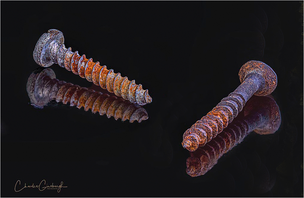
| 65 |
Oct 20 |
Comment |
I rather like your classic example showing the impact of simplicity. The dark glass causes the the mirrored reflections to compliment and be subordinate to the originals. The dynamic angles of the screws on the left, placed at 90 deg from each other The subtle lightness of the tip of the screw facing me causes it to have a three dimensional look.
I have difficulty seeing what the brass screw on the right contributes to the image. In the VF, in addition to the obvious, I made a small curves adjustment in LAB mode, to show a bit more tonality range in the rust, and placed a thin white border to show where the image ends.
|
Oct 6th |
 |
| 65 |
Oct 20 |
Comment |
I like that you are showing us the old leaves which depict the beauty of aging and impermanence, contrasting the mushrooms, which remind me that life is not wasted. Like Charles, I am not convinced that it was necessary for you to put so much effort this particular image. However, I feel that you probably did so to increase your understanding of the process. To my eye, the falloff in sharpness helps to frame your subject.
However, I would like to see less brightness and saturation in the dominant green, and the bright areas on the fallen limb keep drawing my eye away from the leaves and mushrooms.
|
Oct 6th |
| 65 |
Oct 20 |
Reply |
Charles, Thank you for the comment. I should have mentioned that I mildly smudged part of the center of the image. It was never my intention to show ice with fruit under it. In reality, the surface of the ice was never sharp. My personal feeling is that it is not necessary for all images to be tack sharp, and I did not intend for it to be. The image was actually intermediate. This is the final abstract, which I do not think is on topic for this group.
|
Oct 6th |
 |
5 comments - 1 reply for Group 65
|
9 comments - 3 replies Total
|


