|
| Group |
Round |
C/R |
Comment |
Date |
Image |
| 21 |
Sep 20 |
Comment |
Steve, I like the abstraction in your image. It shows true creativity, and thinking out of the box. I enjoy looking at the way you combined the images.
I am wondering if you are showing us too much. Also I agree with Phillipa's comment about the right column. |
Sep 22nd |
| 21 |
Sep 20 |
Reply |
Joan, Thank you for your comment. Despite the title, I did not intend for the image to be a portrait of the bubble blower, so I distorted most of her face to fit inside the bubble. In the upper right of the bubble you can barely see her lips.
Your comment about possibly using the upper right of the bubble as an insect is a concept that I had not thought of. I will definitely use it in the future. |
Sep 20th |
| 21 |
Sep 20 |
Comment |
Phillipa,
This is a striking image. The gravestones and crosses with the varying red tones, gives me an emotional chill. I am reminded where my soul will probably end up after I am buried.
The only change I can suggest would be to add four horsemen. :-)
Seriously, thank you for sharing your very well done image. It provokes an emotional response in me, every time.
|
Sep 17th |
| 21 |
Sep 20 |
Comment |
Brian, You have shared an image that makes traditional Rococo look Art Deco. I keep looking for the spirits who are haunting the area. Very well done. |
Sep 14th |
| 21 |
Sep 20 |
Comment |
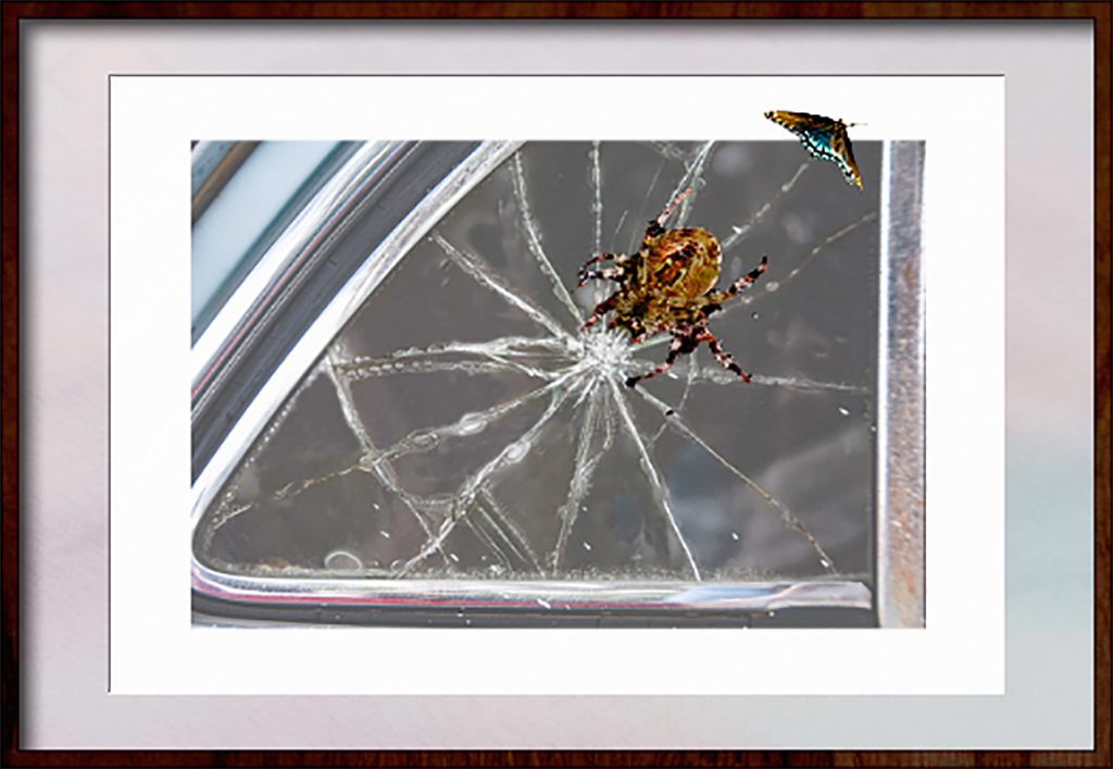
I like the overall effect. The cracks in the glass, aka spider web, not only serve as leading lines, they also cause me to wonder if the spider cracked the glass. I think it's a cracking good image.
To my eye the spider is about to jump out of the image. I would prefer to see it into the image, or it's prey just outside the image. Quick & dirty example.
|
Sep 13th |
 |
| 21 |
Sep 20 |
Reply |
Thanks, You are right about needing more room on the left. more room on the left. I also noticed that I was too sloppy with my selection of the lower part of the bubble. |
Sep 9th |
4 comments - 2 replies for Group 21
|
| 65 |
Sep 20 |
Reply |
Lynn & Charlie, Thanks for your comments. I had to laugh when you guys mentioned the pacifier. Never thought of that until it was mentioned here. I completely agree about the white reflection. Candidly I never saw it. Sadly, the four members of my club, who were in back of me have passed. Only the two on the right, and myself are still around. |
Sep 30th |
| 65 |
Sep 20 |
Reply |
Lynne, I am not sure I want to see the base. I think the bottom bubble stands on its own. Maybe it's me, but after another look, the bottom bubble reminds me of a coin operated gumball machine. |
Sep 22nd |
| 65 |
Sep 20 |
Reply |
Jeff, I don't remember adding any sharpening. However if I did, it was inadvertent.
|
Sep 14th |
| 65 |
Sep 20 |
Reply |
I am not sure that the "rules" of composition apply to all images. It is my understanding that they are only a guide, which may or may not be followed. |
Sep 14th |
| 65 |
Sep 20 |
Reply |
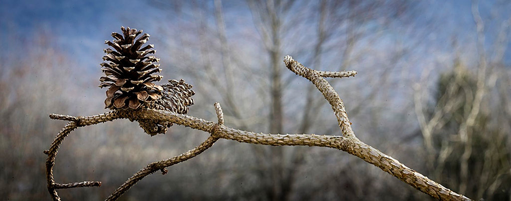
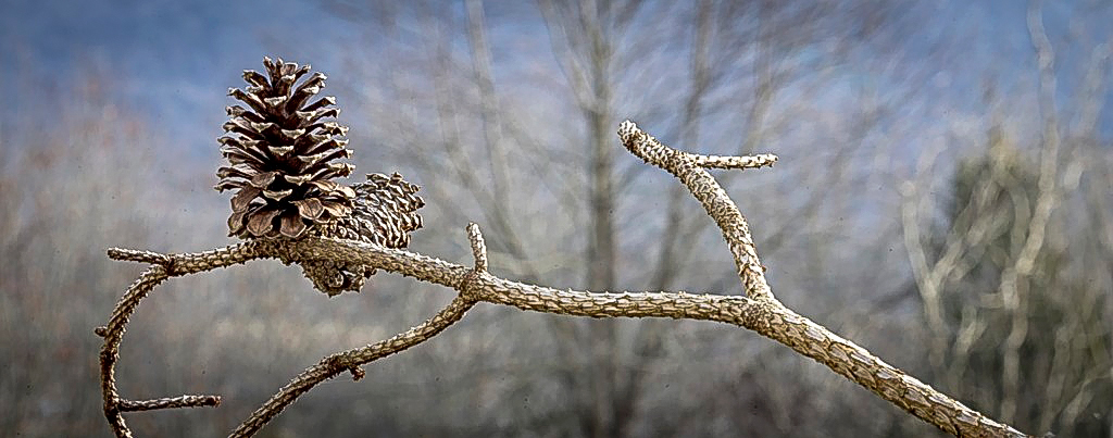
Your revision certainly brightened up the shadows and the branch. To my eye, it looks like too much separation. I suspect that the sunshine filter may have brightened the branch and the rear pine cone. I burned them a tad, and applied a surface blur of two pixels to the branch and rear pine cone.
|
Sep 14th |
 |
| 65 |
Sep 20 |
Reply |
I may be dipping my toe into focus stacking. So far I am simply reading and watching web tutorials. Opinions on techniques are, not surprisingly, all over the place.
However, the one thing most seem to agree upon is that lenses perform best at their largest aperture. I also went to the DxO lens info site. I looked at Micro & Macro lenses, and some of my other Nikon lenses. All indicated that the best performance was at the widest aperture, and indicated the smallest aperture at which you can get reasonable performance. I had not been aware that the minimum aperture varied with the camera. If I use my Nikon Micro 105 with my D800 the minimum is f32, with my D500 it is f24. |
Sep 14th |
| 65 |
Sep 20 |
Reply |
Oops. I just re-read my comment. The blossom and the buds, seem to pop right out. It comes close to a 3d image. |
Sep 14th |
| 65 |
Sep 20 |
Reply |
Wow! this image has a soft ethereal feel. I don't see the need for a "final crop." It's beautiful as it is. |
Sep 12th |
| 65 |
Sep 20 |
Reply |
Thank you for your comments, Jeff. At one point I was toying with just showing the reflection in her glasses, but decided against it. |
Sep 12th |
| 65 |
Sep 20 |
Comment |
Hi Charles, You have created I an image that is a delight to look at. Everything you show supports the main subject. I think the this is a image that needed to be centered, as you have done. The curves on the bud stems, are a good counterpoint to the fairly straight stem of the flower. It is so difficult to get the right exposure on a white flower, but you nailed it. The texture in the petals are well shown without appearing to be artificial, as is the overall texture in the buds. The back lighting gives a nice overall glow. Very nicely one.
I do agree with Jeff, that the highlights on top of the buds tend to pull my eyes from the subject flower. I think they should be toned down a tad. |
Sep 12th |
| 65 |
Sep 20 |
Comment |
Hi Jeff, welcome to the group.
You have shown us a really nice image. I like the angle of the branch, which serves as a leading line to your subject. I agree that not all closeup subjects should be shown in isolation. Your image image is clear proof that some closeup images are best shown in context. I like the way you show a sharp image, set against the nicely blurred background.
Just a nit, to my eyes some of the shadow areas are a bit too dark and I would like to see a subtle vignette on the corners. I made those slight adjustments in Photoshop, using the ACR filter. Please let us know if you agree.
|
Sep 12th |
 |
| 65 |
Sep 20 |
Comment |
Lynne, Thank you for sharing your image. My eye is drawn straight to the subject. Your placement of the subject and the angle you used, create a dynamic feel. I think you created a nice simple and interesting image.
I would like to see a thin white border around the image, so it doesn't merge into a black background. |
Sep 12th |
| 65 |
Sep 20 |
Reply |
We all make similar mistakes. The good part is we learn from them, and that type of error will not affect our ability to put food on the table. |
Sep 12th |
| 65 |
Sep 20 |
Comment |
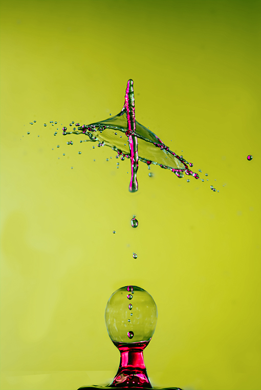
Hi Angela, I continue to be impressed and fascinated by your water drop images, and your ability to control the appearance of the collision.
The bright green background was pulling my eye away from the beauty of the drop formations. I took the liberty of muting the background in PS, by applying a curves adjustment to the "a" channel in LAB mode.
Just out of curiosity, if you shorten the distance of the drop, would you keep the stem attached to the collision? |
Sep 12th |
 |
4 comments - 10 replies for Group 65
|
8 comments - 12 replies Total
|


