|
| Group |
Round |
C/R |
Comment |
Date |
Image |
| 21 |
Aug 20 |
Reply |
Thank you. I don't know how to get this type of varying tonalities in RGB, but in LAB color space it's simply a matter of applying curves to the correct channel. |
Aug 23rd |
| 21 |
Aug 20 |
Reply |
Charles, I don't know for certain, but I have seen images of nude models in one of the DSG groups, posted by one person on a regular basis for over a year. That said, I would check with Joan.
|
Aug 22nd |
| 21 |
Aug 20 |
Reply |
Brian,
How does a wide border contribute to the image? Please see comment on borders below. |
Aug 22nd |
| 21 |
Aug 20 |
Comment |
Barrie,
I see a painterly effect from the film that I enjoy, together with your creative cropping. I am not sure whether that look can be duplicated digitally.
I agree with Brian about the black background, and think that black makes your strong image even stronger. But, my personal feeling is, that unless the frame is part of and artistically important to the image: it is a distraction, and should act only as a delimiter for the image. Therefore, I think that the border should be no wider than the minimum number of pixels necessary to achieve separation. But that's me. |
Aug 22nd |
| 21 |
Aug 20 |
Comment |
Barrie, Is it me, or is this the same image we saw last round? |
Aug 9th |
| 21 |
Aug 20 |
Comment |
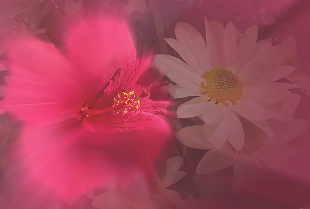
Phillipa, I like your concept. Too my eyes by placing the bright yellow stamens dead center, they are all I see, except for a portion of the saturated red petal surrounding the stamens. I took the liberty of moving and rotating the image, and reducing the saturation of the red by placing a light magenta fill layer underneath, and reducing the opacity of the flower layer to 80%, to give you an idea of what I mean. |
Aug 9th |
 |
| 21 |
Aug 20 |
Reply |
Thank you for your comment. It is my belief that a pure abstract can be anything the viewer thinks it is. |
Aug 9th |
| 21 |
Aug 20 |
Comment |
Charles, I like what I think is your impression of a Flamenco dancer. You did a nice job of keeping her sharp enough to stand out against the blurred background, yet she is just blurry enough to indicate that she is in motion. Although she is in the center, her "S" curve keeps her from looking static. I would like to see the light magenta of the amethyst toned down, or eliminated. It tends to draw my eye away from the subject. |
Aug 9th |
| 21 |
Aug 20 |
Comment |
Charles, I like what I think is your impression of a Flamenco dancer. You did a nice job of keeping her sharp enough to stand out against the blurred background, yet she is just blurry enough to indicate that she is in motion. Although she is in the center, her "S" curve keeps her from looking static.
I would like to see the light magenta of the amethyst toned down, or eliminated. It tends to draw my eye away from the subject.
To answer your question, her skin tone looks fine to me in your setting. |
Aug 9th |
| 21 |
Aug 20 |
Comment |
Brian, Thank you for showing us such an unusual and interesting image. This is what happens when you are not afraid to noodle around with he tools in PS. I was wondering if there might be a tad too much room on the top.
Sorry, I cannot resist asking: Did the proverbial mouse bite the clock?
|
Aug 9th |
| 21 |
Aug 20 |
Comment |
Joan, I think it's definitely creative, cute, interesting, and well executed. |
Aug 9th |
7 comments - 4 replies for Group 21
|
| 65 |
Aug 20 |
Reply |
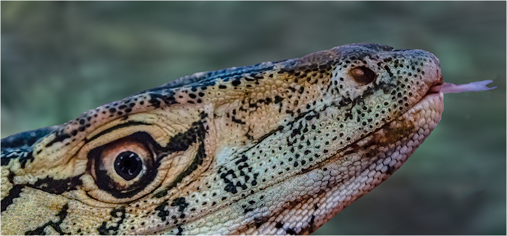
Thanks for your observation and comment. I revised the image, as suggested, and left some more room between the tongue and the edge. |
Aug 30th |
 |
| 65 |
Aug 20 |
Reply |
This is not total theory. Fermat's principle is that "light travels in the shortest that will take the least time. Snell's law is an algebraic expression of Fermat. Since the color of the light is indicated by it's wavelength, and in the RGB color space there are 16,777,216 colors. Lens construction must be precise. Tools and molds have slight changes in the normal course of production, Thereby causing differences in lenses with the same model number, from the same manufacturer. Although the above is still an oversimplification of the issues, you are correct, there is no way of knowing the sweet spot for your lens without testing. I personally don't bother, as I don't do forensic, catalog, or scientific photography. All I need to know is why my image looks weird, and I make adjustments on the next shot. If I can't adjust, I enjoy the view. |
Aug 22nd |
| 65 |
Aug 20 |
Reply |
Yup! I posted the image simply to show at least how much magnification could be done, without pixelization. After I scaled the image in PS, it contained exactly the same # of pixels as the original crop that I scaled to. I then used Gigapixel to increase the pixel count, while keeping the PPI the same. The default settings in Gigapixel include sharpening, for reasons that I would be happy to discuss privately, or on a bulletin board, if we had one. (Some Groups have them.)
As to noise, yes I could have done some NR, but it was not needed.
|
Aug 22nd |
| 65 |
Aug 20 |
Reply |
I totally agree. I do not think every image should be tack sharp. There are images that should be slightly soft, partially soft with some sharp areas, some complete blurs, and some totally sharp. It is all very subjective. |
Aug 17th |
| 65 |
Aug 20 |
Comment |
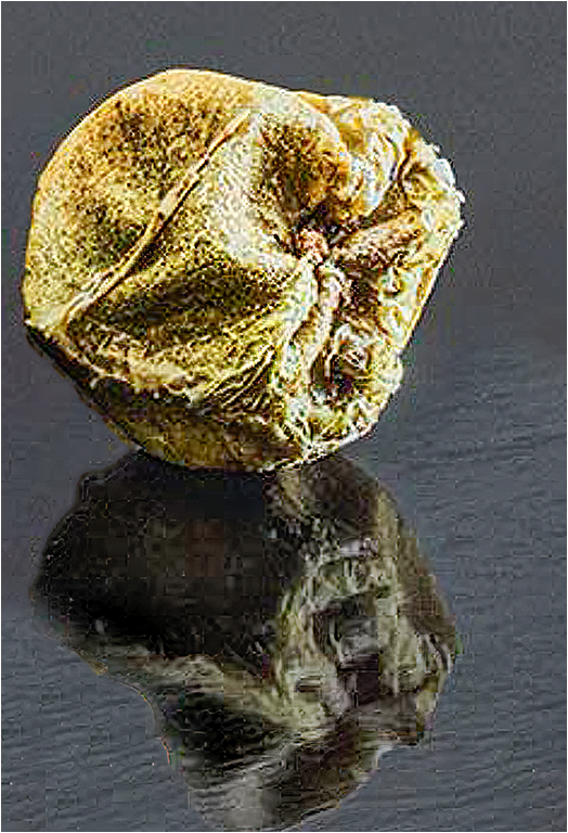
Charlie, I think that your arrangement of the various peppercorns and their reflections is fascinating to me. While I agree with Lynne about a tad of softness in some of the peppercorns, I agree with you that it doesn't matter. When I sit at my normal viewing distance of approximately 3', the softness is barely noticeable. I think you have created a very interesting image. Your composition comes close to following a combination of the golden spiral and triangles. Whichever one, if any, you intended your composition works for me. I also like the variety of colors that you used, and the juxtaposition of complimentary of blending colors. Your placement of them makes for a strong image.
While I freely admit that I do not have the temperament for focus stacking, I appreciate your results, and thank you for sharing both the image, and how you made it.
Just for play I wanted to see how your image would stand up to increased magnification. I converted your image to RAW, then in PS I scaled the image using edit| transform| scale, until I had just one peppercorn. I then further upsized the image 2x using Topaz Gigapixel. In order to meet PSA standards, I then reduced the peppercorn to comply with PSA image size. I suspect that I could have gone further without significant loss of detail, but there is a time to stop. Here is the result.
|
Aug 17th |
 |
| 65 |
Aug 20 |
Reply |
Charles. I agree that I should not have placed the plant directly from the corner. |
Aug 17th |
| 65 |
Aug 20 |
Comment |
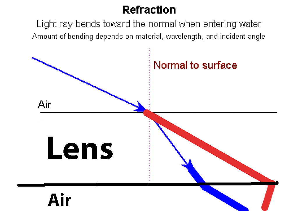
CORRECTION OF ORIGINAL REPLY.
I attached an incorrect image, and an incomplete explanation.
While I agree with Charlies comments, I thought I would oversimplify the the technical reason your image is soft.
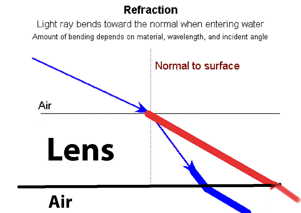
Light travels through glass at a slower rate than through air. This causes the light to bend. When light exits the glass it speeds up, causing it to bend again. I have attached an inaccurate diagram but it illustrates: that if your diaphragm is smaller than the space between the red line and the blue line as they exit a lens, or if you focus on the red line, the image will be out of focus, or distorted. Some lenses compensate for this, most do not.
|
Aug 17th |
 |
| 65 |
Aug 20 |
Comment |
Elaine, While I agree with Charlies comments, I thought I would oversimplify the the technical reason your image is soft.
Light travels through glass at a slower rate than through air. This causes the light to bend. When light exits the glass it speeds up, causing it to bend again. I have attached an inaccurate diagram to illustrate that if your diaphragm is smaller than the space between the red line and the blue line as they exit a lens, the image will be out of focus, or distorted. Some lenses compensate for this, most do not.
|
Aug 15th |
 |
| 65 |
Aug 20 |
Reply |
Angela, I sent my original comment without mentioning the image itself. I recognize it as an experimental image, but you have still produced what I call a rhythmic abstraction.
As I see your image, its delicacy would be preserved if the blown out portion on the bottom was eliminated. To my eyes the background looks too warm. Because of its color dominance it detracts from the delicacy of the bubbles. To me using a bluish image allows me to see more of the varying translucency of the bubbles. I have taken the liberty of illustrating what I mean. I change the background by making some slight adjustments to a reverse curve layer, applied to "b" channel in LAB mode. |
Aug 15th |
 |
| 65 |
Aug 20 |
Comment |
Lynne, The high magnification brings out the hidden beauty in the weed. If the plant was much larger, I wonder if it would still be called a "weed." I like the variant color of the background. It compliments the plant.
To me, the horizontal placement looks too static, and the plant looks just a tad not as sharp as it could be.
|
Aug 12th |
 |
| 65 |
Aug 20 |
Comment |
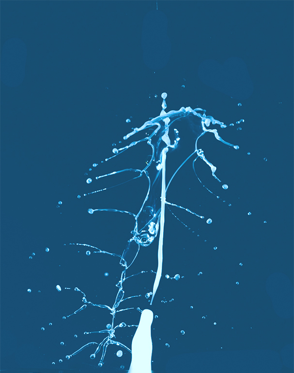
Angela, I am thrilled to learn that you are continuing our experiments. Water drop photography has a large learning curve and you are pursuing it in a logical and methodical manner. From what I have seen of your work, you have a lot of natural ability. Please pursue it further. I am looking forward to seeing your production of some beautiful and intricate images. |
Aug 12th |
5 comments - 6 replies for Group 65
|
12 comments - 10 replies Total
|


